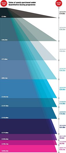
The Chart Porn blog referred me to an attractive but remarkably ineffective chart, in UK Quantitative Easing. The chart appeared in the British newspaper the Guardian, and shows the “money injected into the UK economy by the British government to help ease the recession.” [cite] This illustration is reduced to fit; click on this image to open the original in all of its full sized glory.
Apparently there has been much criticism of this chart. On the one hand, it is eye-catching. On the other, it does not clearly show anything without a lot of mental gymnastics. If you view it at full size, you can at least read the numeric labels in the margin, but reduced to fit into a medium sized monitor, it’s illegible.
The iGraphics Explained blog posted an attempted clarification of and justification for this beast in Data Visualisation and Quantitative Easing explained by Ciaran Hughes in the Daily Telegraph. The explanation said
On the left we can see the ‘running total’ of the value of assets purchased, against the ‘monthly total’ on the right hand side, keyed at the top of the graphic.
I think the reader is able to understand the depth of the financial stimulus package, and when.
Right. I showed this picture to an unbiased bystander (my wife, who has a PhD in the biological sciences and who now teaches math and science), and asked how well it showed monthly and cumulative spending. Her initial response: WTF!!??
As I pointed out, you can only see the running and monthly totals if the text labels are legible. A table without the pretty distraction in the middle would be an improvement, if only because the numbers are not spaced out by the nice colors.
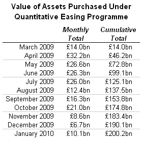
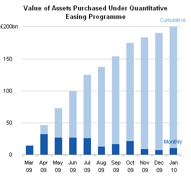
Of course, seeing numbers in text form is not the same as truly visualizing the data. A bar chart is a major improvement over the table and over the fancy illustration at the top of this article.
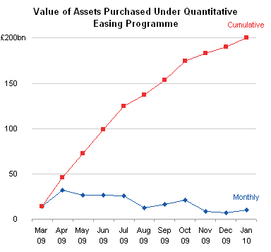
If you want to see, or emphasize, the month-to-month trend, which was the intent of the original illustration (i.e., the “Easing” of government support), a line chart is the best option. You can readily see the negative slope of the Monthly data, and the decreasing slope of the Cumulative values.


DMurphy says
An excellent example of applying the KISS principle. In what, 2 minutes or less, you provided a much clearer picture of the banking disaster/credit crisis than what, I assume, was someone trying to either “hide” the information, trying to show off or just not understanding the data – and I wonder just how long it took them to generate?
By the way, is it true that the collective noun for bankers is a “wunch”? ;-)
Phil says
hmmm… I definitely agree with the fact that the initial chart is quite hard to understand.
I personally think that they wanted to stand ot from the crows and they did ;-)
The chart-type that came immediately into my mind was a combined line-bar-chart utilizing the line for the increasing cummulative value and the bars for each months individual value so this is a combination of your two approaches ;-)
derek says
The first duty of a chart is to be more comprehensible than the equivalent table. That, and not zero, is the floor of chart performance. This chart is less comprehensible than the table.
I suppose they felt line or bar charts would be boring because line and bar charts are always being used for this sort of thing. Have any of the people responsible for this decision had the steering wheels of their cars replaced by porcupines, to relieve the monotony of that old boring steering wheel design? I doubt it.
Jon Peltier says
Phil –
What you describe is like the Pareto Charts I covered recently, except in this case the categories are sorted chronologically, not by value. Still, the lines do a better job of showing trends than bars.
Jon Peltier says
Derek –
Nice analogy. Sometimes there are risks to not using the boring old approaches that everyone understands. This is a case where the path less traveled should stay that way.
Naomi B. Robbins says
Derek – I’d like permission to quote your ” The first duty of a chart is to be more comprehensible than the equivalent table.”
derek says
You’re very welcome, but I’m pretty sure it’s not mine but Tufte’s, or at least that it’s in Tufte’s books by implication. As it is in Jon’s post above as well, when he says the table is an improvement.
I believe my greatest contribution to the collective wit of charting is still <>
Ciaran Hughes says
I hold my hand up and admit I am the man guilty of such remarkably ineffective work. But if I am to take seriously the criticisms here then it’s only fair I point out the errors in your remarkably ineffective critique. If you are going to criticise something at least read the article properly
1. In the igraphicsexplained.blogspot.com piece it clearly says in the first sentence the graphic was from The Daily Telegraph, not the Guardian.
‘Data Visualisation and Quantitative Easing explained by Ciaran Hughes in the Daily Telegraph’
2. There has been no criticism of this chart to my knowledge (except here).
From the blog
‘The idea, initiated by a infographic which appeared in the Guardian last year. The tried and tested theory of using ‘shapes’ to ‘show’ data volume, this example had as many critics in the newsroom as admirers.’
The example cited is from the Guardian, though the link is wrong – it takes you to my flickr page and not the Guardian example mentioned (I am not responsible for the blog).
3. You say
‘If you view it at full size, you can at least read the numeric labels in the margin, but reduced to fit into a medium sized monitor, it’s illegible’.
Well of course it is – it was done, at the large size for a newspaper, as mentioned, which prints at 200 dpi. It was not created to be viewed on a monitor which leads me to…
4. ‘As I pointed out, you can only see the running and monthly totals if the text labels are legible’.
Well they are in print.
And so indeed there was no need to run a not very pretty table, which has little impact and no sense of the accumulated debt.
5. You say
‘If you want to see, or emphasize, the month-to-month trend, which was the intent of the original illustration, a line chart is the best option.’
How do you know what my intention was?
It may well have been your intention had you done it but it wasn’t mine. My emphasis was on the cumulative figure, with the monthly figure as a secondary level of information.
Your bar chart example shows clearly the trend in monthly figures which is fine if you want to show that, and I like it for that. But in my case it wasn’t relevant.
6. You say
‘Of course, seeing numbers in text form is not the same as truly visualizing the data. A bar chart is a major improvement over the table and over the fancy illustration at the top of this article.’
I agree, but you see a ‘fancy illustration’. Well I see a bar chart, a cumulative bar chart. Maybe not the bar charts you are accustomed to, but a (fancy) bar chart nonetheless.
In fact it has more information on it than the examples you created – it has the figures for each category. Your examples are excellent at showing the trends but their is no specific figure for either part and so surely would fail this following maxim…
‘The first duty of a chart is to be more comprehensible than the equivalent table’.
I think all charts should be as comprehensible as the equivalent table at least and certainly should never clutter the information. I would say that the visual impact, the sense of mounting debt, is only to be found in a bar chart and not in a table and the reader will be left with a greater sense of the figures than just reading them, as you know.
In this case he also has the figures should he choose to compare them and he can see the decreasing trend on the right hand side (though not as effectively as your example).
Thank you for your time
Jon Peltier says
Ciaran –
Thank you for your reply.
1. Sorry, I misunderstood the source of the illustration. I must not have read the bold subtitle, and the link to the Telegraph showed no graphic. The first nonbold sentence said “The idea, initiated by a infographic which appeared in the Guardian last year”, leading to my misunderstanding.
2. “as many critics in the newsroom as admirers” implies criticism, n’est-ce pas?
3, 4. The large distance between the labels reduces a reader’s ability to relate the numbers. A large size display should not be required to show all of 22 data values. These same values can be tabulated or graphed clearly in an area of only a few cm on a side, as I showed in my figures. Given the large size of your illustration compared to the text size, and given the initial incomprehensibility of the meaning of the illustration (see my response to point 6), I’d say you succeeded in making a pretty table, which was not as legible as a simple table.
5. I can only guess at an author’s intentions. When I see monthly and cumulative values, and the term “easing”, I look for the trends which are implied.
In fact there are two month-to-month trends, aren’t there? There is the monthly value trend, and the cumulative value trend, and in fact they are intricately related. Clearly showing both trends merely cements these trends in the readers mind. Your illustration neglects any time scale, thus showing is a stack of colored shapes without as much context as the data deserves. Stacking the monthly values makes it harder to see any trend, because the individual parts lack a common baseline. A viewer might estimate that some values are larger or smaller than others, but a bar chart like I used leaves no doubt.
6. On close inspection, yes, it seems that you have produced a stacked bar chart. At first glance, however, I did not know how you had encoded the values. By the way, this is not a good quality to make your readers guess at. Fortunately, the values were present as labels, so I could figure out what the shapes represented. Since your graphic is not comprehensible without the labels, it fails the Junk Charts self-sufficiency test.
You have described how a chart might be more comprehensible than an equivalent table, but your illustration falls short of your own description.
Jeff Weir says
Ciaran: It’s nice to see someone willing to try new approaches. From a designer’s perspective, I imagine it can be a damn boring trade-off between form and function.
However, I think that where graphs are concerned, success is measured by whether enough people who see your work get your message, and also how hard they have to work to ‘join the dots’ before they reach that understanding.
An elegant chart is a great start, but we should also be striving for the best comprehension rate that we can achieve. If that’s achieved with something new (such as your chart), then excellent…use it. If a table or even (gasp) a pie chart aids comprehension the most, then excellent, use it.
But we shouldn’t assume that others ‘get it’ just because we do. We should ask some neutral people that are reprehensive of our intended audience if they get our message…at least for the first time we intend on using that design. And we should get them to compare it with other designs, and see which design they understand best. If only a few people ‘get’ a particular design compared to another, then we’ve let down the majority of people that didn’t ‘get’ it. If equal numbers get the old design and the new design, then bonus points if you also establish how easily they ‘got’ it…people are busy, so we want to help them understand with as little effort as possible.
We can also take some lessons from the literature when designing charts …Edward Tufte and Stephen Few have not only done a lot of work in this area, and their books highlight a lot of other people who came before them.
I’d include Jon Peltier’s site in that list…poke around this site and you’ll see that Jon has numerous posts and tutorials that focus on understandability…not necessarily always at the expense of style.
You may see a cumulative bar chart, but I don’t know what I see. If the first duty of a chart is to be more comprehensible than the equivalent table, then I personally think a table is comprehensible to more people than your graphic is. Although your graphic would look way cooler :-)
Ciaran Hughes says
Jon, briefly…
2. “as many critics in the newsroom as admirers” implies criticism, n’est-ce pas?
Yes, but as I said, not criticism of this chart but of the Guardian’s. This one in fact
http://www.flickr.com/photos/typeindication/4047438816/
”3, 4. The large distance between the labels reduces a reader’s ability to relate the numbers. Given the large size of your illustration compared to the text size, and given the initial incomprehensibility of the meaning of the illustration (see my response to point 6), I’d say you succeeded in making a pretty table, which was not as legible as a simple table.”
I don’t think so at all – and this is the point. I think as the eye moves down the page it emphasises the size of the money involved by the space covered. As long as the typography is ordered and consistent then it will serve the visual. Of course you can do it in one column but that’s no reason in itself to do so. If it gains something from the size (impact, display, a focal point) it performs an editorial function rather than being subservient to copy. It informs on its own terms.
Also it is perfectly legible. You mean readable – which is why we are sitting here typing.
”5. I can only guess at an author’s intentions. When I see monthly and cumulative values, and the term “easing”, I look for the trends which are implied.”
You are seeing it out of context – it is from a newspaper and has a headline and goes with a story with a headline which make it clear what it’s about and what the emphasis is.
”Your illustration neglects any time scale, thus showing is a stack of colored shapes without as much context as the data deserves.”
No it doesn’t. Have a look – the timescale is on the right.
”Stacking the monthly values makes it harder to see any trend, because the individual parts lack a common baseline”
Which is why the bars are transparent – so you can see that they have a common baseline.
”A viewer might estimate that some values are larger or smaller than others, but a bar chart like I used leaves no doubt.’
Really? Well why are there are huge white gaps between your bars? I initially read that as the data being available for only half the month. Doesn’t a cumulative chart, like the interest rate line, go up in steps as part of a continuous line? Yours exist in isolation, without continuity.
‘6. On close inspection, yes, it seems that you have produced a stacked bar chart. At first glance, however, I did not know how you had encoded the values. By the way, this is not a good quality to make your readers guess at.’
I don’t think it takes that much inspection and the people who saw it in the newsroom all thought it was a bar chart.
Of course you should get it immediately and if it fails it fails. But not everyone will get everything.
”Fortunately, the values were present as labels, so I could figure out what the shapes represented. Since your graphic is not comprehensible without the labels, it fails the Junk Charts self-sufficiency test.”
Well what chart works without labels? Without context? Show me one please
”You have described how a chart might be more comprehensible than an equivalent table, but your illustration falls short of your own description.’
That may or may not be true. There is a bar chart there and a table if you were to take away the visual element. Whether it works seems a matter of opinion. I’m happy to hear why it doesn’t work – it’s just that the reasons given here seem subjective at best.
Jeff, I mostly agree. Nothing goes unless it it signed off by the most visually illiterate amongst us – people who deal entirely in words and metaphors – journalists. It went. A table would not have been better – quite simply if no one looks at it, it is useless. It would not fulfill the functions I mentioned earlier in the context of the front page of the business section.
I admire Tufte and I abhor a culture that mistakes stylists for designers. However I would add that often the telling of the story is an important part of the story as well
Jon Peltier says
2. You didn’t provide this link, or your whole post would have been clearer. This circular chart is worthy of much criticism. As with yours, it can be improved using the chart types I have proposed.
3, 4. If the values are proportional to distance, then simply using a larger distance per unit amount adds nothing to the comprehension. You show no explicit scale, and the user must keep numbers in mind to maintain the sense of the scale.
Human cognition is strongly visual. Your use of colors speaks to this, but the need for reading text goes against this. Reading text does not make efficient use of our powerful visual cortex, but instead forces other systems into play. You have more numbers than can be kept in our 5-to-9 slot short term memory. A chart like mine puts all of the information into one short-term memory slot.
If my paragraph above sounds like mumbo-jumbo, then I suggest you study the work of Stephen Few, who has studied graphical effectiveness in terms of human cognition: use of colors, shapes, and arrangements of visual elements.
I mean legibility in terms of the shrunken text, and comprehensibility in terms of the ability of the reader – not the author – to understand what it means.
5. You should have provided the whole context. Title, or axis labels (or even an axis), or other explanatory text. My charts contain this context.
You do not provide a time scale. You provide labels, which the user must integrate manually and keep in short term memory.
Bars are more effective for showing comparative values when they share a common baseline. The user knows which is taller, because it starts at the same place, and extends further. In a stacked chart, the user has to somehow translate the bar in his mind before making the comparison.
The telling of a story is important to its being understood. If the telling is not clear, the understanding suffers.
Your chart is eye-catching, but does not reward the eye with information.
Anonymous says
I didn’t provide the link, which was faulty in the blog, as you were talking about my graphic initially. It’s a side issue really – the Guardian graphic has problems because it’s showing volume when it should be comparing height and is what the blog alluded to.
My graphic doesn’t need a numbers scale – the bars are proportionate and provide the visual scale as well as having precise numbers on them.
They also have a baseline.
I don’t understand how you can criticise something for having too many numbers for short term memory (what happens with tables then?) when yours has none at all.
I also see you didn’t comment on the white bars between your bars – you have introduced an element which confuses, not clarifies. There is also an ambivalence with your stacked bars as the dark blue could be seen as obscuring the baseline of the light blue.
I think a headline always helps but again, I didn’t write the blog.
Time scales?
What are the dates on the right if not a time scale? What is the difference between your timescale and mine, except that mine is more precise?
‘You provide labels, which the user must integrate manually and keep in short term memory’.
And are yours any different?
You said ”I’d say you succeeded in making a pretty table, which was not as legible as a simple table”
There is no argument here – it is as legible in print. It is as legible as a table would be as the point size is the same. You mean readability, which you find difficult in this case.
You said
‘Bars are more effective for showing comparative values when they share a common baseline. The user knows which is taller, because it starts at the same place, and extends further. In a stacked chart, the user has to somehow translate the bar in his mind before making the comparison.
You’re right. But mine does share a common baseline and yours, the stacked chart, doesn’t.
Confused? Absolutely.
‘The telling of a story is important to its being understood. If the telling is not clear, the understanding suffers.’
I agree. But I would add if the telling is so dull the reader will not continue and have little recall even if they do. I think my chart does inform. And you don’t, for reasons which seem contradictory in your explanations.
Jeff Weir says
Ciaran: This is an interesting discussion. It’s great that you are part of it.
I’ve got a few thoughts on your recent comments…
Nothing goes unless it it signed off by the most visually illiterate amongst us – people who deal entirely in words and metaphors – journalists.
Perhaps journalists aren’t the best signoff if we are judging an image by the kinds of standards that Tufte et al bring to the party.
I imagine that:
a) journalists have a higher average reading age than your actual readers (I certainly hope so, otherwise we are in a race to the bottom in terms of news quality!). My point is that they are probably not representative of your audience and they are certainly not impartial (as per my point c below). So while the least visually literate person in the newsroom may understand it (possibly while you are hanging over their shoulder, providing some context) this does not mean that most of the intended audience will;
b) if you had given them this graphic and asked them to interpret it without any guidance from yourself, then I think they would have struggled, compared to Jon’s alternative;
c) a large part of them deciding to include the graph is that it added some sizzle to the article. They probably cared less about whether readers were likely to understand the actual sausage.
But then, their job is to sell newspapers and appease stockholders, and not necessarily to impart meaning. So in a way it’s harsh to critique the graph without bearing in mind this fact. Ultimately, regardless of what criticism a few chart-junkies may have, if more interesting-looking infographics help sell more newspapers than less interesting ones, then there is a business case for them regardless of whether they are the *best practice* way of encoding information or not.
I think this is a very important point…there’s a key tension here between what the audience wants (or what they think they want, which is effectively the same thing), and what chart-junkies think they need in order to aid understanding. So perhaps this is the right graph for the task in the context of selling newspapers, even if chart junkies think it is not the right graph in the context of imparting wisdom.
That said, I don’t think this kind of graph would meet the needs of another publication such as The Economist, where the audience almost certainly would have different wants i.e. a want to see the information presented in the way they are most comfortable in interpreting it.
A table would not have been better – quite simply if no one looks at it, it is useless.. The other side of this argument is that just because people look at it, it does not mean it is useful. Understanding is required for something to be useful, unless we’re talking about a work of art. And as per my point above, maybe that’s where chart-junkies miss the point…if chart art sells more newspapers, then bring it on.
I would add that often the telling of the story is an important part of the story as well But if people don’t understand the story, then there is no story. But then again, as per my points above, if people value design over function, then the telling becomes more important than the story as far as they are concerned.
Would love to hear your thoughts on this.
Ciaran Hughes says
Jeff… I’m sure you have a life to go to so I’ll try and be brief.
Journalists. Basically if they can get it, anyone can. The fact that they have a large say on things unrelated to words goes a long way in explaining the decline of newspapers. They are entirely literal and deal only in metaphor in relation to images. Their default setting is illustration which is always what they ask for. However, when they get something unexpected, as above, they have to either get it unaided or it doesn’t go. I don’t sit with them and am not privy to their conversations but they do want their pages to look interesting. A one column bar chart with no figures, as suggested above, is neither informative nor interesting and doesn’t work by the criteria Jon draws up for mine.
The letters we get from readers suggest that they are much more engaged and visually literate than those who deal solely in words imagine.
There was a time when there were no photographs in paper. Can you imagine that now?
I have read Tufte’s books and liked them. He is very interesting but seems to exist in a somewhat academic atmosphere.
I think journalists do care about whether the reader understands a graphic, as do I. They also want it to act as a snapshot and a way of getting the reader to read their prose. A one column graphic with no figures is far to general to do that. It also contradicts the editorial emphasis when it goes with the lead story.
I doubt if an infographic has ever helped sell a newspaper but if the graphics and copy are only attractive and lack clear content then papers will find that their readers go elsewhere, I imagine.
The Economist is an excellent, intelligent, focused high-quality magazine. It’s maps and charts are, from memory, perfunctory and certainly years ago used to be very poor quality.
‘Just because people look at something doesn’t make it useful’.
Yes it does. It is useful – in attracting your attention. If after the initial interest the design hinders the narrative then it has been shown to be a distraction.
It’s really like the start of a conversation. If the one column bar chart is so sure of its interesting information that it doesn’t have to engage with you how will you ever find out?
Understanding is required if the viewer/reader is to take anything more from the conversation. The understanding in contemporary art often comes from accompanying text, which to me is a total failure. However often we don’t have to understand things, in art and music, to take things from them.
People should always be able to understand the story, in words or graphics. Anything else is a failure.
But how often have you seen a film you really liked and tried to describe it and ended up realising that the story really was quite slight. And what you had got most from it wasn’t the story, but the way it was told? The way it made you feel? Is that not valid?
Good design can provide an editorial element in addition to what is simply a presentation of the story or data. It can inform.
Jon Peltier says
“My graphic doesn’t need a numbers scale – the bars are proportionate and provide the visual scale as well as having precise numbers on them.
They also have a baseline.”
The precise numbers do not instantly lead themselves to comparisons the way a vertical scale might. The ‘bars’ are proportional, but in the form of semitransparent triangles, it is not clear that they are in fact bars.
“I don’t understand how you can criticise something for having too many numbers for short term memory (what happens with tables then?) when yours has none at all.”
Tables suffer from the same issue with too many numbers, but I believe they are more effective if they are placed in an aligned grid, rather than strewn along an already confusing pattern of overlapping shapes. I don’t have numbers on the data points (the bars) because I have a scale. I did not feel the precise numbers were as important as clearly showing the trends.
“I also see you didn’t comment on the white bars between your bars”
Okay, I’ll comment now: why do you find the white spaces in the bar chart confusing?
“There is also an ambivalence with your stacked bars as the dark blue could be seen as obscuring the baseline of the light blue.”
Perhaps so. In one version of the bar chart (they are not stacked, by the way: all bars start at zero), I used a wider bar for the totals, so it was clear that all bars started from the baseline at zero. I prefer the line chart version, since there is no ambivalence and no obscuring of one series by another. The line also very clearly shows the trends.
“What are the dates on the right if not a time scale?”
Your dates are merely a list. A time scale in my definition is a proportional numerical scale oriented horizontally in a chart, so the values plotted vertically can be easily compared from one time period to another.
“I have read Tufte’s books and liked them.”
Tufte is a graphics designer with a minimalist approach to data. A good approach to keep in mind. (Your overlapping triangles are not minimalist.) Another expert to follow is Stephen Few, who is much more practical than Tufte, and he gives reasons for his suggestions based in his knowledge of human perception and cognition. Read “Show me the Numbers”.
As you say, the way a story is told is important. There are two aspects to this. First, is how to tell the story to make people pay attention. This is where attractive graphics like yours outperform my “boring” charts. Second, is how to make the user understand the information quickly and easily. This is where your illustration falls short.
I think we really need to learn a few things from each other. Use colors to attract attention and not detract from the information. Use effective charting approaches that describe the information clearly without putting readers to sleep.
Jeff Weir says
Ciaran:
Sounds to me that you lump ‘perfunctory’ in with ‘simple’. My dictionary defines ‘perfunctory’ as “carried out with a minimum of effort or thought.” ‘Simple’ is described as ‘plain and basic’ as well as ‘easily understood or done’.
I don’t think the below graphs – the first two I came across when looking in the Economist for examples – are carried out with a minimum of thought. Minimum of effort, perhaps…and granted, they could be better. But I think these graphs are both easily done, and easily understood.
But I think your graph fails on both counts. Granted, it might have drawn readers attention, but then so would a pair of breasts (female preferably) superimposed over Jon’s graph.
I couldn’t agree more that Understanding is required if the viewer/reader is to take anything more from the conversation. I just feel that most people who looked at your graph probably didn’t understand your graph.
I also agree that we don’t have to understand things, in art and music, to take things from them. But your graph is neither art, nor music. What are most people walking away with? Jeez, that looks neat or wow, look how the cumulative figure is changing? I doubt that the answer is both.
And I agree that Good design can provide an editorial element in addition to what is simply a presentation of the story or data. But I personally don’t think your graph is good design.
Out of interest, I’ll print off a full-sized copy of your graph tomorrow, and ask half the team at work to tell me their take-home point from it, and I’ll ask the other half what their take-home point is of Jon’s graph. It will be interesting to see how each graph fares.
Jeff Weir says
Ciaran:
Sounds to me that you lump ‘perfunctory’ in with ‘simple’. My dictionary defines ‘perfunctory’ as “carried out with a minimum of effort or thought.” ‘Simple’ is described as ‘plain and basic’ as well as ‘easily understood or done’.
I don’t think the below graphs – the first two I came across when looking in the Economist for examples – are carried out with a minimum of thought. Minimum of effort, perhaps…and granted, they could be better. But I think these graphs are both easily done, and easily understood.
But I think your graph fails on the simple counts of ‘easily understood or done’. Granted, it might have drawn readers attention, but then so would a pair of breasts (female preferably) superimposed over Jon’s graph.
I couldn’t agree more that Understanding is required if the viewer/reader is to take anything more from the conversation. I just feel that most people who looked at your graph probably didn’t understand your graph.
I also agree that we don’t have to understand things, in art and music, to take things from them. But your graph is neither art, nor music. What are most people walking away with? Jeez, that looks neat or wow, look how the cumulative figure is changing? I doubt that the answer is both.
And I agree that Good design can provide an editorial element in addition to what is simply a presentation of the story or data. But I personally don’t think your graph is good design.
Out of interest, I’ll print off a full-sized copy of your graph tomorrow, and ask half the team at work to tell me their take-home point from it, and I’ll ask the other half what their take-home point is of Jon’s graph. It will be interesting to see how each graph fares.
Ciaran Hughes says
Jeff,
No, ‘perfunctory’ doesn’t mean simple in this case (also there is a very big difference between simplified and simplistic).
Perfrunctory means
1. lacking interest, care, or enthusiasm; indifferent or apathetic.
Those samples are poorly visualised graphs. The typography and the design are very poor and introduce elements that slow down the understanding but not prevent it. As you say, they could be better
‘But I think your graph fails on the simple counts of ‘easily understood or done’. Granted, it might have drawn readers attention, but then so would a pair of breasts (female preferably) superimposed over Jon’s graph.’
You think my graph fails, I don’t. The reason’s given, initially in this blog, I find have been based on skim reading and pre-held ideas. What has annoyed me is not that the graphic isn’t liked – it’s that the critique is little more than revisionism. The bar chart example and the line chart (which show the figures either isolated and not running to the end of the month, or joined with a sloping line, when it should be a step, are both wrong) yet are used to correct my graph. You may not like mine, and I think partly because it is ‘pretty’ and you distrust this, but it is accurate and has all the data on it.
In a word, the opinions you have expressed are subjective.
When you print off the copies, ask your team these questions please.
What is the figure put in at the start?
What is the cumulative figure at the end?
What date was £26.3bn put in?
And then ask them which chart they got that information from
DaleW says
Some charts are intended for efficient data visualization.
Some charts are intended as eye-catching chart art. This is clearly the latter.
To me, this art evokes how our overhanging public debt keeps growing, like a mysterious but enormous stalactite with deadly pointed edges, each layer more brightly alarming than the previous as cumulative debt keeps ever increasing.
Jon, this is not merely an abstract stacked bar chart; this is also an abstract MULTIPLE PIE chart, where the slice starts small at the top and alarming grows each month (even you might be alarmed by a 3D PIE with time as the third dimension!) at cross-purposes to a productive free economy as it creeps closer towards its 90° limit of effectively infinite government debt which would mark the sharp collapse of Western Civilization as we know it.
Or, it could be Derek’s porcupine.
Matt Cloves says
Truth be told, I consider myself a highly visual oriented person (certainly not what I would call visually illiterate at any rate), and I had a little trouble understanding your graph Ciaran.
In fact, I have had to revise this post a couple of times, as thinking longer and longer on it, my understanding is still not quite down…
My natural instinct was to try and make sense of the angle’s involved in the middle of the image, but there seems to be little meaning to that part.. the angles radically change from month to month anyway due their progress down the page. this makes me ready to believe that the angle, and the area of the ‘end segments’ are meaningless, and that the height is the only factor displaying data.
Why include this middle segment of the graph at all then? perhaps to clarify that this is a non-stacked bar chart? By using the various differences in the angles, coupled with a transparency effect, to indicate that there is in fact a shared baseline at the top… and why do that? the only reason I can think is so you can label each segment with a cumulative total rather than a monthly figure. if so, an elaborate set up for a little needed justification.
I would have read this more clearly had you missed the middle part of the image out, leaving a stacked bar on the left and the dates on the right… but then this would highlight another issue: The dates on the right imply that each segment (non overlapping area of each new cumulative area) represents a month, but the central alignment of each date label makes it hard to tell if this is really the case. does the ‘end segment’ of each new bar relate to a given month from the 1st to the 30th? (being represented by the dots on the line)? Given that the distance between these dots is dictated by the amount of spending that month, it seems somehow ‘off’ to me that this line representing time should ebb and flow, this line for time would seem less unusual if it were constant. (perhaps remove that line entirely and just label each ‘bar’ with the month name?)… or even better, make the time-line down the page constant, and have the data in the bars encoded outwards, where the triangles used to be… this way, time doesn’t look funny, and we still use visual perception to assess changes between months.
Some of the advice already given has been very easy for me to understand the exact intent of the person giving it… Taking Jon’s excellent (and free!!) bar chart and line chart examples (only very slightly obscured by the gaps) the trend overall is downward, and that this has lead to a ‘slowing’ of the cumulative spending… this is information not readily visible in your view without being willing to put the time in, and in Jon’s it screams at you.
These might seem like petty revisions, but I gave up trying to understand your own graph before I even realised it was essentially an inverted (non) stacked column.
This is not to say, as has already been noted, that your graph ‘failed’*. This is just the difference between working within the confines of a national paper’s ideas, or in trying to maximise the amount of information you want to reveal about about a given data set while also maximising the rate at which that information can be absorbed.
*(the day I get my own pedantic work published in the Guardian, I might feel entitled to change my opinion however)
Matt Cloves says
Forgot to say, really interesting thread guys.
Ciaran Hughes says
Matt, I have little trouble with what you say.
The angle and the end segments aren’t entirely meaningless – they create a visual effect which emphasise the debt.
Height is the determining factor.
‘Why include this middle segment of the graph at all then? perhaps to clarify that this is a non-stacked bar chart? By using the various differences in the angles, coupled with a transparency effect, to indicate that there is in fact a shared baseline at the top… and why do that? the only reason I can think is so you can label each segment with a cumulative total rather than a monthly figure. if so, an elaborate set up for a little needed justification’.
Fair enough, but it would very dull and not justify the space otherwise and then it wouldn’t go, and then no one would see it.
‘I would have read this more clearly had you missed the middle part of the image out, leaving a stacked bar on the left and the dates on the right… but then this would highlight another issue: The dates on the right imply that each segment (non overlapping area of each new cumulative area) represents a month, but the central alignment of each date label makes it hard to tell if this is really the case. does the ‘end segment’ of each new bar relate to a given month from the 1st to the 30th? (being represented by the dots on the line)? Given that the distance between these dots is dictated by the amount of spending that month, it seems somehow ‘off’ to me that this line representing time should ebb and flow, this line for time would seem less unusual if it were constant. (perhaps remove that line entirely and just label each ‘bar’ with the month name?)… or even better, make the time-line down the page constant, and have the data in the bars encoded outwards, where the triangles used to be… this way, time doesn’t look funny, and we still use visual perception to assess changes between months.’
I agree – I should have put the dates at the start of the change, where the small circles are
Jon’s charts do scream trend at you. As I have said here they give you no more accurate information than that though (can you tell me the final figure or any figure, as accurately as a table or my graphic?) and the monthly trend wasn’t the story.
It is essentially an inverted (non) stacked column.
It’s not pedantic to say it wasn’t in the Guardian – it shows that the original criticism was based on not thoroughly reading the blog, looking closely at the graph by mentioning problems with legibility, no baseline and no time line.
Jeff Weir says
Ciaran:
What is the figure put in at the start?
What is the cumulative figure at the end?
What date was £26.3bn put in?
These are questions just as easily answered by a table, aren’t they?
Jeff Weir says
On The Economist graphs, how much do you think understanding is being slowed down by? How many seconds could better typography and better design realistically save?
Surely the design of your chart also introduces elements that slow down the understanding but not prevent it.
Certainly that’s what most of the comments above from people are saying, don’t you think?
Ciaran Hughes says
Jeff, of course they are. But try answering them using either example provided in Jon’s graphs above.
Jeff Weir says
Ciaran: you’re asking questions that are incredibly narrow. These questions could just as easily be answered by Jon’s graph with one mouse click.
So your chart as it stands offers better precicion in terms of actual numbers. But Jon’s offers another glimpse – it shows clearly the trend in monthly figures . Sure, that wasn’t your intention, but Jon’s graph – with 2 seconds’ more work – shows this as well as the scale of precision in terms of the actual numbers that you think is so important.
This precision thing is interesting…if you had access to more precise numbers for each data point – say along the lines of 14.20345 billion monthly spend for the first number – then how much precision would you show? Two digits? Three? Why that level compared to more precision.? Mcause that’s what you think your readers need? That’s exactly the call that Jon’s making. Does’nt make him wrong, just makes him subjective.
If, as you say, all charts should be as comprehensible as the equivalent table at least and certainly should never clutter the information. then why not try to gauge whether this goal has been achieved?
I’ll be sure to ask your questions, but I’ll also ask whether your chart – and Jon’s chart – are as comprehensible as the equivalent table, and I’ll be sure to ask which device readers learn the most from.
Ciaran Hughes says
No, I’m asking questions that were asked of mine. If Jon’s existed in print there is no mouse click and there shouldn’t have to be. I’ve clicked on the example above and nothing happens.
‘So your chart as it stands offers better precicion in terms of actual numbers’.
Is there something wrong with that? You prefer something imprecise? Isn’t that what I’ve been accused of?
He started off the arguement by saying
‘A table without the pretty distraction in the middle would be an improvement, if only because the numbers are not spaced out by the nice colors’.
Then he says…
‘Of course, seeing numbers in text form is not the same as truly visualizing the data. A bar chart is a major improvement over the table and over the fancy illustration at the top of this article.’
Well is removing the precision of the table an improvement?
Mine shows the accumulated figures visually, the monthly figures visually, and all the data, including a timeline.
His don’t.
Precision.
They show the trend, which I like – but are incapable of showing any more.
There is a huge difference between providing a figure to one or two decimal points and none at all.
And you know it.
It doesn’t make him wrong, indeed – but it does in the context of this debate because he tells me how to improve the graphic and he fails because of the reasons I have pointed out.
‘If, as you say, all charts should be as comprehensible as the equivalent table at least and certainly should never clutter the information. then why not try to gauge whether this goal has been achieved?’
Why do you think I haven’t?
Charts provide more information for things like this than tables.
Why? Because they show. They don’t tell
Jeff Weir says
Okay, I’ll rephrase: The questions asked of your graph were incredibly narrow. There’s more to working out which method of encoding information is best for readers than these questions could answer. As you agree above, a table would satisfy questions this narrow. So would Jon’s graph, if he added data labels. So would yours. How do you pick a winner if they all score the same on these narrow measures? By the one that draws the most attention? What kind of clincher is that?
I don’t think its good practice to choose one graph over another simply because it meets some minimum requirements with regards to regurgitating information that you would otherwise get from a table. I would pick the graph that tells as much as it can about the story buried in the data.
Does Jon’s graph fail altogether as a story just because it has less precision? I don’t think so. Does your graph trump Jon’s altogether as a story just because it has more precision? I don’t think so. I think the best graph is the one that readers learn the most useful information from, in the best manner for the reader possible. ‘Useful’ is obviously subjective, here. Personally I think the trends that Jon shows are useful, as is the amount of precision that you show in your graph.
I was not clear on what I meant by mouse click…sorry about that. I meant that if Jon had believed that more precision would help tell a better story, he would have added data labels in an instant. But he obviously thought that the shape of the graph tells the more interesting story, and that precision to the level in your graph was not an essential element to his story.
Jon and you obviously had slightly different ideas as to which story was most important. Now that Jon sees precision is quite important to the story you were asked to tell, lets say he added data labels to his graph giving the same figures you can see in yours. How would you judge his graph then? I think we’d get the best of both worlds: the same information that one can get from reading your graph, plus a better showcase of the trend in monthly figures.
In hindsight , I agree that it would be good if a reader could read Jon’s graph with more precision. Perhaps I would have either added data labels giving the kind of precision that you do, or I would decrease the spacing on the grid lines to increments of 25b, allowing the reader to be ‘precise enough’ to get the general idea. To me, either of these would be good enough. I don’t think that my amended graph would fail compared with yours solely because a reader couldn’t quote a figure to 1 decimal place.
There is a huge difference between providing a figure to one or two decimal points and none at all. And you know it. Of course. I’m just pointing out that the level of precicion we think is needed is something based on our subjective determination of “what is the key message I need to tell here”
I think you have failed, because I don’t think people will get your chart, and I think you could have told a better story with the huge amount of space that you devoted to it.
Charts provide more information for things like this than tables. Providing information is one thing. Understanding it is another.
You say that Jon is wrong in the context of this debate, but to me you define the context very narrowly, indeed.
Ciaran Hughes says
Jon raised that point about the table. I am replying to terms he defined only to be told off for it.
My only conclusion is that when I reply on your terms you can’t respond so I become too… ‘pedantic’ or too… ‘precise’.
You keep moving the goalposts
‘So would Jon’s graph, if he added data labels…’
Well he didn’t.
He says this is how you do it but when I dare point out that no, you don’t … you say what if…
Moving the goalposts.
‘I don’t think its good practice to choose one graph over another simply because it meets some minimum requirements with regards to regurgitating information that you would otherwise get from a table. I would pick the graph that tells as much as it can about the story buried in the data.’
Never mind precision – it trumps it because it has more information. And is that a problem to give the reader that option? Not according to Jon.
Feeling a theme here, yes… moving the goalposts.
Mine was accused of having no scale, timeline, baseline (but they do). This was deemed a problem but Jon’s not having data isn’t a problem?
Yes…
‘Useful. Subjective.’
Indeed.
All of this has shown is that what appear to be insightful points raised at the start of this debate were nothing more than half formed opinions based on a quick read and the writer’s subjectivity.
Namely if it’s ‘pretty’ it can’t be much use.
Jon showed me how to do it but when I dared question this by the same criteria used to question mine I’m too… precise.
I think the trends that Jon shows are useful too.
But that is the limit of his informing.
I also think that if no one looks at it then it makes little difference anyway.
‘Jon and you obviously had slightly different ideas as to which story was most important.’
No, he made the mistake of presumng my intentions…
‘I think you have failed, because I don’t think people will get your chart, and I think you could have told a better story with the huge amount of space that you devoted to it.’
‘You say that Jon is wrong in the context of this debate, but to me you define the context very narrowly, indeed.’
That is your opinion, fine. I’m happy to have it and you may be right. But it does not fail for the supposed reasons Jon has mentioned. In fact when these rules are applied Jon’s fails as I explained.
He falls on his own sword, not my subjectivity.
‘Charts provide more information for things like this than tables. Providing information is one thing. Understanding it is another.’
Absolutely.
Jeff Weir says
Ciaran, just because we’re having this conversation on Jons blog where he put up an alternative to your chart doesn’t mean that I can only compare Jon’s chart to yours.
I’m not critiquing your graph based on what Jon has to say…I’m critiquing your graph based on what I have to say. Making a ‘moving the goalposts’ defense in response to my comments is a red herring.
Here’s the question…do you think the way you have graphed this data is the best way you could have, given the data, the audience, and the possible stories you can tell with that data?
I think the following way (follow link and click on ‘download’…sorry, I have no screenshot functionality on my work PC) is easier for readers to comprehend and draw their own conclusions from – albeit the end result would look slicker if I had your design skills.
http://cid-f380a394764ef31f.skydrive.live.com/self.aspx/.Public/Copy%20of%20monthly%20vs%20cumulative.xls
Is this graph a better way? If not, why not?
Ciaran Hughes says
‘I’m not critiquing your graph based on what Jon has to say…I’m critiquing your graph based on what I have to say’.
Yes, but you are using his points and more so his graphs to back up your case.
‘Making a ‘moving the goalposts’ defense in response to my comments is a red herring.’
No, it’s not. It’s pointing out inconsistencies in you supporting his argument and examples while ignoring mine
Here’s the question…do you think the way you have graphed this data is the best way you could have, given the data, the audience, and the possible stories you can tell with that data?
Yes. For reasons given.
Is this graph a better way?
No.
Why not?
Because it’s wrong, as I said earlier. It has a monthly time line but shows the figures as points which then have a slope between them. It’s a graphic device forced on the information and changing it, not coming from it, which is what mine is accused of.
They are constant figures which, when they change, go up vertically. They are steps. It goes like this. Always.
Jeff Weir says
Re your point They are constant figures which, when they change, go up vertically. The Bank of England graph is correct, but only because they raise the base rate at exact times, leading to a stepped graph. Giving the data from my graph the same treatment would be incorrect, because it would show that 14b was spent on the day of the 26/3/09, 32.2b was spent on the day of the 30/4/09, and so on.
I’m not inconsistently supporting Jon’s argument while ignoring yours: I have in fact amended Jon’s graph in response of your points about precision. I think your points on precision are valid. I think my amended graph is better than yours.
There’s more dialog between us in the comments than there is in Jon’s post. I’m supporting my own argument, and I made my own graph to show it. You’ve given me one reason why you think my graph is not a better way, but your reason is wrong.
Critique me directly…I love to learn from what others think of my arguments an analysis.
Jeff Weir says
I printed both Ciaran’s graph and my amended version of Jon’s graph, and asked a few people at work what they thought. Here’s the specific questions:
1. What is the figure put in at the start?
2. What is the cumulative figure at the end?
3. What date was £26.3bn put in?
4. In what month was the highest value of assets purchased?
5. What other kinds of information (if any) can you infer from the graph?
6. What four-month period had the most assets purchased during it?
7. When was the biggest fall between months?
I better point out that my highly statistical and representative sample is of *cough* er…four people who are all data analysts. Will ask a few more non-data-geeks what they think as time permits. But – for what it’s worth – here’s what I found:
*Little difference in the time taken to answer most questions (certainly next to no difference to answer the first three), with the exception of the last one.
*A comment by two of the four that Ciaran’s graph better displays how the different categories stack up cumulatively. That is, as you run your eyes down the LHS of Ciaran’s graph, it’s quite easy to see how the relative sizes of the components stack up. Whereas with the cumulative chart, you would have to mentally transfer the cumulative data points to the vertical axis to see the same effect. (Incidentally, this is when the penny finally dropped for me that Ciaran’s chart indeed is a stacked bar chart. That is, lop off the triangles on the right, and what remains on the left is a one-data-point stacked bar chart showing how each month accounts for the whole package.)
*A preference by two of the four at how Ciaran’s graph better grabs your attention.
*A preference by all four for how my reworked chart better shows month-on-month changes.
*General comments that the more traditional graph was easier for them to interpret. But recognition that this might largely be because the analysts weren’t used to a graph such as Ciarans.
In short, I was surprised at how little difference there was to interpret each graph in response to these questions. However, all four said they had to work harder overall. But I learnt something from even this small sample. What I took from this is that both approaches have their advantages.
So I whipped up a hybrid. Check out http://cid-f380a394764ef31f.skydrive.live.com/self.aspx/.Public/monthly%20vs%20cumulative%202.xls (follow link and click on ‘Download’. Jon – perhaps you could post the image here).
Thoughts?
Jon Peltier says
Strictly speaking, the data we have been discussing are discrete. Each month (one point in time) has a single spending value (one point in value). These points are marked clearly in my line charts with markers, or are indicated by bars. There are no data points between markers (or within bars). Is there any risk that someone would try to interpolate a spending value for a date between data points? A step chart is not needed. If there is a possibility that someone wants to report a value during a continuous time period, as in Ciaran’s interest rate plot, a step chart does show the data more accurately. But I don’t know why Ciaran has brought up this red herring.
I have reworked my charts. First I added data labels to add a sense of improved precision to the charts:
This is one of the variations Jeff has also put forth. The trends are still clearly visible, but the labels supply the precise values that Ciaran says are so important. I hope the labels do not add clutter to the chart.
Then I made an attempt to show how monthly values stack up, using floating bars where each month adds to the previous month’s total. This stacked chart, with offset bars, may be an improvement over Ciaran’s because it has an actual time scale, the horizontal displacement of the bars. The horizontal displacement coupled with the vertical values provides a slope, which improves comparisons of the changing values. (Ciaran – you do not have a time scale, you have merely printed dates alongside the monetary values.) I’ve retained the data labels for precision.
This offset stacked bar chart is somewhat of an improvement over a simple stacked chart because of the effect of the “slope”.
Ciaran Hughes says
So every point I raise is pedantic or a red herring? And yet you end up acting on my criticisms and revising and improving your work?
‘Strictly speaking, the data we have been discussing are discrete. Each month (one point in time) has a single spending value (one point in value)’.
No, they aren’t when you use a timeline across the bottom the way you do. You are showing 365 days, broken into months. You cannot give a month a value when sometimes the figure overlaps or over-runs if it is to properly represent the timeline. Which is why the example I sent is right and your line chart is wrong.
‘A step chart is not needed’.
Well only if you introduce a timescale in the way you did. Then you end up with a step chart.
You introduced the timescale, not me, so how is it a red herring?
I think your floating chart is excellent and effective and I would have no criticism of it. It is not cluttered and is very informative, and it shows the trend as well. It’s excellent.
However that’s not what you produced in your critique – you only came up with that after I pointed out the ‘red herrings’.
‘Ciaran – you do not have a time scale, you have merely printed dates alongside the monetary values. I’ve retained the data labels for precision.’
No, I do have a timescale. What I don’t have is the timescale as an axis which dictates how I must treat the graphic, the way you have. There is nothing wrong with either approach, it is a question of emphasis. All the dates of the increases are on mine if you want them.
Jeff Weir says
Ciaran, your tone makes me think that you believe that once anyone dare critique aspects of your work, then they are selling out if they dare revise their original viewpoint even a smidgin on any one aspect.
You say So every point I raise is pedantic or a red herring? You are the only one who says that. Then you say And yet you end up acting on my criticisms and revising and improving your work? Perhaps you’ve got a point…how dare anyone learn anything from free and frank dialog and constructive critisism.
Please point out where every point you raise has been labelled as pedandic or a red herring. Alternatively, stop making such claims…they make a crappy arguement.
Ciaran Hughes says
Jeff,
‘Re your point They are constant figures which, when they change, go up vertically. The Bank of England graph is correct, but only because they raise the base rate at exact times, leading to a stepped graph. Giving the data from my graph the same treatment would be incorrect, because it would show that 14b was spent on the day of the 26/3/09, 32.2b was spent on the day of the 30/4/09, and so on.’
Yes. They announce it on a single day, as I state. At exact times. Which is what my chart shows.
Jeff, my tone is one of weariness. Time and again I explain my points. As the debate continues I then clarify them. This is either described as being pedantic, introducing red herrings or being too precise.
I am entirely happy to have my work criticised. Why shouldn’t I be? I am not at all happy to have a subjective opinion passed of as a considered critique, which, when I respond to it, doesn’t go down well with the consensus on this blog.
It seems to me that what you are accusing me of is what you are guilty of yourself. Are the graphs that showed me how my graphic should be done beyond criticism? Have they not improved because of my criticisms? I think so and am happy to say so. I really like that last one.
Pedantic, narrow, red herring.
Matt Cloves
Time: Wednesday, February 17, 2010, 9:30 am
*(the day I get my own pedantic work published in the Guardian, I might feel entitled to change my opinion however.
Comment from Jeff Weir
Time: Wednesday, February 17, 2010, 1:52 pm
Ciaran: you’re asking questions that are incredibly narrow. These questions could just as easily be answered by Jon’s graph with one mouse click.
Comment from Jeff Weir
Time: Wednesday, February 17, 2010, 6:06 pm
Making a ‘moving the goalposts’ defense in response to my comments is a red herring.
Comment from Jon Peltier
Time: Wednesday, February 17, 2010, 11:37 pm
If there is a possibility that someone wants to report a value during a continuous time period, as in Ciaran’s interest rate plot, a step chart does show the data more accurately. But I don’t know why Ciaran has brought up this red herring.
Jon Peltier says
Ciaran –
In my time scale, I am using the months as categorical axis points. I interpreted the dates as being roughly end-of-month dates, but perhaps this is part of the imprecision you indicate I am guilty of.
This discrete use of categorical months is obvious in the bar chart, and the discrete markers and month-only (no day) labels in the line chart also speak to this; this is also a widely used and accepted use of a time scale.
I have plotted a single Y amount for each discrete X category, so any attempt to interpolate an intermediate value is misguided and futile. I have never had anyone misunderstand a chart made in this way, which is why I have called your point a red herring.
Listing values of two variables, whether in a table or in a one-dimensional chart, does not provide the same insight as plotting them along orthogonal scales. When you merely show them along a single dimension, the viewer is forced to try to correlate their behavior in his mind, while a line chart of one variable vs the other displays the correlation so the viewer is freed to analyze the result.
Matt Cloves says
Ciaran,
Bigger post to come later explaining what I meant about the middle of the original chart…
But, just to set your mind at rest while you wait… (I am unable to link images into my reply at work)
re: The comment you quoted above, where I mention the word pedantic.
this is a reference to my own work, which I semi-humorously called pedantic (hence “my own pedantic work”).
I do not think your work is pedantic.
Sorry if you took offence, it was not my intention to offend you.
Jon Peltier says
Ciaran –
I created my line and bar charts to show the trends which were at best obscure in your graphic. I have concentrated on trends, which are more important in most analyses than actual magnitudes. When you stated your concern that my chart hid the precise values, I added data labels. The floating bar chart was an approach I tried at first, but set aside because comparing values of the differentials depicted by the bars is less precise than comparing values of bars that rise from a common baseline. I revived the floating bars in an attempt to get around your insistence that a step chart is necessary even when using categorical months for my independent variable.
The single day treatment of your costs is misguided. The government may announce a monetary value on a given date, but is it not a monthly total for the month ending on that date, comprised of a number of smaller costs spread out between the last month’s ending data and this month’s? If my chart using lines connecting markers at an angle is wrong, then for the same reasoning your listing of only the month-ending data is also wrong.
Ciaran Hughes says
Jon,
Simply, your revised bar chart works very well – because it removes the problems with the lines and single points.I understand your line chart and I never at any point said I didn’t. I did say it was misleading and could be improved and by doing what I suggested that’s exactly what has happened. How was my advice a red herring when you have shown it to be of use? Why persist with the line chart at all?
Just because people don’t misunderstand what you have done doesn’t make what you have done correct.
Matt,
thank you for that clarification.
I had thought, and I think it’s a fair reading especially with a mention of The Guardian, a point I had corrected, that
‘my own pedantic work published in the Guardian’ implied that it was in addition to mine.
It was also a point picked up on by indirectly when I was criticised for narrowness, precision and accuracy.
Ciaran Hughes says
Jon,
As I have stated, I didn’t care to show them (and picked up on in Andy’s vox pop of four). You presumed I had and keep feeling the need to reintroduce it.
Don’t you feel your floating bar chart is an improvement? I do. It also looks more interesting… but maybe that’s a bad thing?
The single day treatment of your costs is misguided.
No, it’s a single figure announced on one day. It goes up vertically and continues as a plateau until the next announcement. I list these dates. There is nothing wrong in that
Matt Cloves says
Regarding the ‘Visual Effect to emphasise the debt’, and my description of it as ‘meaningless’. [might need a little help here with the images Jon]
In the image on the left, the yellow segment appears to represent total spending to date. This is one month’s worth of data, ending at the strong horizontal line which meets the second dot on the timeline which runs down the right of the image. The Area in Red to my mind represents $14bn.
Now look at the image on the right. Again, the Yellow segment is highlighting the total spending to date ($44.2 bn). And again, the strong horizontal lines come into play, and this time, they intersect and split the yellow segment into two parts, here highlighted Red and Green. Green would be $33.2bn for April, and Red would be the same $14bn for March. But although the red segment in both images represents the same figure, both the angle and the areas of these segments differ greatly. This effect is repeated down the whole image making visual comparison of months very troublesome. The second point on this is that, the Green segment in the image on the right represents a value which is very roughly twice that of the Red segment (~2.3 times), but the angle is exactly the same, and the area of the green segment, appears to be at least 5 or 6 time as large as that of the red one. The width of the triangles adds further distortion (if the chart were wider, with bigger sloped areas, would we accept that the debt were worse, would the shapes be relatively sized?).
Because the Visual Effect you have created in the middle section is has an indirect, and unclear relationship to the data it muddies the waters.
Removing this middle section, leaves the ‘inverted stacked bar’ above, which is similar to some of the other alternatives (Jeff’s hybrid, and Jon’s floating bar), apart from the timeline here is a series of labels at irregular intervals, rather than the constant horizontal axis extending left to right that would allow us to see the ‘Slope’, or slowing in spending more clearly…
But then admittedly, you don’t have any space for the cool colours.
Ciaran Hughes says
Fine, but it’s not area. It’s the depth, as your eye goes with the copy, down the page. It doesn’t matter about the width at the start as it’s a constant.
The angle emphasises the fall and takes your eye to the point where the next amount is added.
Jeff Weir says
Ciaran: re the fact that I’ve joined the dates up with a line…Are you saying that if we only have discrete measurements of something then it is wrong to join those points with a line? Could you clarify…I’m a little confused.
If that is what you are saying, then is there ever a time that one should use a line graph?
Ciaran Hughes says
Jeff
Yes: Line graphs, when share prices fluctuate throughout the day.
Over a long period of time, say weeks or months and you put a precise time line on your graph then no, as in interest rates, where they literally go up at one time and then flatline
Jon Peltier says
Ciaran –
I used “red herring” to describe your insistence that a line chart is wrong for this data, and a step chart should be used instead. I still don’t understand your resistance to a regular line chart. If the markers denote the state at given points, then the line guides the eyes from one to the next.
I don’t feel the floating bar chart is an improvement, merely an alternative. In general I prefer lines to bars, perhaps given the nature of data in my previous chosen profession (engineering). I also prefer the non-floating if comparison of the lengths of the bars is critical. However, for this particular data, any of the three types of chart I’ve presented (line, bar, floating bar) are acceptable.
Jon Peltier says
Ciaran –
Following on Matt’s analysis of the triangles in your graphic, and your comment that it’s not area but depth…
The problem is the use of these triangular shapes affects the reader’s judgment of the areas, with varying areas stacked from top to bottom. Despite your intentions that the depth is important, this problem with the areas has an important effect on perception of your graphic.
Ciaran Hughes says
Jon
‘I used “red herring” to describe your insistence that a line chart is wrong for this data’
Why is it a red herring when you end up producing a bar chart which is better than the line graph? I have explained why the line chart is wrong and doesn’t work, several times.
You have shown me.
‘I don’t feel the floating bar chart is an improvement, merely an alternative. In general I prefer lines to bars, perhaps given the nature of data in my previous chosen profession (engineering)’
That is an honest statement, not least for acknowledging your subjectivity.
I have no preference either, except that which best represents the data (or by default, that which is not wrong or misleading) which is why the floating bar is the right one.
Ciaran Hughes says
Jon
They aren’t triangular. They have four sides – the baseline width, a constant, and the bottom line expressing depth (and the figure) again a constant width. In relation to each other, or scaled in depth, they are consistent. Area is irrelevant. The labeled numbers are arranged to emphasise the vertical nature.
The perception, as picked up on in the poll of four, is that it gives the impression of cumulative debt. The figures give the detail
Jon Peltier says
Ciaran –
You have explained what you think is wrong with the line chart, based on a false interpretation of the dates along the axis. Can I not use discrete categories for my X values, where each category relates to a month, and the value for each category relates to a total value over the month? If you say I cannot do this, then you are also calling Stephen Few wrong, for example, in Visualizing Change: An Innovation in Time-Series Analysis.
I had noticed but not really appreciated the trapezoidal shape of your graphical elements. Since the top horizontal segment is so short compared to the bottom segment, The shapes appear triangular. My comments about how the colored areas skew perception are still valid. Matt’s version of your graphic that lops off the triangular parts of your shapes, leaving only the narrow stacked rectangular shapes, is clearer than the original, though I think the variation I made with offset rectangles (floating bars) improves on this further.
I’m not saying that your graphic is not attractive and eye-catching. I simply don’t think it effectively shows what you wish it to show.
Jeff Weir says
Ciaran: I think you’ll find there’s quite a few people who don’t know it’s wrong to use a line graph for this kind of data.
Here’s a tenth or eleventh century graph that does it:
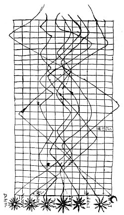
Here’s a 1786 graph fromWilliam Playfair that does it:
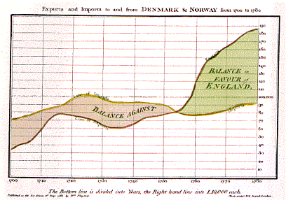
Here’s Charles Minard’s graph of French losses in the Russian invasion from 1869 that does it:

Here’s three graphs from The Guardian that do it:
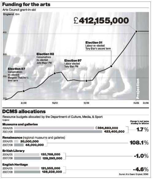
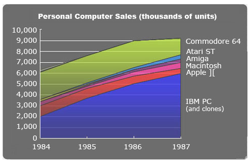
Several from the UK National Statistics body:

This one by Edward Tufte himself must surely be wrong, too:
Ciaran Hughes says
Ciaran –
If you put a timescale for a year that, by implication has 365 figures, when in my case you have only 11 figures that are introduced at irregular times, then you have to draw them as in interest rates. What you have done is provide an average – you show the trend, the rate of change.
Go to your line graph and look at the line at the end of March. When I look at it that figure looks about £35bn. But it is actually £14bn and continues to be so until it jumps up to £46.2bn.
‘I’m not saying that your graphic is not attractive and eye-catching. I simply don’t think it effectively shows what you wish it to show.’
I disagree. I think it works visually and gives you the sense of ever-mounting debt while giving you a detailed breakdown with the text.
And it certainly shows it better than a line graph where the figures aren’t labeled and impossible to read accurately
Jon Peltier says
Ciaran –
I have a timescale that is split by months. Each month has one explicitly marked data point. The exact date of the data point is not specified, but in fact it is very close to the end of the month. In fact, except for November, this date is the last Thursday of each month. It is thus obviously monthly.
You see a timescale which, despite the labeling and marking, is split into 365 subunits (days).
Why stop there? Why not split the year into 8760 units (hours)? Or 525,600 minutes, or 31,536,000 seconds?
Why not? Because it is ridiculous. The axis labeling says nothing about seconds, or minutes, or hours, or days. Only the month and year are labeled.
In addition, only the actual data values are indicated by markers. I purposely used markers to indicate the actual announced values, to distinguish between the lines which trace the points from month to month. You say you know how to read a line graph, yet you continue to feign confusion.
There is no data point for the “end of March”. There is a data point for March, £14bn, for both monthly and cumulative, and another for April, £32bn for monthly and £46bn for cumulative.
Matt Cloves says
I agree that the way we plot lines in a line graph speaks of the assumptions we are prepared to make about the data itself. (apologies for repeating previous arguments, maybe a new description will help)
Consider this, The Bank of England Base Rate graph above rightly uses a Step approach because it represents a state which is one or the other. When the Bank announces a rate change, they don’t smoothly ramp it up over a period of time, one moment it is one thing, and in the instant of change, it becomes another. There is no middle ground.
I think the issue here is regarding the programme is: what assumptions are we willing to make about the spending which the data represents. It is true that the data we have only specifies certain amounts at irregular intervals which fall within a month, but, I think it is a fairly safe assumption that this announcement is not given at the exact same instant that all of the money is spent (try spending $33bn in one second). Far more likely that the spending takes place in the time up until that point (although we don’t know what spending takes place when), and the announcement serves to delimit the progress of the spending.
Now the alternate approach to using a Stepped line, is to group the spending into defined time periods (most commonly chosen here is by month).
However, and I can appreciate Ciaran’s concern here, it is true that, as the dates are split by specific mid-month dates, we cannot know for certain, how much of ‘Aprils’ spending happened between the 26th of March, and the 1st of April.
If I were being uber-pedantic, I might say that this unknown amount should be grouped into ‘Marchs’ block, rather than Aprils.
Its an interesting concern that I would never have considered had the discussion not continued this far.
While this is a small issue in the scheme of things, it could rightly be called a distortion. I suppose one way to remedy this would be to use a chart which has bars of irregular width, along a constant timeline, the width corresponding to exact days (this need not change the axis labels, but I would want to see how it looked first). Or perhaps to use a Line chart alternative with irregular horizontal spacing of points…
any thoughts?
Jon Peltier says
The data are announced every fourth or fifth Thursday, except on an intermediate Sunday in November. These can rightly be considered the values for a given month, based on date of announcement. I also adjusted the title of the chart to indicate that these are monthly values to try to stem the related debate.
When plotted on an actual numerical date scale, still using markers to indicate the actual values, and lines not to indicate intermediate values (because there is no continuously varying variable in this data set) but to trace from one point to the next, the result is not particularly different from what I have presented already.
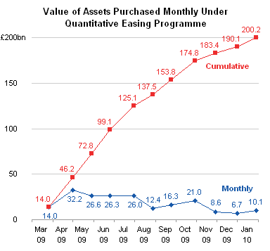
I can produce a similar chart with proportional-width bars for monthly values and with steps for the cumulative amounts. While the proportional width bars do in fact show a slightly pronounced irregularity in spacing of announcements, I am not convinced that the increased precision in the date display is worth the additional clutter of the many lines which have been added to the chart. (See Step Charts in Excel for a tutorial.
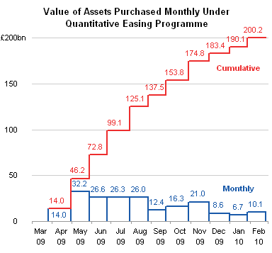
Taken to the other extreme, using only markers without connecting lines, it is clear that the data is not continuous. The upward moving but slowing behavior of the cumulative curve is apparent, but the data labels on the monthly data actually seem to be somewhat masking their decreasing trend.
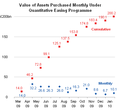
Following the philosophy of “make it as simple as possible, but no simpler” I prefer the first of these three charts, which uses simple lines and markers.
Matt Cloves says
Jon,
Good stuff.
Thanks for taking the time to look at that aspect.
I think, of the three, I also prefer the first, as it is the most familiar style and seems most accessible.
I personally dont think it is an issue to connect lines like that in order to estimate the amount of spending, even when the actually figures and dates are rolled into one end of month annoucement, so the third does seem a little overkill (as long as the lines are not ‘smoothed’ that is… a point I think I took from an earlier post here).
Jeff Weir says
Another type of chart where they interpolate between data points in order on infer what might be going on is a map. For sure, there’s less interpolation these days given we’re probably using GPS and satelite readings to help get more precision.
Here’s a pre 1900 map of America:
Here’s one from later with more precision:
And here’s how it looks for real:

It’s obvious that each map shows the same general trend. Just because the first two don’t have the same level of precision than the last, does that make them wrong? I’d say it depends on their use, and that certainly the difference between the second and third in terms of precision is largely academic to the majority of people that would use it. Perhaps the same with the first, depending on what readers need to know.
Kind of reminds me of Jon’s original graph without the data labels…it might not have given readers the precision of later iterations, but did they get to the destination nonetheless?
Ciaran Hughes says
No, they have nothing in common at all.
In the first map when they don’t know what’s there, they leave it out.
In Jon’s he shows things he knows not to be there. Matt – he doesn’t estimate (he has no need to, he knows the figure and when it changes). He distorts the data.
I’m still waiting for an answer –
Look at the line at the end of March and tell me that figure doesn’t look to be about £35bn.
And how this can be an estimate when you know the figure is £14bn?
Jeff Weir says
Cairan – While your’e waiting for an answer, just a reminder that I’m still waiting for an answer whether the 11 graphs I posted are all wrong on account that they don’t use stepped lines. I’d love to hear your thoughts on these.
On the chart, How are you defining “Nothing in common at all”? If I printed these out and gave them to someone and asked “what – if anything – do these have in common (apart from the fact that they are all maps) then I’d be damn surprised if i didn’t at least get the answer that they all show North America.
Jeff Weir says
One could argue that Ciaran’s graph title of “Value of assets purchased under the quantitative easing programme” is incorrect, and that to avoid painting a misleading picture of the data it really should be titled more accurately: something like “Dates that the walue of assets purchased under the quantitative easing programme were announced”
But I think arguments down to this truly microscopic level of technicality are irrelevant to the readers of the graph given you’d be hard pressed to get most readers to take an interest in the macro level. Deckchairs and Titanic stuff.
I make this point because I think Ciaran’s argument about whether Jon’s graph might cause someone to infer the wrong amount as at the ‘end of March’ is microscopic, even if it was right.
Reality check…let’s bring this argument back to audience needs. if Jon’s reworked graph above – the one with the numerical date scale – was printed in The Daily Telegraph, what is the likelihood of any reader trying to work out what the inferred spend is between points? I think it’s next to zero.
Ciaran Hughes says
Jeff, oddly enough as there is only one of me coming under this deluge then I don’t feel obliged to answer every detail of every post – especially when I have been clear and consistent in my explanations and answered them already.
If you want to show trends then slopes work, as you well know.
We have stairs in my house. They have a 45 degree angle top to bottom. But, as stairs everywhere are, they are stepped. Do you think that when the carpenter was given a drawing to make them he was given a cross section that showed individual steps or just one slope?
Would it be acceptable to make them as one big slope? You seem to think so or at least fail too see the difference.
There is a difference and in cases such as my graphic and the interest rates, as I keep saying, they are steps.
My end of March is not pedantic but now (even if it is right) ‘microscopic’!. The difference between misreading £14bn and £36bn is not microscopic, literally or figuratively.
You seem to think such details are of little interest and yet the whole tone of this blog is to show how design misses the details because the designer is too preoccupied with making things look pretty.
Ciaran Hughes says
Jeff, say you want to drive over to the other side of a city, you would use a map. The line graph above is just drawing a line as the crow flies to connect the start and end, to show the general direction (or trend). But when it comes to getting there the route is vital. That is what the steps are, a recognition of the story, the narrative.
Jon Peltier says
Ciaran –
If my line indicates a route as the crow flies, then your steps show someone how to first change their latitude, then their longitude to get from point to point. Such orthogonal road systems are the exception; the actual route is much more complicated.
In actuality there must be a large number of individual transactions making up each month’s reported spend. It would look like so many tiny little steps, that at any reasonable resolution, it would look like a smooth curve.
Graphs are models of a (usually) real system. A line chart simplifies this system in one way, a step chart in another. Just as there is not “end of March” value for the data in a line chart, there is no “end of March” value for the data in a step chart, unless at each date in the horizontal span of each step, there is an equal spend. For example, from 26 March to 29 April 2009, there is an equal spend of £14bn.
Strictly speaking, a step chart is inaccurate. If a value is constant over a certain time period, then the horizontal part of the line models this constant value. However, the change from one value to another is not a smooth transition, rather it jumps from one value to the next without ever equaling any value in between. The accurate model for this (which is not accurate for the system we’ve been discussing for days) is a chart with horizontal line segments.

Our system of monthly spending is best modeled as a set of markers without any lines, because there are no intermediate announcements of spending; any intermediate amounts are combined into the next scheduled announcement. We use constructions like connecting lines or steps to bridge the gaps from one state of the system to another.
Ciaran Hughes says
Of course, I see it now.
I should never have dared criticise your criticisms. Apart from making things pretty I have no grasp, nor does anyone else in my business by the look of it, about what they are payed to do. Those fools on the business desks, those statisticians, who insist on differentiation, on accuracy, on ‘microscopic’ details… the fools! Perhaps you should get in contact with the Bank of England and explain to them the error of their ways?
Jon Peltier says
Ciaran –
Nobody has claimed that you (nor the entirety of your business) are ignorant or fools, simply that your graphic has gone against best practices of data presentation. This made you defensive from the start. You have denounced best practices, and ignored explanations and counter arguments. This was an opportunity for discussion and mutual learning, but unfortunately you did not see it that way.
Ciaran Hughes says
Jon, I have explained at length my position. I have admitted there are things that could have been done better and I have praised one of your solutions. You are the one who refuses to engage his imagination.
I shouldn’t have been defensive? You expect me to agree with the half-read subjective ‘critique’?
I have not denounced best practices and have responded to your arguments, which, sooner or later always come back to the same point. Namely, you don’t like it because it’s, well, ‘pretty’, and anything I say is too precise for you or a distraction – it’s your blog and how dare anyone not agree with you.
So much for mutual learning.
You have complained about having to clarify things that you feel are beneath explanation. I consider all opinions and criticisms are valid no matter where they come from and irrespective of the background of the sayer.
You do not accorded me the same respect, and whether you like it or not, I do know something about what I do.
I haven’t seen any of your work but I really wonder whether a man who has a logo like yours at the top of his page has any right to talk about best practices in the visual domain
Jeff Weir says
You stated that it okay to use Line graphs, when share prices fluctuate throughout the day. But you say about line graphs that Over a long period of time, say weeks or months and you put a precise time line on your graph then no .
I showed you a whole bunch of examples where other people don’t realise this is wrong, and invited you to comment on this.
Your comeback… Perhaps you should get in contact with the Bank of England and explain to them the error of their ways But what did I actually say ? The Bank of England graph is correct, but only because they raise the base rate at exact times, leading to a stepped graph.
According to your criteria for the use of line graphs , even the Bank of England get it wrong sometimes:
http://screencast.com/t/N2ZhZDc2ZW
And I’m not sure whether this graph from you meets your own criteria:
http://screencast.com/t/MWZjZmI3Y
Or this one on unemployment from you:
http://screencast.com/t/NDViODliZ
I agree with Jon that for this particular data we’re discussing, any of the three types of chart presented (line, bar, floating bar) are acceptable.
You say the the steps are a recognition of the story, the narrative. I say the steps are recognition of one story, one narrative, and that it’s not a right/wrong choice if you choose to show steps or a line.
You say The whole tone of this blog is to show how design misses the details because the designer is too preoccupied with making things look pretty.
I think the whole tone of this blog is to show how design could better meet the big picture of getting the majority of the audience to understand your story.
Ciaran Hughes says
Jeff,
when you want to show, as Jon did, the rate of change then lines are right. The graphs aren’t wrong. I have always said that and am consistent in that approach in the work of mine you posted. Ask Jon if he thinks the interest rates is right or wrong.
The reason it is right is the reason mine is right and a slope is wrong, (no one replied to my staircase analogy earlier) namely they flatline for long periods before going vertically up. You put a timeline, with the start and end of months marked, you have to be accurate with the data.
‘I think the whole tone of this blog is to show how design could better meet the big picture of getting the majority of the audience to understand your story’.
And you think by misrepresenting the line at the end of March to make it look like £35bn, when you know the figure is £14bn, helps the audience understand the story???
Jon Peltier says
I am beginning to regret having written this article.
I saw an illustration which took me a great deal of examination to comprehend. In fact, the illustration was not truly comprehensible until the data was replotted using a different charting approach. Perhaps I’m too slow in comprehending data visualizations, having so little experience in the field. I can only take solace that so many so-called visualization experts also prefer different approaches than that used in the illustration.
I have presented my reasoning for why this illustration is ineffective. The artist who produced the illustration showed how, if misinterpreted, the alternative chart is wrong. The artist has not responded to repeated explanations nor to additional examples of this approach, but instead returns to this favorite misinterpretation.
The discussion is going nowhere, so I have suspend further comments. I’ve never before felt the need to do this.