In a recent tutorial I showed how to make Variable Width Column Charts. A stacked version of this chart type, called a Marimekko chart, is popular in business, particularly where marketing departments analyze segmentation of their markets. The Marimekko chart gets its name from the patterns found in Marimekko fabric.

Marimekko Chart
Laying Out the Data
Suppose we have four companies, Alpha through Delta, competing in four segments, A through D, of a particular market. This could be like the companies Dell, HP, and Toshiba competing in the laptop, desktop, and home server segments of the personal computer market. A summary of the data would look like this table. The sum of the segment percentages is 100%, and the market segment shares of the companies in each segment (each row) also sum to 100%.

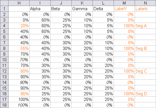
Like most non-standard charts, we have to arrange the chart source data in a special pattern. Here is how the above data is rearranged. The first column, the X values, comprise a cumulative percentage of the segment percentages: 0, 40, 70 (40+30), 90 (40+30+20), and 100 (40+30+20+10). Each of these values is listed three times. In between each of these values, I’ve inserted another row with the average of the values above and below, with orange text. These orange values correspond to dummy data which will provide labels later in this protocol.
Note that the X values look like percentages, but are not. A date-scale axis, which we will use to spread out the widths of the area chart data, cannot render fractional values. These X values are whole numbers, and I’ve used a number format of 0"%" with the percentage symbol in quotation marks to place it as generic text after the whole number.
The Y values for each series and each segment are repeated three times, at the beginning, middle, and ending X values for this segment. For example, Alpha has 60% for Seg A in rows 3 through 5, next to X values of 0%, 20%, and 40%. The Y values return to zero at the end of each segment. Alpha shows 0% in rows 2, 6, 10, etc.
The column labeled “dummy” holds Y values for a dummy series that will provide the labels in the column marked “Labels”. I’ve colored this text orange to indicate labeling helper data, corresponding with the inserted orange rows above.
Creating the Chart
Select the data in columns H through M and create a stacked area chart.

Convert series LabelsY into a line chart series.

If you clear the zero values in the LabelY data, column M, the points and connecting lines will not clutter up the chart.

Clear the legend to add more room for the chart.

Now the X axis needs to be adjusted. All the X values in column H are treated as text labels, equally spaced without regard to their numerical value.
In Classic Excel (2003 and earlier) select the chart and go to the Chart menu > Chart Options > Axes tab. The Primary Category axis is listed as Automatic. Change this setting to Time-Scale.
In New Excel (2007 and later) select the axis and press Ctrl+1 (numeral one) to open the Format Axis dialog. Under Axis type, change Automatically Select to Date Axis.
The result is that all Y values for equal X values are vertically aligned, as if in an XY chart. Of course, Excel has helpfully converted the values into dates, spaced one week apart.
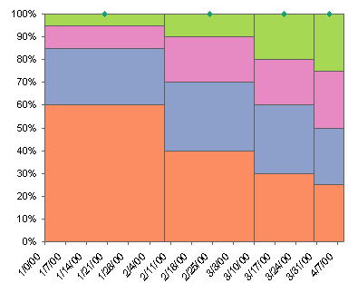
Format the X axis scale so it runs from 0 to 100 in steps of 20 (not percent but whole numbers). Apply a number format of 0″%”, which places the percent sign in quotes so Excel adds it as text to the end of the whole number rather than converting the value to a percentage.
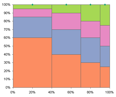
Add Labels to the Marimekko Chart
To add segment labels, I use Rob Bovey’s free Chart Labeler utility. This utility adds a menu item called “XY Chart Labels” to the Tools menu. It works on any chart type that accommodates chart labels, not just XY charts.
Using the utility, assign the labels in the Labels column to the LabelY series. The labels here have been positioned above the points.

Format the Labels series so it uses no markers or lines, and these points will no longer appear.
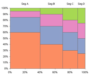
To add labels to the blocks in the chart, you need points which will be located in the center of each block. The X values are the same as above, but the Y values for each series (the names are the same as above, but they are distinct series) are calculated to place a point at the mid-height of each block.
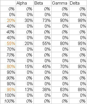
Copy this data, select the chart, and use Paste Special to add the data as new series. Since the last series in the chart, LabelsY, had been converted to a line type, these are added as lines. Notice that the points are located exactly where needed, although there are also points along the category axis and lines everywhere.
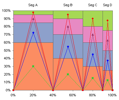
Clear the cells with zero values. . .
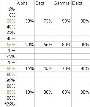
. . . and only the desired points will remain in the chart.
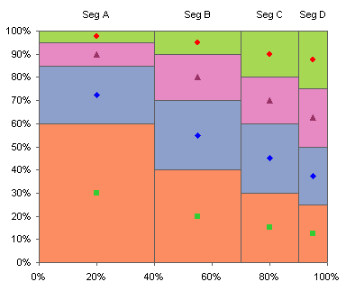
Format each series so it uses no lines or markers, and so it also displays data labels using the series name. Then format the labels so they are centered on the points (the default is to the left of the points).
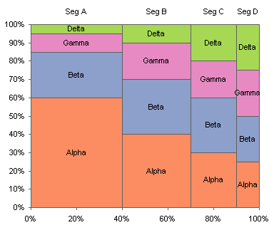
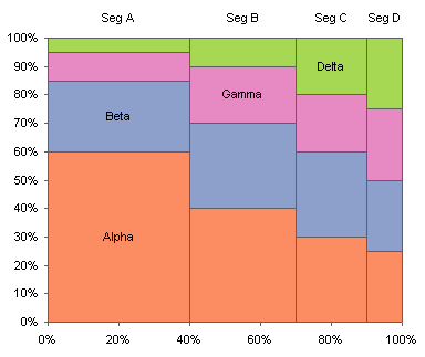
This chart has way too many labels. We could get away with one label per series. I’ve removed all Y values except for the ones that put points in the largest block for each series.

This is a much cleaner chart.
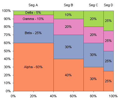
Naturally you could tailor the labels to show a dollar value or a percentage, or any other information, but you would need not only a table containing the X and Y values as shown in the table above the last, but also a table containing the values to be used for each label. You would use Rob Bovey’s Chart Labeler to apply the labels, as described for the segment labels along the top of the chart.
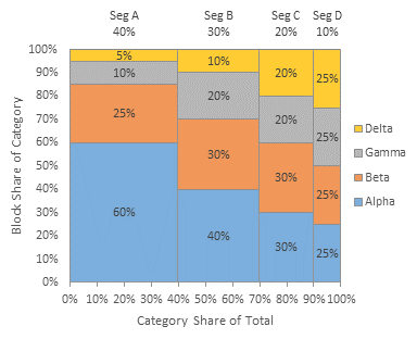
Marimekko Charts in Peltier Tech Charts for Excel
This tutorial shows how to create Marimekko Charts, including the specialized data layout needed, and the detailed combination of chart series and chart types required. This manual process takes time, is prone to error, and becomes tedious.
I have created Peltier Tech Charts for Excel to create Marimekko Charts (and many other custom charts) automatically from raw data. This utility, a standard Excel add-in, lays out data in the required layout, then constructs a chart with the right combination of chart types. This is a commercial product, tested on thousands of machines in a wide variety of configurations, Windows and Mac, which saves time and aggravation.
Please visit the Peltier Tech Charts for Excel page for more information.


Hadley says
The “marimekko” chart is also known as the mosaic or the eikosogram.
Scott says
I’m wondering why everytime I pick the time-scale it almost looks like it delete’s the data. In the previous post I got the right outcome, but i’m struggling to replicate today’s.
Scott
Jerry Betz says
Hi Jon,
I am having trouble with the method outlined here, I end up with a mismatch on the X-Axis starting at the 90% mark and progressing towards the 100% mark.
This Step 1 snapshot shows the series created and the label series converted to a line, with the extraneous zeroes removed (all appears as yours does):
Step 2 makes the change on the X-Axis from Automatic to Time-scale:
In Step 2, everything collapses onto the Y-Axis. I found that by multiplying my X-Axis numbers in Column H by 100, they came back, as shown here in Step 3:
In Step 4, I made the changes to the X-Axis number format, and added the labels to the four points at the top using JWalk Chart Tools:
It is in Step 4 that the 90% X-Axis value doesn’t line up with the 90% data values, and there would appear to be a gap between what the series data shows as 100% and the X-Axis shows as 100%. I’ve tried going over these steps several times and keep getting the same result. In Step 3, the X-Axis labels are the same as yours, as well as having the right-most label “4/7/00” showing up slightly to the left of the end of the axis.
Thank you for any advice.
Jon Peltier says
Jerry & Scott –
I suspect you might be having the same issue. Since you can’t render fractions on a time-scale axis, you need to use whole number percentages, and append “%” in the number format to provide the look you need.
Then make sure the axis scales from 0 to 100; 100 should be 4/9/1900. Make sure the upper limit didn’t automatically adjust itself. Is everything on the primary axis?
Jerry Betz says
Jon,
That was it. I created the table right away, and didn’t use the 0″%” Custom number format until it came time to do so on the X-Axis. I was using numbers formatted as a percentage in column H. In the corrected version shown:
both the X-Axis values in column H and the X-Axis labels are formatted using the 0″%” Custom number format. All other numbers in columns I, J, K, & L are formatted as percentages.
I should have mentioned in the first post that I am using Excel 2003.
Thanks :-)
Bernard Lebelle says
Hi John,
Am using Excel 2007 and with the appropriate table, all is fine until I reach the point where I change the X axis to “timescale”.
All I end up with is a big block with the 4 layers and without the width / height variations. The X axis only shows 0% and 100% values. There is no indication that it as converted the X axis labels in date format.
Many thanks for your advices & great blog
Jon Peltier says
Bernard –
That’s the same problem that Jerry and Scott experienced before you. I couldn’t imagine so many of my readers, among the smartest people on earth, were having such trouble. But then I went back to the tutorial and discovered that I’d left out a crucial paragraph about using whole numbers, not percentages, as my X values.
Read the paragraph that begins with “Note that the X values look like percentages, but are not.” This should explain how to fix your problem.
Bernard Lebelle says
And … presto ! Thank you John for your fantastic insights !
derek says
For accuracy’s sake, I would go further, and make my scale from 0 to 100,000, and use the following number format:
0,”%”
Now the data (suitably multiplied) can be represented with a potential precision of 0.001% on the chart.
Jon Peltier says
Derek –
That’s probably 20 times more precise than pixel spacing allows.
There’s a limit to what the multiplier should be. I built one of these a long time ago which used revenues across the X axis. When the client looked at a larger market, the chart broke down. I had to insert a divisor and remove a comma from the number format. The cut-off seems to be 2,958,465 days.
derek says
That’s probably 20 times more precise than pixel spacing allows.
Yes, but it’s the minimum precision you can arrange for using this technique, short of integer percentages. It’s not as if you’re forced to use it all. I usually use it for tenths of a percent, because it would not be acceptable to display a 3.6% segment next to a 4.4% segment with them both looking the same size.
The cut-off is caused by reaching Dec 31 in the year 9999, which is why I couldn’t have done it with two commas even if I wanted to.
Jon Peltier says
I thought 2,958,465 days was kind of random, but 31 Dec 9999 is logical after all. I was looking for a nearby power of 2.
Joe says
Hi Jon,
Thanks for the Marimekko chart! I have another question for you. Do you have an example of a Ishikawa (fishbone) diagram template? Possibly one that adds lines to the chart automatically as you add different sements? Thanks. – Joe
Jon Peltier says
Joe –
Sorry, I’ve used Ishikawa diagrams, but never tried programming one in Excel. It wouldn’t fit well within the Excel charting system. I think years ago we used Visio for such diagrams. Not automatic, but elegant in the way you could add elements to diagrams.
Nitin says
Hi Jon,
In this merimekko charts is it possible to color individual blocks seperately. For Ex: I want to color different color for alpha 60% & alpha 40%.
I can do it using text box. Paste a text box of different color on the required block.
Is there any way out????
Jon Peltier says
Nitin –
Each block which is separately colored needs its own area series. The original source data in H1:N18 has to be split out into H1:Z18 like this:
Construction of the chart proceeds as above, with the result like one of the following:
Jon Peltier says
Maybe the visualization gods will smite me, but on the other hand, I’ve received a lot of questions about Marimekko charts, through comments here and via email.
To address this attention, I’ve decided to offer a custom Excel utility to create Marimekko charts from simple data tables. You can read about it in PTS Marimekko Chart Utility.
Gülsen says
Hello Jon,
Thanks a lot for all the information. It realy helps :)
I created my Mekko successfully, but I can’t create this last table you mentioned, the one thats needed to label the values.
It will be really great if you can also show the formation of that table.
Thanks, Gülsen
Jon Peltier says
Hi Gülsen –
The tables can be populated using formulas that compute the midpoints of each rectangle, and add this to the height of the rectangles it is stacked on. I didn’t show the formulas because it was somewhat tedious. In this case, I manually deleted all data except for the points I wanted to show, resulting in the last table.
Kalle says
Hi Jon,
First of all, really nice page!
I have a couple of questions, is this applicable in Excel 2007 or is it just for the 2003 version?
Would you be willing to share the xls file so it is a bit easier to test it?
I had a look at this page:
http://www.ultimatepres.com/create-marimekko-chart/info_13.html
I was not able to create the Mekko chart based on that cause the last step are to blurry. Is it possible to use the 100 % area stack chart in the 2007 version? Is that why they have a smaller matrix then you?
Thanks!
Kalle
Jon Peltier says
These types of chart, both stacked 100% area and marimekko) can be made in 2007 as well as in 2003. The steps may be slightly different in 2007, and I should address that in a new post.
In the reference you’ve cited, their data array is not as large as mine because they didn’t use enough data to get the chart they showed. Here is my stacked 100% area chart at an intermediate step. Note that the rows of zero values force the areas to drop to the bottom of the chart:
These sloping lines to zero result in vertical lines to zero in the final chart:
The data in the page you cited does not force the areas to drop to the bottom of the chart:
so they don’t have vertical lines between adjacent segments:
Kalle says
Thank you Jon for clearing that out, I have been sitting for some hours now trying to figure out how they could achive that chart with that data.
I am looking forward to your new post on the 2007 version!
Jon Peltier says
Oh no! Now I have to write it!
Kalle says
=)
That would be great cause I got stuck again doing it step by step.. =/
The problem the “time scale” step, either I have formated wrong or the time scale in the 2007 version does not work!
How is it going with that post?? =)
Jon Peltier says
Works for me in 2007/SP2. Your description is not sufficiently detailed to tell me where you got stuck.
Kalle says
Hi Jon,
I tried it now in Excel 2003 and it works fine and it was the Time Scale that I got wrong in the 2007 version but that was somehow easier with older version but now I know were to look.
Thanks for a great blog
Kalle
Kalle says
I have now created three charts one for the fiscal year 07, 08 and 09. It consist of 6 countries and each country have 5 groups. The changes over the years has not been major so when I will use this in a PP the audience might have a hard time to see the difference over the years.
My question is if you know any good way of showing what the differnce is between the charts other then just adding the numbers?
Jon Peltier says
One of the shortcomings of Marimekko charts is that they present a picture of a single point in time. Even if the audience had full color glossy reproductions of several charts, comparisons between them would be difficult to make.
This is a hard realization, after so much work, but you should consider other types of charts, or groupings of charts, which effectively show how the various items change with time. For example, line charts (or bar/column charts) with time as the X axis, perhaps in panel chart form. I have some examples in Panel Charts with Different Scales and How to Build a 2×2 Panel Chart.
Charles says
Hey Jon – thanks for this great site.
I’m having issues with the label-lines in the chart; after following the steps, I remove 0%’s from the table but the lines persist. Effectively, for each series I have one labeling point where Y>0, but for all other points (X>0) it’s recording distinct points on the chart with Y=0…any thoughts on how I remove these unwanted points?
Jon Peltier says
Charles –
Presumably you are formatting the series so it has no markers and no lines? And you’ve cleared the cells that have the Y values for the labels? If you don’t clear the cells, but use a formula that returns “”, the “” is text not a blank, so Excel treats it as a zero. To keep the formulas, change “” to NA(), which puts the #N/A error in the cell, but doesn’t plot a point.
James says
Hi, is there any way to sort the data such that for each company, their largest share of a market appears at the bottom of the chart, so one company might have laptops closest to the x-axis, another company might have servers – it would mean finding a way to decouple the ‘category data’ so it can be individually moved / prioritised for each company . . . . can this be done in Excel or does it need a package of some sort? All best, James.
Jon Peltier says
James –
Arranging blocks by size (not color) is already pretty complicated to handle with column charts, as I described in Stack Columns In Order Of Size and in Stack Columns In Order Of Size With VBA. In the latter article I also noted that this change makes the chart much more difficult to interpret.
James says
Many thanks Jon, I can see I have some more bedtime reading here . . . hope you are well, this is the first blog I have ever had any really useful information from, all best James (Gloucestershire, UK)
Kurt says
Lot of thanks for this great description how it works! I struggled with this, but your solution helped me a lot!
One comment for adding labels: I draw the “LabelY” on the secondary axis. So I can set the description for this axis to the “Labels”-Column (edit datasource for this row). After activating “Category” in the datadescription tab for the “LabelY”-serie, the text in column “Labels” is displayed.
Andy says
Jon, thanks for the excellent write-up. I was able to use your instructions to create a fairly comprehensive (though not robust in terms of error management) macro within Excel. I would be happy to share my coding with you, if you would like to see/have it, as it only seems fair. I’m not a developer, so my code might be rather crude to you. Either way, thanks and let me know if you want my macro.
Jon Peltier says
Andy –
I’ve already developed a macro into a commercial product , but thanks for your offer.
AL says
Hi Jon,
I’m sure I might just be missing something very basic here, but I managed to get all the way to displaying segment labels using the XY tool but got stuck trying to add labels to the blocks — the new series appear but the scale doesn’t seem to match the X axis even if I haven’t changed or deviated from your instructions at all.
So basically the points align across the Y axis but don’t seem to align on the X axis –making the plots fall a bit squat on the height area.
Any ideas on why this would happen?
Thanks!
AL says
sorry, ignore earlier comment :) finally figured this out. Thanks for the uber helpful post!
Lyndon says
regarding the alternative method of producing the graph and your comments:
http://www.ultimatepres.com/create-marimekko-chart/info_13.html
“so they don’t have vertical lines between adjacent segments:”…
to get the vertical separators:
Format Data Series>Options> Drop Lines (with tick) (you can then format the drop lines to your satisfaction)
Jon Peltier says
Lyndon –
I had not thought of using droplines to create the vertical lines. Nice suggestion.
Now there is a choice between needing more rows of data (to force the area chart outlines to reach to zero) or more elements in the chart (the drop lines).
Keith says
Jon,
thank you for this posting, it was both useful and interesting. I have a question regarding the section that begins with “To add labels to the blocks in the chart”, I constructed the data in columns as shown, pasted them as new series, then deleted the rows of “0%”. however The markers at the 0% locations remain, so when i add the data labels they appear both at the center of each box and also at the lower left and lower right corners of the box at 0%. I am using Excel 2007. Any suggestions?
Alistair says
Jon,
I am trying to create a chart that is essentially a stacked bar chart along the x-axis, while at the same time a clustered collumn chart with respect to the Y-axis.
The aim is to create a visual representation of possible improvement projects, mapping their contribution to a total figure (tons of CO2) horizontally, and also showing the individual net cost (positive or negative) in dollars.
Could you please tell me if this possible? and if so, how?
Jon Peltier says
Alistair –
Perhaps you want to use a Cascade Chart? I wrote a tutorial in Variable Width Column Charts (Cascade Charts).
Kate says
Thank you so much for this really useful explanation
I am able to recreate your chart and creat my own with up to about 6 vertical blocks on the x axis. However, when I increase this in number – say to 9 – one of my vertical blocks is no longer the correct width (the one third from last). Any explanation for this?
Thank you
Jon Peltier says
Kate –
Sounds like a calculation error, as if the formulas aren’t extended as far as they should be. Hard to tell without seeing the data.
Matt Fletcher says
Hi – is there a way of creating a Marimekko with horizontal segments rather than vertical segments (as above) or is it limited to vertical segments because of using an area chart?
The only workaround I’ve found is to rotate text labels and then copy/paste a picture of the chart to allow me to rotate it horizontally. While this works, it is a pain to update!
Any suggestions would be greatly appreciated!
Jon Peltier says
Matt –
I’ve made Mekkos with horizontal stacks. It’s much trickier using area charts, and if the blocks don’t move systematically from stack to stack, the whole thing falls apart.
However, you could skip the area charts and use stacked bar charts, using enough bars across the width/height of the chart to provide adequate resolution (100? 1000?), where the width of a stack is controlled by using more or fewer bars to build that stack.
In this example, I started with a bar chart, then used a very small gap width to show how it loos at first like a mekko with equal widths.
Then I expanded the data, with number of rows per category that is proportional to the width value. This example was easy, I only needed ten bars to provide accurate widths, but in general you will need lots of rows, with formulas that help you figure out how to apportion the data across your table. (Do I smell a blog post?)
Finally I hid the default axis labels, and added some hidden XY points to anchor the desired category labels, and another set to anchor horizontal error bars that separate the categories.
Rebecca Wurster says
Dear Jon,
thanks for this great article!
I’m currently trying to follow the guide step-by-step, but unfortunately I’m using Excel 2010.
I’m stuck at this part:
“Now the X axis needs to be adjusted. All the X values in column H are treated as text labels, equally spaced without regard to their numerical value. In Classic Excel (2003 and earlier) go to the Chart menu > Chart Options > Axes tab.
The Primary Category axis is listed as Automatic. Change this setting to Time-Scale.”
Actually, I just can’t find this option in Excel 2010. Do you happen to know where I can find the option?
Or is there a new guide for 2010 already?
Looking forward to hearing from you soon!
Regards,
Rebecca
Jon Peltier says
Rebecca –
I’ve added the 2007-2010 instructions to the article.
Michael Komarnitsky says
Jon-
Thanks for the guidance and inspiration (and the Chart Labeler macro). I found the macro-driven approaches a little limiting for my needs, so I built a general template for doing Marimekko charts that doesn’t involve any macros. I uploaded it at http://www.megaexcel.com/
Emilie Chen says
This is very helpful! But I can’t get the x-axis widths correct. The mekko chart is here: http://tinypic.com/r/2e3cy2f/8
The width between 4 and 7 (difference of 3), for example, is the same width as between 7 and 9 (difference of 2). I’ve made sure that all the formulae and formats for the x-axis are correct, so I’m not sure what else could be the issue.
Jon Peltier says
Emilie –
Could you post a screenshot of the data? I can see that some things are not right, but I can’t really tell what and why.
It might be helpful at first to build the chart with only a handful of vertical stacks. It’s smaller, so a little easier to get a handle on it. Then when it’s working, make another chart with the larger data set.
Emilie Chen says
Thanks so much for responding! I have tried creating the chart with less data, but it didn’t solve the problem. I’ve pasted the data in this link: http://tinypic.com/r/2zflb9i/8.
-Emilie
Jon Peltier says
Emilie –
The problem is that the date axis works in whole numbers only. Multiply the values in the X column by 1000. If you want the labels to look like percentages, use a custom number format of 0,”%” or 0.0,”%”
Twan Hendrikx says
Great approach Jon! I love it.
Any chance this can be adapted to show a root-cause analysis two levels deep?
Main root cause A, B, C, D on the x-axis, Secondary root causes on the y-axis: A1, A2, A3, B1, B2, B3, B4, C1, C2, C3 e.g. Both primary root causes A-C and secondary root causes 1-3 or 1-4 adding up to 100%.
Difficulty is in the labeling of the area’s as secondary root cause 1-3 can be different for A, B and C.
Any chance you can pull something out of your sleeve other than adding labels manually. I would prefer to work with cell references.
Regards,
Twan
Jon Peltier says
Twan –
You could easily do this. You may need to adjust the way the formulas calculate the box sizes (or not, I haven’t thought about it). To get different colors for the different secondary causes, just put each into a separate column, so each is plotted in a separate series and can be formatted differently.
Ken Johnson says
I liked all the ways that the data was displayed totally awesome. I am looking for a software tool, and have been looking for month,, for software to be able to produce a wall chart that is similar to this link:
http://en.wikipedia.org/wiki/File:United_States_Frequency_Allocations_Chart_2011_-_The_Radio_Spectrum.pdf
The different lines of course cover a wider range of frequencies so what I would like to do is to produce a chart by using each line as a different graphic and then pasting these into a graphics tool and printing the wall chart after getting all the charts lined up.
Please help in my search
I can call you to explain further through Skype. I work for the US Army as a spectrum manager and want to produce a chart like this for our local area.
Thanks
Kenneth Johnson
Tamás says
Dear Jon,
I just have an easy problem, would you be so kind as to help me? I use Excel 2013, and if I type 5″%” the cell shows exactly this instead of 5% (as number formatted). How can I fix this problem? I have tried ‘ instead of “.
Thank you for your response in advance.
Tamás
Jon Peltier says
You just want numbers in the cell. The number format has to be 0″%”.
Michel K says
I’ve been using your method for many years without any problem. However since moving to Excel 2010 I’ve noticed strange plotting problem when there is a 0 velue on the baseline of the chart depending on the style used.
With this basic style no problem: chart looks right
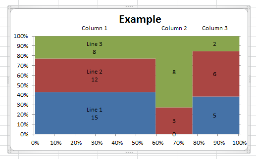
With this style, the chart looks wrong where there is a 0 value.
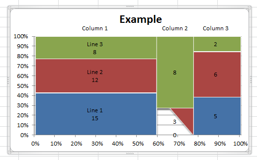
The data are absolutely the same in the two cases, I just changed the style.
Is this an Excel bug issue or did I miss something ?
I would be delighted to have any clues on this baffling issue
Best regards
Michel
Jon Peltier says
Michel –
The style with the problem places shadows on the plotted data. If you format the chart series so they have no shadow, the problem goes away (and the shadows serve no useful purpose). To get the appearance of that style without shadows, format each area series so it uses thin white borders. You should also format the X axis to position the Y axis on tick marks, not between tick marks.
This is a problem in Excel 2010. Excel 2013 doesn’t seem to have the same set of chart styles.
Michel K says
There is an issue with the basic trick of marimekko charting : putting the x-scale in a date format and then converting back to 100% scale.
Dates varies 1 by 1 increment and not by part of 1 day. That’s produce a rounding that is acceptable in many cases but not when the number of column of your marimekko chart is high.
Let’s consider this simple 1 ligne 30 colums mekko chart.
http://gofile.me/20VHe/c3LztkBA
Columns values are continuouly decreasing; so you should see a decreasing width on colums from left to right. It is obviously not the case between column 9 and 10 and afterwards, Moreover the value labels are not centered in the column. This is due to the fact that dates varies by 1 day and not by sub-part of a day..
If you change the base value from 100 to 1000 the problem is solved
http://gofile.me/20VHe/3dWgie7Y
Now column are clearly of decreasing width from left to right and value labels are centered
But the x-axis is now showing figures from 1 to 1000.
I can put a custom format on .TickLabels.NumberFormat= “#0.## ” & ChrW(&h2030) but the graph look strange with percent on Y-axis and per thousand on X-axis (incomprehensible fro the standard reader)
I tried to put a 100000 scale and then putting a blank space in the custom format of the axis number to divide it by 1000. I can do that in excel but not in VBA where custom format does not enable to play this neat trick (even through macro recording what I do in excel).
Do you have any idea how to put back programmatically (in VBA) the 100 bases values on the x-axis labels while keeping the 1000 base underlying values that are necessary to the correct plotting ?
Best Regards and Happy New Year
Michel
Michel K says
Please disregard my previous comment.
I realize that you already answered this question in Emilie Chen Post in early 2014.
Thank you for your valuable expertise anyway
Best regards
Michel K
Kate says
Hello,
I have read your tutorial and other comments and can’t seem to find an answer as to why when I try to convert the x axis to date that I get an error message (please enter a value that falls between the min and max for this data set). I am not sure what of the 6 options (min, max, base unit, major, minor unit, or vertical axis cross) to change and how to change it to make it work. I have only whole numbers in the x axis, so I don’t think that is the issue. If you can help me solve this and I do get dates on x axis, I am still unclear on how to change those to the different increments within the 6 date options (listed above).
Additionally, when I delete the 0s from the labelY column, I still have the lines showing. Only when I delete the 100%s does it erase. Any ideas here?
Thank you for your help!
Kate
Paige says
Hi John Peltier,
I continue to face the error message “The entry is invalid for the data used by this chart. Please enter a value that falls within the minimum and maximum data values used by this chart.” I have gone and made all of the data points to be whole numbers including the access to no avail. Is this an error you have encountered before. I am also attempting this on a mac for context.
Thank you,
Paige
Jon Peltier says
Hi Paige –
At what point do you see the error? Have you tried with the simple data in the example? Can you upload the workbook to a file sharing site (e.g., Dropbox, etc.)?
Paige Brenner says
Hi John,
I have only tried using your data. The only way I can get it to work is if I change the labels to dates. Please see the attached excel. Could this be a mac excel issue? Have you seen this problem before/do you know of any work arounds?
Thank you!
Paige
https://www.dropbox.com/s/03e4gajzs7kp0o2/Stacked%20Bar%20Chart.xlsx?dl=0
Jon Peltier says
That Mac Excel 2011 dialog behaves a bit differently than I’ve seen in Windows versions. Excel doesn’t really like 0 as a date; 0 converts to 1/0/1900. Windows Excel tolerates it just fine, but Mac Excel 2011 has a fit. You can change it in VBA without any complaints, but that’s a hassle, even to someone like me who lives and breathes VBA.
But here’s an easy way out. Temporarily change the zeros at the beginning of the X values range to ones, change the axis to Date Scale, then with the axis converted to a date scale, change the values back from ones to zeros.
Anshul S says
Hi Jon,
Thank you so much for this tutorial. This has been really helpful for me. However, I need to be able to show different ‘Alpha’ data points, for example, in different colors. Since Excel treats it as the same series because of the way data is laid out, I’m not able to change the color for each of the data points individually. Is there any way around this problem?
Thanks
Anshul S
Jon Peltier says
Anshul –
Since individual boxes based on area charts cannot be selected and formatted, you need to set up the data and chart so that each individually formatted box is actually a separate series in the chart. See my comment of 26 February 2009, in response to Nitin, where I show an example.
Sam Seo says
Hello Jon Peltier, After leaving company that uses Mekkographics, I was drawing mekko reading your post all the time. Thank you :)
Last week I had some time so I made xls file only for drawing Mekko. I made with index function + match function + conditional formatting in 150 x 100 cells. My friend saw it and made a website to sell the file.lol.
http://www.mekkoguru.com
It has Demo version free to download bur since I got many help from this page, I would like to give you the file as thank you. Please contact me in the email. I will send you one. :)
Thank you for long time helping me
Sam