In Line-XY Combination Charts I showed how to make a combination Line-XY chart. It is probably important to discuss the differences between line charts and XY charts. The documentation is not clear, and the names of the chart types are not helpful; in fact, they lead to confusion.
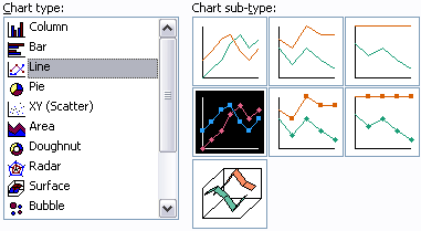
The icons in the Chart Type dialog and in the Chart Wizard do not help to clarify the situation. These are the icons for line charts and XY charts in the Excel 2003 dialogs; the Excel 2007 icons are not substantially different.

It is important to note that:
- The formatting options of XY chart series and line chart series are identical.
- If you want markers connected by lines, you DO NOT have to use a line chart type.
- If you want markers without connecting lines, you DO NOT have to use an XY chart type.
- XY and line charts treat X data differently and thus have different X axis styles.
After selection of a chart type, the user is presented with a set of choices, and the default sub-type for the selected chart type is highlighted. Not all available formatting for these chart types is available through the Chart Type dialog.
Line Chart and XY Chart Sub-Types
Here are the sub-types for a line chart. The first row shows options with lines but no markers. The second row shows options with lines and markers. The third row shows a 3D “ribbon” version of a line chart; you should NEVER use this abominable chart type. Among the first rows of sub-types, the first column shows each series plotted as their actual values. The second column of sub-types shows the series stacked upon each other, and the third column of sub-types shows the stacked values, normalized to the total at each category, that it, normalized to 100%. You should avoid using stacked line chart sub-types, because they cause confusion both for those making charts and for those interpreting charts.
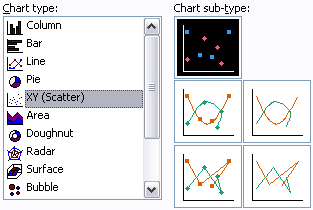
Here are the sub-types for an XY chart. The first column of icons show sub-types with markers, the second column shows those without markers. The first row shows the sub-type with no lines, the second row shows sub-types with smoothed lines, and the third row shows sub-types with straight lines. You should avoid charts with smoothed lines, especially without markers, because the smoothed lines may misrepresent the actual data being plotted.
Line Chart and XY Chart Formatting
To illustrate the identical formatting possibilities of XY and line charts, let’s compare the Format Series dialogs. This is the Format Series dialog for a line chart series:

This is the Format Series dialog for an XY chart series:
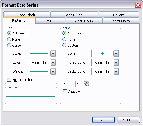
The Patterns tab is identical, both chart types offer the same line and marker formatting options. What is different is that the line chart offers a tab for only Y error bars, while the XY chart offers tabs for both Y error bars and X error bars. The two chart types offer a different set of options on the Options tab, but those are not important to this discussion.
Line Chart and XY Chart Axes
The difference between a line chart and an XY chart has nothing to do with formatting of the series plotted in the charts. The difference relates to how the X data is treated by the chart. There are two important* types of axis in an Excel chart:
- Category (X) Axis – Independent variable, usually the horizontal axis.
- Value (Y) Axis – Dependent variable, usually the vertical axis.
*Some 3D chart types also have a Series axis, which is essentially an additional Category-type axis. Since 3D charts should rarely be used, this axis type is rarely worth worrying about.
There are three varieties of axes in an Excel chart, defined by how the chart uses the X data. There is some duplication of terminology with the axis types described above, but you should try not to mix the chart axis types (above) with these styles.
- Category Axis – Data is treated as non-numeric text labels, regardless of any apparent numerical values in the data.
- Date-Scale Axis – Data is treated as numerical integer dates. Inaccurately called a “time-scale” axis in Excel 2003 and earlier, and renamed “date-scale” in Excel 2007.
- Value Axis – Data is treated as continuously varying numerical data.
The Value (Y) axis in every Excel chart is a value axis. The Category (X) axis in an Excel XY chart is also a value axis.
The Category (X) axes in most Excel charts (line, column, area, bar) can be either Category or Date-Scale axes. If not specified, Excel automatically chooses based on the data. if the data contains time or date formatting, the Date-Scale style is applied; otherwise the Category style is used. The user can overrule Excel’s automatic selection.
Numerical X Values
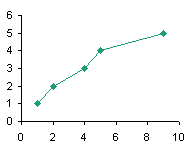
Below are two charts created using regular numerical data, a line chart (left) and an XY chart (right). The line chart places the points uniformly along the X axis, using the numerical values as non-numerical text labels. The XY chart plots the points according to actual X values.

Text X Labels
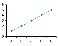
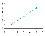
Below are two charts created using text labels as X values, a line chart (left) and an XY chart (right). The line chart places the points uniformly along the X axis, using text labels as axis tick labels. The XY chart doesn’t know how to interpret the labels numerically, so it uses the counting numbers {1, 2, 3,…} as X values, and it uses these numbers, not the text labels, to label the axis.
Dates as X Values
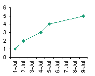
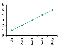
Below are three charts which use dates for X values: a line chart with a date-scale axis (left), a line chart with a category axis (center), and an XY chart (right). Both the line chart with the date-scale axis and the XY chart space the data horizontally according to the dates, while the line chart with the category axis spaces the data uniformly along the X axis. Note that the date-scale axis has a slot for each date along the axis, whether there is a corresponding point or not; the category axis only has categories for dates that have Y values. Vertical axis labels like these aree difficult to read and should not be used in practice; I’ve used them only to illustrate features of the different axis styles.
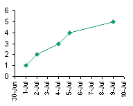
The intricacies of these chart axes will be covered in upcoming posts. This article should at least clear up the confusion between XY and Line chart types.


Tim Mayes says
Jon,
Excellent post! This is one that I’ve been waiting for. So many folks use line when they have numerical X and Y data, and they wonder why their charts don’t look right. Now we’ve got a good resource to tell them to read. Looking forward to the rest of the series.
“You should avoid charts with smoothed lines, especially without markers, because the smoothed lines may misrepresent the actual data being plotted.”
I’m emailing you my favorite example of the evils of smoothed XY charts. I’m sure that there must be a a use, somewhere, for smoothed XY charts, but not in my repertoire.
Tim
[Here is Tim’s example, followed by his commentary in his email. – JP]
This picture shows two XY Scatter charts of the same data. This is supposed to be a step function as shown on the left side. If you choose a smoothed XY scatter, instead of Scatter with Straight Lines, then you get the chart on the right. All too often my students will turn in an example that looks like the one on the right, even though they have seen numerous examples of step functions and I’ve lectured extensively on them.
Jon Peltier says
Tim – Thanks for the example, which I’ve appended to your comment. Tune in soon for a related blog post about bad (and good) smoothed lines.
Jeff W says
I am counting down time of 18 sequential events in three columns as folows:
Date time left count
Fri, 8 May 10 wk 3 d 21
Wed, 13 May 9 wk 5 d 19
Mon, 18 May 9 wk 0 d 17
Fri, 22 May 8 wk 3 d 15
Mon, 25 May 8 wk 0 d 14
Fri, 29 May 7 wk 3 d 13
Mon, 1 Jun 7 wk 0 d 12
Fri, 5 Jun 6 wk 3 d 11
Mon, 8 Jun 6 wk 0 d 10
Fri, 12 Jun 5 wk 3 d 9
Mon, 15 Jun 5 wk 0 d 8
Fri, 19 Jun 4 wk 3 d 7
Mon, 22 Jun 4 wk 0 d 6
Fri, 26 Jun 3 wk 3 d 5
Mon, 29 Jun 3 wk 0 d 4
Fri, 3 Jul 2 wk 3 d 3
Mon, 6 Jul 2 wk 0 d 2
Fri, 10 Jul 1 wk 3 d last one
Notice uneven intervals and events (20, 18, 16) not to be reported. This is all x-axis data to track numeric values on the y-axis. Is it possible to make a week/day scale that will space the date intervals and list the date and count values (Date count)?
I also have some special text labels to apply to the data points. Is it possible to list the value and text label (Value Text label)?
Jeff W says
Date || time left || count
Mon, 25 May || 10 wk 3 d || 21
Fri, 29 May || 9 wk 5 d || 19
Mon, 1 Jun || 9 wk 0 d || 17
Jon Peltier says
Jeff –
You could use the date for the axis, then place points along the axis using a dummy series (a line chart series with no markers or lines) and apply data labels to these points.
Jeff W says
XY with date, then line chart w dummy series? Line chart w date scale doesn’t have the weeks/days hierarchy (no weeks at all). Don’t yet have control of the features.
Jon Peltier says
There’s no weeks item in the sequence Years-Months-Days. To show weeks you would just have to use a tick spacing of 7 days.
I’m not sure what you’re really trying, but this might be it.
Here’s the data range. Columns 1 and 2 are X (the date) and Y (zero to sit on the axis). Columns D-F are your labels, and column C is a concatenated label, which uses this formula:
=TEXT(D2,”d-mmm”)&CHAR(10)&E2&CHAR(10)&F2
It puts the date first, using TEXT to apply a format to the date (or else it would be just a number. like 39941). CHAR(10) tells Excel to use the 10th character in the ASCII character set to add a line break.
I have no idea what else is in your chart, but here is a blank chart with your data points from this table added on top of the default time scale axis using the X and Y values in the table.
Here I’ve hidden the default axis tick labels, and added labels to the series added above. Use Rob Bovey’s Chart Labeler
Finally, you can hide the default axis tick marks and use black crosses to simulate axis ticks.
Jeff W says
Thank you! That is very nice. I do need to work though it, and I will report back.
”ddd-d-mmm” is going to be a little cumbersome. Maybe I can put it on 2 lines
TEXT(D2,”ddd”)&CHAR(10)&(D2,”d-mmm”) ? Then, I might move the second 2 lines up into the lower region of the graph and below my y data (not shown here.
I forgot that the chart labeler was needed to use a column of labels.
Jon Peltier says
The Chart Labeler isn’t required, but without it, the process is very tedious.
Jeff Fose says
Excellent post about the differences in line vs xy charts. I had a trendline polynomial problems that wasn’t explained anywhere else. Thanks for the insight
Cyril says
Hi Jon,
Is it possible to show lines connecting multiple series in an xy chart built in such a manner that each series has a specific value for x and for y. If it was a range then it would work, but being series it seems that connecting the values in either ascending or descending order remain difficult or impossible. The Name of each series would be a date (a year) and X values and Y values percentages. The idea being to connect 2001 to 2002 and so on.
example:
2001 y series 74% and x series 12%
2002 y series 24% and x series 36%
2003 y series 55% and x series 21%
The chart created using xy works, each point shows the name as a label (the year), each point has it’s own X and Y origin, but how could we connect the points chronologically?
Tom Murphy says
I have a stock performance chart (no weekends or holidays) that spans a few years, so I’d like the x-axis labels to be monthly only, either showing up on the first of each month, or being centered on the month. What happens is that the variable initial date dictates the months that are shown, so a starting date of Dec 31, 2011, as an example, ends up with Dec as the first month, and all subsequent months being mislabeled. I’ve been unable to find a solution to this despite spending many hours both on-line and in Excel. TIA.
Tom
Jon Peltier says
Tom –
If you don’t want gaps for weekends and holidays, then you can’t use a date-scale axis, and you’re stuck with the inflexible category axis.
You can always fake it with a dummy series that only has points on the dates you want a label, use the cross symbol for the markers to simulate axis ticks, and apply data labels under the markers, showing the category labels (dates). Maybe I’ll add an example to this article.
Tom Murphy says
Thanks, Jon.