In the Microsoft charting newsgroup, SKP asked how to make a chart that he could easily change from one series to another. This post will detail the steps to make an interactive chart that allows the user to select from among a number of series using a listbox, and the selected series is displayed in a chart.

A similar technique is described in Interactive Parallel Coordinates Chart on my web site, and I used this technique in a workbook that supports my blog post Re: Abortion Ratios 1980-2003.
Update (22 July 2008)
My colleague Dermot Balson read this post and wondered why I was doing it the hard way. Well, he’s right. I’ve built a set of dynamic names that change based on the listbox selection, which is certainly a valid approach. However, for something as “simple” as plotting a column or row of data, it’s overkill. In Easier Interactive Multiple Line Chart I describe an easier approach.
Data by Columns
SKP had data for multiple companies in columns, with each row representing the respective values on a given date. I made up some sine functions for the company data; a portion of the data is shown below.

For many situations a popular visualization approach is to plot one series in a contrasting color, and the rest of the data set is plotted in the background. I plotted this data on a single chart, and formatted all series to use a light gray line. This chart comprises the background.

We need to define some dynamic names to make this work. This process is covered in some detail in Dynamic Charts. First, the column headers, the range of cells containing the Company names, is named “Companies”. The first column, the range of cells containing the dates, is named “Dates”.
The listbox we will add requires a columnar (vertical) list, and the company names are in a horizontal list. I selected a range one column wide and 12 rows high (there are 12 companies in the table), typed this formula
=TRANSPOSE(Companies)
and held down CTRL+SHIFT while pressing ENTER to make it an array formula. When an array formula is correctly entered, Excel wraps it in curly braces:
{=TRANSPOSE(Companies)}
I named this range “CompanyList”, then selected another nearby cell (cell O2 in the shot below) and named it “SelectedItem”.

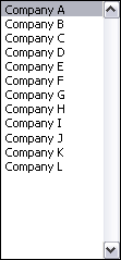
I added a listbox from the forms menu to the worksheet, and formatted it to use CompanyList as the input range and SelectedItem as the cell link. This means the list in CompanyList is displayed in the listbox, and the index of the selected item is displayed in Selecteditem.

The listbox looks like this:
A couple more names must be defined. Open the Defined Name dialog, add the name “SelectedSeries”, enter the following Refers To formula, and click Add.
=OFFSET(Dates,0,SelectedItem)
Add the name “SelectedName”, enter the following Refers To formula, and click Done.
=OFFSET(Dates,-1,SelectedItem,1,1)
Now the selected series can be added to the chart. Select the chart, go to the Chart menu, choose Source data, and click on the Series tab. Click Add, then enter the appropriate names for the series name, values, and category labels, prefixed with the sheet name. Click OK.

To create a chart without the background series (like the one shown at the top of this post), select an empty cell, run the chart wizard, and in Step 2, click on the Series tab, add the first series, and enter the range names as above.
Here is the chart, showing all series in the background gray and the selected Company A highlighted in blue.

Clicking another item in the list changes the highlighted series, to Company L below.

By Row
For this example I made up data for multiple companies in rows, with each column representing the respective values on a given date; a portion of the data is shown below.
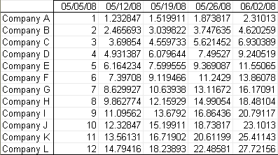
I plotted this data on a single chart, and formatted all series to use a light gray line. This chart comprises the background.
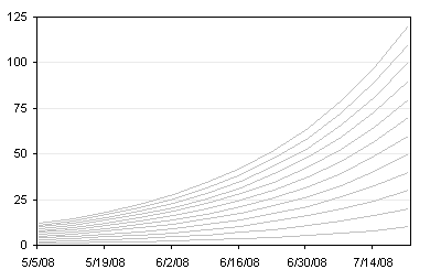
We need to define some dynamic names to make this work, as described in Dynamic Charts. First, the row headers, the range of cells containing the Company names, is named “TheCompanies”. The first row, the range of cells containing the dates, is named “TheDates”. I selected another nearby cell and named it “TheSelection”. (The names are different than in the first example, because both examples are in the same workbook, and I wanted to avoid naming conflicts.)
I added a listbox from the forms menu to the worksheet, and formatted it to use TheCompanies as the input range and TheSelection as the cell link. This means the list in TheCompanies is displayed in the listbox, and the index of the selected item is displayed in TheSelection.
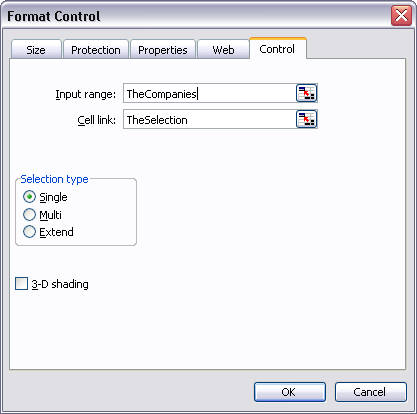
The listbox looks like this:

A couple more names must be defined. Open the Defined Name dialog, add the name “TheSeries”, enter the following Refers To formula, and click Add.
=OFFSET(TheDates,TheSelection,0)
Add the name “TheName”, enter the following Refers To formula, and click Done.
=OFFSET(TheDates,TheSelection,-1,1,1)
Now the selected series can be added to the chart. Select the chart, go to the Chart menu, choose Source data, and click on the Series tab. Click Add, then enter the appropriate names for the series name, values, and category labels, prefixed with the sheet name. Click OK.

To create a chart without the background series (like the one shown at the top of this post), select an empty cell, run the chart wizard, and in Step 2, click on the Series tab, add the first series, and enter the range names as above.
Here is the chart, showing all series in the background gray and the selected Company A highlighted in orange.
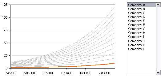
Clicking another item in the list changes the highlighted series, to Company L below.

Sample Workbook
Download a workbook that contains these two examples: InteractiveLines.zip


dermot says
Jon, I don’t know if I’m missing something, but to show a series selected from a listbox, I would add an extra column on the end of the data which I would use for the chart values, and I would use a formula to make the values in that column equal to those column selected by the user. That’s all it takes.
Jon Peltier says
Dermot –
To-may-to, to-mah-to.
Both techniques are appropriate for this application. Using an additional column or row to hold the data for the selected series has the advantage of showing the data for the selected series (the extra column or row), and not requiring the complexity of defined names. In other examples I’ve posted, I have used the extra range. Depends which side of bed I got up on, I guess.
In Interactive Parallel Coordinates Chart I used extra ranges to hold the data for the selected series.
Doug says
Great site….I have a series of monthly incomes with the months undernealth. When I need to show a negative income month, I can set the scale but the months stay in that negative area….how can I move the months out of the negative scale area….thanks.
Jon Peltier says
Doug – When formatting the axis, either on the Patterns tab in Exce l2003 and earlier, or on the main formatting tab in 2007, look for the axis tick label controls, and choose the “Low” position.
derek says
You’ve populated the cell range O4:O15 with the array {=TRANSPOSE(Companies)}, and then named that range CompanyList. Am right in thinking you could have just defined the named formula as that array function without having to occupy any cells?
Jon Peltier says
Derek –
I could have done just that, and in fact I tried. Any worksheet formulas would have had no problems using the named formula rather than a named range. But the listbox did not accept the named formula as its list source data.
derek says
But it accepted the named range. Silly Excel. Oh well, thanks for trying.
Jon Peltier says
Derek –
This is where I slowly rub my chin, and say in my best wise man’s voice, “Excel is like that sometimes.”
cybpsych says
hi Jon, hope it’s not too late to post a comment!
greatly appreciate your interactive charts … been very useful for me to display multiple sets of data across same time span/period …
now, the tricky part: How do i transfer this chart over to PowerPoint and maintain the listbox functionality? (assuming the Excel source is in an external file)
I’ve tried to copy the chart over but the listbox control is still maintained in the Excel file.
thanks!
Jon Peltier says
If you copy the sheet with the chart and listbox, you can access the listbox functionality when the Excel object in PowerPoint is activated. If you want it to work within PowerPoint without activating the Excel object, you need to do put the control into PowerPoint d link it to the embedded Excel object using some heavy duty programming.
jeff weir says
Hi Jon. I’ve come up with a bit of a hybrid between your approach in this post and with what Andreas came up with over at the More Information Per Pixel blog at http://blog.xlcubed.com/interactive-english-league-bumps-chart/
Instead of Andreas’ paramlink formula, but here’s a way to accomplish nearly the same thing without it.
I’ve got a row of form optionbuttons sitting over each of the last plotted points in a bumps chart – one for each series. All the series are formatted gray as in your post above, with nice big round line markers about the same size as my optionbuttons.
Then I’ve got a red series that points to a dynamic range courtesy of the optionbutton value being used in an offset function as you detailed above. The result is that the user clicks on the last datapoint of a particular series of interest, and that series turns red on account of the dynamic graph series range. Almost exactly the same as what Andreas’ paramlink function does, but without the additional addin.
Only problem is that my optionbuttons are visible, which only slightly spoils the ‘magic’ of this effect. What’s more of a problem in this partitular case is that they get in the way when I collapse a grouping that this chart is sitting in. The chart is snapped to a cell so that it completely dissapears courtesy of a ‘group and outline’ group (which is a handy way to get rid of a chart from a dashboard report when you don’t want to see it) but the option buttons seem to behave differently…they don’t dissapear along with the chart even though they are snapped to the same cell. Instead they obscure some text.
So I either need to find out how to make the optionbuttons transparent, or I need a macro that will ron a ActiveSheet.Shapes(”Option Button 33″).Visible = False routine when I collapse the particular row that the graph is in, and that will also make them visible when I expand that particular grouping.
Any help greatly appreciated.
Love your posts…I’m learning a lot from them.
regards
Jeff
Jon Peltier says
I wouldn’t use option buttons. They are a pain to keep aligned, and they won’t work on a chart sheet.
I showed in Easier Interactive Multiple Line Chart and in Gas Prices – Interactive Time Series how to use a listbox to highlight a particular series. This keeps its alignment, but also won’t work on a chart sheet.
I showed in Chart Event to Highlight a Series and in Chart Event Class Module to Highlight a Series how to click on or mouse over a legend to highlight a series. This works on chart sheets and on embedded charts, depending on which of these approaches you use.
I thought I have even demonstrated how to capture a click on a series to highlight that series, but I can’t find such an article. So I guess that’s what I’ll blog about one day this week.
Stay tuned.
jeff weir says
You’ve got a good point that the optionbuttons are a pain to get aligned – it probably wouldn’t be a problem except that the graph behind them is resized given my collapse/expand graph functionality.
I’d forgotten about the posts you mentioned – much better way of doing it.
The paramlink code is also tempting in that users don’t have to select/activate the chart first.
Thanks Jon
Chris says
Jon, thank you for your great posts, your help is very much appreciated:
Maybe I didn’t get your post entirely, but is there an easy way to format all series to use a light gray line with one click or by any chance some VBA-Code?
Chris says
This has done it for me, if anyone cares ;)
Sub FormatAllSeriesInOneColor()
  Dim mySrs As Series

    For Each mySrs In ActiveChart.SeriesCollection
      With mySrs
        'mySrs.Border.Color = RGB(242, 242, 242)
        mySrs.Border.ColorIndex = 15
        mySrs.Border.Weight = xlThin  'xlHairline,xlThin,xlMedium,xlThick
        mySrs.Border.LineStyle = xlContinuous 'xlContinuous,xlDash,xlDashDot,xlDashDotDot,xlDot,xlDouble,xlSlantDashDot,xlLineStyleNone
        'mySrs.MarkerBackgroundColorIndex = xlNone
        'mySrs.MarkerForegroundColorIndex = st
        mySrs.MarkerStyle = xlMarkerStyleNone 'xlMarkerStyleCircle.Circular,xlMarkerStyleDiamond, xlMarkerStyleNone,xlMarkerStylePlus,xlMarkerStyleStar,xlMarkerStyleX,xlMarkerStyleAutomatic,xlMarkerStyleDash,xlMarkerStyleDot,xlMarkerStyleSquare,xlMarkerStyleTriangle.Triangular,
        'mySrs.Smooth = False
        'mySrs.MarkerSize = 2
        'mySrs.Shadow = False
       End With
     Next
End Sub
Jon Peltier says
Chris –
The first thing I do when I need a routine like this, is make a dummy chart, turn on the macro recorder, and do what I want the macro to do (see How To: Record Your Own Macro). Here’s what it recorded (in 2003; 2007 doesn’t record a lot of formatting steps):
So this tells me the syntax, I just need to clean it up (see How To: Fix a Recorded Macro). Remove the default stuff that is not needed, and stick it into a For-Next loop:
Sub AllSeriesGray()
  Dim srs As Series
  For Each srs In ActiveChart.SeriesCollection
    With srs.Border
      .ColorIndex = 15
      .Weight = xlThin
      .LineStyle = xlContinuous
    End With
    With srs
      .MarkerStyle = xlNone
      .Smooth = False
    End With
  Next
End Sub
I noticed after the fact that Chris posted his own recorded and punched-up macro two minutes before I posted this.
Chris says
Thx for taking time to respond to my question anyway.
Pierre says
Sorry if I am not the first one to ask this:
Is it possible to change dots position of a curve with a mouse drag on the chart in Excel 2007, like in Excel 2003 ?
Many thanks
Pierre
Jon Peltier says
Pierre –
You are not the first to ask about this feature, which has been removed, and you will not be the first nor the last to regret its absence.
q.tran says
hello,
i have the most complicated data table i ever had and i luckily found this page. this is the exact table that i am looking for.
my data table is like your “by row” table. i tried many ways to plot the table but it didnt happen. i wonder how to create the chart like your 3rd image. i tried to do insert line table but it look like a mess. … i’d appreciate any help
thanks
Jon Peltier says
Q –
Make sure the top left cell is really a blank cell, not a formula that makes it look empty, but a cell that contains nothing.
Also make sure that the top row contains real dates, not just text that humans can read as dates.