While writing last week’s introductory article about Excel 2013 charting, My First Excel 2013 Chart, I discovered a very cool bit of intelligence built into the function that inserts XY charts.
In prior versions of Excel, if you selected a rectangular range with N columns and inserted an XY chart with data in columns, the chart would use the first column for the X values, and the other columns for Y values for N-1 series. If your series didn’t all use the same X values, you had to define each series separately.
While playing with the Insert Chart dialogs, I discovered that Excel 2013 will offer several additional options if the data is arranged a certain way.
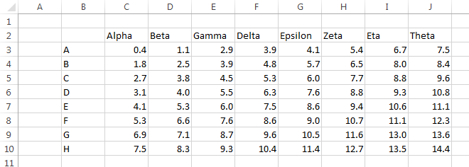
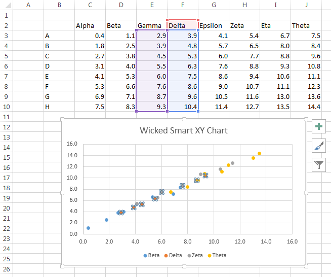
I’ll illustrate this coolness with the following data. There is an 8×8 grid of numerical data, with text labels (Greek letter names) in the row above the grid, and text labels (Latin letters) in the column to the left of the grid. Thedata is better suited for a line or bar chart because of the non-numerical categories in the first row and column.
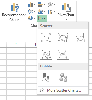
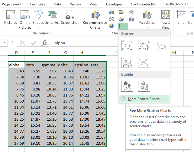
On the Insert tab, click on the XY Chart icon and you’ll see this dropdown.
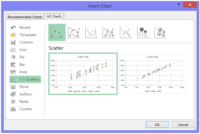
Click on “More Scatter Charts” at the bottom, and you’ll see this dialog.
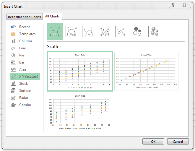
There are thumbnails for three options, which will be discussed shortly.
If you mouse over any of the options, you’ll see a preview of how that chart would look. Double clicking on the thumbnail or preview inserts the chart into the worksheet.
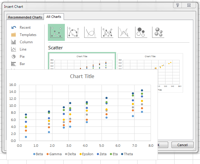
The first XY chart option is what you would get in prior versions of Excel. The first column is used for the X values, and the other N-1 columns are the Y values. In this case, the first column contains text labels, which an XY chart cannot accommodate, so it uses the counting numbers 1, 2, 3, etc. instead.
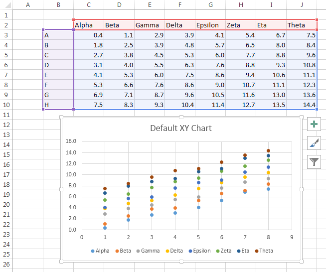
The second option available in this case shows one of the intelligent behaviors. Excel realizes that the first column doesn’t contain numerical values, so it ignores that column, and makes a chart with the number in the rest of the data range. The first numerical column is used for X, and the rest for Y.
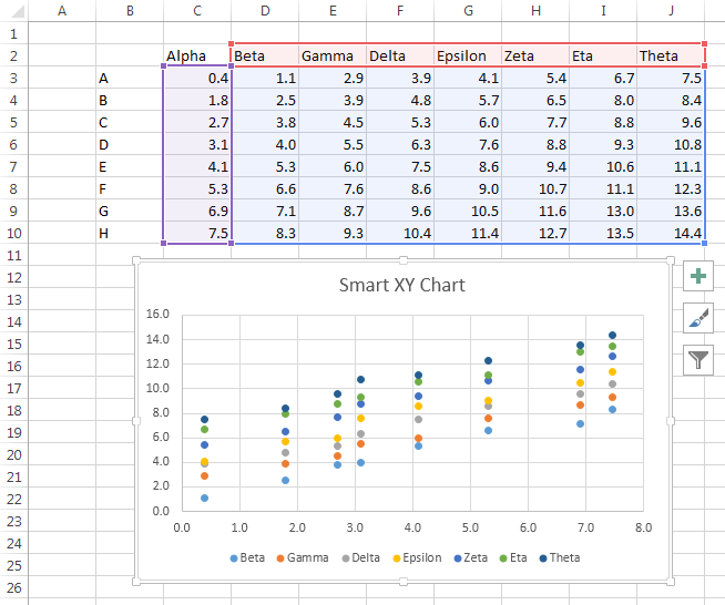
I tested this with one, two, and three leading columns of non-numerical data, and Excel ignored them all. Presumably it will ignore any arbitrary number of leading columns of text.
That’s pretty smart. But the next trick, as we say here in Baaston, is “wicked smaat”.
Many times I’ve been asked how to select a range with alternating X and Y values and create an XY chart with one series for each pair of columns. In Quick Chart VBA Examples I presented code that parses such a range and spits out the desired chart. In that tutorial I showed how to process several different arrangements of X and Y, including alternating X and Y columns.
If your usable numerical data is contained in an even number of columns (either standalone, or with some data ignored as above), Excel will give you the option to treat the data as alternating columns of X and Y data. The result is this Wicked Smaat XY Chaat:
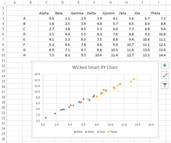
When the chart is selected, there is no highlighted data range, because the chart’s data is “too complicated” to display. This is because the series don’t share their X values.
If you select the first series, however, you can see that it uses the first column of the range for X and the second for Y.
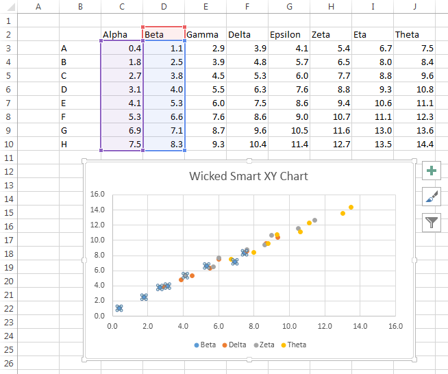
And if you select the second series, you can see that it uses the third column of the range for X and the fourth for Y. And so on, for the rest of the series i the chart.
I discovered this intelligent behavior by accident, using some arbitrary data from a totally different example. But knowing about this intelligence, I can design a data range to take advantage of it.
Here is an even number of columns of numerical data, alternating X and Y values.

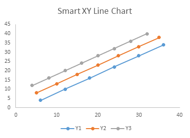
Here’s my wicked smart XY chart created using this data. The default formatting has markers but no lines.

You can use the Change Chart Type feature to change from a markers-only to a lines-and-markers format.
A lot of people are going to be very happy with this new functionality.


derek says
It’s okay, I suppose, but the general problem is still that Excel tries to “intelligently” pick the data series, ignoring the intelligence on the other side of the screen. I’m pleased they’re going a little way out of the universal “block” assumption for charts, but I’d be more pleased if they adopted the sort of wizard format you have in your applications, where you first ask the users how they would like the selected data to be arranged.
Jon Peltier says
Derek –
You mean, like the 2003 Chart Wizard? Yeah. The first thing people would ask, when making a chart in 2007 for the first time, is “Where can I find the Wizard?”
In fact, I thought that the “old” Chart Wizard, upgraded in Excel 97, left out some of the good stuff from the earlier version. For example, when selecting the data in Excel 5/95, the Chart Wizard would make the same assumptions about the data range, but you could override the selection and indicate whether to use one or more rows for category labels and series names.
One improvement in the workflow of this new Chart Type feature, though, is that Excel recognizes different options (like data in rows or in columns, or the three XY data options shown in my first example above) and shows them to you for you to select one, instead of imposing one and forcing you to fix it.
Jay Arthur says
As always, excellent insight into nuances of Excel.
With Microsoft dropping support for Windows XP and Excel 2003 in April of 2014, we’re all going to have to embrace the new directions of Excel and Windows 7/8.
Laura says
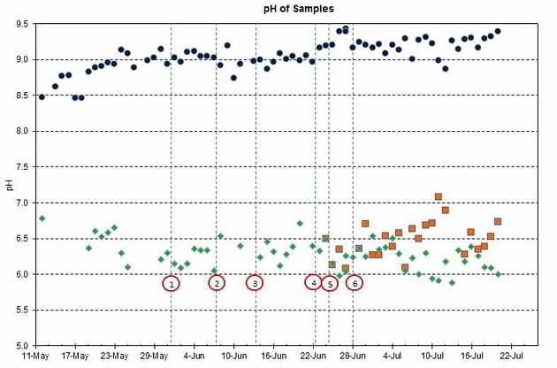
I have 20+ charts of analytical data in an excel 2010 file. Each XY chart illustrates 3 to 6 sampling locations with about 50 daily data points each. The vertical lines indicate “events” are are drawn by inserting 2 data points on the same day, one at 0 and one at 10,000. The problem is that when the events are added, Excel churns because (I think) the 0-10000 range is so far outside of the data range needed to specify the desired parameter. The chart posted is for pH, but there are several other parameters, most of which are less than 10. Is there another way to show the event? I tried it as a single dot, but the line is much better to illustrate the differences from one event to another. The events are in a separate worksheet from the analytical data for both ease of entry and the ability to eyeball a running list of what happened when. Any guidance would be very much appreciated. Excel XY Chart for pH is here: http://share.shutterfly.com/share/received/welcome.sfly?fid=a83cae9ded7010355b2f2841c4d4a52e&sid=0QaNHLFmxbtnFA
Jon Peltier says
Laura –
If it’s a small handful of data points at 10000, a single value way out of range shouldn’t be a problem; try with 10 or 100 to compare. You also have only dozens of points, so the chart isn’t overloaded.
Terence Craven says
Nice post,
Don’t forget you can also further customise your charts (recommended or otherwise) with three great new tools in Excel 2013.
http://www.microsofttraining.net/b/exceltraining/2013/05/excel-2013-charts/
Jon Peltier says
Terence –
Well, two great new tools. The styles (middle button) should probably be avoided. Too much gratuitous formatting. And the first tool is not new, it simply places the chart element controls next to the chart (where they were on the context menu in 2003 & earlier) rather hidden on the ribbon. But that third one, for filtering the chart data without removing data in the source data dialog or hiding rows and column, is genius.
J. Barin says
Is there any reason that Excel 2013 won’t accept X inputs at all, and impose arbitrary 1-2-3-4 integers as X values?j
Jon Peltier says
You need to provide X values. You also need to let Excel know these are X values and not other Y values. The easiest way to to the latter is to include a label above each column of Y values and a corresponding blank cell above the column of X values.
derek says
Laura, apologies if I’m misunderstanding your problem, but instead of drawing vertical lines between two data points, have you tried a single data point and using vertical error bars, or drop down lines? I don’t know if that will stop the churning, but I thought it might be worth a try.
Teri Brooks says
I tried your recommendation of adding a blank cell above my X values, and a label above my column of Y values. However I still cannot get it to use the X values as axis labels. Instead I get integers. A line charge or bar chart will use the X values correctly, but this is not appropriate for my data. Can you advise?
Jon Peltier says
If even one of the X values is not numeric (or a true blank i.e. empty, or #N/A), Excel will treat them all as non-numeric, and use counting numbers.
Below, left to right: All numeric X values, one blank value, one #N/A error, and one non-numeric value.
Teri Brooks says
My values are Participant IDs. X1, X2, Y1, Y5, X7. Because the data values are arranged in ascending order, the Participant IDs are not in order. I have tried formatting the X column as Text, General and Number but it always defaults to 1,2,3,4,5,6…. In one of the examples dates are shown in the X axis. I am unable to get these to display. I was able to select a line chart, which did use them, and then remove the line, leaving the data points. This seems wrong.
Jon Peltier says
Teri –
If you make a Line chart instead of an XY chart, Excel will use the text labels in the cells.
Below, an XY chart and a Line chart using the same text for X axis labels:
Chad says
Hi, is it possible to enter a fixed minimum bound value for the x or y axis of an xy scatter chart? I can’t get it right using Excel 2013. Please help.
Jon Peltier says
Do you want to add a line to the chart?
Try the techniques here: https://peltiertech.com/Excel/Charts/AddLine.html
Do you want to impose a lower limit on the values?
-
-
-
-
-
-
-
-
-
-
-
-
-
-
-
-
-
-
-
-
-
-
-
-
-
-
-

-
-
-
-
Use a formula in another range, something like =IF(A1
Ken P says
Hi. My investment stock line charts, which worked fine in Excel 2003 are wrecked by Excel 2013 setting a limit of 1,000 labels. The crazy thing is that none of my charts use anywhere near as many labels. I only want to label the high points, low points, buy and sell points for any given chart. How do I find out what labels and how many it is trying to insert? Thanks
Jon Peltier says
Ken –
How are you applying the labels?
Alan Wicks says
So, all I want to do is to have two sets of columns, one goes with the left vertical axis and the other goes with the right vertical axis. In Excel 2013 when I go to put the second set of data on the second axis as a clustered column it stacks them even though the picture shows them side by side. Nothing I do can change the fact that they stack rather than set side by side. Rather irritating.
Jon Peltier says
Alan –
I’ll bet the columns are not stacked. The secondary axis columns are in front of the primary axis columns, blocking your view of all but the parts of the primary columns that stick up above the secondary ones.
You cannot cluster columns on one axis with columns on the other axis. The reason columns cluster is that they push each other aside, so they end up side by side. Without the other series pushing your data apart, they will both be centered within each category. There may not even be the same categories on both category axes.
In any case, it takes work to create a clustered column chart where some of the cluster relates to one axis and part to the other, and it takes even more work for readers to figure out and remember which columns go with which axis.
You could use the technique in Bar-Line Chart with Secondary Axis or Two Panels to make a panel chart, one panel with each set of columns.
Roger Hewins says
I switched from Excel 2003 to 2010 four days ago. I have now got a couple of charts made, though one is since corrupted; the problem is that you cannot easily plot x against y: it wants to plot them against 1,2,3 …
I thought that your A,B,C column might be the answer, but it didn’t work.
My first attempt at aplot did work, but I cannot add different seies to the same chart: the data are forced into the same series and/or they become two series plotted on the old x values.
Jon Peltier says
Roger –
The trick, as I often describe in these tutorials, is to place the X values in a column with a blank cell where the header would go, and put one or more sets of Y values in the adjacent columns to the right, with header labels next to the blank cell above the X values. The blank cell tells Excel that the first column and first row are different, so it will try to use these as X values and series names.
Harry says
Does anyone have a solution for the excel 2013 bug whereby you cannot plot simple x-y scatter plots as described above? I have spent ages with data such as those below (this is a small snippet of the full set)
x y
-0.153838104
-0.868086444 -0.550339675
-0.010988436 0.409637946
-0.296687772 -0.276060355
-0.296687772
-0.010988436 -0.276060355
-1.010936111 -1.236037976
-1.296635447
-1.153785779 -1.373177636
-0.868086444 -0.961758655
-1.296635447 -1.373177636
Excel 2013 keeps highlighting strange blocks connected with where the blanks are. Even if I delete all the automatic series that Excel creates it still refuses to accept the numerical x and y values when I tell it excatly where they are. If I put these in Excel 2010 it does the right thing straight away. So Excel 2010 is much cleverer because 2013 cannot do it. Unless there is a solution to this it is useless.
Jon Peltier says
Harry –
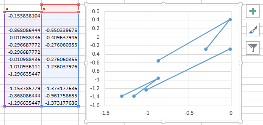
I pasted your exact range into an Excel 2013 worksheet, selected the entire pasted range (to ensure that the blanks didn’t cause Excel not to plot all of the cells), and inserted an XY chart:
This is just what I would have expected.
Harry says
Jon, you are right but … When I copy the above I can reproduce what you have but I think that is a lucky accident. I tried again with the full dataset which has many more entries and it will not do an xy scatter plot. If there are just a few lines the my exel will let me override the default options like those Excel chooses but I cannot show. Here are a few more lines in case it works
x y
-0.153838104
-0.868086444 -0.550339675
-1.010936111 -1.236037976
-1.153785779 -1.373177636
-1.582334783 -1.236037976
-0.725236776
-0.582387108 -0.824618995
-0.010988436 -0.550339675
0.988959239 0.958196586
-1.153785779 -1.373177636
0.417560568 -0.413200015
-0.296687772 -0.276060355
-0.868086444 -0.687479335
-1.010936111 -1.236037976
0.2747109 0.135358626
-0.153838104 -0.961758655
-0.010988436 -0.413200015
-1.010936111 -1.236037976
0.703259904 0.409637946
2.703155255 2.192453527
0.703259904 0.683917266
0.131861232 0.272498286
0.703259904 0.409637946
-0.725236776
0.988959239 1.095336246
0.846109572 0.546777606
When I tried the first 8 lines it can be pesuaded by manually adding series to do a scatter but it made 6 point and there are only 5 pairs. Selecting a few more lines and it stops doing a scatter graph.
Jon Peltier says
Again, I selected the data and inserted an XY chart. No surprise.
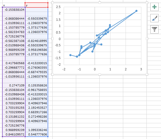
How are you selecting the data? Are you selecting cell-by-cell, or selecting the entire range? Selecting cell-by-cell is inefficient, error-prone, and limited to only a dozen or so points. Selecting the entire range is usually much more reliable.
Harry says
Thanks fot looking at it. I copied the data again from your website and guess what, that scatters correctly in Excel 2013 as it did last time I copied from your site. But I have now figured out what is happening I think. The data copied from your site has only 6 decimal places because copy and paste over the web passes just the visible digits which are 6 decimal places in this case. But the actual contents have 10 decimal places in the original data. However, I try to scatter the original 10 decimal place data Excel fils to do the right thing, and even worse, it cannot be persuaded to do the right thing even if you manually delete automatically selected series and add your own. However, if I copy the data with the round() function at 6 decimal places then it scatters predictably as you have found it. So format cells to 6 decimal places does not work (unless you copy over the internet). But round to 6 decimal places does. This is not a solution but a work around. I experimented with different formatting but nothing works, only degrading the numbers to fewer decimal places which is bad.
Harry says
Correction, sorry my head is spinning. The data on your site is 9 decimal places, the original data that does not work has 15 decimal place and I used round to 6 as an experiment which worked (but the data is degraded).
Jon Peltier says
Harry –
I just used the data you pasted into the comment. If you want, I’ll try the longer numbers. Make the columns wide enough to show them all, and paste them into a new message.
Harry says
Jon
I discovered that if you paste it the data may not stay the same. If I copy and paste between excel documents, even reducing the number of rows in between, which is what I was originally doing, then the problem persists. If within excel I use a formula on the data such as round then the problem goes away. Even if you use round to 15 or 16 decimal places (15 is Excel’s published limit). If I save as txt and then open the txt file them excel will scatter the data correctly. But if I compare the contents of the txt file with the data in the excel file there are subtle differences. The values in the ‘cells’ following blank cells are rounded up in the txt file compared with the excel original whikst other cells remain the same. So i made the file available through file convoy
http://www.fileconvoy.com/dfl.php?id=ge84410ae8678d0f499940013859663b039c8682cd
for 7 days. It is just two columns of numbers. It seems like it is a bug to me though microsoft might say that it does not work to the decimal places of the data. But then it should bark an error message rather than do things that are wrong and sureptitiously change the data. Or alternatively round up the data internally and scatter correctly which I would have thought was relatively easy to do. The default view for general format numbers appears to be 8 decimal places which makes these things even more difficult to spot. This is real data that I have that I wanted to do a quick scatter on to get a handle on it with a regression. Sorry this seems to be getting a bit off your original topic.
Jon Peltier says
Harry –
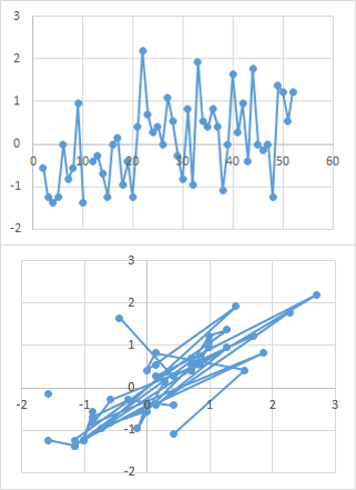
Often when you import data into Excel from somewhere else, it needs to be cleaned up. It has nothing to do with the number of visible digits.
I found that your data needed cleanup. When I simply selected the data and charted it, the scatter chart looked like the top chart below.
Cleanup involves first deleting the cell in the top left cell. This helps Excel figure it out.
Then select the data. Use Ctrl-G for Goto, click the Special button at the bottom, then select Blanks. This will select all the blank cells in the selection. Note how few there are, even though it seems there are lots of blank cells. These apparent but not really blank cells are dirty, and contain some kind of non-printing character.
Excel ignores bad data in the Y values, or more likely, treats bad values as zeros. All it takes, though, is one bad value in the X values to hose the chart.
So select all the data again, from row 2 to the end (leave row 1 alone, we don’t want to delete the “Y” label). Use Ctrl-G again, click on Special, then select Constants, and uncheck Numbers. This will select all non-numeric cells within the data. Now click the Delete button. Instantly the first chart transforms to the second, because now the apparently blank cells are really blank, and the chart is free to ignore them.
When you transform the data using ROUND() and other functions, it forces Excel to either recognize the cells as blank or as zeros. Using the technique I described above is probably cleaner.
Anna Dahlin says
Dear Jon,
In Excel 2013, is there any way that I could change the default chart marker from a filled circle to the marker of my choice (in this case the “x”), so that every single chart I ever create from now on has that marker as default for every data series?
I know how to change the default to difrerent markes for each series, what I want is to have the same marker for all series, but NOT the filled circle.
Thank you
Kind regards
Anna
Jon Peltier says
Anna –
I know of no way to change defaults like this, other than to create a new chart template with enough series to cover how many you’d have in your charts, and format them as desired.
If I needed this, I’d write a little code to reformat all series:
ezra abrams says
suppose you have x,y data, and need to have some text as well as numberic values, and want to plot a scatter gram
eg, your excel sheet looks like this
Time Joe roger
1 47 58
2 nd 90
3 54 off
where time is the x axis value, and Joe and roger are two sets of y values
if you try and do a scattergram, the ‘nd’ and “off” plot as if the y value is zero
you can enter #N/A, and excel will ignore this
If you only need one non number value in your table, you could make the mental substitution, “nd” = “#N/A”
but what if you need two or three non numeric values
in my case, nd is not determined, and off is out of range
Of course you can do this by copying the data and using replace , but that is cumbersome
is there some way to plot a scattergram and have it ignore cells that don’t have a number ?
..
Jon Peltier says
Enter Joe in D1, and =IF(ISNUMBER(B2),B2,NA()) in D2 and fill it down.
Enter Roger in E1, and =IF(ISNUMBER(C2),C2,NA()) in E2 and fill it down.
Plot columns D and E instead of B and C.
K Rand says
Absolutely HATE Excel 2013!!!! Cannot get it to format any chart like I want. Use Excel 2003 on my other laptop and it works like a charm. Don’t know what I’m doing wrong, but I wish programmers would leave a good thing alone!!!
Jon Peltier says
Actually, I like 2013 quite a bit. I find the defaults much improved over any prior version, and formatting is no more difficult than previously.
What specifically is giving you problems?
Alex E. says
Hallo Jon,
Is there a workaround in Excel 2003 that would mimic the “smart” feature described in this article? This blog marks the first time that I have become aware of anything useful being added to newer versions of Excel while a lot has been lost since 2003.
Jon Peltier says
Alex –
Well, you can always do it manually. Make the chart with the first set of XY values, then use Copy/Paste Special to add each subsequent set to the chart. Or you can do it programmatically, as described in Excel XY Chart Variations with VBA. It’s also a feature of my Peltier Tech Chart Utility, but that’s not available for Excel 2003.
Simon says
Hi there, I’ve got a problem that has been driving me insane for a number of years.
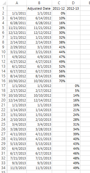
I run a holiday rental business. As I go through the year, i record my “sold” occupancy figures, so that I can track what % of my space is rented out, and plot an xy chart for the year. My challenge is to superimpose data from different years so I can compare.
This is what some example data looks like for (2012 as it happens):
01/01/2011 0%
14/06/2011 10%
28/06/2011 16%
21/11/2011 28%
12/12/2011 30%
21/01/2012 32%
14/02/2012 38%
29/02/2012 41%
21/03/2012 44%
09/04/2012 47%
27/04/2012 49%
01/06/2012 52%
17/06/2012 56%
14/08/2012 69%
30/10/2012 70%
And here’s some more date for the following year, 2013:
01/01/2012 0%
17/02/2012 5%
10/10/2012 14%
14/12/2012 16%
01/01/2013 16%
14/01/2013 21%
31/01/2013 24%
10/02/2013 28%
04/03/2013 31%
28/03/2013 34%
11/04/2013 39%
21/04/2013 40%
13/05/2013 43%
04/06/2013 44%
17/06/2013 46%
21/07/2013 48%
03/09/2013 49%
03/11//2013 49%
As you can see, bookings begin the year before, and finish in November latest. The x-values for different years are never the same. So the only way I can superimpose charts is to literally produce a separate xy chart for every year, adjust the x-values to cover the 2-year period (for this year 1/1/2014-31/10/2015), lay one chart on top of another, stretching each one manually until it lines up with the one below.
There has got to be a better way to do this…please?
Jon Peltier says
Simon –
I’ve rearranged your data below. I’ve put the dates end to end in one column and the two occupancy percentages in adjacent columns. This will allow them to be plotted together even though the dates are not the same, as I wrote about in Plot Two Time Series With Different Dates.
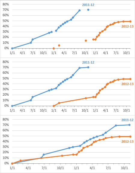
The top chart below shows the occupancy data plotted against the original dates. There are a few places where the lines of either ceries don’t connect all the points, but by editing the data and choosing the option to draw a line across the blanks corresponding to empty cells (see above tutorial), these points are connected.
The data is still offset by one year. For this reason I inserted the column with adjusted dates. I did not change the second set of dates, for the 2012-13 data, but I adjusted the first set, for 2011-12. Cell B2 contains the formula
which essentially adds one year to the date, and I filled this down through B16.
When I use this column as the X values for the chart, I get the aligned data in the bottom chart, and I can easily see how the two years match up.
Charlotte says
Dear Jon,
You managed to get XY correlations for different samples. How do you create it?
“If you selected a rectangular range with N columns and inserted an XY chart with data in columns, the chart would use the first column for the X values, and the other columns for Y values for N-1 series. If your series didn’t all use the same X values, you had to define each series separately” –> this is still the case, even though I have the right version.
Warm regards,
Charlotte
Jon Peltier says
Charlotte –
If I have data like shown below, with an even number of columns (or rows if plotting series by rows), and I bypass the easy selections in the dropdown on the ribbon and click on More Scatter Charts…
… I get a dialog with multiple choices for the resulting chart. I get the same dialog if I right click on an existing scatter chart that has six columns/rows in its source data range.
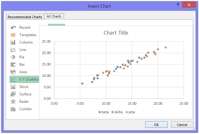
If I mouse over the sample chart on the left, it shows a preview of a chart with one set of X values (the points all line up in vertical lines of markers) and five sets of Y values, labeled beta through zeta in the legend.
If I mouse over the sample chart on the right, it shows a preview of a chart with only three series (beta, delta, and zeta in the legend), each with distinct X and Y values.
Jon Peltier says
Charlotte –
If the data isn’t so neatly arranged, you can also add the series one by one. In the Edit Data dailag, you can add a new XY series, then edit its X and Y data ranges directly.
Neil says
Couldn’t work out why excel didn’t give me the ‘smart’ functions… turns out it can’t cope with my XY data being different lengths (because while the samples were taken at the same time, they are on different time scales (some once per second, others once every 10 seconds etc.). Not so smart after all.
So I had to just select some arbitrary length where all the coloumn lengths were the same (not all the data), then manually adjust each series to tell it the range is longer. Still quicker than manually adding each one, but not quite the revelation I was hoping for.
Thought this might help some other poor soul. Thanks for the tutorial, otherwise I wouldn’t have found it at all.
Jon Peltier says
Neil –
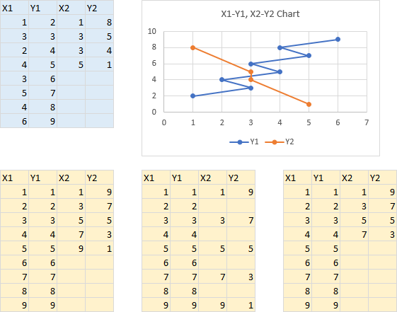
Well, I was all set to give you some words of wisdom. I first set up the range highlighted below in blue, and got the X1-Y1, X2-Y2 chart I expected next to it.
Then I tried the other three ranges, highlighted in gold, and none of them offered me that data arrangement. I could get X1 with the other three columns plotted as Y, and then some other options which I don’t think anyone would have wanted.
So maybe the word “Intelligent” in the title of this post is being a bit generous.
Jon Peltier says
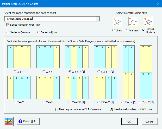
As a follow-up, Peltier Tech Charts for Excel (my commercial Excel charting software) has a Quick XY Charts feature that lets you make a chart using any of a set of non-standard data arrangements. The dialog shows these arrangements, and the particular one with alternating X and Y columns is selected:
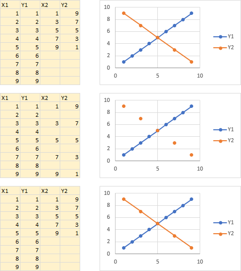
I had no problem with the three troublesome data layouts (the orange series in the middle chart has no connecting lines because of the blank cells in the data, and it would be quick to plot lines instead of gaps):
Trackbacks
[…] Ability to create scatter plots based on a variety of input data layouts (Jon Peltier’s article on this). […]