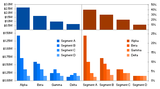
In The Problem with Marimekkos, I used a panel chart to separate the data from a single complex and hard-to-decipher chart into four much simpler charts, following the lead of Stephen Few of Perceptual Edge. I used a trick to place two separate legends into the bottom two panels of the chart.

I introduced a method for placing two legends into a chart in Legend Entry Tricks in Excel Charts, and a few additional tricks were discussed in the comments of that post. These techniques were not what you might call elegant, requiring non-dynamic graphical objects or superposition of multiple charts.
In this post’s panel chart, the legends are not really official Excel chart legend objects. But if there’s one thing I’ve learned, it’s that I can usually coerce one easy to use chart element to substitute for another which is more difficult to deal with.
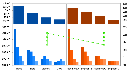
The clever reader may recognize the legend keys and legend entries in the panel chart as markers and data labels of an XY series added to the chart. The XY series and labels use the following data. The X values in the first column indicate that the points will be aligned above the 14th and 35th columns of the lower panels. To get these numbers I merely counted columns or spaces between groups of columns, starting with 1 for the half-space at the left edge of the chart. The Y values correspond to the vertical scale of the bottom left panel. These values can be adjusted to fine-tune the positions of the fake legend entries.

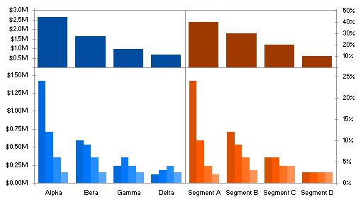
Copy the first two columns of this data range, select the unlabeled chart. . .

. . . and use Paste Special to add the data as a new series, with category data in the first column. I had already added a handful of XY series to the chart to produce the four vertical scales in the chart, so my newly added series was automagically added as an XY series. If your series was added the the chart as a column series, right click on it, choose Chart Type, and select an XY type. Then you probably have to format the new XY series to use the primary chart axes.

Run, don’t walk, to Rob Bovey‘s Applications Professionals web site, and download his Chart Labeler. Rob calls it the XY Chart Labeler, but it works for any chart type that supports data labels. It’s free, easy to install, and easy to use. Add the labels from the third column of the data range shown above to the points of the XY series.

Finally, format the XY series. Remove the connecting line, and fill each marker with the color of the bars that it represents.

Pretty sneaky! That trick alone is worth the price of membership to this blog.


Andy Pope says
I should have guessed it was another dummy xy series.
I did it using 4 additional series interspersed within the real data series.
The text for the entries is just spaces. The number will depend on the choosen size of the legend. A wide legend will require more spaces.
Segment A
Alpha
Segment B
Beta
Segment C
Gamma
Segment D
Delta
You can then format those extra legend to have no marker formatting.
And then size the legend to suit.
And if you include a xy-scatter line in the legend, formatted not to display the legend markers become extended.
Bob says
Hi Jon,
Amen to that. This Blog is on the top of my list of favourites and I check every day.
Way too slick with the xy pair for the pseudo legend.
Cheers,
Bob
Jon Peltier says
Andy –
The narrower columns at the bottom also seem mighty short. I used separate scales for top and bottom, I presume you’ve used the same scale for both sets of data. In your first chart (markers only) I think it might be effective with the legend entries laid out horizontally. It would take up less space vertically, and remove the impression that the lower bars were scrunched to leave room for the legend. It would also put the legend entries in the same spacial relationship (left to right) as in the clustered series.
Something like this:
Andy Pope says
Yeah, I didn’t do anything special with the axis scaling for my examples.
Not sure about the horizontal layout where it is as it looks like a second level of axis labeling. Perhaps it would be better at the bottom of the chart area.
Jon Peltier says
Andy –
Good point, but then it can’t be done using a dummy series.
We could switch the top and bottom panels of the chart, and leave the legend at the top of the sub-subdivided panels.
Andy Pope says
I assume all the plotarea and axis border lines are currently being created by a dummy series, in which case you could use negative Y values for the positioning of the dummy legend markers. At the same time reducing the vertical white space between panels.
Jon Peltier says
Andy –
The only line produced via dummy series is the central vertical line. The box is the plot area, the horizontal dividing line is one of the category axes. The four axis scales are also dummy series, but just for the “+” markers and data labels.
But it all could be drawn with dummy series for all of the boxes and lines. Then the dummy axis legend could go anywhere.
Bob says
Hi Jon,
I’ve been watching this post anxiously waiting for you to show how you built this thing.
I understood how you finessed the legend, but am at a loss to start laying out the data to get the all the bars to line up.
Will you be posting that?
Cheers,
Bob
Jon Peltier says
Bob –
I was planning what to write about next week. That would make a good post. It’s a 2×2 panel chart, with some added features (different axis scales, etc.).
First I’ll write about the overlapping columns, because that’s an easier topic.