Nathan Yau of Flowing Data provided the inspiration for my first chart makeover as part of the Chart Busters program. Nathan asks, and answers, the question Does this Calorie Intake Infographic Work? Not Really. As Nathan says, the chart is “creative and visually appealing”, but it just doesn’t work.
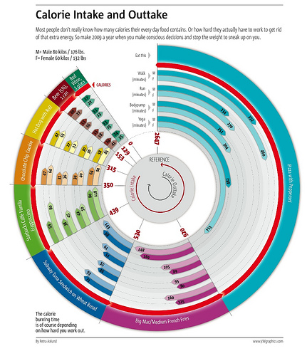
The chart in question is a big round circular mess, posted on Flickr by Petra Axlund of 5W Infographics. Below is a smaller version of the chart, but you can see the original in all of its glory by clicking on this one.
Click on the image for a larger view.
The chart is eye-catching, but not very informative.
So what’s wrong with the chart?
There’s a problem with arc length vs. value. The longer arcs, that is, those representing the longest times, are also on the innermost rings. This distorts the story. It also looks like the 304 arc, minutes for a woman to bodypump off a pizza, looks like it covers a larger area than the 352 minutes is takes a man to walk off the same pizza. The 105 minutes for a woman to burn off a Big Mac and fries looks as long, or nearly as long, as the 125 minutes for a man to walk it off. Since at first glance it’s hard to tell if this is an error, or due to the arcs and different radii.
For a while I didn’t know whether the calorie counts for the food all started at the inclined edge next to the cut-out. But after careful examination, I think the calories of each section are added to the previous sections. This removes any possibility of gauging values from a common baseline.
Some of the color schemes are hard to interpret. Black numbers on the dark brown beer arrows, and even the balck on dark purple Big Mac arrows, are difficult to read. And these numbers are important to read, because the lengths of the arrows are meaningless. This means the chart without the numbers is not self-sufficient.
The hard to read numbers and the out of scale arrows reduce the credibility of the chart. One other thing bothers me as well. Are those 2647 calories for the whole pizza? When’s the last time you saw a non-teenager eat a whole pizza? Or a teenage girsl?
Finally, it is impossible to do any adjustment of items on this chart. How would you account for a larger individual (who burns more calories per minute), or for onion rings instead of fries, or for biking instead of walking? Impossible.
By the way, what’s bodypumping? Some new age kind of weight training? Or do I really want to know?
How can we improve on the chart?
You don’t need all those numbers. An XY chart with clear axis scales is a large improvement. Instead of drawing completely separate graphical elements for each food item, why not draw some simple lines showing calories expended vs. time for the different exercises? Then draw a line corresponding to the caloric value of the food item, and you can pick off the times required to burn off its calories.
Here is a version with calories plotted horizontally and exercise duration vertically.

This one has its axes swapped, and I think I prefer this orientation.
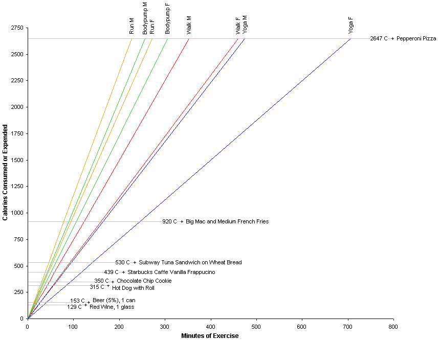
This simple charting technique has the benefit that different factors can easily be shown. The lines of expended energy vs. time can be adjusted for individuals with different weights (for running and walking, energy spent is almost proportional to weight). Or a different exercise can be placed on the chart: biking would be somewhere between runniing and walking. Or the time to burn off a bacon double cheeseburger and onion rings from Burger King could be placed on the chart at 1220 calories.
If you want you could add some color to the chart, and use bolder lines and text to denote the larger male’s exercise values. I’m not wild about the vertically oriented labels, but I find the food labels more important to show horizontally.
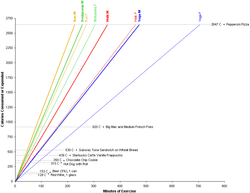
Well, that’s a pretty large chart. If we assume someone will eat half a pizza, we can reduce the scales on the axes, and make the entire chart a bit smaller.

As Jeff points out in his comment, this kind of chart is fine for anyone who is scientifically trained and works with numbers. For those who are not so numerically literate, it might be simpler to show tow separate charts, one with the calorie content of a few representative foods, the other with caloric expenditures for a few popular exercises.

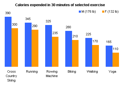
Additional exercise calorie expenditures were based on data in Exercise Calorie Expenditures – Sorted by Intensity.
Maybe we could combine the two charts above, so they use the same scale, and a simpleton user could at least judge that a chocolate chip cookie is at least half an hour of running.
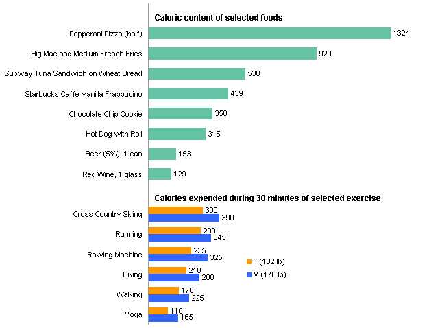
How would you approach this data?


jeff weir says
What an improvement! But while your graph does allow different factors to easily be shown, the ‘continuous’ nature of it means it takes up a very large amount of screen real estate,.
Also, while an XY chart is a great format for the average analyst, dietician, or scientist, I think that if your intended audience was to be the readers of some glossy magazine or a sunday paper, then you’d have to account for their likelyhood of understanding it. I think this audience would include many un-chart-savvy people who would struggle to make head or tails of it, or couldn’t be bothered exercising their brains, let alone their bodies.
Given this, I’d be inclined to just display this in tabular form. Even if you added in some extra exercises like biking, and some extra food items sourced from the Bacon Bits blog, a table would still have a much smaller footprint than a chart, and more people are likely to understand it in this form.
I’d include some pretty pictures of running, hotdogs, and heart attack patients. And I’d rank the calorie per hour impact of the various exercise categories in a simple bar chart under the table.
Jon Peltier says
Jeff –
Thanks for the comment. I was tempted to scale my chart to half a pizza and reduce it to around 2/3 of its linear dimensions. So I’ve done this and added it to the article.
To make the chart more useful, I’d make it dynamic, and allow the user to select from a set of exercises and from a selection of foods. These would be highlighted, but I’d leave other representative items on the chart for comparison. Numbers by themselves don’t mean as much.
The problem with tabulated data is that it’s difficult to interpolate meaningfully. On a chart, it can be done graphically, and our visualcognitive centers make simple work of it. The original chart gave our cognitive centers something to look at, but unfortunately not actually analyze, and the data it presented was even less effective than in a table.
Your point about simplifying charts for the numerically illiterate is unfortunately a good one, and I’ve also added this to the end of my analysis above. I could also add lots of clip art, or just a few clowns.
DMurphy says
Hi Jon: As usual, an exercise to set us all thinking. Personally, I like to keep to the KISS principle in the belief that most people cannot take in too many facts at the same time. So, in agreement with your comment to make the chart more useful, here is my attemps at making it simple and dynamic: http://www.box.net/shared/tu7cyklj1x
Looking at the results, I fancy Walking to the bar for a Beer…
jerome cukier says
I was sitting at this talk last week where the speaker said that with all the pressure that USDA is getting from various lobbyist, “official” calorie charts are designed more to confuse than to instruct, like in our days.
that said, I feel it’s ok to mix your last 2 bar charts – keeping your colors distinct. essentially, even if they go in opposite directions, those two things can be measured with the same unit. I wouldn’t mind seeing, say, the biking bar in between beer and hot dog.
Jon Peltier says
David – I like that. It’s similar to the dynamic/interactive chart I had in mind.
Jon Peltier says
Jerome –
Certainly each redesign of the “food pyramid” or whatever geometric metaphor they’re using lately is less helpful than ever.
I like the combined chart, but I think it’s best to keep the two sets of bars separate and pointing the same way.
jeff weir says
I like your idea to combine the two charts so they use the same scale, so that a simpleton user could at least judge that a chocolate chip cookie is at least half an hour of running.
If the aim is to help people work out how much exercise they need to do to burn off the effects of different foods, then we should keep in mind a couple of things concerning presentation of our message:
1. most people eat a large range of foods. I think the bad things are well covered by our ‘menu’ (*groan*) of choices of commonly consumed food items; but it would be good to have some healthy options, so that people could see that eating better is as much an option as exercising more
2. exercise methods or options for the majority of people are likely to be much more limited i.e. most people probably get their exercise from walking, and I’m guessing running comes second. These are options that almost everyone either can do or can relate to doing, and they’re free. But yoga cost money, and skiing requires snow.
So, to use Few’s mantra…simplify, simplify, simplify. Graph the foods, and graph just one exercise method (I’d pick either the amount of fast walking or slow running required to burn off the calories from that food item. It would be great if these had such similar energy requirements that you could denote both things with the one series)
This allows readers to make a simple one-to-one comparison of each food to an exercise medium that most users can relate to and afford.
Then – if you want to – have a seperate conversion table (or simple bar graph) to show a multiplier you’d have to apply for say yoga or cross country skiing or sex (another great exercise – granted, not free for all though) .
I.e. the conversion chart shows that for sex, you should triple the exercise time shown above for fast walking (for lazy lovemakers).
jeff weir says
Actually, you can show all the above information in a one series cumulative stacked bar graph. My rough example at http://cid-f380a394764ef31f.skydrive.live.com/browse.aspx/.Public?uc=1
jeff weir says
Or you could use 2 back to back bar graphs: one on the left showing the calorific value of each food, one on the right (a cumulative bar graph) showing the cumulative effort required for different exercise groups. I’ve updated my example to reflect this approach.
Jon Peltier says
Jeff – Thanks for your thoughtfull comments. Simplicity is good, and your latest chart (which I’ve inserted into your comment) shows everything that the original chart does, in a more compace and easier to grasp manner.
jeff weir says
Yes – on hindsight basically all I’ve done is unwind the original graph. I ran out of time to show male vs female, but this would be easy enough to work in. It took quite a bit of fiddling around to work out how to do this, but like anything in Excel, it’s easy when you know how. And now I know how.
Thanks for the challenge – It’s given me a good idea for a project I’m working on now. I’ve currently got a scatterplot that shows where abouts a large number of customers fall on a pricing curve (it compares the prices of hardcopy books with the equivalent cost of subscribing to an online library), but many of the points bunch together near the start of the curve so it’s hard to make out exact numbers of customers there.
Building on the above approach, I’m going to stick an inverted bar chart on the left, that shares the same y axis as my scatterplot. This can then display a frequency tabulation of how many customers fall in each pricing range (i.e how many customers between $0 and $500, how many between $500 and $1000 – basically how many fall within each tick mark on the scatterplot’s y axis). Then – using a second axis on the same bar chart – I can also show how much total revenue comes from each pricing bracket.
So Chartdoctoring has been the mother of invention.
Jon Peltier says
Jeff –
These exercises are good, because they force you to think about things in a different way, and they give you insights into other people’s though processes.
Similar to your project, I’ve seen scatter plots with distribution histograms on the X and Y axes. Not too much new under the sun, but even something old can provide insight.
jeff weir says
Jon: I like the simplified version of your graph posted by ritchielee at via the flowing data blog at http://flowingdata.com/2009/06/24/does-this-calorie-intake-infographic-work-not-really/
It looks pretty striking on a computer monitor. He’s just used yoga, running, and walking; which are probably amoungst the most common forms of exercise available to many. Although it would be more compact if he used half a pizza as in your reworked chart, and as per comments above, may leave some non-chart-savvy people scratching their heads. But hey…that’s exercise.
Jon Peltier says
Jeff –
I liked the simplicity of ritchielee’s chart. What I didn’t like was the black black background. I found it hard to read the colored lines and text. Especially as one’s eyes age, a white background with dark colors is easiest to read.
Jon Peltier says
Another great graphic is the three-scale nomogram posted in the comments to Nathan’s blog entry by Ron D, at . Ron created this nomogram with the Pynomo software at http://www.pynomo.org.
j techy says
great information here ! the charts above are a good source of information , most people donnot understand the Calorific values of the simplest of food. You would have thought that forcing restaurants to list nutritional information in their menus would make people more careful about what they ate – apparently it makes no difference at all.