In Bad Graphics – Stacked Pyramid Chart, I critiqued a popular infographic display type, the pyramid chart. In this post I will repeat the favor for funnel charts. These are not the funnel charts which are also called tornado charts, and in some circles are used to construct population pyramids (see Tornado Charts and Tornado Charts and Dot Plots elsewhere on PeltierTech.com). These are stacked 3D abominations which sometimes follow a flawed analogy to a physical funnel, just like the pyramid charts in my previous example follow a flawed analogy to an actual pyramid.
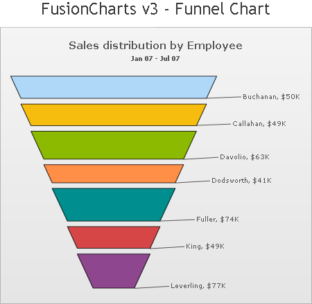
The first example of a funnel chart comes from the FusionCharts Free Chart Gallery.
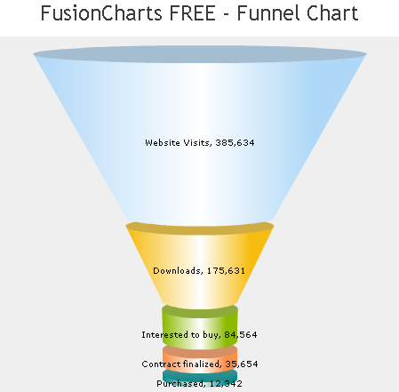
This example shows the flawed analogy I’ve alluded to, which indicates that some quantity goes from a large number to a small number, starting with website visits, only a fraction of which result in downloads, and only a fraction of those result in inquiries about purchase, etc. It seems to me that a physical funnel should make everything that goes in the top come out the narrower bottom. If it didn’t work that way, your kitchen would become a disaster.
This chart indicates a filtering process, but a more accurate representation might show X percent going forward and 100-X percent dropping out. The chart’s analogy breaks down, however. In their zeal to make the chart more closely resemble a kitchen funnel, there is a conical section and a cylindrical extension on the narrow end of the cone. Within this cylindrical section, the values decrease in magnitude, but the diameter is constant. So the false impression that diameter relates somehow to value has broken down.
A second version of this chart is hardly better. It has lost the cylindrical extension at the bottom, but all of the conical sections have different slopes of their sides. This is almost a stacked parabolic chart, which I really hope never to see.
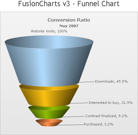
In Misleading charts, Damir Sudarevic of Damir Systems describes the problems with the funnel and pyramid charts offered by Fusion Charts.
Let’s review the problems with 3D charts of this type.
- The value of each section is portrayed by its thickness, while the apparent cross-sectional area, width, and volume of each 3D section overwhelms the reader’s impression of its thickness.
- The apparent cross-sectional area, width, and volume of each 3D section change arbitrarily, more as a function of position within the stack than of value.
- The 3D appearance adds unnecessary clutter (chart junk).
- The chart makes comparison between segments impossible.
- The chart do not allow easy comparison between time periods.
- The whole funnel chart rationale is based on a faulty analogy to an actual funnel.
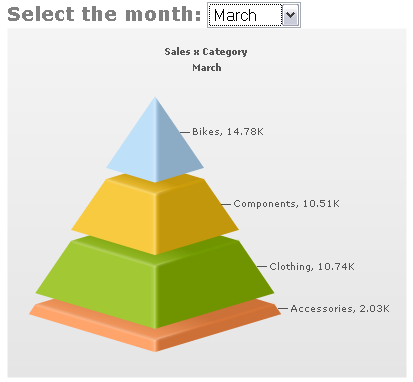
The pyramid chart shows a similar faulty analogy to a true pyramid. The base is the most important part of a pyramid: without a strong base, the pyramid will soon crumble. In the example below (from UberBI), the ‘Accessories’ product line is depicted as the base of the company’s sales. While the profit margin for accessories may be greater than for the main product, the ‘Accessories’ product line cannot support the whole company, and like a pyramid with a faulty base, a company based on a nonessential product line will soon crumble.
The following FusionCharts example doesn’t even follow the false analogy that each slab is a subset of the slab above. Instead, the data points are aligned arbitrarily, in alphabetical order.
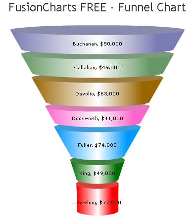
Their 2D version of this chart is not much easier to read than the 3D chart above.
FusionCharts offers more examples, but I think they’ve shown the features of their charts quite well in the charts I’ve shown.
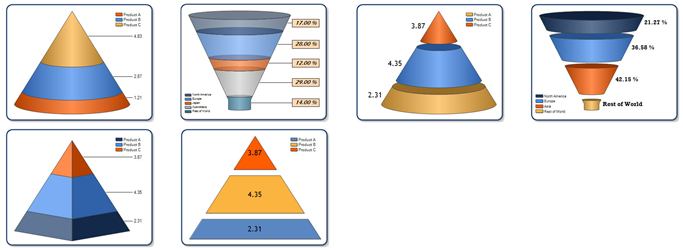
Dundas has a very good white paper, Dashboard Best Practices, which is available online in both html format [link no longer available] and as a pdf document [link no longer available]. Unfortunately, their chart gallery is filled with examples that show how not to apply best practices. They proudly display examples of bad funnel, cone, and pyramid charts.
Similar examples of bad charts abound. Search the internet for computer graphics, business intelligence, data visualization, and dashboards, and you will find many more bad examples than good.
So what’s a good alternative? Keeping it simple is always a good strategy. If you have a single time period to report, a bar chart works nicely:

There is no need to overwhelm the reader with multiple colors, no reason to add 3D effects or any of the seductive lighting and shading effects now too readily available in modern software packages. Note how easy it is to compare values in this chart. Data labels can easily be added to show a relevant percentage.
To present a time series you could use a line chart:
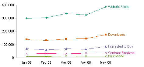
Because the ‘Purchased’ series is so small relative to the other series, you should add another chart showing this series by itself.
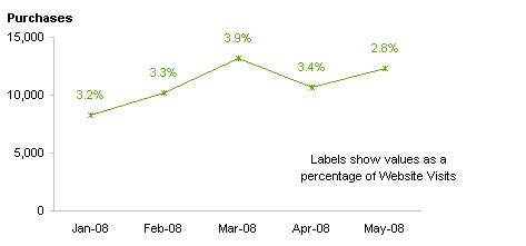
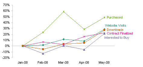
Another way to analyze this kind of data is to normalize each series by its value at the beginning of the time span covered by the data, to compare the percentages each series changes over time. The labeling in this chart should be laid out better, but you get the idea.


dermot says
give it to them, jon, nice work
Tim Mayes says
“These are stacked 3D abominations…”
Tell us what you really think, Jon! :-)
I’ve got to agree that this is an awful chart. For me, I think your bar chart is much easier to read. So, I think that the lesson here is to apply Occam’s Razor to charts, right?
That leads to a question: How much “eye candy” is permissible? There’s probably not a short answer to that. Maybe something like “start simple, and don’t add anything that detracts from easily interpreting the data.”
Jon Peltier says
Hi Tim –
Occam’s Razor is a good guideline; Keep It Simple Stupid is a good alternative.
How much eye candy is allowable?
Short answer: none.
Longer answer: it depends. You want to capture attention without distorting the data.
Use appropriate colors. You can match a company’s logo, or use colors that relate to the items in the chart. You shouldn’t overpower the reader with obnoxious colors, or excessive gradients. You should leave shadows and glows and any other false 3D effects completely off the chart.
TV says
“These are not the funnel charts which are also called tornado charts”
I thought funnel charts were tornado charts that didn’t reach the ground.
As for the last chart with labels on the last data point: it’s fairly easy to quickly add them, but for changing data series or auto generated charts, it can be a real hassle to go back and move the labels for improved readability. Perhaps VBA code could be used to make sure they’re padded by some sufficient distance? I’ve not been pressed hard enough to try yet…
Jon Peltier says
For the data labels, I use my Label Last Point utility to label the last point in a series. Then I use Rob Bovey’s Chart Labeler to nudge labels as required.
Colin Banfield says
Jon, as usual – great work. What amazes me most are the folks that adamantly defend these kind of charts. But then, even Microsoft supports all this junk in spades.
As a rule, if I use value labels on a bar or column chart, I omit the value axis because it reduces the clutter and at any rate it’s superfluous. Labeling the last point on the line series is a great technique, especially when many series are plotted on the same chart.
Out of curiousity, is direct comparison between categories one of the goals? If not, multiple single line charts solves a lot of problems inherent in a single chart with multiple line series. Having said that, I quite like the last chart.
Colin
Jon Peltier says
“Out of curiousity, is direct comparison between categories one of the goals?”
If I am interested in the relative amounts of (whatever) goes from one step to the next, as in a filtered process, then I think multiple series in a chart is required. However, I can imagine scenarios in which you would want multiple charts with one series each, whether you are tracking numbers or percentage pass-through. As always, the answer for best chart type is, “It depends.”
Damir Sudarevic says
The question remains, is there a case when one should use the funnel or the pyramid?
How about a case when each bar (slab) represents a step in a process with input and output. Each step has inherent losses.
Suppose we want to chart power flow through a servo press.
The simplified system looks like:
Power Grid (input) -> Power Supply -> Motor -> Belt drive -> Ball Screw -> On Part (output).
Here are some numbers:
efficiency In Power Out Power
Power supply 0.70 100.00 70.00
Motor 0.75 70.00 52.50
Belt drive 0.97 52.50 50.93
Ball screw 0.80 50.93 40.74
How would we go about charting the power flow?
Funnel would seem like a choice here, top side representing the input and bottom the output. Having fixed slope the height of the slab would represent losses in the process step.
Is there a 2D funnel chart which could be properly used to represent this?
Jon Peltier says
Damir – It is possible to construct a 2D funnel to illustrate this if you chose. I made a 2D pyramid in Excel in Bad Graphic – Stacked Pyramid Chart. It can be done.
Should it be done? The funnel metaphor is flawed. A funnel forces the entire volume through an ever decreasing diameter. Your data shows an incrementally decreasing volume.
You have only one variable, Power. If you plot Power vs. Step, you can show the power decrease without confusing the chart with slopes and with matching one variable to thickness and another to two different widths of a trapezoidal shape.
Keep it simple. Use a simple bar chart, add labels if you want to show efficiency or power level:
Damir Sudarevic says
Yes, the bar chart obviously wins. Even adding the loss column to the table and using stacked bar with output and loss plotted looks fine.
I guess, we still do not have appropriate use for funnel and pyramid charts.
derek says
If you want to be fancy, you could use a Sankey diagram to show the power losses at each stage. That should wow the bosses as much as a funnel picture :-)
Jon Peltier says
Derek – I thought of SanKey diagrams while writing this up, but didn’t want to confuse the issue. Wikipedia has an entry on (a href=”http://en.wikipedia.org/wiki/Sankey_diagram”>Sankey Diagrams, and I also found a list of Sankey Diagram Software.
There is a free version that works in Excel called Sankey Helper. I was going to use it to make a Sankey diagram matching my simple bar chart, but there is a lot of interaction required. So I included the drawing above from the Wikipedia entry.
Jon Peltier says
Your link script comes through, but not the image script. Maybe that’s how WordPress protects me from porn spam. I’ve added your image to the latest comment. FWIW, the html I used is
<p align="center"><img src="http://www.branta.demon.co.uk/infographics/sankey.png" /></p>
Since I check comments before letting them appear, you could put a link to the image with some ugly character string, like “###### PLEASE EMBED THIS IMAGE ######” and I’ll insert the code. No big deal, I’m glad to get thoughtful comments.
derek says
Jon, once again my Excel Sankey diagram [link no longer available] is lost in the ether, even though this time I copied the IMG tag from your comment above. Are you sure anyone except the WordPress blog’s own author is able to embed images in the comments?
derek says
Yes, that’s the string I cut and pasted. It seems clear to me that WordPress is filtering it out before it reaches you, the moderator.
Jon Peltier says
I can’t find a setting in WordPress to change this. Maybe there’s some plugin I don’t have, or some code I could write, but I’m not a web designer. Just make a blatant note in a post and I’ll embed the image.
derek says
No problem. By the way, I feel I owe my particular company’s bosses an apology, since I have been seeing a large number of diagrams all about progressive shavings-off of an initial figure to get a diminished final figure, and the preferred graph form for it that seems to float their boat is not the Sankey diagram but the waterfall graph, which is reasonable enough.
Jon Peltier says
The waterfall plot isn’t bad. Have you tried my waterfall utility?
hnb says
Thank you, I nearly wanted to write something similar myself. This is just a horrible concept..
Mike says
You’re right. If your goal is to represent data to a data-minded audience, the funnel is just distracting.
But if you need to show a general idea, the funnel is a concept that more people will understand, which is sure to make it more powerful.
Simply put, it’s bigger at the top and smaller at the bottom. Your audience probably won’t think it through more than that.
Ulrich Seidl says
Jon,
Rolf Hichert on his HI-SUCCESS-Rules poster agrees with you defining under 4.3 CHECK Visualization – the rule number 4.3.1 Replace radar, funnel and other misleading structure charts.
For more examples of good and bad charts see:
http://www.hichert.com/de/software/exceldiagramme/55
Jon Peltier says
Ulrich –
Thank you for the links. Do you know of a reliable English translation? The Google and Babelfish translators are okay, but they do miss a few things/
Ulrich Seidl says
Hello Jon,
http://dict.leo.org/ende?lang=en&lp=ende&search= mostly worked fine for me.
The good news is, as they told me at Hichert+Partner, that they are working on an english version of their site.
If you are interested in a special chart they can translate it into english as well.
zoomzoom says
i think this is just dumb drawing analogies with physical things with narrow interpretations and I actually stopped reading there. what if I envision my funnel as one with a closed bottom? btw, not all funnels work like your kitchen funnel. A funnel cloud for example doesn’t have anything flowing through it. Its a funnel cloud because the upper part is larger than the bottom part. in other words its a cone.
Jon Peltier says
A funnel cloud is a funnel cloud because it is shaped like a kitchen funnel. By the shape analogy, then, I guess a funnel chart is a funnel chart because it is shaped like a kitchen funnel.
However, users of funnel charts talk about sales (or other information) flowing through the funnel, mimicking not only the shape but also the function of a kitchen funnel. Their analogy, not mine. Since the term is used in this way, it is just fine to say this functional analogy is flawed.
There is another type of funnel chart which uses horizontal bars to show the spread of several factors, min to max, along a horizontal value axis. These factors are sorted to show the larger bars (wider spreads) at the top. Due to appearance alone, this chart is called a funnel or tornado chart.
Ric Dragon says
OK, I’m going to say something unpopular… I don’t entirely agree with everyone on this. I say “entirely” – because it isn’t difficult to understand that using a 3d funnel chart to show quantitative data can be misleading. On the other hand, 3D funnel charts can be quite useful to show trending data. For example, on a presentation on the sales funnel, I might use a funnel to indicate the funneling of users from “awareness” to “brand advocate”. I’m not trying to show precise percentages here.
Why 3D? Because depending on to whom you’re presenting, the 3D can add just a touch of sexiness… and keep people from falling asleep. I’m not saying the Dundas version of 3D makes it… but I’ve seen versions that are pretty nice.
OK, bring on the pitchforks and stones now.
Jon Peltier says
Ric –
If people are falling asleep, don’t blame a non-3D chart. Something else is the sedative.
You might be showing imprecise trends, but there might be someone in the audience who is interested in the precise figures. As Naomi Robbins says in her book Creating More Effective Graphs:
“Writers don’t use vague words because the reader just needs an impression of what is intended. Let’s show the same respect for numbers.”
Carl Barlow says
In your explanation of funnel charts, you say that the value is represented by thickness (like pyramid charts), not by the cross-section area. Actually, I think in the “v3” versions, the values ARE represented by the cross section areas, which is why the lines point to positions where the slices happen (including the area at the top and bottom of the funnel) rather than pointing to the individual masses. For me, that’s even MORE misleading, because it means that when I see a huge chunk, it doesn’t represent a large value so much as a large DIFFERENCE between two adjacent values. The deltas are more easily perceived than the actual values, which are mainly described in an imaginary third dimension that is partially concealed (or completely concealed if you don’t choose to have the funnel/cone/pyramid break apart at the slices. I also don’t like the restriction of these v3 funnels that the data are sorted from highest to smallest value just to get the funnel effect. Another benefit the alternative methods you suggest is that you’re not locked into that artificial sorting just to attempt to mimic a familiar kitchen implement.
Tom Kline says
“These are stacked 3D abominations which sometimes follow a flawed analogy to a physical funnel, just like the pyramid charts in my previous example follow a flawed analogy to an actual pyramid.”
I laughed when I read this line, I deal with a lot of funnel charts on a daily basis that are really just painful to look at. You also stated that there is no reason to overwhelm the user with different colors. Although many would disagree with that logic, I completely agree. A chart should be simple, and to the point. No need for it to look like a box of crayons.
Darksem says
I agree, the funnel an pyramid charts have stacked parts, so the sizes don’t seem as big a deal as the stack order, so it sorta doesn’t make sense to the reader, plus they don’t vary in size enough (in my opinion) to really show a big enough difference.
I agree entirely,
Score one for simplicity
Irina Haque says
can I get these wonderful funnel charts in excel? If yes, then how?
Jon Peltier says
Irina –
Did you read the article? Or just the second half of the title (the part after “Bad Graphics”)?
These funnel charts are not wonderful, in fact no funnel charts are any good. Even if I knew how to get them, I would not perpetuate them by showing other people how to do it.