We all have been awed and amazed by the Hans Rosling talk Debunking third-world myths with the best stats you’ve ever seen.
The software used by Professor Rosling is Gapminder. There are demos and links to numerous similar presentations on their web site.
I’ve made numerous animated charts in Excel, including Gas Prices – Animated Bar Chart for Excel and Gas Prices – Animated Bar Chart for Excel 2. I’ve been meaning to try one of these Gapminder-style animated bubble charts, but I’d never taken the time. However, I received an email from Wiebe van der Waals, who had put together a prototype Gapminder chart in Excel.
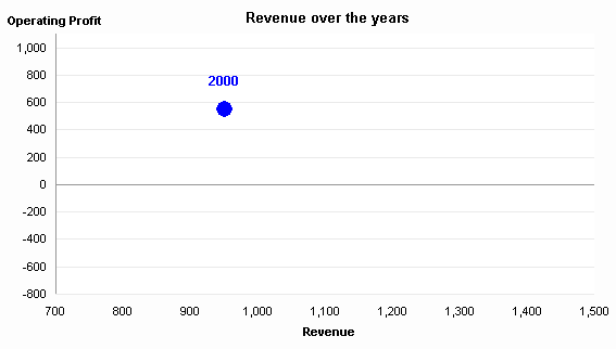
Here is Wiebe’s simple data, followed by his chart, which I’ve adjusted a bit.


Move a scroll bar to display the point for a particular year. Click a Play button to show each year in sequence.
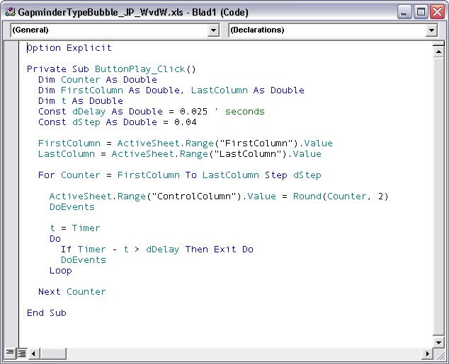
Wiebe’s animation was very simple, jumping from one year to the next in a very irregular fashion, but it had the right idea. To smooth the animation, I introduced an interpolation routine so the transition from year to year took a series of steps in between individual data points. Here is the current state of the animation program.

There is still a lot of room to improve this simple charting animation. There is already a scrollbar and a Play button. It would be easy to include additional controls as in my Gas Price animation, such as Pause, Reverse, Go To Start, Go To Finish. Other adjustments would include the ability to change the number of steps in the interpolation (smoothing) algorithm and to change the playback rate, preferably on the fly.
Download the Gapminder Type Bubble Chart workbook, try it out, and give me your comments. The code is unprotected, so you can see how it works. This is a very cool addition to Excel’s arsenal.
Update 9 December 2008
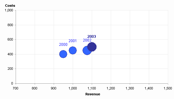
In response to Eric’s comment, I’ve put together a version of this file in which the moving bubble leaves a “breadcrumb” corresponding to the data point for each year. This new workbook is described in Gapminder For Excel II.


derek says
I was just thinking of Gapminder the other day, when you introduced your first animated bar chart! I definitely want to play with this when I get home.
Chandoo says
This is fantastic Jon, I was going to write about Gapminder sometime this week, but I guess I will just link to this and save the vba.. :D
I am sure this will help a lot of folks out there who would like to animate without any coding…
derek says
Sadly, this is one of the occasions when my normally-satisfactory Excel 97 just can’t handle modern VBA code. Maybe I’ll try it on the work machine later.
db says
Actually, this particular workbook doesn’t do it for me. Firstly, you can’t interpolate annual data points like this, and secondly, animation works best when you are comparing several points against each other, and when there is a striking trend which the animation uncovers with an element of surprise.
This data just bumps up and down, and when it’s finished, I challenge anyone to tell me what the figures or trends were without looking back at the table – in other words, it communicates badly, and animation is a bad choice for this data.
IMHO, this is therefore chart junk, and a boring old static chart communicates this data much better. (I still think Gapminder is outstanding, however).
Jon Peltier says
Dermot – This particular workbook shows a single series of rather arbitrary data. The intent was to demonstrate a technique from a fancy graphical package that can alse be applied to data in Excel. The interpolation, which is also used in Rosling’s presentation by the way, is merely to smooth out the animation.
Derek – Excel 2000 is generally considered to be the least-common-denominator version of Excel. That release introduced a then-new version of VBA and incorporated a number of other changes to core Excel capabilities.
derek says
I know, I’m not complaining.
Stéphane Nolf says
Hi Jon,
First of all I have to say that I am definitively a fan of your work and I really reading you since about 2 months. Good job!
I had a small question regarding the presentation that supported the topic. During his show Hans Rosling used several time logarithmic scales. I know the option exists and is easy to use in Excel but what would be the correct use of it ? When do you think it is relevant to use such a scale in comparison with a linear scale ?
My first impresssion on some of the charts displayed by Hans Rosling was that something was wrong with scale and that “false” linearity was shown. It reminds me the chart that do not start at 0 but only show e.g. percentage between 80% and 100% and therefore exagerate the variation.
What do you think ?
Thanks !
Jon Peltier says
A linear axis has the same spacing between values along its length, so that the same absolute change results in the same distance along an axis. For example, a change from 1000 to 2000 moves the marker as far as a change from 10,000 to 11,000.
A log scale expands the lower end of a scale and compresses the upper end. The result is that an equal relative change produces an equal distance along an axis. For example, a change from 1000 to 1100 moves the marker as far as a change from 10,000 to 11,000.
The log scale is often used where percentage changes are more important than absolute changes, such as pricing (stock pricing especially) and population studies.
Sarah says
I’m excited to see this–a while ago I created a Gapminder-type animated chart at the request of my boss, but it looks like you’ve implemented a couple of the features that I left out (interpolation to smooth the animation, a slider to change years, and changing bubble size). I look forward to trying them out. In my version, I added the option to trace the paths of some data points through time–easy enough to do, but in case you’re interested: [link not available].
Jon Peltier says
Thanks Sarah, I’ll have to check that out. (I’ve fixed your link.)
Eric says
Wonderful code. so simple and so clever.
I adopted it.
One thing is missing for me… the possibility to keep track of the way the bubble is moving… like a footprint.
any idea of how we can spot on the graph each interpolations (i mean not each but the main ones…)
Jon Peltier says
Eric –
Great idea. Stay tuned this week for a new post named Gapminder For Excel II.
Note: the post will be at that link in a couple days. I need to finish it up nicely.
Tyler says
Hi Jon. The link for Gapminder for Excel II doesn’t seem to be working.
Jon Peltier says
Tyler –
Thanks for the report. Sometimes my htaccess file is rewritten and the older permalinks are incorrectly resolved. I suspect it’s my host doing it. They’re ultra restrictive on what they allow me to do.
Walter Jacques says
Jon, nice work! I’ve wondered if the Gapminder software effects could be duplicated in Excel, and I thank you for showing that it can. The interpolation for smooting is brilliant! I looked at the chart and couldn’t figure out how you directly specified the data range for the chart, though. Also, I’d like to plot data for several states, which are in turn divided into ten different regions (so the regions would have different colored bubbles). Where in the data set would you accommodate for the different regions to discern between the bubble colors?
Thanks!
Walter
Patrick says
Hi there,
Thank you for your article. I am sorry but how do I make it play? I turned on VBA and macros…? I can manually move the slider, but don’t know how to push the button.
Jon Peltier says
Patrick –
I just downloaded the file, enabled content (macros) while opening the file, and clicked the big Play button, and the program operated the chart as described.
Stefan Selby says
It is interesting to see how you did your motion charts. I found an example somewhere else similar to yours and worked around it to create an app
It does more than just bubble charts, I have got trails on the bubble charts too!. I have done the same for most excel charts and a speedometer chart. It is shared with the world have a look at:
https://googledrive.com/host/0B0Ms4sM4a2RoSW9YYmkxbVlMc2M/vbamotioncharts.html