Gantt charts are a special kind of bar chart used in scheduling and program management. A set of tasks or activities is listed along the left hand axis, and the bottom axis shows dates. Horizontal bars indicate when each task begins and ends, and which tasks are in progress at any given time. The simplest kind of Excel Gantt chart involves a worksheet range, with the tasks listed in the first column, and dates (for example, week beginning or ending dates) in the top row. If a date along the top falls between the start and end dates for that task, the cell in the same row as the task is shaded a different color.
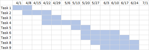
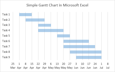
It is not too difficult to create a regular bar chart showing this same amount of detail.
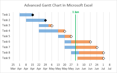
And once you’ve decided to make a chart, you can add more advanced embellishments to show more details.
This tutorial will show you how to make all types of Gantt chart in Microsoft Excel.
Simple Gantt Charts in the Excel Worksheet
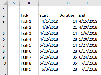
Let’s start with this simple Gantt chart data. Listed are tasks, beginning and ending dates, and duration. For this simple chart, we don’t even need the duration column.
We can expand the range to the right, with weekly dates in the top row of the added columns.

We can fill the cells in manually, of course, but it’s nice to set up conditional formatting so the colors update whenever the beginning or ending dates change. For each cell, the formula checks whether the date at the top of the column is greater than or equal to (on or after) the starting date and less than (before) the ending date for that row. If so, then the cell is formatted as shown.
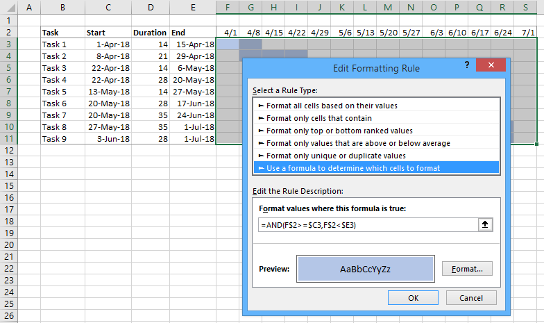
The result is a quick little graphic, easily done right in the worksheet, so the Gantt chart timelines line up with the task rows.

It’s not fancy, but sometimes all you need is something quick.
Simple Excel Gantt Charts
To make a Gantt chart from an Excel bar chart, we can start with the following simple data: Task, Start Date, End Date, and Duration.
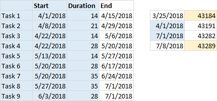
Since dates and duration are interrelated, usually Start is entered, and either End or Duration. If Start and Duration are entered, End is calculated as =Start+Duration. If Start and End are entered, Duration is calculated as =End-Start.
The small range to the right will come in handy when fixing our date axis limits in the bar chart. The upper blue-shaded cell contains a formula that returns the minimum of the Start Dates, and the cell above this is seven days earlier. The lower blue-shaded cell has a formula that returns the maximum of the End Dates, and the cell below that is seven days later. The second column shows these dates in General number format, so we see just the serial number of the date (the number of days since 1/1/1900); we will use the yellow shaded cells as the limits of the chart’s date axis.
Before we make the chart, we should apply a special number format to the Start Dates so they fit closer along the axis. Select the dates, click Ctrl+1 to format them, and on the Number tab, choose Custom, and in the Type box, enter d (for day), type Ctrl+J to enter a line feed right in the format, then enter mmm (for three letter month abbreviation) and press Enter. This produces two-line dates with the day number on the first line and the month abbreviation on the second. We can change this back later, but it’s easier to create this format in the worksheet than to try to achieve it in the chart. Also, clear the top left cell, so Excel plots the data the way we need it plotted.
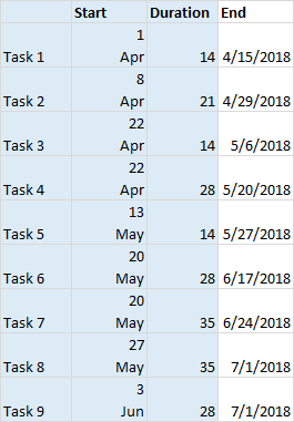
To create the simple Gantt chart, we start by selecting the columns with Task, Start Date, and Duration, and inserting a stacked bar chart. Notice the date format which was taken from the worksheet range.
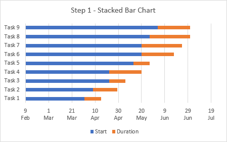
The tasks are listed in the opposite order, so we need to format the vertical axis (select it and press Ctrl+1 or simply double click on it). Check ‘Categories in Reverse Order’ and ‘Horizontal Axis Crosses at Maximum Category’ to correct this. See Why Are My Excel Bar Chart Categories Backwards? and Excel Plotted My Bar Chart Upside-Down to read all about it.
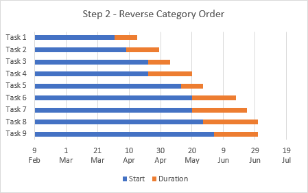
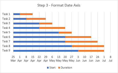
Now we need to format the date axis, so select the axis and press Ctrl+1. Change the minimum and maximum to 43184 and 43289 (from the special range we set up beside the main data range), and set the major unit to 7. Under Number, uncheck ‘Linked to Source’, and then you can reset the date formats in the data range.
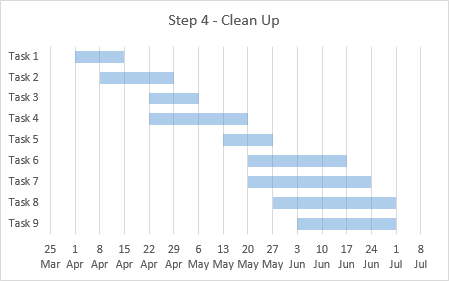
Finally, a little clean-up. Format the Start bars to have no fill color, and give the Duration bars an appropriate fill. I like to use 25 or 50% transparency, so the fill isn’t overpoweringly dark and so the gridlines show through. Also, delete the legend.
That wasn’t too hard now, was it?
Advanced Excel Gantt Charts
Now that we know how to make a Gantt chart with a regular Excel chart, we can think of ways to enhance it. How about duration bars that show the fraction complete? How about milestone markers coded to show finished and unfinished tasks? And maybe a vertical line to indicate a date of interest?
The data range is a bit more complicated. The user enters Start Date, % Complete, and either Duration or End Date. % Complete could also be computed from the Start Date, End Date, and the date of interest (indicated in the block labeled “Vertical”).
If the user enters Duration, the End Date formula in G3 is =C3+F3.
If the user enters End Date, the Duration formula in F3 is =G3-C3.
Duration is split into Done and Not Done components with two simple formulas.
The formula in D3 is =K3*F3.
The formula in E3 is =(1-K3)*F3.
The Milestones formula in J3 is =(ROW()-ROW(J$2)-0.5)/ROWS(J$3:J$11), which provides the milestone series with a vertical position to align with the bars.
The Finished milestones formula in H3 is =IF(K3=1,J3,NA()).
The Unfinished milestones formula in I3 is =IF(K3<1,J3,NA()).
All of these formulas are copied down to row 11.
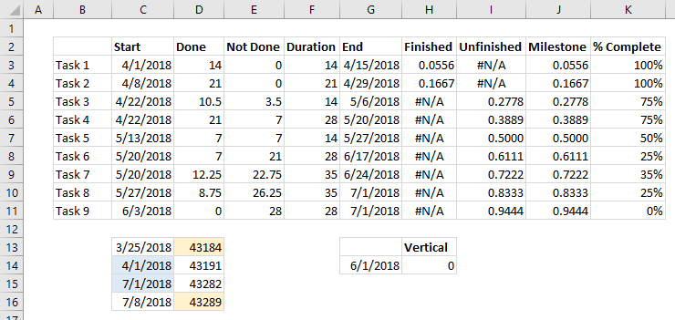
The block to the left below the main table will help with setting the date axis scale later.
Cell C14 has the formula =MIN(C3:C11).
Cell C15 has the formula =MAX(G3:G11).
Cell C13 has the formula =C14-7.
Cell C16 has the formula =C15+7.
Cells D13 through D16 link to C13 through C16, but are formatted as General to show the serial number of the date.
The date listed next to ‘Vertical’ is where we will draw a vertical line indicating our interest in that date. Before we insert our chart, let’s apply a temporary special number format to the Start Dates in C3:C11. Select the range, click Ctrl+1 to format the cells, and on the Number tab, choose Custom, and in the Type box, enter d (for day), type Ctrl+J to enter a line feed right in the format, then enter mmm (for three-letter month abbreviation), and press Enter. We will change this back later, but it’s easier to create this in the worksheet than to try to achieve it in the chart. Note also that cell B2 has been cleared, to help Excel understand how to plot the data.
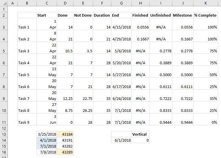
The chart starts out pretty much like the simple Gantt chart above. Select the first four columns containing data for Tasks, Start Date, Done, and Not Done, and insert a stacked bar chart.
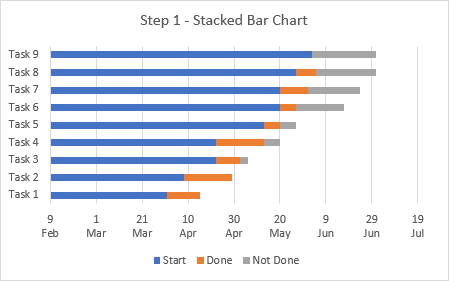
Format the vertical axis (select it and press Ctrl+1 or simply double click on it). Check ‘Categories in Reverse Order’ and ‘Horizontal Axis Crosses at Maximum Category’ to put the tasks in the order we want.
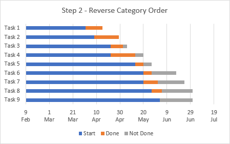
Now change the time scale on the horizontal axis. Change the minimum and maximum to 43184 and 43289 (from C13 and C16 in the special range we set up below the main data range), and set the major unit to 7. Under Number, uncheck ‘Linked to Source’, and then you can reset the date formats in the data range.
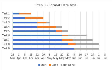
Now we can format the bars. I’ve made the Start series invisible by using no fill color; I’ve colored the Done bars blue and the Not Done bars orange, with 25% transparency on each so the gridlines appear through them.
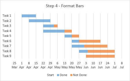
At this point, we depart from the procedure for a simple Excel Gantt chart, by adding the Milestone data. Select and copy G2:I11 (End Date, Finished, and Unfinished), select the chart, and use Paste Special from the Paste dropdown on the Home tab of the ribbon, and add the data as new series, with series in columns, category labels in first column, and series names in first row. The data is added as new bars stacked on the Done and Not Done bars.
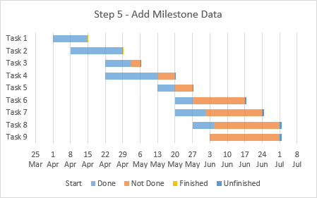
Right-click on any series in the chart, and choose Change Series Chart Type from the pop-up menu. Change Finished and Unfinished to XY Scatter. Excel automatically assigns them to the secondary axis group and adds a secondary vertical axis.
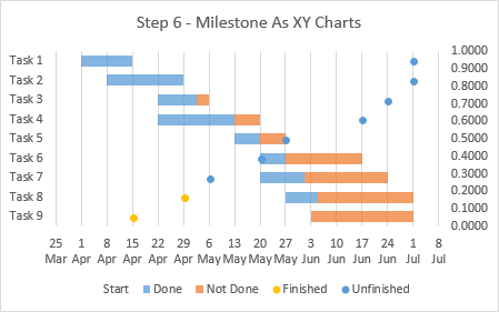
We need to switch the new axis: select it and press Ctrl+1, and check ‘Values in Reverse Order’. We also need to lock the axis min and max to 0 and 1. Under Axis Options, the Minimum box shows 0.0, and the Maximum box shows 1.0. Change these to 0 and 1, which does not change the chart, but the Auto label next to each box changes to Reset.
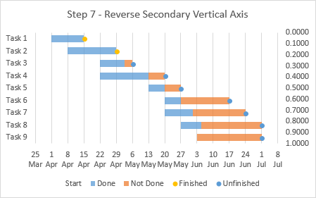
Now we can hide the secondary vertical axis (the one we just reversed). While formatting it, under Labels, change Label Position to None.
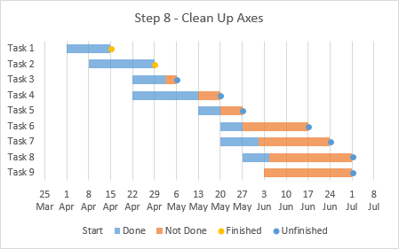
Now let’s format those milestones. I’ve used black-bordered diamonds for both, with black fill for Finished and white fill for Unfinished.
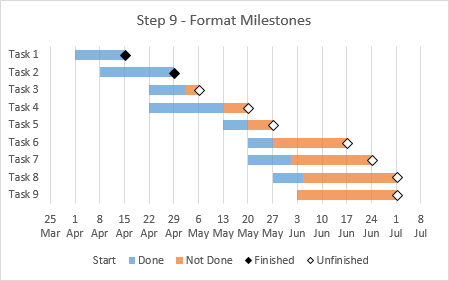
Now let’s add the data for the vertical reference date line. Select and copy G13:H14 (which includes the “Vertical” label), select the chart, and use Paste Special from the Paste dropdown on the Home tab of the ribbon, to add the data as a new series, with series in columns, category labels in first column, and series names in first row. The data is added as a new single point along the top of the chart.
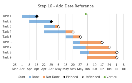
Select this new point, and choose Error Bars from the menu you get when you click the plus icon floating beside the chart. Microsoft calls these little icons “Skittles”.
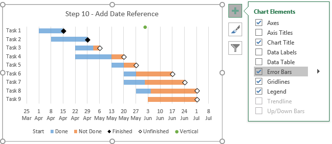
You might not even see them, but the point now has vertical and horizontal error bars. Selecting them is a bit of a challenge: you can right-click on the chart, and click the Chart Element dropdown to see all of the chart elements.
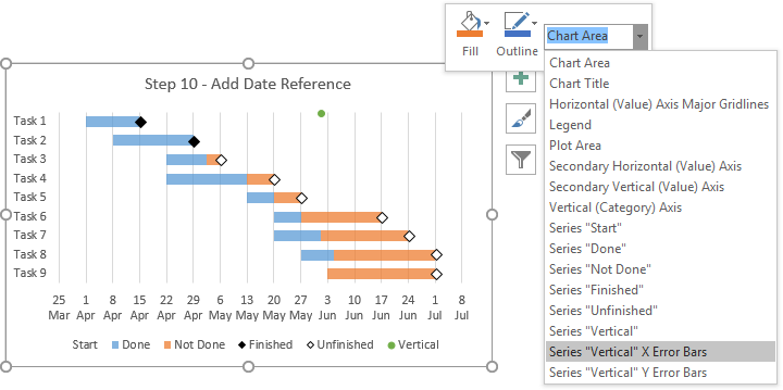
Or you can click the Current Selection dropdown at the top left corner of the Chart Tools > Format tab of the ribbon. Select the ‘Series “Vertical” X Error Bars’, and press the Delete key. Then select the ‘Series “Vertical” Y Error Bars’, and press Ctrl+1 to format them. Select Plus (the bar will point downward, but we just reversed the order of the axis, remember?), No Cap, and assign it a Fixed Value of 1. Then format the line color (I used a green line). Select the Vertical data point again, and using the plus skittle, check Data Labels. Format the data label to show X value, not Y value, and assign a number format of “d mmm”. The space between day and month is fine, no need to try to insert that pesky linefeed.
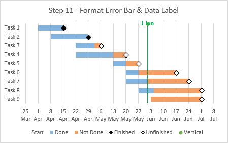
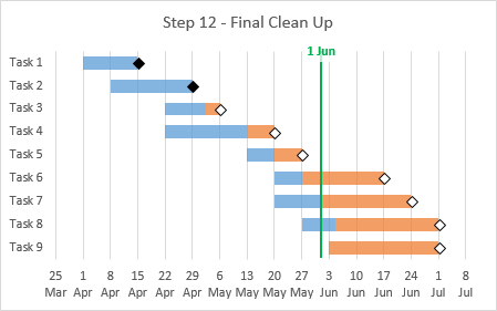
And now a little more clean-up. I made the error bar thicker, gave the “Vertical” data label (“1 Jun”) a white fill with 25% transparency, and formatted the Vertical to use no marker at all. I deleted the legend, because it’s no longer needed.
There are a few additional labeling embellishments you might use, shown below. I’ve hidden the task labels on the vertical axis (change Label Position to None), and added data labels to the invisible Start Date bar chart series. I am using the Category Name option instead of Value, and the Inside End Label Position. This puts the task names to the left of the visible floating bars. Then I added data labels to the Finished and Unfinished markers. In both cases, I changed to the Value from Cells option, using the % Complete values in K3:K11.
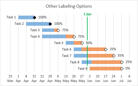
I’ve given all of these labels a white fill background with 25% transparency.


Josh says
Very classy and effective!
Quick note: you said “The formula in E3 is =(1-F3)*K3”
Should it be =(1-K3)*F3 ?
Jon Peltier says
Josh –
That’s right, and I just corrected it. Thanks.
Megan says
How exactly did you do this;
Then I added data labels to the Finished and Unfinished markers. In both cases, I changed to the Value from Cells option, using the % Complete values in K3:K11.
Hermien Oberholzer says
I followed your step by step instruction – thank you very good. However, when I get to the step “Select Plus (the bar will point downward, but we just reversed the order of the axis, remember?), No Cap, and assign it a Fixed Value of 1.” I start to struggle.
If I add the value of 1, all my “finish/unfinish” markers move away from their bars.
Jon Peltier says
Hermien –
I left out a step in the instructions. When you change the direction of the secondary vertical axis, you also need to adjust the axis scale. Here is the sentence I’ve added to this part of the instructions:
We also need to lock the axis min and max to 0 and 1. Under Axis Options, the Minimum box shows 0.0, and the Maximum box shows 1.0. Change these to 0 and 1, which does not change the chart, but the Auto label next to each box changes to Reset.
Hermien Oberholzer says
Thanks Jon – you are doing amazing things with Excel and your blogs are very good.
Netty says
Hi Jon,
Thank you so much for this – it makes an excellent chart.
I need advice on making it slightly more autonomous. I have made this as a standard template for others to fill in but the one thing that I cannot make automatic is the formatting of the x axis so that it starts on whatever their start date is.
I know in your guide, you just type in the date in its general format but is there a way that it can pick up this number automatically? I.e. if someone’s start date is 1st Jan then the minimum axis starts at 43101 but if their first task actually starts 1st Oct, this automatically changes the minimum to 43374.
Any ideas?
Thanks!
Jon Peltier says
Netty –
This isn’t something that’s easy to do. I have an idea or two to try out, but I seem to remember trying this in the past with no joy.
Netty says
Hi Jon,
Thanks for your reply. This is very annoying. I don’t know how to make it easier for non technical people!
If you do have any ideas, please do let me know.
Thanks!
Jose Higuita says
Hi Jon,
What formula did you use to work out the %complete?
Regards,
Jose
Jon Peltier says
Jose –
% Complete is a parameter entered in this case by the user, who would estimate progress. I used arbitrary values as examples.
In a more detailed analysis, there may be tracking of progress against the milestones, which would mean formulas formulas would have to be determined.
Camille says
Hi John – great article! Super helpful.
One thought – if you want to create Gantt charts and project timelines in PowerPoint, it’s actually super hard. Especially if you want to be able to update them easily.
If any of your audience members want to learn how to do that, they can check out this step-by-step blog post: https://nutsandboltsspeedtraining.com/powerpoint-tutorials/how-to-make-a-gantt-chart-in-powerpoint/
Cheers!
Jon Peltier says
Interesting approach, using SmartArt as an intermediate step to turn an Excel list into a set at shapes and labels. But then you’re stuck having to drag and align these shapes manually. And maintaining the collection of shapes sounds like a nightmare.
Why not build the chart in Excel, then copy and paste it into PowerPoint? Format it all you want, and it’s still linked to the data if you need to make adjustments.
Thom Mitchell says
Thank you, Jon! I had a very nerdy application for this technique!
Jesse Blattstein says
Jon,
Absolutely phenomenal series! Breaks it down beautifully…
I have a question … I want to graph two hockey players … from two opposing teams that faced each other in a game. The goal is to chart their start times and duration, and they go on the ice in shifts.
So, for example, player 1 during his first shift, enters the ice at :55 (which means 55 seconds have elapsed in the game) and stays on for 1:26 (a minute and 26 seconds) …
Player A of the opposing team jumps on the ice at :57 (after 57 seconds have elapsed) and stays on for a minute and 45 seconds (1:45) …
My goals is to see which players have start times and durations that overlap the most. Is this possible to do with 2 sets of data values in Gantt? How would this be done?
Much thanks again.
alberto kusmic says
Outstanding job, very clear step-by-step instructions.
Thank you so much!
Michele says
Hi John,
I found your article by accident and it was a revelation. Thank you so much.
Do you know why once I changed Finished and Unfinished to XY Scatter, Excel automatically assigns them to the secondary axis group and adds a secondary vertical axis but not aligned with the previous bars.
Thank you so much for your answer
Jon Peltier says
Michele –
If you have a bar chart, Excel cannot plot other chart types on the same axes as the bar data. So Excel automatically assigns the other data to the secondary axes, and we just have to make it work.
Are your points not aligned vertically? That’s why I use Y values from 0 to 1, set the secondary vertical axis scale of 0 to 1, and plot that axis in reverse order.
Are your points not aligned horizontally? As long as both the bars and the XY points use valid dates, they should work on the bar chart’s horizontal axis. If Excel also provided a secondary horizontal axis, you may delete it.
Michele says
Hi Jon,
thank you very much for your prompt reply. Sorry, I’m getting crazy because I followed your step by step but when I change the chart to XY points, all my finish and unfinished markers move away from their bars. Vertically they would be ok, but starting from the task n°5 they remain in higher position respect the bar even if I adapted the scale from 0 to 1 in the secondary axe. I would like to show you a picture of that.
Thanks a lot.
Michele
Mark Rosenkrantz says
Hi Jon;
This is a well documented example of creating Gantt Charts which I was trying to make more dynamic using the Excel Table functionality. In essence to add a variable amount of tasks to the chart without having to format and update my formulas and chart!
Sadly, this includes (according to this example) adding a field name in cell B2, which leads to a totally different chart!
Is there a work around, or option (which I might have missed) to overcome this?
Would like to hear from you!
Jon Peltier says
Mark –
If having a label in cell B2 messes up the chart, select all of the needed columns except column B when you create the chart, then use Select Data to add the appropriate X values to the chart.
Ollie H says
I realize it has been a while since this post was last commented on, but I wanted to thank you for the tutorial and pose a question.
I have a similar dataset and all steps work great until I get to the point of inserting the “End Date,” “Finished,” and “Unfinished” columns. I have searched all over the web for a solution, but the XY series for Finished and Unfinished just do not appear when I paste them in or manually add the series. The series are plotted against a secondary axis, and the secondary axis is present, but the actual data points do not appear on the chart. I have tried with values in the X-axis labels if the Category text is throwing it off, but to no avail. Any help?
Thanks!
Jon Peltier says
Ollie –
When pasted, these series are stacked bars like Done and Not Done, but their lengths are fractions less than one, and the lengths of the other bars are days or weeks in the example and perhaps months and years in yours. The bars of the new series might be too narrow to see.
Are the pasted series added to the legend? When you right click on one series and choose Change Series Chart Type, are they listed in the dialog? If so, then just proceed with the protocol, change them to XY Scatter series, and format the markers.
Sometimes XY series are plotted without lines or markers; they are present, but not visible. However, you can cycle through the series in a chart by selecting one that you can see, then hold Ctrl while pressing the up and down arrow keys. You will see the points highlighted even if they have no marker. Press Ctrl+1 to format the highlighted series.
Sandy J says
Hi Jon,
I’m using Excel 365 and have used your instructions successfully before, but for some reason, I’m now having the same trouble Ollie H had. When I add Finished and Unfinished to the stacked bars, they’re visible at the ends of my other bars. But as soon as I change them to the XY Scatter, they disappear. The series are both in the legend and in the list of options to choose from in the formatting dialog on the right side. The marker formatting options are all enabled and can be changed – the fills are solid colors, and I’ve tried setting the marker size to 40 and expanding the chart and plot areas ridiculously large just in case they were too small to see. I’ve also tried removing both series through the “Select Data” dialog box and adding them again. When I select another series in the chart and cycle through the elements using Ctrl-arrow as you suggested, I can see in the formula bar when it gets to the Finished and Unfinished series – but nothing is selected in the chart. I can see other elements selected as I cycle through, but not those two. It’s like they’re hidden somewhere. I’m thoroughly stumped and hoping you can help!
Jon Peltier says
Sandy –
This is tricky to troubleshoot. If you see the series names in the legend after pasting, and if you see the new bars stacked on the end of the existing bars, then the series are in the chart. When you change to XY Scatter chart type, make sure that Excel plots the series on the secondary Y-axis (it should happen by default). To select the series now, you need to select a visible series, then use Ctrl+Arrow Keys to cycle through all series. You should stop cycling when you see the appropriate series formula in the formula bar, even if nothing appears to be selected in the chart. At this point, click Ctrl+1, and assign a marker type and colors.
Fernando Gomez says
Hello Jon, thank you for this amazing tool.
Is there a way to include delays and variations of the start/finish dates? Ideally, the chart should show the planned schedule versus the actual during and after execution of the tasks. This update would make it perfect for applications in real life.
Thanks
Jon Peltier says
Fernando –
Unfortunately that is a totally new level of complexity that I am not equipped to handle. Does MS Project even do that?
Fernando Gomez says
Jon,
Sorry, I think it is more simple than what I explained above. I think we could get it done by assuming what we have done in the excel so far is the actual and we only add extra bars overlayed indicating what the planned start and finish were for each task. These new bars must be independent from the actual stacked bars so that they dont get modified by changes in the actual performance. Hope it makes sense.
My excel knowledge is not enough to implement this idea.
Jon Peltier says
Fernando –
It’s still adding complexity. How should the planned and actual bars be displayed relative to each other: as parallel floating bars offset in the vertical direction, as foreground and background bars? Some choices make it more difficult to add milestone markers, reference lines, and labels.
Soumi says
Very helpful!
Thank you!!
Michiel Soede says
Jon, thanks for this post, you’re a real chart wizard! Regards, Michiel
leia says
Hi Jon! This is awesome. I’m just completely lost on how you came up with the milestone formula. Is there a post you’ve done in the past you can link?
Jon Peltier says
Leia –
I assume you mean the formula for the milestone height. Below I’ve reproduced one of the charts above. The secondary vertical axis (green line and labels) is the Y-axis for the milestone data points. It is scaled from 0 to 1, in reverse order (0 at the top, 1 at the bottom). Each task and milestone are in their own lane of the chart, there are nine lanes, so each lane is 1/9 of the total height of the chart. Lane 1 is from 0 to 0.1111, Lane 2 from 0.1111 to 0.2222, etc. Each marker is in the middle of its lane, so the Task 1 milestone is midway from 0 to 0.1111, or 0.0556; Task 2 is midway from 0.1111 and 0.2222, or 0.1667.
I need to calculate Task Number, which is Row()-Row(J$2). For Task 1, in the third row, this equals 3 minus 2 or 1. For Task 2, in the fourth row, this equals 4 minus 2 or 2.
I need to subtract 1/2 from this to bring the point into the middle of the lane.
And I need to divide this by the number of lanes, or the number of rows, which is ROWS(J$3:J$11), or 9.
So the formula in J3 is
=(ROW()-ROW(J$2)-0.5)/ROWS(J$3:J$11)