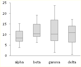
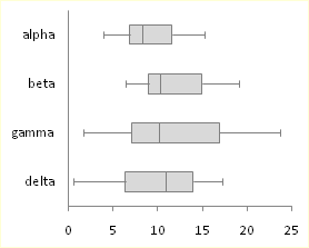
Box and Whisker Charts (Box Plots) are commonly used in the display of statistical analyses. In 2016 Microsoft Excel added a box and whisker chart, but it is not very flexible, and some of the expected formatting options for charts are not available. But you can create your own fully-features Box and Whisker charts, using stacked bar or column charts and error bars. This tutorial shows how to make box plots, in vertical or horizontal orientations, in all modern versions of Excel.
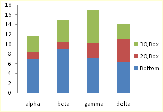
In its simplest form, the box and whisker diagram has a box showing the range from first to third quartiles, and the median divides this large box, the “interquartile range”, into two boxes, for the second and third quartiles. The whiskers span the first quartile, from the second quartile box down to the minimum, and the fourth quartile, from the third quartile box up to the maximum.
These techniques for creating box plots are complicated, and they can get long and boring, and this resulting tedium can lead to errors. Peltier Tech Charts for Excel creates waterfall charts and many other charts not built into Excel, at the push of a button.
Sample Data and Calculations
To play along at home in Excel 2007 or 2010, download the workbook Excel_2007_Box_Plot_Workbook.xlsx.
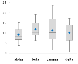
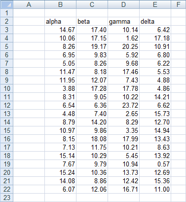
Let’s use the following simple data set for our tutorial. The values were taken from a normally distributed population with a mean of 10 and standard deviation of 5. There are four sets of 20 values.
All of these values are positive. If your data set has mixed positive and negative values, this technique requires major modifications.
First, insert a bunch of blank rows, and set up a range for calculations. Only the horizontal version of the box plot uses the last calculated row, “Offset”. It will not hurt to include it in the vertical box plot’s calculations.
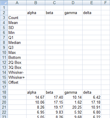
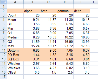
First, compute some simple statistics, such as the count, mean, and standard deviation. The formulas used in column B are shown in column G of the screen shot.

Now let’s compute the minimum and maximum, median, and first and third quartiles.

Finally, let’s determine which values we need to plot. Our chart has a box for the second quartile, which shows the difference between median and first quartile calculated above. It has a box for third quartile, which show the difference between the third quartile calculation and the median. The bottom of the lower box rests on the first calculated quartile. The down whisker is as long as the first quartile minus the minimum, and the up whisker is as long as the maximum minus the third quartile.
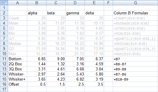
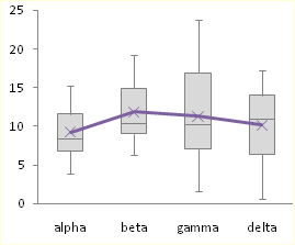
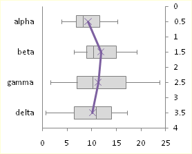
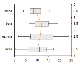
The offset values are calculated as follows: In my example, I have four categories, Alpha through Delta. I can divide my horizontal chart into four horizontal strips, numbered from 0 to 4, each containing one box-and-whisker unit. I need to position my average points in the middle of each 1-unit horizontal strip. These will ultimately go onto a secondary vertical axis which I will have conveniently scaled from 0 to 4. Hence the Y values I will need are 0.5, 1.5, 2.5, and 3.5.
Chart Construction
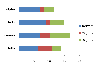
Select the header row of the calculated data, then hold Ctrl while selecting the three rows that include Bottom, 2Q Box, and 3Q Box. This multiple-area range is highlighted in orange below.
With this range selected, insert a stacked column chart or a stacked bar chart. Be sure to use the stacked version, and not the 100% stacked version, of the column or bar chart.
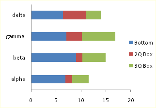
The labels in the bar chart go bottom-to-top. To reverse the labels, select the vertical axis, press Ctrl-1 (numeral one) to open the Format Axis dialog, then check the “Categories in Reverse Order” box, then under “Horizontal Axis Crosses”, select “At maximum category”.
To add the down whisker, select the Bottom series, then in the Chart Tools > Layout tab, click Error Bars, and select More Error Bar Options from the bottom of the menu. Choose the Minus direction, select Custom for Error Amount, and click on Specify Value. Leave the contents of the Positive Error Value box alone (“={1}”) in the mini dialog that appears, then clear the Negative Error Value box and select the Whisker- row from the table (B14:E14). Click OK and Close to get back to Excel. These “down” error bars (whiskers) extend from the bottom (left) edge of the 2Q Box downward (leftward) into the Bottom series.
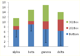
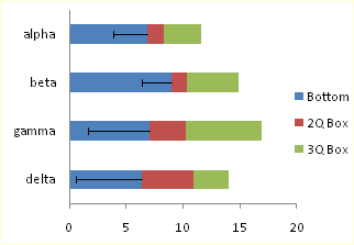
To add the up whisker, select the 3Q Box series,then in the Chart Tools > Layout tab, click Error Bars, and select More Error Bar Options from the bottom of the menu. Choose the Plus direction, select Custom for Error Amount, and click on Specify Value. Leave the contents of the Negative Error Value box alone (“={1}”) in the mini dialog that appears, then clear the Positive Error Value box and select the Whisker+ row from the table (B15:E15). Click OK and Close to get back to Excel.
These “up” error bars (whiskers) extend upward (rightward) from the top (right) of the 3Q Box.
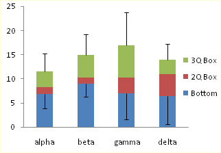
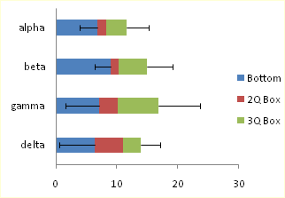
Now we can format the boxes. Select the Bottom series, and apply no fill and no border, so it is hidden. Then select each of the 2Q Box and 3Q Box series, and apply a dark border and a light fill.
Adding the Mean
To add the mean as a series of markers, select the Mean row in the calculated range (highlighted in blue). If you are making a horizontal box plot, hold Ctrl and also select the Offset row (highlighted in green), so both areas are selected. Copy the selected range.

Select the chart, and use Paste Special to add the data as a new series. If you are making a horizontal box and whisker diagram, check the “Category (X Labels) in First Row” box. The “Series Names in First Column” box should already be checked.
The new series is added as another column or bar stacked on top of the existing ones.

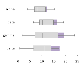
Select this new series, then on the Chart Tools > Design tab, click on Change Chart Type. If you are making a vertical box plot, choose a Line Chart style. If you are making a horizontal box plot, choose an XY Scatter style.

The points in the horizontal box plot are in reverse order. To change the order of points, select the secondary vertical axis (right edge of the chart), press Ctrl-1 (numeral one) to open the Format Axis dialog, then check the “Values in Reverse Order” box.
If you’re making a horizontal box plot in Excel 2003, this last process is a little more involved. Excel draws both secondary axes, but the vertical one is hidden behind the primary axis with the text labels (below left). Double click on the secondary horizontal axis (top of chart), and on the scale tab of the Format Axis dialog, check “Value (Y) Axis Crosses at Maximum Value” (below right).
Excel 2003, continued: Double click the secondary vertical axis (right of chart), and on the scale tab, check “Values in Reverse Order” and uncheck “Value (X) Axis Crosses at Maximum Value” (below left). Finally, select the secondary horizontal axis (top) and click Delete; Excel will now plot the XY series on the primary horizontal axis.

All Versions: Now format the mean series: remove the line, and use an appropriate marker of a contrasting color. If you’ve made a horizontal box plot, hide the secondary Y axis (right edge of the chart) by choosing no tick marks, no tick labels, and no line in the Format Axis dialog.
That was easy and didn’t take too long.
Box and Whisker Charts in Peltier Tech Charts for Excel

This tutorial shows how to create Box and Whisker Charts (Box Plots), including the specialized data layout needed, and the detailed combination of chart series and chart types required. This manual process takes time, is prone to error, and becomes tedious.
I have created Peltier Tech Charts for Excel to create Box Plots (and many other custom charts) automatically from raw data. This utility, a standard Excel add-in, lays out data in the required layout, then constructs a chart with the right combination of chart types.
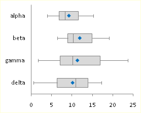
The utility creates vertical Box Plots …
… horizontal Box Plots …
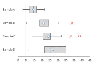
… and Grouped Box Plots …
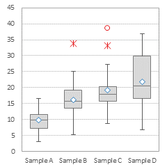
Outliers can be shown or hidden, and a number of quartile definition options are available.
This is a commercial product, tested on thousands of machines in a wide variety of configurations, Windows and Mac, which saves time and aggravation.
Please visit the Peltier Tech Charts for Excel page for more information.

Tamoghna Acharyya says
Hi Jon!!
Thanks for the post. I am a big fan of you.
M Amjad says
how we can move secondary Y axis in bottom direction, like for common x-axis, one Y-axis in upward direction and other Y-axis in downward direction.
Jon Peltier says
I’m not sure what you’re doing with the axes. Why do you want two axes, and what are they showing?
robert a says
I have been enjoying the PTS Box and Whisker in Excel 2003 for the past two years. I now have Excel 2010 … how do I add this in? I have tried to reinstall from the zip file.
robert a says
Actually, after reinstalling it now shows up under Add-Ins.
Wangari Gichiru says
Thank you so much for this information. This is VERY helpful.
David says
i want to draw a graph of one dependent variable having two categories and one continuous independent variable, what is the appropriate graph?
Jon Peltier says
David –
Seems to me you want an XY (Scatter) Chart.
Dorina says
Perfect! Exactly what i was looking for! Thanks a lot!
Eva Van De Water says
Thanks a million!
Franziska Lindner says
I can draw a horizontal boxplot and get the outliers marked as points (using xy scatter plot). However, the outliers are not in line with the actual boxplot (but above the boxplot if I use y>0 and below, if I use y=0). How can I make the outliers “lie on the same axis” as the boxplot.
Thank you so much.
Regards
Franziska
Jon Peltier says
Franziska –
Did you line them up using the same approach I used to align the average markers in this example? The X values need to be the outlier value, and the Y values use the offset values 0.5, 1.5, 2.5, etc. as shown in the last table above.
Franziska Lindner says
This is so freaky, suddenly it’s working. Thank you so much – I don’t know how you did it, but it seems you persuaded my Excel to be obedient. Thank you :-)
Jon Peltier says
Franziska –
Ha, I wish I had that kind of control over MY Excel!
Brad says
Can these box plots identify outliers i.e., the asteris beyound the wiskers?
Jon Peltier says
Brad –
Outliers can be displayed on charts such as these, but you need to add more data series, and adjust the lengths of the whiskers to indicate not min and max data, but data closest to the definition of outlier without being outliers.
The ability to display outliers is built into the Peltier Tech Box and Whisker Chart Utility.
Jhiel says
Dear Jon,
Thanks for this post, I was able to build a box and whisker plot from scratch because of you. I need some tweaking however, hope you can still be of help. I need to show the position of outliers (any values outside the USL / LSL) in the graph also. How it can be done?
thanks,
Jhiel
Jon Peltier says
Jhiel –
First, you have to redefine the length of the whiskers. If you are dealing with outliers, the whisker goes as far as the farthest point which is not an outlier. Near outliers are more than 1.5 interquartile ranges (third quartile minus first quartile) outside the first and third quartiles. Far outliers are more than 3 interquartile ranges outside the quartiles.
Then you need to set up your outlier data. Put the category for each outlier in column 1 of a convenient range (the first box is category 1, etc.), and put the value into column 2. Copy this range, select the chart, and use paste special to add this data as a new series. Convert this new series to an XY type, and then assign it to the primary axis (if Excel moved it to the secondary axis).
andy says
Very helpful, thanks.
A note: I made a vertical box and whisker chart but Excel kept “forgetting” the plus whisker value. I had to follow the instructions for the horizontal plot to trick Excel into remembering the plus whisker. BTW, how the heck did you ever figure out this workaround!? (and the eternal question: why is MS office so buggy?)
Appalanaidu says
Dear sir,
This is Naidu Ph.D student, before i do not no about Excel Box and Whisker Diagrams (Box Plots) how to draw this diagrams in Excel? why we are using?. But i typed this words in Google then i got your Pelteir tech blog. Then i learned about various charts like Box plot, cluster stock, Dot plot etc.
Thanking you very much giving this opportunity to all
mariam says
thank you so much, finally I did it!
best wishes
M
brad says
huge help. thanks a ton.
I have some borders on the box that are above and below 0. any work around for this? thanks
GP says
Want to make the plot horizontal, but Excel 2010 doesn’t have a “Categories in Reverse Order” box in the vertical axis “Format Axis” box, but only “Values in Reverse Order”. Any thoughts would be most appreciated.
Jon Peltier says
The setting is certainly there:
If you already have secondary axes in the chart, you may be trying to format the other vertical axis.
Kelly says
How do you calculate the offset?
Jon Peltier says
Kelly –
In my example, I have four categories, Alpha through Delta. If I scale my secondary vertical axis from 0 to 4, I need points in the middle of each 1-unit division. Hence 0.5, 1.5, 2.5, and 3.5.
brad says
can you please help find a solution to box values that are both above and below 0? here’s an example that is causing difficulty.
whisker- 7
1q box -11
mid box 6
3q box 5
whisker+ 9
Thanks a ton!
Melissa says
Hi,
Thanks for the great blog! I was wondering if there is any way of changing the width of the boxes to reflect different sample sizes per cateorgory?
Sheikh Ali Ahmed says
Hi,
Thank you very much for providing those utmost valuable information regarding different charts in Excel. I have drawn a box plot using your instruction. It was fun and interesting. But for my data set, I need to convert the box into standard deviation box. In which the mean value will be middle. And offcourse the whiskers range for upper and lower values would be as it is.
Please help.
Sheikh Ali Ahmed
Jon Peltier says
It is not advisable to use quantities other than quartiles for box plots. You risk distorting the interpretation of those who are familiar with the standard box plot construction, causing them to overestimate the variability in the plotted data (mean ± 1 sd includes 68% of a population, while the interquartile range includes 50% of the population). You also risk distorting the future use of box plots by those who are not yet familiar with them.
Youssef RAYADI says
Thinks a lot
I have one more question please: It’s about adding the mean in the Blox Plot
I dont know how to do it.
Gretchen says
Hello–Thanks so much for this tutorial, ecstatic that I’ve made three box plots from scratch! I was wondering, is there a way to make just two? (i.e. just the ‘alpha’ and ‘beta’ boxes in your example?) The tutorial doesn’t seem to work for this.
Jon Peltier says
Gretchen –
You don’t define what isn’t working, but I suspect it’s something like this.
When you first create a chart, Excel counts rows and columns in the source data range, and tries to minimize series and maximize points per series. You get the following chart, with two series and three categories:
Right click on the chart, select Select Data, and click the Switch Row/Column button, to get the proper starting chart:
From here, follow the steps to get your two-category box plot:
Anonymous says
Hi Thanks a lot for posting it. It is a lot helpful. However I am using excel 2007 and when I try to add whisker +, every error bar will have similar length of bar…I couldn’t know what went wrong there
Jon Peltier says
Did you do exactly this, which is the instruction for Excel 2007:
Choose the Plus direction, select Custom for Error Amount, and click on Specify Value. Delete the contents of the Negative Error Value box in the mini dialog that appears, then clear the Positive Error Value box and select the Whisker+ row from the table (B15:E15). Click OK and Close to get back to Excel.
dave says
This is fantastic right until I get to insertion of means. It works perfect in a vertical box plot. But in the horizontal plot, even when I click on xy scatter style, something is wrong. The line is on the wrong axis, somehow. Anyone else getting this bug (excel 2007)
Gretchen says
OH Thank you! It worked! Happy Holidays to you and your family…Gretchen
Cassy says
Hello!
Thanks so much for your tutorial, it really came in handy when constructing my charts! I do have a question though: Are the up and down whiskers equivalent to the min and max for the data sets? Are there box and whisker charts that use the min and max as the up and down whisker? Basically I’m just not sure how to interpret the up and down whiskers based on the quartile calculations you use to get them.
Thanks!
Cassy
Richees says
Thanks, very helpful
Kelly says
I have used this site several times, so I appreciate you posting it! I now have to do an analysis with positive and negative data, and this says that the method would require major modifications. Is there another page that discusses how to do that? I need to look at chemical sampling data (influent v/s effluent) through a system. Sometimes the system removes the chemical (positive percent removal) and sometimes it loads the chemical (negative percent removal). I need to find out if overall it achieves 85% removal. Any thoughts on that? Thanks!
Jon Peltier says
Kelly –
Scroll down to “Stacked Columns for Positive and Negative Data” in Excel Waterfall Charts (Bridge Charts), or visit the older tutorial at Stacked Column Charts that Cross the X Axis.
Meena says
Thank you for your easy to follow instructions. I want to put a line across each box and whisker plot for the mean series (instead of a dot). How do I do that? Thanks.
Jon Peltier says
Meena –
The simplest is to use the wide dash marker for the data points. Or if you don’t need the median, use mean for the boundary between the two boxes (but this might confuse people who are familiar with box plots, because box plots were designed to show median, not mean).
Meena says
Jon,
What is a wide dash marker? My boss wants me to put black dots for all of the data points on the box and whisker plot. He also wants me to put a single red line (in addition to the black median line) for the mean. I followed your instructions and plotted a dot for the mean and then drew a red line using “shapes” in excel before deleting the orginal dot. The problem is that the line drawn keeps moving. How can I make a line that doesn’t move (like the median line)? Thanks. -M
Jon Peltier says
Meena –
The long dash is the 7th marker in the dropdown list, right above the circle. You can enlarge it by changing the size, but it gets thicker as well as wider.
Another way to get a line that doesn’t move around is to draw a line as you’re doing now and format it (size, color, line thickness, etc.), copy the line, select the series, and paste (Ctrl+V). Then you can delete the line you drew. This pastes the line as a new custom marker for the series. This technique works for other shapes as well, but don’t get carried away.
Megan says
Hi John, thanks so much for your tutorial! I’m creating a horizontal plot and am having trouble adding the mean…I have eight categories (months) on my y axis and the range of my data on the x axis, and each time I try to add my mean series by selecting my months and then my offset data points (0.5 – 4), Excel plots all of my mean values for the month of May only (my first month). Do you happen to know what I might be doing wrong?
Thank you so much,
Megan
Lily says
How do I make only one axses. The examples show two.
Ping says
Hi Jon,
Thank for sharing your expertise knowledge with all of us! I learn a lot from your posts.
I need to generate the Box and Whisker Charts for more than one groups with four categories (like alpha, beta, gamma, and delta in the example here )for each. I am wondering if it is possible to differentiate the categories (like green for alpha in all the groups and blue for beta in all the groups, etc.).
Thank you very much for your time and help,
Ping
Sarah says
Hi, Thank you so much for this tutorial. It has really helped a lot. I have one problem though. When I try plot the whisker+ excel just puts the same length error bar for each category. I did exactly what you said in the tutorial. My whisker+ values are 0,0,0,0,0,1 but excel puts each error bar length as 1. I would appreciate any advice on fixing this.
Thanks so much!
Jon Peltier says
Sarah –
Those are funny whisker lengths for a box plot, but that’s not your question.
Adding and setting error bar values is something that many people have a lot of trouble with. While other things can b done “almost exactly” like the instructions, the error bars have to be generated “exactly exactly” as shown.
Remember to use the custom option, and select the entire range containing the error bar values, not just the last cell.
Jenni says
These steps were so easy to follow, so thorough, and the explanations were excellent in describing why values were used where! I am so relieved to find this site to aid in my assignment for school. Thank you so much for posting this!
xx Jenni
Katie says
Thank you so much, this was an excellent resource and I was able to use it quite quickly to get some great ‘whisker’ plots for a paper. Much appreciated!!!
Marian says
Hi Jon,
thanks for a post. I did not find if you already find a solution, but it seems your instructions and formulae do not work for number series involving both positive and negative values. I have a data series that range from say -25 to 65. If Q1 is negative, median is positive and Q3 is also positive, than the error line draws from the bottom line of the Bottom rectangle, i.e. say minnus 2, and not from the top line of the Bottom rectangle as is the case of Q1 being a positive value. I have solved the problem with border calculations for 2Qbox, 3Qbox and Whiskers where the calculations must look like this: 2Qbox=Abs(median – abs(Q1)). Similarly for the whiskers. However, still could not find a solution how to adjust for the Bottom calculation correctly. I can send you numbers to check, but do not have your mail. Any suggestion is appreciated.
Marian
Jon Peltier says
Marian –
I haven’t done the write-up for box plots that span positive and negative numbers. For explanations of how to handle stacked column or bar charts that cross the category axis, scroll down to “Stacked Columns for Positive and Negative Data” in Excel Waterfall Charts (Bridge Charts), or visit the older tutorial at Stacked Column Charts that Cross the X Axis.
Patricia says
What modifications you do when you have negative values?
Jon Peltier says
Patricia –
You can see what is needed in Stacked Column Charts that Cross the X Axis, and see it applied to waterfall charts in Excel Waterfall Charts (Bridge Charts).
Peter says
This is really useful,
I have created 2 diagrams with 5 box and whisker diagrams on each, they have the same x values.
I’ve been trying for ages to superimpose the charts by simply copy and pasting one into the other, but excel won’t let me.
Any advice would be much appreciated.
Jon Peltier says
Superimposing the plots is possible, but is likely to be difficult and problematic to do, and is also likely to result in something difficult to read.
Instead of 5 categories each in two charts, how about treating the data as 10 categories? Related pairs of data will be adjacent, so overlapping will not obscure any data.
Patrick Durkin says
I recent purchased you box-and-whisker plot utility. It works great!
One question, however, involved outliers. I believe that outliers are plotted as points that are over 1.5 x the inner-quartile range. That is standard.
Can you give me the criterion for ‘far outliers’? Also, could you provide a reference for this?
Thank you,
Pat Durkin
Jon Peltier says
Patrick –
“Far” outliers exceed 3.0 IQ from the nearest quartiles. I’m sitting in an airport right now, so I can’t look up a reference, but I’ve seen it in multiple places.
Ian says
Thanks for the useful, easy to follow instructions. I have now created versions of the winning entry for scenario 2 in DM Review’s 2005 data visualization competition (not sure if I can post a link, but Google “Boxes of Insight”, it’s the first 2 links).
The problem with the whisker+ error bars, where the range keeps on defaulting back is solved in Andy’s post on 24th Sept 2011.
Follow the instructions for the horizontal plot for this section, and you will get your error bars – I did this and it worked.
Thanks
Ian
PS – I and my colleagues keep coming back here to find out how to present and chart data more clearly. We really appreciate this excellent resource!
Julian says
Hi Jon,
Thanks for this great post!
I was trying this on Excel 2010 and I think it is more accurate if instead of selecting the ‘Bottom’ Row, to select the Q1 row instead. Also for the Whisker+ plot, it only works if the Negative Error Value box is left as it is – “={1}”, otherwise for some reason the Positive Error values simply goes back to {1}. Hope that makes sense.
Jon Peltier says
Julian –
I don’t know what you mean by “instead of selecting the ‘Bottom’ Row, to select the Q1 row instead”. The protocol says to select the Bottom Series, then add the negative whiskers.
I hadn’t noticed how flaky the positive error bars were if you didn’t leave ={1} for the negative values. I’ve modified the protocol to suggest not changing the value for the error bar direction which is not shown.
Julian says
Hi Jon,
Sorry please ignore the first part of my comment. I was referring to the very first part of the chart construction. But I made a mistake in the Bottom row formula and used “= B6” (which is the Min value) instead of using the Q1 values.
Cheers
Amelia Jones says
I need Help with my maths homework but I’m a idiot and don’t know what the range is in Cumulative Frequency on a box and whisk diagram………I’m stuck, Help is needed
Sandra Clapham says
Hi Jon, awesome, detailed work! Thanks for sharing. My attempt to plot two graphs vertically next to one another worked really well until I came to the whiskers part. For some reason I can not choose different values, i.e. when I assign my cell “B17” as lower value for the data set 1 lower whisker value (through choosing specify error value) it automatically assigns the same value to my second data set (which would be the WRONG lower value/ lower whisker value).
How can I manually assign different whisker values in the specify error box if I have more than one data set in my graph?
Hope this makes sense. Perhaps you are able to help me? Thanks, Sandra.
Jon Peltier says
Sandra –
Are Data Sets 1 and 2 different chart series, or different points in one chart series? I assume from the question that they are different points in one series.
Put the error values for your data sets (points) into a range of cells, then select this entire range in the custom values dialog.
Jon Peltier says
Amelia –
It’s probably too late to help with your homework, but here goes.
The cumulative frequencies in a box plot by definition are the values at 0% (minimum), 25% (the first quartile), 50% (the median), 75% (the third quartile), and 100% (maximum).
Amy says
I’m trying to create a box plot with a continuous x variable, but Excel plots it out as if my x variable is categorial (as in your example: alpha, beta, gamma). I want the plots to be placed to scale with the x variable, how can I do this?
Jon Peltier says
Each box/whisker unit shows the distribution of data for one category. These categories are generally not numerical, and in the Excel charts used to make Box Plots, these categories cannot be treated numerically, unless those numbers are uniformly spaced whole numbers (i.e., 1, 2, 3, etc.).
Cole says
Hi Jon
Thanks for the tutorial. I am really awful at this but my boss has asked me to produce a box and whisker diagram to illustrate the 95 percentile for a number of data sets. I’m guessing that the whiskers will illustrate the 5 and 95 percentiles instead of the max and min values but how do I calculate these percentiles and will the upper and lower quartile values be extracted from these to give the whisker + and – values as in the table above. Any help you could give will be greatly received. Thanks.
ndb says
I’m currently trying to do the negative one too, so if you have a solution that would be great…
Fay Watson says
Hi John. I seem to have a repetitive problem in that the first bar will not take the whiskers. They appear on the subsequent bars. Any idea what I’m doing wrong?
Fay Watson says
Hi Jon, further to this, the whisker ‘caps’ are showing on the first bar, but not the vertical lines, and the caps are in the wrong place (on the edge of the quartile bars). Also, if I hover over where the whiskers should show below the quartile bars, the dialogue box appears telling me what the value at the bottom should be (and says ‘series “bottom” Y Error Bars), but the whiskers remain invisible. Does that help? The whiskers are showing on the subsequent bars which is confusing because the whiskers for all bars should appear at the same time.
Thanks
Jon Peltier says
Fay –
Are the values for the first point’s error bars numerical? It sounds like Excel thinks they are text, and in assigning a numerical value of zero. Make sure the error bar range you specified starts in the cell you think it does, and make sure all values are stored in the cells as values.
Greg Vanhoy says
Works great on positive data. I’m not sure what the workaround is for mixed positive and negative data but it does not seem to be able to handle both negative data.
Joost says
Many, many, many, many thanks!!!!
Greg Vanhoy says
I should have looked at all the comments first. I’m optimistic that your solution for positive and negative data will work. Thanks
vijay antharam says
Hi Jon
Thank you for your website. I am using your excel box-plot template and it works brilliantly (thank you). But I would like to know if there is a way to over lay data points over the box-plot to show outliers and the overall distribution of the data. There are ways to do this using R or Minitab, but I cannot code, and I really dont want to purchase Minitab right now. Thank you so much.
Respectfully yours,
vijay
Jon Peltier says
Hi Vijay –
It certainly is possible to plot outliers or even all points over the box plots. In fact, I’ve worked out the details for defining and plotting outliers in my commercial box plotter application. For the denser data in the middle of the plot, there are also algorithms needed to jitter the points (shuffle them sideways) so you can tell if multiple points have the same value. I haven’t done this part, though I’m considering an attempt.
Andrew says
When I change the Chart Type for the means to XY Scatter for the horizontal graph, Excel plots the Y value on the X and the X value on the Y. I’m using Excel:mac 2011. I’ve tried having my data in both columns and rows, but it makes no difference.
Jon Peltier says
Andrew –
Are you making a bar chart with horizontal or vertical bars?
Alice says
Thanks, this has saved me a lot of trouble! Really clear instructions, even for a Excel novice like me!
Alba says
Hi,
Thank you for your very usful example of box-plot.
But, I have one doubt!
The central box plot represents the 95% CI or range?
Jon Peltier says
The central box represents the span between the 25th percentile of the data and the 75th percentile. In other words, it’s the middle 50% of the data.
Tlou says
Hi Jon;
Thank you so much for your tutorial on Box plot, however, i dont seem to get how you inserted mean values as series. If i try it, the mean values are stacked on the first series. If i try to paste special mean values i get a pop up menu then for values in (Y) i checked column, then checked categories (X Labels in First row) then OK. Can you please advise
Jon Peltier says
The added series is in fact stacked on the existing series. You then have to change the chart type to a line or XY type.
Phil Martin says
Hi!
This site is absolutely fantastic – it has been proved itself handy time and time again and is always my 1st port of call!
I was wondering, howver, if you could provide guidance on how you would design a clustered boxplot chart in Excel? I have tried to use both the BoxPlot guidance and Cluster-Stack guidance in parallel for this particular chart design but I just keep getting a bit tripped up along the way.
It would be very useful to have this summarised in some way (or to be provided with a link to somewhere where I could find this) – perhaps an example would be to provide “male” & “female” results clustered on the “alpha”, “beta”, “gamma” and “delta” used in the example above?
Thanks for your time and I hope to hear from you soon.
P
Anonymous says
Very good presentation
anye wanki says
When I clear the negative values i cant seem to get to whisker row. i have no idea how to find it
Jon Peltier says
Anye – I don’t know what your negative numbers refer to.
Michael says
What is the best way to handle the box plot when the whisker value is >> than the box values. If you go full scale you squeeze the box. I have read your opinions on broken axis, and even tried a panel chart with the box plots. Just wanted to get your opinion on the best way to display data like that.
Jon Peltier says
What is it important to show? Are you comparing this with other boxes in the same chart? If this is the only one that has such a high value, maybe you can truncate the chart without showing the entire whisker. A panel is going to be difficult to construct, but you could show two charts side by side.
Michael says
Unfortunately the majority of my data has the same issues. I was trying to show 5 or 6 box plots side by side. The max point is important to show but I wanted the audience to also get a feel for the distribution of the data points. That is why I was drawn to the broken axis for the whisker
Lungi Zuma says
THank you so much for this, it is so simple to do and it saved me a lot of time!
Colin says
Jon,
This post has been so helpful, but I’ve fallen over at the final hurdle. I’m using Excel 2010 and have a horizontal box showing the 5th – 25th %ile, the middle 50%, and the 75th-95th ile%. There are 44 categories and the outliers sit on 0% & 100%
I now want to plot the relative position for a single data point in each category (bar). However, no matter how I do this (X-Y scatter or Line) Exel plots these points across the x axis rather than along the y axis, so that point 1 is on the extreme left rather than the top of the chart and point 44 is on the extreme right rather than the bottom.
If I add the series to the stacked boxes it does this correctly. If I try and swap rows and columns it does this for the other series as well.
Don’t think it is significant but my data is laid out with categories in rows and series in Columns
I have tried eveyrhting I can around your instructions above but can’t make any headway
Any ideas?
Jon Peltier says
Colin –
Sounds like your definitions of the boxes and positions of the outliers are different from standard practice, so you run the risk of confusing your audience, unless they really know know what you’re doing.
Anyway, to plot data points on the chart, you have to remember that X is vertical and Y horizontal for a horizontal bar chart, but X is horizontal and Y is vertical for points plotted using scatter or line charts (and for this you want to use a scatter chart series). You have to edit the data for just the one series in the select data dialog or by editing the series formula.
Laure-Anne says
Thank you so much for this! I’d been tearing my hair out for weeks and continually have to use workarounds to present statistical data. Am so happy I could dance!
Naomi says
Hi, thanks so much for this walkthrough. Very easy to follow and much simpler than what I was trying to come up with!
Naomi
Sarah says
Hi there, I am wondering if you can help me. I need to make a box and whisker plot in Excel but I am comparing combinations of drugs. There are two drugs A and B. Drug A has doses 0, 110, 210, 330 and drug B has one dose 200. There are 8 groups:
Drug A (0) + Drug B;
Drug A(0);
Drug A (110) + Drug B;
Drug A (110);
Drug A (210) + Drug B;
Drug A (210);
Drug A (330) + Drug B;
Drug A (330).
I need to group these 8 groups into 4 groups comparing
Drug A (0) with or without Drug B;
Drug A (110) with or without Drug B;
Drug A (210) with or without Drug B;
Drug A (330) with or without drug B.
I need to make a box and whisker plot but with 8 box and whiskers but they need to be different colours/shades within their drug group. I.e there will be a legend saying black box and whisker is with Drug B and grey box and whisker is without Drug B. Then on x axis will be Drug A doses. Each Drug A dose on Y axis will have two box and whisker plots, one black and one grey.
If this has made any sense at all please could you let me know how i would go about making a box and whisker plot like this.
Kind regards,
Sarah.
Sarah says
Hi there,
Sorry ith regards to my previous post I need to correct part of it. I was meant to say Each drug A dose on X axis will have two box and whisker plots, one black and one grey.
Kind regards,
Sarah.
Duncan says
Hi Jon,
This is by far the clearest and most helpful guide to making these charts on the web, thanks for putting it together. I hope you’re still checking back on this thread, as I have a question I’d like your help with.
Why are my whisker lines showing negative values when there are none in my dataset?
The down whisker goes to minus 18, when the lowest number in my ‘Whisker-‘ row is 2. For example, three of my whisker – numbers are 54, 38, and 63, but my down whisker extends to -16, -18, and 22 respectively. Is that correct? (or do you need to see the dataset to be able to tell?)
Am I misunderstanding what the error bars are displaying?
Likewise, the Upward Whiskers don’t quite extend to the Maximum either, but not by the same ratio as the downwards whiskers..
in your introduction you say
“The whiskers span the first quartile, from the second quartile box down to the minimum, and the fourth quartile, from the third quartile box up to the maximum.”
But this isn’t what my chart is displaying, the whiskers go further beyond the minimum.
Any help you could offer would be most appreciated. Thanks!
Jon Peltier says
Duncan –
Make sure your formulas correctly subtract the min from the first quartile, to give accurate whisker lengths.
Duncan says
Hi Jon. thanks for the reply. Unfortunately, my formulas are correct. I really can’t tell what I am or am not doing. Frustrating.
Duncan says
Hi again. I have figured it out! I highlighted the entire row, so Excel was looking at column A for the first error bar’s value instead of matching the exact selection of cells for the error bars – so the error bar results off-set all the columns by one, corrupting the values.
Elizabeth says
Hi Jon
Thank you very much for your website, it has helped me on a number of occasions.
I was wondering if it was possible to create a Box Plot graph similar to the following image: http://i1283.photobucket.com/albums/a555/EMcNaughton7/Graph_zpse9206dfb.jpg. I was able to create it singularly for each year but was wanting to sit them beside each other in one graph. If there might be a better graph to use, I’d love to know :)
Thank you – Liz
Jon Peltier says
Hi Liz –
That’s a simple stacked bar chart. Using the data below, insert a stacked (not stacked 100%) bar chart, then apply some formatting.
Elizabeth says
Hi John
Thank you for the reply to my last post. I created it successfully! :) Thank you.
I have another question. In your “Excel_2007_Box_Plot_Workbook.xlsx” above, why is Whisker+ a sum of Max-Q3? It doesn’t show the largest figure in the data set.
Thank you – Liz
Jon Peltier says
The upper whisker by definition is as long as the distance from the third quartile up to the maximum point, hence Max-Q3. Did you attach the error bars to the appropriate points?
Gavin Lawrence says
Variable width plots are a useful tool, I would like to be able to capture more of the uncertainty by making the width of the boxes proportional to the standard deviation.
See http://en.wikipedia.org/wiki/Box_plot
Can you show me how to do this please?
Jon Peltier says
Gavin –
These box plots are based on Excel’s column and bar charts, which do not support more than one bar width.
Eric Wang says
Hi Jon, I just wanted to thank you for this very helpful walkthrough and accompanying excel file. I happened to have negative values for some of my quartiles, but your comments in the stacked column charts guide helped me with that. It’s bizarre to me that excel doesn’t have a default method of creating these types of charts, but nonetheless your guide helped me out. Thanks!
ali says
Having problems with adding the minus whiskers to negative datasets.
Any insight? It’s not working. The minus whisker from the 2nd quartile boxes get tricky, and I can’t get rid of it for the one chart I need a negative 2nd quatile box for.
I really hope that makes sense…
Jon Peltier says
Ali –
If your data contains positive and negative values, you need to do the stacked columns differently. To see how, scroll down to “Stacked Columns for Positive and Negative Data” in Excel Waterfall Charts (Bridge Charts), or visit the older tutorial at Stacked Column Charts that Cross the X Axis. Then what I do is add XY or Line chart series at the first and third quartile values, hide the markers and lines for these series, and attache the error bars to thes series.
Justin Wagner says
Jon,
Thanks for this wonderful post! You describe the process very nicely and it was super easy to follow.
Keep up the great work.
Justin
Xiaoyi says
Thank you so much, Jon! That helps a lot. My question is what if the value of the bottom is negative. I tried putting the error bar to the right position but failed. It always goes from the lower boarder of the bottom box.
Xiaoyi
Jon Peltier says
Xiaoyi –
See my reply to Ali’s question just above yours.
Parisa says
Thanks Jon, this was fantastic :-)
Otto A Sanchez says
This works well, except when bottom is negative, then the error bar does not start at the lower end of 2Q but at the lower end of bottom. Is there any way to fix this?
Thanks
Joao Franco says
Hello John ,
Just found out this excellent tool!
I was wondering if it is possible to create pairs of these box plots with means – for two treatments at the same time in the same graph. Regarding your example would be alpha +; alpha -; beta+; beta – and so one….. so we could graph the pairs and check differences of treatment + and – at each vaiable.
Cheers
Joao
Portugal
ati says
hi
this information help me very much! thanks a lot!
Francis says
How do I add new data to a box plot i have already created, if i don’t have the original dataset? I have the original chart only. For example can I add a new year of data by doing the above steps without changing the existing chart, just adding the new box and whiskers?
Jon Peltier says
You have the chart but not the original data. Do you have the calculations based on the original data? If so, you could add a column, enter the calculations for the added year, then extend the data ranges of each chart series by one column.
Yus2Aces says
Thank you so much. Your post has helped me accomplished the task my boss gave.
Sireesha says
how to check the p value by using man Whitney test
Jon Peltier says
Sireesha – Try Google.
sepide says
It was very useful for me. thanks a lot.
Moulay says
Almost three years later and this post is still helping people like me! Thanks a bunch!
I remember having used a template that one can use to calculate the quartiles and the rest of the statistics. All I had to do was to specify where my data were in an Excel 2000 spreadsheet.
It was easy to create too. If possible, one of the Excel gurus can post here.
Thanks.
Anonymous says
what[ do you do when you have negative numbers?
Jon Peltier says
When the charts must display positive and negative numbers, the formulas and construction of the chart become more complicated. I describe how to handle this in Stacked Column Charts that Cross the X Axis, and show its application to waterfall charts in Excel Waterfall Charts (Bridge Charts).
Sally says
I refer to this post every time that I have to do a box and whisker diagram, but it’s also useful for general excel tips and tricks.
Thanks so much for taking the time to put it together, I very much appreciate it!
Anonymous says
Just perfect description! Thank you so much!
Patrick says
Thank you for your tips. They are very useful. Is it possible to build vertical box-and-whisker diagrams using multiple sets of data (and x-values) on one chart? More specifically, I want to show how three tiers (Tiers A, B, C) perform across 10 different scenarios. I’d like Scenarios 1-10 to be on the x-axis. For each scenario, I want to show the statistics (the box-and-whisker plot) for each of Tier A, Tier B, and Tier C right next to each other. (For example, I think the x-values would be something like 1.0, 1.1, and 1.2 for Tier A, Tier B, and Tier C, respectively, for Scenario 1.)
Jon Peltier says
Patrick –
I would do this with 30 columns of input data. I would arrange them as 1A, 1B, 1C, 2A, 2B, 2C, etc. If you wanted to group the boxes more obviously, I’d decrease the gap width of the stacked columns, and leave a blank column between 1C and 2A, between 2C and 3A, etc.
It would look something like this:
Patrick says
Thank you! Much appreciated. Keep up the great work.
Anoul says
Thanx, was really helpfull!!
Gary says
i am attempting to add the mean values to a horizontal chart, but i am having trouble with the following instruction:
Select the chart, and use Paste Special to add the data as a new series. If you are making a horizontal box and whisker diagram, check the “Category (X Labels) in First Row” box. The “Series Names in First Column” box should already be checked.
i am using Excel 2010. I can copy the mean and offset rows, but i don’t see a paste special option. If I paste using the only paste option, my results show different horizontal bars. Also, it don’t see the two items in the instructions in parentheses from the instructions copied above.
What am i missing?
Jon Peltier says
Go to the Home tab, click the little down arrow for Paste, and select Paste Special.
Adi says
Hey. May I know how to do outliers at my boxplot? Help me
Jon Peltier says
Adi –
Outliers complicate a box plot tremendously.
You first need to compute the interquartile ranges (IQ, third quartile minus first quartile) for each category, then determine the points at each category which are furthest from the boxes but still within 1.5 interquratile ranges from the boxes. These points define the fences, that is, the ends of the whiskers.
Any points beyond the fences are outliers. You need to plot these points on the chart as XY scatter points, using the category numbers as X and the values as Y (reverse for horizontal bar chart-based boxes). You may want to differentiate between “near” outliers, 1.5 to 3.0 IQ from the boxes, and “far” outliers, beyond 3.0 IQ.
Jormad says
Thank you for this great article!
However I have a question : how can I create a boxplot in Excel that shows data from the same series of two different groups? For example, something like this:
Data are also similar to:
Group 1
Act 1 Act 2 Act 3
73 47 82
45 50 90
* Group 2
Act 1 Act 2 Act 3
92 35 82
60 75 52
Thank You :)!
Jon Peltier says
Jormad –
I would set this up the same way, with a few minor adjustments. I made up some data to show it.
First, I would do my calculations as described in the tutorial. I would use two rows for the headers, Groups 1 and 2 in the first and Acts 1 through 3 in the second. I would insert a blank column between the two groups, and type a space character in the two shaded cells in the illustration.
When I build the chart, I would use the two header rows as the category labels (X values). This and the spaces gives me the nice labeling on the chart axis.
Then the tedious part is to color the boxes individually. You need to click once on a box to select the series of boxes, then click again to select the box (two single clicks, not a double click). Then format each box with the respective fill color.
Andrey Lee says
Hi Jon,
Let say I only have 5 data points (i.e. Count=5), do you think it’s worthwhile for me to use the box & whisker plot method to display the data distribution? Seems to me that you need to have a lot of raw data in order to use this method.
If NO, then what is the best tool to use
Regards… Andrey
Jon Peltier says
Andrey –
Five points is all you need to define a box plot. The five values will be sorted and used as Minimum, First Quartile, Median, Third Quartile, and Maximum.
Shalin says
What is the diagram software you used to create these plot graphs? Is it a online diagram software like creately?
Jon Peltier says
Seriously, why would I use some third-party online service to make charts when, with a little guidance, Excel can do such a good job? And didn’t you get that the point of this post (and of most of this blog) is about making charts right in Excel?
Marjan says
Hello
Thanks for your boxplot training. That was very useful and helped me a lot.
Gavin Lawrence says
Hi Jon,
I have been having some odd behaviour with the box plot. When the minimum of one of the varaible is a minus number the error bar very weirdly becomes enormous , many times greater than the LQ-Min range.
Regards
Jon Peltier says
Gavin –
If it’s just the minimum that’s less than zero, check your formulas. If it’s the first quartile, you need to build much more complicated formulas to account for the fact that the box between first quartile and must be split between the negative part and the positive part. See my comment from Friday, January 13, 2012 above.
Peter says
Hey this product looks really exciting. How would I use pivot tables as the source data for your charts?
Jon Peltier says
Peter –
I suggest you read my tutorial Making Regular Charts from Pivot Tables.
Sharita says
what if I do not have the min and max only Q1, Median & Q3. Can I create box chart or are there any other charts I could use
Jon Peltier says
Sharita –
You could construct just the boxes and omit the whiskers, but then you should indicate that it’s only plotting the middle quartiles.
Sharita says
thanks for responding so quickly. I will do so.
PZ says
wow, this is amazing exactly what I was looking for,thank you thank you.
hansel and gretel says
Hej!
Nice tutorial, worked directly and produces some nice results! Thanks!
Now I want to extend this some more. I have some test data which I do want to compare within the same plot. My intention is to plot some boxplots “on top” of each other. More detailed, I have the same y-axis and identical categories on the x-axis. But I have different data series which differ in the input parameters and hence have different values.
I came so long as to produce three or four different boxplots as you described but I’d like to show them simultaneously.
If the data would not cross each other one could play (I guess quite a lot!) to stack the boxes on top of each other, always having some invisible spacers in between. But since my boxes would overlap, I think this will not work.
Any ideas? Highly appreciated!
Jon Peltier says
Couldn’t you plot pairs side by side?
hansel and gretel says
Hej!
Thanks for replying!
No, I’d not want to do this, but I was thinking the same. Reason for not doing like this is it is not as obvious which series belong together and hence may confuse the reader. Additionally, I connect the mean values with lines, just as you showed above. And this would not work as good anymore if they are next to each other.
I was thinking of leaving out the boxes and just working with the whiskers. The I would create line plots only which can be stacked.
One could of course also “draw” the boxes with lines, a rather complicated way of creating a boxplot though.
Let’s see, if I find a way. Or if I need it at all.
Jon Peltier says
Here’s a few examples of comparative box plots.
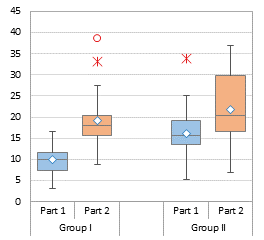
I generated some data, with two main groups (Alpha and Beta), each with two subgroups (One and Two). I can plot the data like this, paired by Alpha and Beta:
or like this, paired by One and Two:
Using the two first rows of the data set (Alpha. Beta and One, Two, One, Two) gives me the two-level axis labels that may help clarify the grouping.
If desired, you can insert a column between the main groups, like this:
or this:
You need a space (not a blank) in cell E21 to make the chart axis labels come out right.
In my software product Peltier Tech Charts for Excel 3.0, Advanced Edition, there is an option to create a Grouped Box Plot, which creates a box plot, grouped by category with categories separated by a space, and color coded by subcategory:
Jon says
What an excellent post, thank you so much! I have one question: I did the vertical version of this so I could add in a second marker — one for the median — and use the horizontal line. I added it in the same way the mean is added in. I want the horizontal line marker to extend across the entire width of each bar though, and the only way I can get it to do that is by increasing the size of the marker, which unfortunately transforms it from a horizontal line into a rectangle, which isn’t what I want. Is there a way to “stretch” the horizontal line marker so it takes up more area without growing vertically as well?
Jon Peltier says
Jon –
In my charts, the median is represented by the line separating the two boxes, and an additional set of markers represents the mean. That horizontal tick-mark-style marker is in fact a rectangle.
In an older version of my utility I used an XY Scatter series for the median, with a hidden marker but a horizontal error bar with the length I needed to span the bar. But this wasn’t as elegant as the border of the boxes.
Jon says
Thanks for the quick reply! I guess I didn’t give you my whole thought process, but basically I want to be able to say “the thick horizontal bar is the median” somewhere in the text pertaining to this graph. If I can’t differentiate the thickness of the borders of the boxes depending on what side they’re on (to make the median border thicker) then this doesn’t really work. I know it’s a really small nitpicky thing, but that’s just how my personality is, and I figured it couldn’t hurt to ask if you knew an easy way to make this happen.
Jon Peltier says
How about “The median is the line between the two boxes”?
In fact, the reason I used an error bar is that in Excel 2003, the line between the two boxes was twice as thick, because Excel didn’t overlap the edges of the boxes; instead you saw the two box outlines side by side. I hated that appearance. Since Excel 2007 the line between stacked boxes looks like a single line, and believe me, it looks cleaner.
Jon says
Yeah, that statement works, I’m just so used to referring to (and seeing others refer to) the median as “the thick horizontal line” that that’s what I defaulted to. I also thought it would make that particular border stand out slightly more relative to all the other boxs’ borders if there were a way to do this. Anyway, thanks for your responses!
Deborah says
Hi Jon,
Thanks for this post, I refer to it all the time (it’s saved in my favourites!) In my latest iteration I am making horizontal box plots and I want to add a target line, ideally a dashed line. Scrolling through the comments I saw your suggestion to use the wide dash marker options but unfortunately they don’t rotate for horizontal! Any suggestions on how to solve that one?
Thanks.
Deborah says
Sorry Jon, one further question: I can’t get the mean to plot correctly when I am making a single horizontal box plot, any ideas on where I might be going wrong?
Jon Peltier says
Deborah –
Does it work if you make a multiple horizontal boxplot, or any vertical one?
Are all series on the intended axis (primary vs secondary)?
Deborah says
Hi Jon, it works fine with multiple horizontal box plots, just the single one was an issue. It was due to the way excel was reading the data – got around it by adding multiple means and then deleting the ones I didn’t want which left the one I did want in the right place. Not an elegant solution but functional! Any thoughts on target lines for horizontal box plots? I have partially resolved it by using an image of a dashed line as the marker, but I can’t re-size it so it is a bit limited.
Thanks, Deborah
Jon Peltier says
Deborah –
You can make a target line by adding another XY series, like you did with the mean, and adding a vertical error bar while hiding its marker. I’ve described how to do this for horizontal bullet charts (another tweaked horizontal bar chart).
Go to Bullet Charts in Excel and scroll down to “Single Horizontal Bullet”.
Bob says
Dear Jon,
Thank you very much for this tutorial. It helped me a lot!
I’m wondering if you could help me extend this concept more. I’d like to produce a graph to compare a treatment group to a control group, with time being on the X-axis. So the side by side graphs does not work for me. Thanks very much!
Mark McLean says
Thank you for this, exactly what I needed.
John says
Thank you for your posts! You’ve made life better for so many of us!
Peter says
Thanks for fantastic work-arounds to avoid limitations of the built-in Box-Whisker plots, which work so much better and more flexibly than the in-built box-whisker plot methods which are pretty disappointing. I ran into problems with IQR ranges spanning zero, but great to see you’ve got that further complication covered elsewhere (Stacked Column Charts Above and Below the Axis).
Jon Peltier says
Peter –
I’ve been building box plots in Excel for over twenty years, and I introduced the Peltier Tech Box and Whisker Chart Utility back in 2008, long before Microsoft offered their limited box plots in Excel 2016. I use stacked columns and bars depending on orientation (Microsoft only offers vertically oriented box plots) and if a box crosses the axis, I split it into positive and negative pieces.
Check out Peltier Tech Charts for Excel for the latest implementations of Box Plots and Grouped Box Plots.
Peter says
Thanks Jon, your approach gives much better results than the in-built MS option. Splitting positive and negative pieces creates a line at zero which detracts a bit from the median; more obvious with open symbol plots so fills help to obscure.
Coco says
hi Charles,
my boxplot Whisker- connects to the edge of Q1 instead of Q2. So there is a gap after remove fill and border.
I see a couple of users facing the same issue. Are you able to advise?
Table below is my data set
GM Macro EQ Credit ALF
Bottom (386,875,823) (302,304,928) (54,330,036) (160,634,937) (82,284,960)
2Q Box 16,239,662 10,135,173 249,924 2,292,166 1,789,986
3Q Box 9,904,897 15,450,580 289,053 6,025,799 24,768,126
Whisker – 37,988,195 24,237,443 890,104 5,382,063 482,768
Whisker +32,956,816 24,369,372 1,964,219 4,321,916 784,320
Jon Peltier says
It looks like your data is all negative, which changes things. Excel cannot handle a stacked column chart that spans the X axis, at least not without a lot of smoke and mirrors, so it can’t build a chart using a large negative bottom series and small positive ones. You must have noticed that the Bottom series was enormous and stretched below the X axis, and the 2Q and 3Q boxes were situated above the X axis, starting with Y=0.
Your series have to be reconfigured like this:
Top: =B9 (the 3Q value, negative)
3Q box: =B8-B9 (Median minus 3Q, negative)
2Q Box: =B7-B8 (1Q minus Median, negative)
Whisker+: =B10-B7 (Max minus 3Q, positive)
Whisker-: =B7-B6 (1Q minus Min, positive)
Whisker+ is used on positive error bars on the Top set of bars (which should be made transparent)
Whisker- is used on negative error bars on the 2Q set of bars
FWIW, Peltier Tech Charts for Excel can handle data like this without any problems.
playtekno says
thank you for sharing mate, keep it up