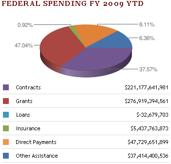
In Whacky Graphics at USAspending.gov, Seth Grimes of Intelligent Enterprise (another Seth G) deconstructs a pie chart showing Federal Spending FY 2009 on USAspending.gov’s interactive dashboard. As Seth says, this is “one downright whacky graphic. I can’t recall the last time I saw a graphic that so distorted the numbers, so I tried to recreate it (and failed).”
So what’s wrong with the chart?

Seth says, “Now I’m not a big believer in 3-D charting that simply adds depths, supposedly creating visual appeal, to a 2-D chart.” As you all know, neither are we here at Chart Busters, Inc. And of course, adding 3D effects to a pie chart is adding insult to injury.
There’s an interesting negative value, Loans, in the table below the chart. It may or may not have been added to this chart, but since it comprises less than 0.01% of the total, it isn’t visible, and they mercifully did not label it. We have seen in Pie for Dessert Again? that Excel allows negative numbers in pie charts, and merely plots their absolute values. Makes perfect sense.
Seth also asks us to ignore the labels for a moment, and judge which area is largest: the purple wedge in the front right of this ugly ovoid, the brick red wedge at the left. or the combined orange and blue wedge in the top right? To my untrained eye, they look about the same. But the labels show that these areas represent 38%, 47% and, 14% of the total. As Seth points out, this is not just caused by the magical distortion of 3D rendering, but also because the numbers don’t agree with the graphics.
We’ve also seen in Pie Chart Plotting Deficiency that even Microsoft doesn’t always care that numbers in pie charts add up. But the Microsoft chart merely left off the “Other” category, while the USAspending chart is just way off.
Seth made a 2D chart to show a more accurate depiction of the data. Note that he included the Loans wedge, but it’s not even as thick as the leader line attached to the data label.

Then Seth tries to reproduce the 3D appearance of the original chart, and he almost succeeds, except that his numbers are still faithful to the inputs.

Seth has demonstrated without doubt that the original pie was doctored. He suspects that at some point after the chart was constructed, the site design was turned over to a graphic artist who “improved” the display. Seth hasn’t demonstrated that 2D or 3D pies are a good way to illustrate this information. Okay, chart busters, what’s the best way to show this kind of data?
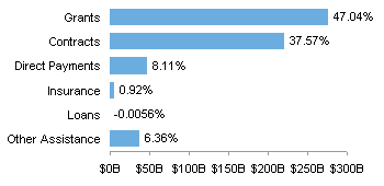
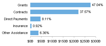
A boring. old. bar. chart.
I’ve made two versions, one with the minuscule Loans category:

and one without:

Seth’s planning a review of the USAspending.gov dashboard. I’m looking forward to that. I spent a few minutes on the dashboard, and found it awkward, with labels scrolling out of view before you could read them.


Jeff Weir says
Aside from the bad presentation, I wonder what would be useful about this graph even if it was correct. What kind of story, if any, can we get from a one-time snapshot of rather unhelpful labels along the lines of “Grants, Contracts, Direct Payments, Insurance, Direct Payments, Other Assistance”?
I can’t imagine joe or jane public drawing any meaningful conclusion from these categories. To me it just seems like arbitrary bucketing of spending classes. In other words, so what?
I see at the original web page that they do break the data down further into top 5 assistance recipients and top 5 contractors, but even this doesn’t give the public much information. For instance, what’s more important to know…who got the money, or what they did with it? Personally I think the ‘what’ is more important. Unfortunately we have to infer the what from the who. For instance, I don’t think that Lockheed Martin Corporation spent their $20,472,135,547 on improving education outcomes.
Another example of a graph in need of a defined audience and a defined purpose.
Jon Peltier says
Stupid WordPress, this post was supposed to appear Monday morning.
Jeff – Good point. What got me about the dashboard is you could decide what department to display, and you got a 3D set of pies and bars, with unlabeled colors (presumably good-fair-bad). When the labels didn’t jump out of view, they told you how many “investments” were in each color group. No idea what an “investment” was, or how much cash was in each “investment”.
DaleW (acting as devil's advocate) says
Pie charts get no respect.
There is nothing inherently wrong with an honest 2D pie chart that slices a total into a few meaningful parts. Pie charts are popular because the message is so easy to grasp visually. (Disclaimer: I do sometimes read and even enjoy USAToday.)
The pie chart in question deserves ridicule because it is a terrible and dishonest graphic, not because it is a pie chart and we know that those are bad apples, if not always to this degree.
If you would Pareto-ize a bar chart from high to low, the same can be done for the pie chart and its labels. In the wrong hands, both pie charts and bar charts can be distorted by similar tricks.
More versatile bar charts do tend to win as the number of parts goes up, or if there are negative values. But a bar chart doesn’t convey the whole-as-parts concept at a glance like a pie chart does. Optionally, a pie chart can be labeled in real units, and the eye can figure out the rough percentages without two sets of numbers on the graphic. Try doing that with a bar chart. (Yes, I’m counting any axis numbers as a second set of numbers.)
Anybody noticed how Wikipedia visualizes the US Federal Budget? It’s a 2D pie chart.
http://en.wikipedia.org/wiki/File:Fy2009spendingbycategory2.png
I really can’t defend 31 separate color-coded slices (use a boring bar chart!), but a simplified pie chart depicting current spending in 5 to 8 key categories could work:
{Defense* ~22%, Social Security 21%, Medicare 13%, Interest 9%, Others ~35%}
BTW, The War Resistors League provides dueling pie charts by asking us to suspend our collective disbelief in trust funds for SS+Medicare and by reinterpreting what constitutes military spending (such as by including 50% of NASA):
http://www.warresisters.org/pages/piechart.htm
While one always may dispute the underlying details and assumptions (just as for a bar chart), pie charts do effectively communicate a big picture — assuming the pie metaphor applies to the data.
Jon Peltier says
“There is nothing inherently wrong with an honest 2D pie chart that slices a total into a few meaningful parts.”
As I’ve said elsewhere in this blog and elsewhere in the internet, when a pie chart has more than three or so segments, it loses its effectiveness.
“If you would Pareto-ize a bar chart from high to low, the same can be done for the pie chart and its labels.”
This is often the only way to compare at-a-glance values in a pie chart, because the lack of a common baseline for the angular measures makes relative judgement of similar angles impossible.
The dueling pie charts shown by the WRL would be interesting as dual bar charts, so the actual amounts, not just percentages, could be compared. For example, WRL ignores Social Security, since it is funded independently of income taxes. WRL also accounts differently for other categories of spending. These differences would be illustrated in a bar chart using dollars as the value axis unit.
DaleW says
Jon,
Assuredly, the ranking is pie charts < bar charts < tables of data when trying to make precise quantitative comparisons between any two numbers.
However, most people seem to prefer pie charts when trying to visualize % of a total. (If they didn’t, the mass media would stop using them.) Simple bar charts are not very effective for visualizing such fractions of the whole, because we’d have to visually stack our finite series of unstacked bars to estimate the total height. Tricky if there are more than three or so segments.
So — how do we enable BOTH modes of understanding at once (intuitive big picture comparison to the whole AND still retain the ability to discern fine differences)? This is a live question for me in a data reporting situation [where fine differences are likely meaningless anyway], and I can think of four plausible “engineering compromises”:
1) include both types of charts (or a pie chart and a table)
2) add % labels to the bar chart (but the visualization remains piece-wise!)
3) add numeric labels to the pie chart (so we read numbers to get fine differences)
4) use stacked % bar charts with numeric labels (or a table) — but these are subject to most of the same objections as pie charts, and lack the redeeming feature where shape of the isolated segment lets us grasp how large it is.
I suspect this choice comes down mostly to taste and circumstance. Or am I merely unenlightened?
Agreed, a bar chart with real $ units would clarify how WRL believes Washington skews the budget categories. However, most of us find it much easier to start to understand the total federal budget as % of total than as unimaginable billions and trillions of dollars, so WRL presents their view as %. Their website might have enough details to create your bar chart. To a tangential point, I’d bet the claim that Social Security “is funded independently of income taxes” will be proven false in a decade or so; anyway, Social Security and FICA taxes are the closest thing that we have right now to a flat income tax across the USA!
Colin Banfield says
“As I’ve said elsewhere in this blog and elsewhere in the internet, when a pie chart has more than three or so segments, it loses its effectiveness.”
And in this case you have to ask, why bother with a pie chart at all? What intelligence can you derive from the pie that you can’t *immediately* get from looking at three numbers? The same three numbers you label the pie with? In fact, it’s far easier to look at a table with three labels and three numbers than it is to look at a pie chart + a legend.
I’ve decided to no longer be an apologist for using pie charts under any circumstances.
Jon Peltier says
Colin – I’ve pretty much reached the same decision.