Chandoo’s Pointy Haired Dilbert blog had its best month ever in June, and he posted some stats to prove it. Congratulations, Chandoo!

Pointy Haired Dilbert statistics for June 2009
John Walkenbach responded with his own visitor stats.
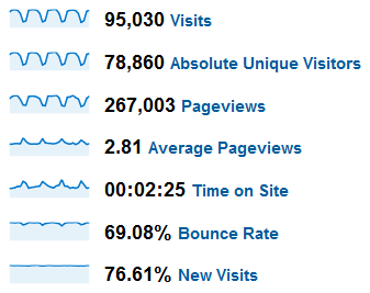
The Spreadsheet Page statistics for June 2009
John asked, so here are my June stats, first for the entire Peltier Tech website (which includes the blog), then for the PTS Blog.
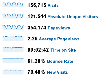
PeltierTech website statistics for June 2009
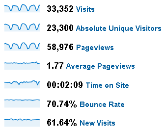
PTS Blog statistics for June 2009
This was almost the best month for the web site, but March (below) was slightly better (February and April were in between March and June).
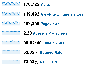
PeltierTech website statistics for March 2009
June was the highest month for visits and visitors on the blog, but April had more pageviews.
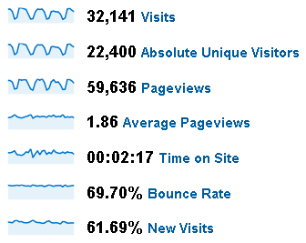
PTS Blog statistics for April 2009
My stats show “typical” daily variation, with high weekday and low weekend, for visits, visitors, and pages, while the other measures are flat. John has the same daily variation in visits, visitors, and pages, while hispages per visit and time per visit are higher on weekends. I think this means that people spend more time on his site on weekends, when they have more time to poke around.
Chandoo’s stats in the second week of June are crazy, higher and less regular than the rest of the month, which may show a regular variation except for the distraction of the second week. The peak in Chandoo’s numbers probably corresponds to the June 12 announcement of the new Chart Busters feature he and I are working together. This announcement led to some controversy, as it at first used the name Chart Doctor, which is also the name of a feature on Kelly O’Day’s Process Trends web site.


derek says
It’s a shame the stats don’t show sparklines for more than a month, so we can see the trends properly. 24 hour and 7 day moving averages would be good; I stopped being interested in the daily and weekly cycles once they established their existence. Now I just want them to step into the background and allow the context of longer term changes to take the foreground.
jeff weir says
Okay, here’s a challenge for you. I nominate the information posted above for a chartdoctors consultation. Would be good to include the daily dose of excel and other blogs who posted as well. Game on?
jeff weir says
I’d love to see the % new visits for the Data Pig blog, given it’s just a month old. How does Google Analytics handle a divide by zero scerario?
Jorge Camoes says
Not bad… Congrats all! I’m expecting to reach 150 000 monthly visits very soon too (around July 5, 2030)…
Jon Peltier says
You can readily change the time scale of the sparkline; this is my site for two months (1 May to 30 June):
PeltierTech website statistics for May and June 2009
You can show numbers weekly as well; this is my site weekly in 2009 (4 January to 27 June):
PeltierTech website weekly statistics for 2009
And of course, you can do your own charts. These are for 1 January through 30 June, 1009.
PeltierTech website pageview statistics for 2009
PeltierTech website pageview statistics with 7-day moving average for 2009
PeltierTech website pageview statistics with loess smoothing for 2009
jeff weir says
Cool. I hope you didn’t take my comment as a critisism of the way the information is presented above.
Rather, I just thought it would be a good challenge to design a graph or series of graphs from first principles that shows how the different blogs relate to each other.
Some small multiples, crossed with some dynamic graphs with selectable series…that kind of thing.
I’d have a go, if there was some downloadable data from a few different blogs..
Chandoo says
Hey Jon.. pretty cool post this. I have always been skeptical to show or talk about stats. I think they measure reader engagement incorrectly. But they are very good for a host of other things like measuring bounce rates, understanding search engine, referral performances, how users navigate et al.
I have uploaded the entire stats screenshot for June and for the last three months here.
Pointy Haired Dilbert statistics for June 2009
Pointy Haired Dilbert statistics for Q2 2009
Note, June numbers have slightly gone up, may be because google analytics counted few more visits after taking the screencap. I was on 1st july in India, but few parts of the world must be still in June at that time… (or there is something funny with the way google measures these numbers)
Also, one correction: the june 12 spike is due to mention in Lifehacker. While chartbuster announcement did have a local spike, the lifehacker mention alone fetched 25k new visits in a frenzy.
Jon Peltier says
Chandoo –
The other thing Google Analytics is good for is analyzing traffic, and knowing for example that your June spike was due to the mention in Lifehacker. I hadn’t really thought the Chart Doctor controversy was enough to account for such a huge spike. What fraction of June’s traffic do you think came from the spike?
I use GA to see variation in visits to specific pages, to see trends in traffic from different referring sites, to see how visitors move within my site. This is an academic exercise for me so far, since I haven’t really figured out how to use the information.
Jon Peltier says
Another Excel blog heard from:
Daily Dose of Excel statistics for June 2009