If you select a well-defined worksheet range and insert a chart, Excel parses the range and assigns values (Y values), categories (X values), and series names based on its analysis of the range.
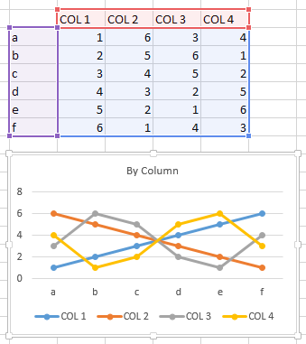
For example, if you select the range C2:F8 shown below, Excel notices that the top left cell C2 is blank, so Row 2 and Column C will be treated differently. Excel also notices that there are more rows than columns, so the data will be plotted by column, with categories in the first column and series names in the first row. When you insert a chart, the worksheet is highlighted showing that Column C (purple highlights) is used as category labels (X values), Row 2 (red highlights) is used as series names, and the rest of the area (blue highlights) is used as Y values.
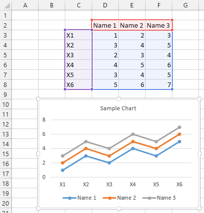
If you always arrange your data nicely like this, you will rarely have to fix up what Excel uses for X values, Y values, and series names.
Assign Names from Cells in Front of Y Values
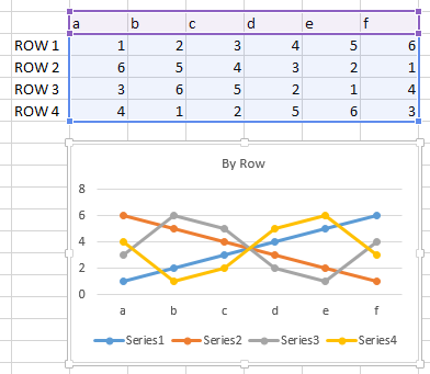
But sometimes your chart hasn’t been no nicely assigned to the worksheet range. The chart below has series plotted by row, but the first column has not been used for series names. Instead the series have the dreaded “Series1”, “Series2”, etc., as their names.
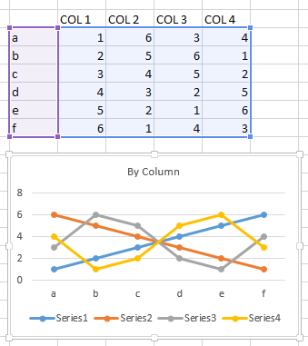
Similarly, this chart has series plotted by column, but the first row has not been used for series names. Again, the series are labeled with the dreaded “Series1”, “Series2”, etc.
You can manually name the series, using the Select Data command from the ribbon or from the right click menu, or editing the series formula. But it’s not too much trouble to write a little code to find the appropriate cells to name the series in a chart.
I’ll start with a routing that works on one chart series. It gets the series formula, parses out the argument that specifies the series Y values, and finds the range containing those values. (If the Y values are not from a range, for example, they are hard-coded as an array right in the formula, the code skips the series.) If the Y values range is a row, the code finds the cell to the left of this range in the same row; if the Y values range is a column, the code finds the cell above this range in the same column. This cell is used to create a link for the series name.
Sub Series_AssignNameToCellBeforeYValues(srs As Series)
  Dim sFmla As String
  Dim vFmla As Variant
  Dim sYVals As String
  Dim rYVals As Range
  Dim rName As Range

  sFmla = srs.Formula
    ' e.g. =SERIES("Name",Sheet1!$A$2:$A$10,Sheet1!$B$2:$B$10,1)
  sFmla = Replace(sFmla, "=SERIES(", "")
  sFmla = Left$(sFmla, Len(sFmla) - 1)
    ' e.g. "Name",Sheet1!$A$2:$A$10,Sheet1!$B$2:$B$10,1
  vFmla = Split(sFmla, ",")

  If UBound(vFmla) + 1 - LBound(vFmla) = 4 Then
    sYVals = vFmla(LBound(vFmla) + 2)
      ' third element (first + 2)
      ' e.g. Sheet1!$B$2:$B$10
    On Error Resume Next
    Set rYVals = Range(sYVals)
    On Error GoTo 0
    If Not rYVals Is Nothing Then
      If rYVals.Cells.Count > 1 Then
        On Error Resume Next
        If rYVals.Columns.Count > rYVals.Rows.Count Then
          ' by row, take cell to left
          Set rName = rYVals.Resize(1, 1).Offset(, -1)
        Else
          ' by col, take cell above
          Set rName = rYVals.Resize(1, 1).Offset(-1)
        End If
        On Error GoTo 0
        If Not rName Is Nothing Then
          srs.Name = "=" & rName.Address(, , , True)
            ' e.g. "=Sheet1!$B$1"
            ' use formula notation so it links to cell
        End If
      End If
    End If
  End If
End Sub
That’s great for one series. Use the following code to call the above procedure for each series in a given chart:
Sub Chart_AssignNameToCellBeforeYValues(cht As Chart)
  Dim srs As Series
  For Each srs In ActiveChart.SeriesCollection
    Series_AssignNameToCellBeforeYValues srs
  Next
End Sub
Use this to assign names for the active chart:
Sub ActiveChart_AssignNameToCellBeforeYValues()
  If Not ActiveChart Is Nothing Then
    Chart_AssignNameToCellBeforeYValues ActiveChart
  End If
End Sub
Use this to assign names to every chart in the active sheet:
Sub AllCharts_AssignNameToCellBeforeYValues()
  Dim chtob As ChartObject
  For Each chtob In ActiveSheet.ChartObjects
    Chart_AssignNameToCellBeforeYValues chtob.Chart
  Next
End Sub
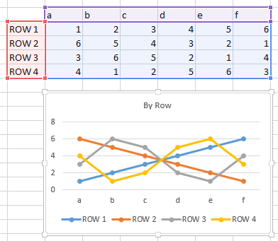
Here is our first chart, plotted by row, with its series names now defined: note the red highlighted range containing the same labels now displayed in the legend.
Here is the second chart, plotted by column, with names assigned.
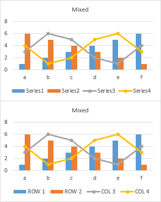
In fact, the alignment of all series need not be the same, since the routine works series-by-series. The top chart below uses the first two rows of data from the first chart above and the last two columns from the second chart, with no series names assigned. The bottom chart shows how the code has correctly assigned names.
Assign Names from an Arbitrary Range
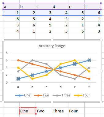
What if the series names are in a range that isn’t connected to the rest of the chart data? Here I want to use series names from the range below the chart. The highlights in the worksheet only show X and Y values for the selected series.
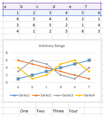
Here is a routine that assigns names from a given range to series in a given chart:
Sub Chart_AssignNamesFromRange(cht As Chart, rng As Range)
  Dim iSrs As Long
  For iSrs = 1 To cht.SeriesCollection.Count
    If iSrs > rng.Cells.Count Then Exit For
    cht.SeriesCollection(iSrs).Name = _
        "=" & rng.Cells(iSrs).Address(, , , True)
  Next
End Sub
This routine asks the user to select a range, then calls the routine above to assign names from this range to the active chart:
Sub ActiveChart_AssignNamesFromRange()
  Dim myRange As Range
  On Error Resume Next
  Set myRange = Application.InputBox( _
      "Select a range containing series names for the active chart.", _
      "Select Range", , , , , , 8)
    ' Type 8 to input a range
  If Not myRange Is Nothing Then
    Chart_AssignNamesFromRange ActiveChart, myRange
  End If
End Sub
Here is the dialog, which I’ve already used to select a range containing labels.
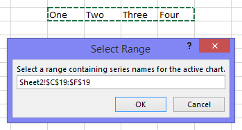
Here the chart’s series have been labeled. The highlights show X and Y values and a series name for the selected series.


Leave a Reply