Note
A new feature in Office 365 (and Excel 2019), Show #N/A As An Empty Cell, solves the pain and frustration experienced by generations of Excel users trying to avoid plotting what look like apparently blank cells.
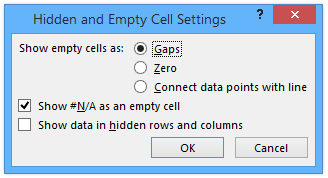
Read about it in Plot Blank Cells and #N/A in Excel Charts.
This new behavior in Excel makes this article obsolete.
In Mind the Gap – Charting Empty Cells, I described in gory detail how Excel’s various chart types treat empty cells, that is, cells that are totally empty. I also described why none of the approaches we mortals have ever tried to produce a gap across a simulated blank cell has ever worked.
Cells that have formulas that return a null string (i.e., “”) are plotted like any text, with a marker at a value of zero. In line and XY Scatter charts, an error value of #N/A almost works, because it suppresses plotting of a point, but does not produce a gap in the line segments connecting points.
The only way to get a gap in the lines of a chart is to have empty cells is to rely on a VBA routine to correct the appearance of the chart, whether by changing the formatting of the points and lines you want to hide, or by clearing the contents of the associated cells. These work well, but must be repeated every time the data changes, and if you’ve cleared any cells, their contents must be recreated in case those points should no longer show gaps.
This post contains two routines to fix the chart’s appearance, one by changing the chart series formatting, the other by changing the data.
The Gap Problem
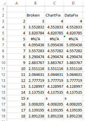
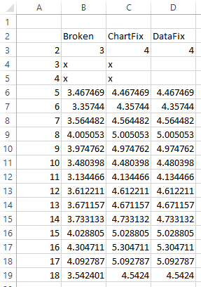
Below is a simple data range I created to illustrate this problem. The “Broken” column shows a set of random values centered around 3, with either #N/A or “x” inserted into random cells in place of the random values. The “x” is text, so it will be treated the same as “”, but it is used instead so it shows up in the cells.
In the “ChartFix” and “DataFix” I’ve included this same data, increased by 1 so I could plot it with the “Broken” data without obscuring it. I’ll use two XY Scatter charts, one to show how fixing the chart formatting works, the other to show how fixing the data works.
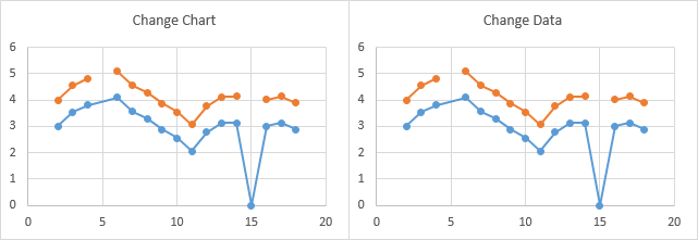
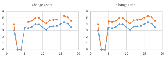
Here are the two charts I promised. The lower (blue) series is the “Broken” data, which will not be changed by these routines. The upper (orange) series is the “ChartFix” series (left) or the “DataFix” series (right).
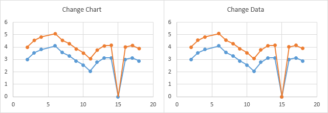
Both series in both charts show a missing marker at X=5, with a line connecting the points at X=4 and X=6. These missing points correspond to #N/A errors in the corresponding cells. All four series also show a point plotted at X=15, Y=0, corresponding to the “x” value in the corresponding cells.
We want our code to leave no markers and no connecting lines at these points in the orange series, while the blue series remain intact to remind us where changes were made. In general, you will probably want to process all series in your charts.
The Code
Both procedures parse the series formula (see detailed documentation at the end of this article) to find the ranges containing the X and Y values. If you are not using XY Scatter charts, remove the X value components of the code, because non-numeric X values are allowed for other chart types.
The first procedure loops through the parsed X and Y values, and where it finds a non-numeric value, it formats the point to have no marker and for the connecting line segment on either side to show no line. Where it finds a numeric value, it restores marker and line segment formatting, in case the chart already was “fixed” but now the data has changed.
Sub FixLineFormatInChart()
  Dim iPt As Long
  Dim sFmla As String
  Dim vFmla As Variant
  Dim sXVals As String
  Dim sYVals As String
  Dim rXVals As Range
  Dim rYVals As Range
  Dim vXVals As Variant
  Dim vYVals As Variant

  With ActiveChart
    ' just process the orange series
    With .SeriesCollection(2)
      sFmla = .Formula
      vFmla = Split(sFmla, ",")

      sXVals = vFmla(1)
      sYVals = vFmla(2)

      Set rXVals = Range(sXVals)
      Set rYVals = Range(sYVals)

      vXVals = rXVals.Value
      vYVals = rYVals.Value

      For iPt = 1 To .Points.Count
        If IsNumeric(vXVals(iPt, 1)) And IsNumeric(vYVals(iPt, 1)) Then
          .Points(iPt).MarkerStyle = .MarkerStyle
        Else
          .Points(iPt).MarkerStyle = xlMarkerStyleNone
        End If
      Next

      For iPt = 2 To .Points.Count
        If IsNumeric(vXVals(iPt - 1, 1)) And IsNumeric(vXVals(iPt, 1)) And _
            IsNumeric(vYVals(iPt - 1, 1)) And IsNumeric(vYVals(iPt, 1)) Then
          .Points(iPt).Format.Line.Visible = True
        Else
          .Points(iPt).Format.Line.Visible = False
        End If
      Next
    End With
  End With
End Sub
The second procedure loops through the parsed X and Y values, and where it finds a non-numeric value, it clears the cell containing the non-numeric value. When rerun on a chart with changed data, it cannot restore the appropriate cell contents where it finds a numeric value, because the relevant formula or value was previously deleted.
If you plan to use this approach, it is best to leave the original data or calculations intact, and use another worksheet range that simply links to the original data, so the links are easy to recreate.
Sub FixSourceDataInSheet()
  Dim iPt As Long
  Dim sFmla As String
  Dim vFmla As Variant
  Dim sXVals As String
  Dim sYVals As String
  Dim rXVals As Range
  Dim rYVals As Range
  Dim vXVals As Variant
  Dim vYVals As Variant

  With ActiveChart
    ' just process the orange series
    With .SeriesCollection(2)
      sFmla = .Formula
      vFmla = Split(sFmla, ",")

      sXVals = vFmla(1)
      sYVals = vFmla(2)

      Set rXVals = Range(sXVals)
      Set rYVals = Range(sYVals)

      vXVals = rXVals.Value
      vYVals = rYVals.Value

      For iPt = 1 To .Points.Count
        If Not IsNumeric(vXVals(iPt, 1)) Then
          rXVals.Cells(iPt).ClearContents
        End If
        If Not IsNumeric(vYVals(iPt, 1)) Then
          rYVals.Cells(iPt).ClearContents
        End If
      Next
    End With
  End With
End Sub
The Results
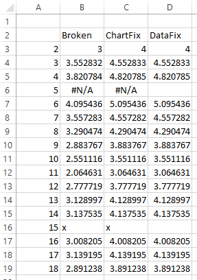
I selected the first chart (title = “Change Chart”) and ran the first procedure (FixLineFormatInChart). Then I selected the second chart (title = “Change Data”) and ran the second procedure (FixSourceDataInSheet). Here is the resulting data. Note that the ChartFix data is unchanged because the FixLineFormatInChart procedure only changes the chart, while the DataFix data now has a couple of blank cells because the FixSourceDataInSheet works by changing the data and leaving the chart alone.
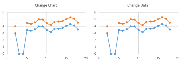
Here are the resulting charts. The two procedures produce identical results, changing the interpolated line across point 5 (the #N/A value) to a gap, and changing the plotted zero at point 15 (the text label “x”) to a gap. The interpolated line across point 5 and the zero value plotted at point 15 remain in the blue series.
What if the Data Changes?
Worksheets are not always static pictures of data. The original data may change, or you may perform the same analysis with new data. The following table represents new data overlaid on the previous data range.
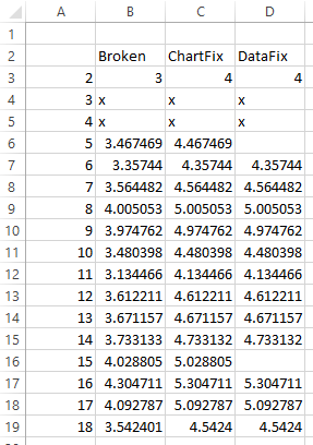
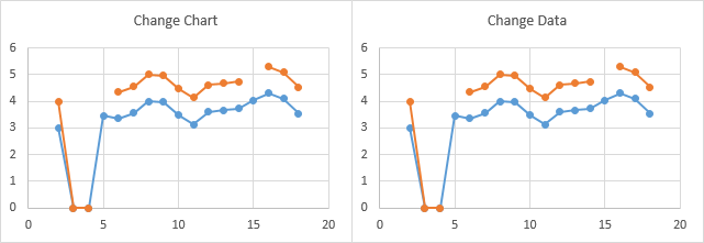
The original non-numeric cells now contain numeric values, but we’ve gained text values in rows 4 and 5. Because the previously non-numeric cells in column D were cleared, whatever formulas we had there could not recompute new values for cells D6 and D16. In the charts from before, we still see gaps, whether because we formatted them not to appear (left) or because we deleted the values (right).
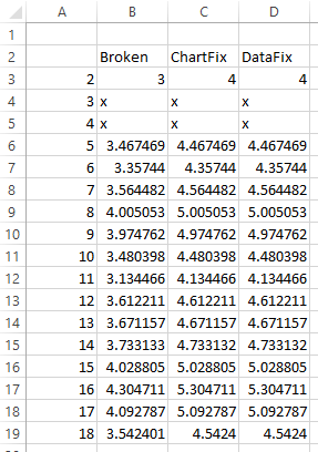
We’re fine if we used the Change Chart approach, or if we simply pasted values on top of the data, which filled in any blank cells from before. But if we deleted formulas, as in column D above, we need to restore them, as shown in the worksheet range below.
The chart with reformatted points still shows gaps (left) but the formatting will be restored to numeric points by the procedure. The chart with unchanged formatting and restored data (right) shows all markers and line segments. The text values are plotted as the two zeros near the left edge of these charts.
We run the corresponding procedures on the two charts. The data is changed in column D, as before.
The orange series in both charts now show gaps where the blue series remind us of the text values plotted as zero.
Parsing the Series Formula
A series formula has the following form:
=SERIES(Sheet1!$C$2,Sheet1!$A$3:$A$19,Sheet1!$C$3:$C$19,2)The four arguments of the series formula are:
- Series Name – can be a worksheet address or defined name, a text label, or empty. In this example it’s a cell reference, Sheet1!$C$2.
- X Values (Category Labels) – can be a worksheet address or defined name, a literal array such as {1,2,3} or {“A”,”B”,”C”}, or empty. In this example it’s a worksheet address, Sheet1!$A$3:$A$19.
- Y Values – can be a worksheet address or defined name, or a literal array such as {1,2,3}. In this example it’s a worksheet address, Sheet1!$C$3:$C$19.
- Plot Order – an integer, in this case 2.
Generally, to parse the series formula, you first need to strip off everything except the parameters, which means the open parenthesis and the preceding text, and the closing parenthesis. Then you split the resulting string into a comma-separated array. This works as long as none of the ranges contain multiple areas, in which case there are commas separating the addresses of the individual areas, and simple separation by commas will produce surprises. The result is a zero-based array.
Since we only want the X and Y values, we don’t care that the first parameter will contain the opening parenthesis and the preceding text, or that the last parameter will contain the closing parenthesis.
So our code looks like this, with loads of nice documentation:
    With .SeriesCollection(2)
      ' get series formula
      ' =SERIES(Sheet1!$C$2,Sheet1!$A$3:$A$19,Sheet1!$C$3:$C$19,2)
      sFmla = .Formula

      ' split formula into its arguments
      vFmla = Split(sFmla, ",")
      ' vFmla(0) = "=SERIES(Sheet1!$C$2"
      ' vFmla(1) = "Sheet1!$A$3:$A$19"
      ' vFmla(2) = "Sheet1!$C$3:$C$19"
      ' vFmla(3) = "2)"

      ' get the individual addresses for X and Y
      sXVals = vFmla(1)
      sYVals = vFmla(2)

      ' find the ranges containing the X and Y values
      Set rXVals = Range(sXVals)
      Set rYVals = Range(sYVals)

      ' put the values from the X and Y ranges into arrays
      ' (faster processing in an array than cell-by-cell in a range)
      vXVals = rXVals.Value
      vYVals = rYVals.Value
Now we can test for non-numeric values in the arrays, and either clear the corresponding cells or change the formatting of the plotted points.
You can put the X and Y values of a series directly into an array as follows:
      vXVals = ActiveChart.SeriesCollection(2).XValues
      vYVals = ActiveChart.SeriesCollection(2).Values
The problem here is that the values saved internally in the series have already been changed. The #N/A remains #N/A in the array, but any blanks and any text values are converted to zeros, so they are undetectable as non-numeric.


derek says
I have a reluctance to use VBA, so I attempt alternative table layouts instead:
Where the initial range is this:
A
1 1
2 3
3 4
4 #N/A
5 4
6 3
7 4
8 text
9 5
10 1
11 2
I turn it into this
A
1 1
2 3
3 4
4 #N/A
5 4
6 3
7 4
8 text
9 5
10 1
11 2
2
3
4
5
6
7
8
9
10
11
2 3
3 4
4 #N/A
5 4
6 3
7 4
8 text
9 5
10 1
11 2
Then set the axis type to “date axis”. This creates gaps where NA() values are, but not where the value is text.
Jon Peltier says
Derek –
Very clever. To refine it slightly, you don’t need spaces between each of the three blocks of data in the new range, and the second two blocks don’t need the first and last points (you’ve skipped the first, not the last).
To refine it further, you can keep the original range where it is, then use formulas to repeat the X values, and for the first and third block use formulas like =IF(ISNUMBER(B2),B2,NA()), so that text, #N/A errors, and blank cells all display blanks in the chart.
derek says
Thank you. You may notice I use that date axis trick a lot.
Also, ouch on the spelling and grammar in my comment. Proofreading skills seem to quit and go home late at night without [telling] your brain they’ve left.
(I typed that sentence without the word “telling”, but since it’s not late at night, my brain spotted the omission)
roberto mensa says
@ Derek
I agree with Jon … wow really a clever trick!
I think we can make it easier to use by using the union operator “,” as in our recent post
https://peltiertech.com/another-approach-plotting-gaps-excel-charts/
so if A2: A10 have the progressive numbers to use in the axis (set as date) and in B2: B10 have the data … and D2:D10 are empty … we can use for the serie:
=B2:B10,D2:D10,B2:B10
and for axis:
=A2:A10,A2:A10,A2:A10
regards
r
DJ Smith says
Can this be modified to work on a pie chart which is dynamic via a combo activex dropdown? I would want the macro to run automatically when a new selection is made (changing the chart). My biggest concern is the expansive nature of the legend, due to null/zero value series.
Thanks.
Jon Peltier says
DJ –
I would do it somewhat differently. Since you’re using a dropdown to do something, I’d attach a VBA procedure to it that sorted the data in decreasing order, then changed the chart range to include only positive values.
siva says
Hi,
I am stuck n do not know how to start on this vba. I need help on copying a certain data from excel into sap. Is that possible? Plz to help with the code if possible. Many thanks
Jon Peltier says
Enter this phrase into a search engine, then see if any of the links are helpful:
excel to sap via vba
arrowhot says
TAKE THE QUOTE MARKS OFF THE #N/A to suppress graph display of blank values.
I have a large set of data (400,000+ rows) that is receipts of parts from various suppliers. Each row had the expected delivery date for the item, and the actual receipt. My graph summarizes delivery performance by supplier per month.
A days360 function would provide the days early or late on scheduled delivery that the supplier achieved. If a supplier delivered RIGHT on time, the days360 would be zero. Negative is early, positive is late, etc. Sometimes the supplier didn’t deliver ANY parts within a given month. So I had a data set where zero meant on time, blank meant no deliveries, and any other number, plus or minus, was how far off the mark the supplier was. Problem was, when graphing, i couldn’t get the graphing to suppress the blank numbers and not display – they were always appearing as zeros, which confused them with “on time”. And the selection that people were describing to not display blank values wasn’t working for me either. Then I tried inserting #N/A in a blank cell, and IT wouldn’t work. I was replacing any blank values with “#N/A” in an if statement. Still appearing as zeroes on the graph.
Solution: Then I read an entry that said to take the quotes off the #N/A. That worked perfectly. Blank values that are changed to #N/A don’t display on my graphs. Zeros appear as zero. etc.
Filiep Samyn says
Unfortunately Derek’s method does not work in Excel 2013. For starters you cannot always select the axis type; this is the case when the horizontal axis is numeric. You can work around it by using text or dates first and the overwrite with numeric values.
Excel 2013 treats NA() resulting in the #N/A error as if the cell contains data and hence no gaps appear, the points get connected even when the axis is set to type Date.
The only solution that I have used is to copy the chart data to new columns as values and then run some simple VBA to clear the cell content of the ’empty’ cells. I have tried to use copy/skip blanks but that did not work.
Yes we really need functionality that allows graphs to treat empty cells as cells without data. And yes a clipboard that does not constantly empty itself would be nice too.
Jon Peltier says
Filiep –
Of course Derek’s method works in Excel 2013. Did you change to a Date Axis? The top chart below plots Derek’s data in a line chart, but the default (Text) axis is used. The axis of the bottom chart was changed to a Date axis. The date axis sorts the data by date (X values) before plotting, so that the #N/A in B5 is plotted right before the blank in B15 and this just before the #N/A in B25. The blank ensures that a gap is drawn in the chart.
Filiep Samyn says
Yes I did change the axis to a date axis. With the data below Excel
does not create a gap for the #N/A points. Maybe I’m missing something.
1/1/2014 1
1/2/2014 2
1/3/2014 #N/A
1/4/2014 #N/A
1/5/2014 #N/A
1/6/2014 3
1/7/2014 4
1/8/2014
1/9/2014 5
1/10/2014 1
1/11/2014 2
Jon Peltier says
Filiep –
You missed the part where the data is repeated two more times. Using Derek’s technique, your data range (shown in blue below) is expanded (shown in blue and yellow), so the chart does in fact have a gap corresponding to the #N/A errors.
Here is how the chart sees the data. Using a text axis makes the chart sort the data first, so the yellow and blue cells from above are mixed together. The top chart shows the chart with a text axis, the bottom with a date axis. Every place where the date axis chart shows a marker, the text axis has two markers, with a gap in between. The gap and double points are present in the date axis chart too, but they are neatly superimposed, giving you the appearance you need.
While this may seem a long way around the issue, the data range can be extended using simple formulas in the yellow range that point to the corresponding cells in the blue range.
Filiep says
Thank you Jon for clarifying. I overlooked that part.
Filiep
Jan Erik says
Hi!
What about if the chart is a Pivot Chart.
Is it not possible to generate gaps in that case?
Jon Peltier says
Jan Erik –
You can change the point formatting in a pivot chart (using FixLineFormatInChart) but not the data which the chart is based on (via FixSourceDataInSheet).
Filiep Samyn says
Jon,
I have tried this method and it works EXCEPT when the second or next to last entry is #N/A. In that case Excel ignores the first and last data point and does not plot them even when they contain numeric data.
Dataset below
1/1/2016 2
1/8/2016 #N/A
1/15/2016 6
1/22/2016 8
1/29/2016 10
2/5/2016 12
2/12/2016 14
2/19/2016 #N/A
2/26/2016 18
3/4/2016 20
3/11/2016 22
3/18/2016 24
3/25/2016 26
4/1/2016 #N/A
4/8/2016 #N/A
4/15/2016 32
4/22/2016 34
4/29/2016 36
5/6/2016 38
5/13/2016 #N/A
5/20/2016 42
Filiep Samyn says
Jon,
Never mind I did not turn the markers on.