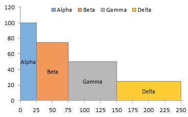
Reader Joe left a comment on the Clustered-Stacked Column Charts article asking how to make column charts with variable width columns. Stacked versions of these charts are often used in marketing where the horizontal axis is divided up into the segments of a market, with the width of each segment proportional to sales in that segment, and the vertical axis is divided into the competitors in each segment, with each block proportional to that competitor’s sales or share of the segment. I’ll provide my normal warning here, that using areas is not the most effective way to convey information. However, for people familiar with this chart type, it is an effective and customary chart.
Variable Width Column Chart (Cascade Chart)
Laying Out the Data For this simple example, we’ll use four entities, each with their own widths and heights.
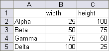
Like most non-standard charts, we have to use a special layout for our chart source data. Here is how the above data is set up. The first column, the X values, comprise a cumulative total of the series widths: 0, 25, 75 (25+50), 150 (25+50+75), and 250 (25+50+75+100). Each of these values is listed twice. In between each of these values, I’ve inserted another row with the average of the values above and below, with orange text. These orange values correspond to dummy data which will provide labels later in this protocol. Each series has mostly zero values or blanks. The X values for series Alpha range from 0 to 25: at X=0 the first Y value for Alpha is zero and the second is 100, the height for Alpha; at X=25, the first Y value is 100, and the second is zero. This provides the step up from 0 to 100 and the step down from 100 to 0. At the in-between point where X=12.5, Y is also 100. Data for other series is laid out in the same way. The column labeled “dummy” holds Y values for a dummy series that will provide the labels in the column marked “Labels”. I’ve colored this text orange to indicate labeling helper data, corresponding with the inserted orange rows above.

Creating the Chart Select the data in columns E through J and create a stacked area chart.
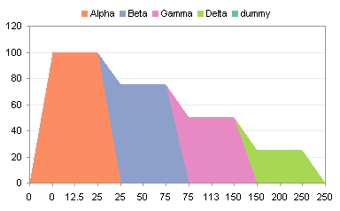
Select the “dummy” series (select the “Delta” area and press the up arrow) and change its chart type to a line chart.
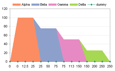
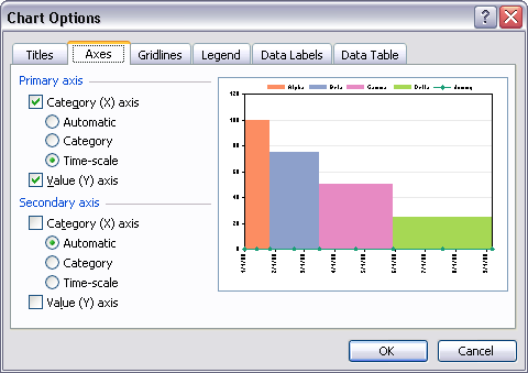
All the X values in column E are treated as text labels, equally spaced without regard to their numerical value. In Classic Excel (2003 and earlier) go to the Chart menu > Chart Options > Axes tab.
The Primary Category axis is listed as Automatic.
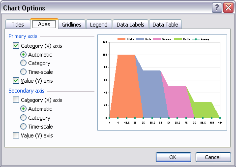
Change this setting to Time-Scale. This is somewhat misleading, as Excel time-scale axes only consider dates and ignore times.
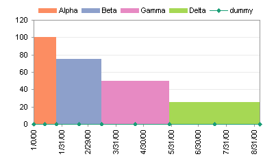
The result is that all Y values for equal X values are vertically aligned, as if in an XY chart. Of course, Excel has helpfully converted the values into dates, spaced one month apart.
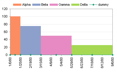
First change the spacing to 25 (or another value that makes sense with your widths).
Then change the number format of the axis labels to General (or to another format that makes sense with your widths).
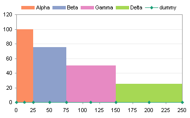
Add Labels to the Variable Width Column Chart If you didn’t need labels, you could have ignored the “dummy” series and the rows with orange X values. But usually you want labels. To do this, I use Rob Bovey‘s free Chart Labeler utility. This utility adds a menu item called “XY Chart Labels” to the Tools menu. It works on any chart type that accommodates chart labels, not just XY charts.
Using the utility, assign the labels in the “Labels” column to the “dummy” series. The labels here have been positioned below the points.
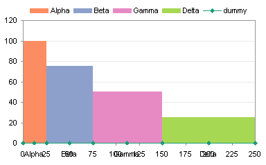
These labels overlap with the axis labels, but there are a few ways to avoid this. You could position the labels above the points. (In this chart, I’ve removed the dummy series from the legend, and formatted it without lines or markers to hide it.) The legend itself could now be removed, because it’s redundant.
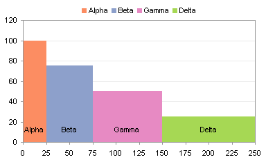
If the labels are crowded (the Alpha label barely fits within its column), you could rotate the text, but this makes it more difficult to read.
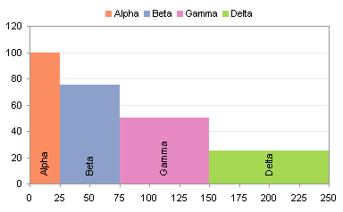
Depending on the purpose of the chart, you could hide the axis labels, and leave the “dummy” series labels below the chart.

There are a couple of alternative sets of data you could use for the “dummy” series, instead of the zero values that correspond to the bottom of the columns. The table below shows data that produces points which are located at the top of the columns, or at the mid-height of the columns.

Position the “dummy” labels above the points located at the tops of the columns.

Here is the chart again after hiding the dummy series.

Center the “dummy” labels on the points located at the mid-heights of the columns.
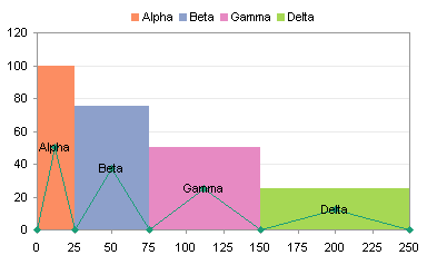
Once more without the “dummy” series.

You may be interested in Marimekko Charts, which are 100% stacked variable-width column charts.
Cascade Charts in Peltier Tech Charts for Excel
This tutorial shows how to create Cascade Charts, including the specialized data layout needed, and the detailed combination of chart series and chart types required. This manual process takes time, is prone to error, and becomes tedious. I have created Peltier Tech Charts for Excel to create Cascade Charts (and many other custom charts) automatically from raw data. This utility, a standard Excel add-in, lays out data in the required layout, then constructs a chart with the right combination of chart types. This is a commercial product, tested on thousands of machines in a wide variety of configurations, Windows and Mac, which saves time and aggravation.
Please visit the Peltier Tech Charts for Excel page for more information.


Colin Banfield says
“I’ll provide my normal warning here, that using areas is not the most effective way to convey information. However, for people familiar with this chart type, it is an effective and customary chart.”
Jon, the two statements almost appear to contradict each other. The first sentence is somewhat of an understatement. As you mention in “Peltier Goes Bar Hopping,” using area to encode data is even worse than using pie charts (I shudder at the thought of a stacked area chart). The example you use illustrates the problem well. Which area is bigger, Beta or Gamma? Alpha or Delta? In what way do you consider the chart to be “effective?”
Jon Peltier says
Colin –
Well, you got me. The best way to represent the simple numbers I plotted in this exercise is with an XY chart.
I was using this article as a lead in to the next one, which discusses Marimekko charts. These are stacked-variable-width-column charts, and that sounds terrible. But within the marketing community these are actually a staple, and the way they are used does not lead to the same confusion over areas that you reminded me about here. The line you quoted should probably be affixed to the next article, and the “effective and customary” description removed from this one.
In Marimekkos, the widths and heights are considered separately, so that the width indicates the relative size of a market segment, that is, the relative size of the entire column relative to other columns, and the height of each block in a stack represents the fraction of that block within its stack.
Colin Banfield says
Hi Jon: Please continue with the follow up discussion on Mekkos. There’s an interesing discussion on the topic over at Stephen’s site
http://www.perceptualedge.com/example13.php
gerdami says
Just wondering whether this technique could render the “oil cost curve” attached below.
Jon Peltier says
Gerdami –
This is exactly the technique one would use, with the following data and some appropriate formatting.
Again, use of this kind of chart is subject to the limitations of encoding data using areas. Of course, the areas here have no real physical meaning. The widths correspond to predicted reserves of oil, which the vertical dimensions indicate a range of costs.
derek says
I really like your integrated dummy series on the right. I used to use a separate, neater and more compact series added using Paste Special.., but in the corporate environment I’ve found it breaks my colleague’s brains, and I get endless calls for support when they accidentally misplace something or need to make an adjustment. I’m learning never to attempt a chart type that will leave my control, that does not use a single simple wizardable rectangle as the base of the data. Sigh.
gerdami says
Re: oil cost curve.
Jon, you’re great.
Thanks for sharing your knowledge.
Owen Bussey says
How would you do this same procedure in excel 2007? I am stuck on how to convert the x axis to time units so I get vertical columns.
thanks,
Owen Bussey
Jon Peltier says
Owen –
That has been moved to the Format Axes dialog. Right click on the axis, choose Format Axis. The dialog opens to the pane shown below. Just above the first horizontal line, there are three radio buttons for Axis Type. Choose the Date Axis option.
Gordo says
My data set is a carbon cost curve with 20 points adding to around 40 kilotonnes. This means that some of the points are less than one kilotonne and I think the date function cannot handle this small number? I multiplied by 1,000 because my original data was in kilotonnes but now the numbeers seem to large and the graph refuses to cooperate either way! Is there a limited data range that we need to use? (Hint, if I mutiply by 10 it works like magic but the scale shows the wrong numbers)
Jon Peltier says
Gordo –
The date axis cannot handle fractional values, and I know there is an upper limit as well.
Sometimes I have to use whatever works with the data (your factor of ten, for example), then hide the real axis labels and add a series which has dummy labels where I want them. See Custom Axis Scales using Dummy Series for examples.
Federico Boccardo says
Dear Jon,
I’m working to build a waterfall chart with variable width coloumn that i can automatize througha macro in excel could you please show to me how I have to format my figures?
Could you give me an email address where I can send to you my work?
Thank you in advance
Federico
Mayank Singh says
Hi,
I have to plot a column chart for the following data table and here, the columns’ width must vary with the ‘rate’ column’s values :-
Time (hours) MWH( Mega Watt Hour ) Rate ( Rs./Unit )
1 600 2
2 100 1
3 1000 3.8
4 1500 1.5
5 800 2.9
How can I make such a column chart using MS-excel 2007?
Please Reply.
Thanks.
Mayank Singh.
Mayank Singh says
In my abovesaid comment the table is not properly arranged. Here are the values again:-
time 1, 2, 3, 4, 5
MWH 600,100,1000,1500,800
rate 2,1,3.8, 1.5, 2.9
Gordo says
Hey Mayank, we all have to start somewhere. Jon has given excellent instructions here but it is much easier if you have done one of these before. I use these tips quite often for MACC curves. I have your chart done already. If you post your email I will send it?
Regards
Gordo
Jon Peltier says
Your table should start out like this (in columns the way you had it first, with Rate before MWH):
just like the first table in this example. Follow the steps carefully, and you should end up with something like this:
I used my commercial Cascade Chart Utility to create this in 60 seconds: 1 second to make the chart and the rest to tweak the formatting.
Reza says
Hi Jon,
Can you please explain the steps to make the graph asked by mayank (chart for mayank) in excel 2007.
gerdami says
Could not solve Mayank Singh’s problem manually by using the described technique because of the decimals.
However, I succeeded with a column chart, 5 series and replicated values for each step of 0.10 from 0 to 11.2, overlap set to 100 and gap width set to 0.
Jon Peltier says
Hi Reza –
The protocol I laid out here works in new and old Excel. Where have you gotten stuck?
Jon Peltier says
Gerdami –
You need to normalize the X axis data. I used an applicable approach in Fill Below an XY Chart Series (XY-Area Combo Chart) to normalize the X axis values from 0 to 1000.
Reza says
Sir,
I am confused in which chart type to choose from in the new excel to make it look like the one you generated.
Jon Peltier says
Reza – The cascade chart is based on a stacked area chart.
Rich says
Hello…. love this chart. Wondering if there is any way to make this into a Stacked Chart as well? What I’m trying to show are:
Stacked Chart with 5 product categories “height” = market size of each category
4 different time periods (Q1, Q2, Q3, Q4)
Now comes the tough part. I would also like to make the Width of each of the stack segments = our Market Share.
So the chart would look like a regular stacked chart but with wide and narrow segments on each stack
Jon Peltier says
Rich –
You can easily stack these variable width bars. If your data can be aligned like that in A1:D5 below (for only two series), it can be expanded like that in F1:J18, and plotted using the protocol in this tutorial to make the chart shown below.
Your market share widths will be hard to display intelligibly. Your four market share percentages (for the four quarters) will only coincidentally add to 100%, which is how the widths of your segments be constructed.
I suppose you could adjust the widths to the market share widths, and including a span of 100% minus market share with values of zero, within each equal-width quarter. I’ve tried to capture this with the data and chart below.
Aviad says
Hi,
Can you please explain how did you calculate the numbers in column F in the chart above (the second one, with the market share percentages…) ?
Thanks for a great solution !
Aviad says
… and another thing…
How can I add values inside the stacked bars?
In the chart above, for example, I would like to add in Q1 “100” in the red part, and “75” in the blue one, “75”/”70″ in Q2, etc.
10x !
Rose says
hi,
I follow up your steps and make the chart, but I can’t make space for Axis X in Excel 2010, meanwhile numbers under Axis X looks crowded and there are overlap of numbers…
in addition, I wasn’t able to change dummy series to line style.
who can help me out? thanks.
Jon Peltier says
Rose –
To change the Dummy series, first select one of the visible series (e.g., Delta), then use the up arrow until the Dummy series is highlighted (the highlight symbols are aligned along the tops of the visible series). Then go to Chart Tools > Design > Change Chart Type, and select a line type.
One way to hide the axis labels is to apply a custom number format of ” ” (a space character within double quotes).
Rose says
Jon,
thanks for your help.
now, I know how to hid the axis label and how to change dummy series in to line, but I still can not manage the scale of Axis X, you mentioned to change spacing to 25 right after changing the axis type to Date axis (in Excel 2010), where and how can I to do so… in another word, how can I manage axis X scale? let’s say, 0, 500, 1000…
look forward to your reply. thanks.
Wei Chi Wong says
Jon – is it possible to overlay two different sets of data on the same variable width cascade chart? I’m thinking specifically of two industry cost curves showing two sets of data (different values on both x and y axes for each).
Thanks!
Wei Chi Wong
Jon Peltier says
Wei Chi –
Construct a chart with one set of industry data. Then add the other set of data, switch it to the secondary axis (and probably you can then delete the secondary axes provided by Excel), and construct a second cascade with this new data.
You may want to show all of your data using lines instead of areas. The technique is the same.
Wei Chi Wong says
Thanks Jon. I tried what you suggested, but when I add the second set of data, it simply covers over the top of the original data. Say for example I have the first point with a y-value of 500 and the second (secondary data) point with a y-value of 600, I no longer see the first point after the addition of the second. What I’d like to have is for the 500 to show on top of the 600, so that both are evident.
Jon Peltier says
Wei Chi –
Make your charts using a line chart type, not an area chart.
Daniel Arce says
This does not work as described in Excel 2007. When I hit the date axis radio button to format the x-axis only the data from the first two series are displayed and the dates are given as an unreadable mess.
Jon Peltier says
Daniel –
Were you trying this with the data from the example? I just recreated the example chart following the protocol without any problem like you described.
If you used different data, could you share it? Maybe there’s something about it that makes it misbehave.
Jon Arnott says
Hi Jon
I am having trouble re-creating the cost curve as i am unable to download the “chart labeler utility”.
I am looking at mining operating costs per lb of materials sold (y axis) and the annual output capacity of that mine in tonnes (x axis) to compare against one another and look at what price the mining for each project would become uneconomical.
I get as far as getting a stacked column chart but the graph shows my x axis as being “operating cost” and y axis as being “output”. When i try and switch them, all hell breaks loose!!
Jon Peltier says
Jon –
Switch X and Y in the worksheet and rebuild the chart. Excel can’t do it within the chart without ruining the effect if the data arrangement.
Becky Taylor says
Hi Jon, this is a brilliant tutorial. In Excel 2003 (for Windows) the variable-width time scale trick works like a charm, but after tinkering about with my graphs later using Excel (2001) on Macintosh, they ended up completely screwed up! It turns out that as long as Excel is not using the 1904 date system as popularised by Apple, you can have the columns starting at zero, such as for a marginal abatement cost curve. Using 1904, everything ends up shifted to the right. It does take a bit of time to set up the data table though when you have 60 columns for your MAC curve!
S. Barber says
Hi Jon – great information here. Could you point me in the direction of how you would make this same concept but on a variable width bar chart? Thanks again
Steve
Jon Peltier says
Steve –
That’s a much more complicated process. I have a mechanism in my head, but I’ve never tried it, and it’s not ready to inflict on anyone else.
Matt Cooperrider says
Hi John,
Thanks for the help on all of this.
I am held up in two spots:
1. When I change the dummy series chart type to line, I get a flatline as expected with a blip at the end, basically it’s reading the Delta height, instead of all 0s for dummy.
2. When I change the axis to Date Axis, for Excel 2007, nothing changes. I still have your second image, not the squares.
I appreciate the help. Thanks, Matt
Matt Cooperrider says
Actually, answered my last question fiddling around.
But now I have another, I need the stacks in order of height, but the x axis values don’t follow a stepwise order, they are 51, 148, 30, ect. How shall I order this?
Jon Peltier says
In order left to right, or bottom to top?
Matt Cooperrider says
Actually I got it figured. Thanks for this, your process works perfect! Feel free to delete my comments, both are now answered just by working through it.
Thanks Jon!
Thibol says
Hi John,
Sorry to bother you with my problem; actually, I’m using Excel 2007 and I have trouble to change the axis to date axis.
I used your data (the ones from your former example) but still, I get stuck just like Matt, nothing changes.
I really followed all the steps, I don’t know where the problem comes from… (I doubt Matt will ever come again on this subject again to explain how he found out how to do it, unfortunately)
Do you have any idea where the problem could come from?
Thibol says
Wow, that’s weird, I just found out, just like Matt.
Actually I did not include the right data for the graph. That was as simple as that..
Thank you very much Jon, your instructions are really helpful.
Seth says
Hi John,
I’m having trouble following your instructions in Excel 2011 for Mac. When I select “date” as my horizontal axis type, the chart adjusts to how I want it to look. But, when I click “ok”, I get the message “The entry is invalid for the data used in this chart,” and I’m unable to continue.
Thoughts?
Thank you!
Jon Peltier says
I just recently acquired a MacBook so I can do things in Excel 2011. I can’t promise a time, but I will eventually get to this technique on the Mac.
Steve says
Seth,
I ran into the same problem. If you set the minimum date to 1/1/1900 (type in all 4 digits of the year) and the “vertical axis crosses at” to 1/1/1900 as well, it should work.
Jo Dohl says
Hi Jon (assuming you are still maintaining this site):
Your work on variable column width charts has been very helpful. I have just purchased the Excel add-in. Now there is always a need to stretch this further. My team is now planning and analyzing the use of lab space for our students. I would be very happy if I could make a graph that had a time scale (weeks,x) vs students (number,y) with an area block for each lab course which in each particular week showed the duration in hours (x) vs number of students. Your cascade graph is almost there, but only almost, since I need to allow for each area blockl in the stack to be of variable width, limited by the available hours in one week (8×5=40). Your cascade graph requires all blocks in the stack to be of equal width.
My idea is of course to show capacity utilization for all lab courses (some of the week will be an unused (40-X) blank area) along with the resource requirements (#students x hours) – and for all lab courses running that week – and all in one stacked graph!
Doable ? I am sure, but how?
Best regards
Jo Dohl
Head, Dept. Chemistry, University of Oslo
Jon Peltier says
Hi Jo –
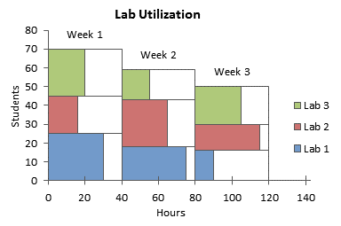
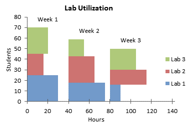
This would be rather complicated. You would need two smaller blocks for each week’s 40-hr block, and make each proportional to the time used and time unused. Then you would have to have a time point everywhere along the axis where each 40-hr block was split, and you’d have to put a value for each other series at this timepoint in the spread-out data, so there was no line through these blocks at irrelevant times. It’s a lot of bookkeeping, and my program would need major revisions to handle it.
Here’s the original chart:

Here’s the chart with each lab/week block split:
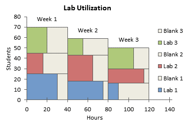
You might want to clean it up:
Even remove the borders:
Chris Durlacher says
Jon – will your charting utility handle variable width column charts like you show here, but for hundreds of columns? I tried your technique manually with a large amount of data and I believe I ran into an issue where one excel chart wouldn’t accomodate so much data. Just want to understand before I purchase the utility. Thanks.
Tim Milazzo says
Unfortunately this doesn’t work for Excel 2013 on Windows 8.
Jon Peltier says
Tim –
Sure it works. The dialogs are a little different in 2013 than in 2003, but the steps are the same.
Where did the protocol break down for you?
Finlay says
Is there a way to order the columns along the X-axis by height rather than width using this method?
Finlay says
Actually, sorry. That was a stupid question, sorted it quite easily. Thanks for the great tutorial!
Tracer says
Jon,
I am trying to get the Cascade chart working in Excel 2013, but when I select “Date Axis” as the axis type (No Time-scale option available in 2013) it does not align all the point with the same X-values, hence by area have slanted slopes. I followed your instruction in Excel 2010, it works perfectly, but with Excel 2013 I am stuck as described above. Please assist !
Regards
E
Jon Peltier says
I don’t know why your chart isn’t working in 2013, because the 2013 protocol is identical to that for 2010.
If any of the values in the X axis column are not numeric, your axis will not be able to treat the values as dates and make vertical edges.
Tracer says
John,
Is there a limit as to the number of columns that can be included in a cascade chart?
Based on your feedback, I checked my X-Axis data, It does not reflect as dates when I change the Axis scale to “Date Axis”, why ?
Regards
`E
Jon Peltier says
Number of columns of data, you mean? The limit based on legibility is way less than the limit based on any capability of Excel.
The X-axis data need only be non-negative numeric values, not necessarily dates (which are themselves numeric, the number of days since 1-Jan-1900, give or take a leap year glitch).
Jane Kennan says
Hi Jon (if you’re still around!)
Thanks for these very clear instructions. Although decidedly non-techy, I’ve managed to arrive successfully at my desired effect except that the last two series plotted (excl. dummy) don’t appear on my graph (though they were there before I changed the X-axis to date format).
I’m trying to plot cumulative shares in employment and relative labour productivity by sector, and my data are (X-axis employment shares first):
Agriculture – 65.2, 0.5
Govt services – 72.4, 1.1
Other industry – 77.2, 1.5
Distribution services – 92.5, 1.9
Other non-market services – 94.7, 2.1
Manufacturing – 99.1, 2.4
Finance/business services – 99.9, 11.5
Mining – 100, 25.0
I have fixed my date range from 1 Jan. to 15 April (i.e. more than 100 days for the time being), and interval to 25 days, so 100 appears on the X axis, but no bars are visible for fin/bus services or mining. Is it because their shares of total employment are just to minuscule to show (and if so, is there a way round this)? If not, why?!
Many thanks for any advice/suggestions.
Cheers
Jane Kennan
Ori Atias says
Hi Jon
I’m having some real trouble with the chart.
i can’t define two different axes to my stack chart, only values.
when selecting data for my chart i get only one line for data (one axis).
I’m probably missing something very basic and will be very thankful for help
Jon Peltier says
Ori –
Start with the data I used, and follow each step. Tell me which step doesn’t work. Also tell me the version of Excel you are using.
Ori Atias says
Hi Jon
Im having problems with the part you called ‘creating the chart’
when selecting the data for the chart, the excel “don’t understand” that there should be two variables
i get a lot of series with only one variable
thanks a lot
Ori
Jon Peltier says
Ori –
Are you using my data?
Is the top left cell of the data range completely blank?
Joe says
Hey Jon, thank you so much for posting these instructions! Up until now, I have been able to create the charts without any issues. For some reason, the “x axis” seems to change from the date axis that I’ve set it at and results in my slopes being diagonal as opposed to straight… Until now, whenever that happened, I would simply close excel and restart it, which seems to fix the issue… However, these days, I’ll have multiple Mekko charts in the file, so some of the mekkos fix themselves while the other ones do not. Have you run into this issue before? do you have any ideas? I wanted to post a picture but can’t seem to do so. If you like, I can send that to you.
Thank you,
Richard LeBer says
Jon,
This is a great tutorial. I’ve run into a limitation on Mac Excel (v15.17): Excel appears to round date axes to the nearest full day. Therefore, if the column widths are fractional, the widths get rounded up or down.
I can work around this by scaling the widths to even integers, but then I have to manually label the horizontal axis.
If there’s a better workaround for this, I’d love to hear about it.
Also, a minor clarification: In the step “Creating the Chart”, you say “Select the data in columns E through J and create a stacked area chart.” This works as long as you include the column titles (Alpha, Beta, Gamma, etc.) along with the data. If you omit the row containing the column titles, weird things happen.
Richard
Jon Peltier says
Richard –
Line/Column/Area chart category (X) axes in all versions of Excel round date-time values to the dates themselves (the whole number part of the date-time), ignoring the times (the fractional part). The discrepancy in my example isn’t too bad, probably off by at most one pixel. If I care about this discrepancy, for example, if my chart is significantly larger than the default size, I scale my X values (dates) to a minimum of 0 and a maximum of 10000 (or something sufficiently large).
And of course, you should include the column header labels when you create the chart.
Dixie says
John – Can you help me create a area/bar graph with column varied in width, I have excel 2007, I am horrible at excel? Thanks
Jon Peltier says
Dixie –
How far into this protocol can you get before you get stuck?
Eddie says
Dear all,
I am trying to set up a column chart in Excel where the width of each individual column represents the capacity (size in MW) of each unit of power generation along the X axis -in ascending aggregated order-. Also, I would like for the height of each column to represent the production costs incurred by each unit of generation along the Y axis. I’ve read through everything here and I am still unable to work out how to set up the data table. This is the data I have:
Unit Capacity (MW) Marginal Cost (£/MWh)
Coal1 8500 34.49
Coal6+7 8500 35.08
Coal5 1500 35.69
Coal2 1300 36.35
Coal4 2250 37.04
Gas2 8000 51.26
Gas1 5000 52.26
Gas4 4000 53.30
Gas6 2000 54.38
Gas3 2500 56.69
Gas5 2000 63.52
Could someone help me please. Thanks in advance.
Eddie
Jon Peltier says
Eddie –
I’ll do this slightly differently than the protocol shown here, more like the Marimekko Chart protocol, but for one series.
Here is what your data looks like, on the left, and how I spread it our to let me draw proportional width blocks. I have inserted two blank rows at the beginning of the data range, three blank rows between each data point, and two or three rows at the end. I use formulas to compute the cumulative capacity. In H2, I simply entered 0. Here are the formulas in the Coal1 block:
H3: =H2
H4: =H2+F4/2 (gives the midpoint so labels are centered in the blocks)
H5: =H2+F4
H6: =H5
You can then select the range H3:H6, then drag the little black square on the bottom right corner down to H46, and it will fill in the formulas all the way down.
Then I used formulas for marginal costs for each of these cumulative capacity values:
I2: =0 (use the formula =0, not just the value 0, or else it won’t autofill properly)
I3: =G4
I4: =G4
I5: =G4
Now select I2:I5, and drage the small black square down to I46 to fill in the formulas.
The last row of the table has 50000 in H47 and nothing in I47. This makes the axis of the final area chart go to 50,000 instead of stopping at 45,550. This last row isn’t needed in the first option below, an XY chart, and it really isn’t needed in the last option, an area chart, but it makes the horizontal axis of the area chart much easier to scale.
The easiest way to make the chart is to select H1:L46 and insert an XY Scatter chart, using the lines without markers option. I’ve added axis titles and data labels above the points. I used the “Labels from Cells” options for the labels, added in Excel 2013, using the range E2:E46, and where the blocks were narrow, I rotated the labels to avoid overlapping.
That might be enough for your purposes. But if you want the blocks to be filled, right click the chart, choose Change Chart Type, and select the stacked area chart type (or unstacked, which looks the same for a single series). It’s not right, since the blocks are all trapezoids with equal widths. But I’ve formatted the area series so it has a thin blue border, and a lighter shade of blue for the fill. The labels automatically and conveniently appear at the mid-height of each block.
Here’s the trick. Format the horizontal axis, and for Axis Type select Date Axis, instead of the automatic text axis. Set the Base Unit to Days, the Major Unit to 10000 Days, and the Minor Unit to 5000 Days (the boxes are only a couple characters wide, but enter these large numbers in them). Add Major and Minor tick marks outside the plot.
The result is pretty much like the XY chart, with shaded areas within the outlines.
Eddie Beuille says
Thank you soooo much Jon, you’ve really helped me, you’re awesome!
Eddie Beuille says
Dear Jon,
I now find myself facing another issue… just been asked to present some data (chart it). The data concerns system prices for electric power in the UK wholesale market, it is publicly available data. These “system prices” occur when there is too much/too little power in the transmission network (they have to regulate the frequency in order not to cause a total meltdown). i.e. the grid operator has to come out to the market in order to incentivise more generation or curtail generation.
How do they do it? Well, imagine what’s the best tool to incentivise us? Yes, MONEY!, that’s it. You might remember some related news concerning a Texas company called Enron a few years back… they were playing that game in California.
So, how on earth do you display these instances? When the grid operator has to come out an pay over the odds? Because, days in the power day (UK) have 48 periods (hhs) and these instances occur only from time to time. For example, in one month (31 days), I’ll have 6 days where this actually happened and on each one of those 6 days during a different number of periods and for different prices.
In this case I’ve been asked to look at negative system prices, i.e. a producer gets paid to produce LESS power… (you save the costs of producing something you had already sold at a profit and you get paid on top by the grid operator in order to not produce).
This is what the data looks like for one month in 2015 (May)… I only need to look at a couple of months. I don’t know how to present this so any way you feel works would be a huge help for me.
date period ssp
03/05/2015 1 -2.27
03/05/2015 2 -25.01
03/05/2015 3 -23.35
03/05/2015 4
03/05/2015 5
03/05/2015 6
03/05/2015 7 -12.75
03/05/2015 8 -29.06
03/05/2015 9 -16.22
03/05/2015 10 -22.70
03/05/2015 11
03/05/2015 12
03/05/2015 13
03/05/2015 14
03/05/2015 15
03/05/2015 16
03/05/2015 17
03/05/2015 18
03/05/2015 19
03/05/2015 20
03/05/2015 21
03/05/2015 22
03/05/2015 23
03/05/2015 24
03/05/2015 25
03/05/2015 26
03/05/2015 27
03/05/2015 28
03/05/2015 29
03/05/2015 30
03/05/2015 31
03/05/2015 32
03/05/2015 33
03/05/2015 34
03/05/2015 35
03/05/2015 36
03/05/2015 37
03/05/2015 38
03/05/2015 39
03/05/2015 40
03/05/2015 41
03/05/2015 42
03/05/2015 43
03/05/2015 44
03/05/2015 45
03/05/2015 46
03/05/2015 47
03/05/2015 48
06/05/2015 1
06/05/2015 2 -2.02
06/05/2015 3 -3.22
06/05/2015 4
06/05/2015 5
06/05/2015 6
06/05/2015 7
06/05/2015 8
06/05/2015 9
06/05/2015 10
06/05/2015 11
06/05/2015 12
06/05/2015 13
06/05/2015 14
06/05/2015 15
06/05/2015 16
06/05/2015 17
06/05/2015 18
06/05/2015 19
06/05/2015 20
06/05/2015 21
06/05/2015 22
06/05/2015 23
06/05/2015 24
06/05/2015 25
06/05/2015 26
06/05/2015 27
06/05/2015 28
06/05/2015 29
06/05/2015 30
06/05/2015 31
06/05/2015 32
06/05/2015 33
06/05/2015 34
06/05/2015 35
06/05/2015 36
06/05/2015 37
06/05/2015 38
06/05/2015 39
06/05/2015 40
06/05/2015 41
06/05/2015 42
06/05/2015 43
06/05/2015 44
06/05/2015 45
06/05/2015 46
06/05/2015 47
06/05/2015 48
09/05/2015 1
09/05/2015 2
09/05/2015 3
09/05/2015 4
09/05/2015 5
09/05/2015 6
09/05/2015 7
09/05/2015 8
09/05/2015 9
09/05/2015 10 -44.43
09/05/2015 11 -42.65
09/05/2015 12 -40.50
09/05/2015 13 -9.51
09/05/2015 14
09/05/2015 15
09/05/2015 16
09/05/2015 17
09/05/2015 18
09/05/2015 19
09/05/2015 20
09/05/2015 21
09/05/2015 22
09/05/2015 23
09/05/2015 24
09/05/2015 25
09/05/2015 26
09/05/2015 27
09/05/2015 28
09/05/2015 29
09/05/2015 30
09/05/2015 31
09/05/2015 32
09/05/2015 33
09/05/2015 34
09/05/2015 35
09/05/2015 36
09/05/2015 37
09/05/2015 38
09/05/2015 39
09/05/2015 40
09/05/2015 41
09/05/2015 42
09/05/2015 43
09/05/2015 44
09/05/2015 45
09/05/2015 46
09/05/2015 47
09/05/2015 48
11/05/2015 1
11/05/2015 2
11/05/2015 3 -9.00
11/05/2015 4 -7.44
11/05/2015 5 -7.28
11/05/2015 6 -8.35
11/05/2015 7
11/05/2015 8
11/05/2015 9
11/05/2015 10
11/05/2015 11
11/05/2015 12
11/05/2015 13
11/05/2015 14
11/05/2015 15
11/05/2015 16
11/05/2015 17
11/05/2015 18
11/05/2015 19
11/05/2015 20
11/05/2015 21
11/05/2015 22
11/05/2015 23
11/05/2015 24
11/05/2015 25
11/05/2015 26
11/05/2015 27
11/05/2015 28
11/05/2015 29
11/05/2015 30
11/05/2015 31
11/05/2015 32
11/05/2015 33
11/05/2015 34
11/05/2015 35
11/05/2015 36
11/05/2015 37
11/05/2015 38
11/05/2015 39
11/05/2015 40
11/05/2015 41
11/05/2015 42
11/05/2015 43
11/05/2015 44
11/05/2015 45
11/05/2015 46
11/05/2015 47
11/05/2015 48
16/05/2015 1
16/05/2015 2
16/05/2015 3
16/05/2015 4
16/05/2015 5
16/05/2015 6
16/05/2015 7
16/05/2015 8
16/05/2015 9
16/05/2015 10
16/05/2015 11
16/05/2015 12
16/05/2015 13
16/05/2015 14
16/05/2015 15
16/05/2015 16
16/05/2015 17
16/05/2015 18
16/05/2015 19
16/05/2015 20
16/05/2015 21
16/05/2015 22
16/05/2015 23
16/05/2015 24
16/05/2015 25
16/05/2015 26
16/05/2015 27 -22.37
16/05/2015 28 -34.97
16/05/2015 29 -35.00
16/05/2015 30 -58.96
16/05/2015 31 -61.16
16/05/2015 32 -61.79
16/05/2015 33 -58.68
16/05/2015 34 -51.47
16/05/2015 35 -0.70
16/05/2015 36
16/05/2015 37
16/05/2015 38
16/05/2015 39
16/05/2015 40
16/05/2015 41
16/05/2015 42
16/05/2015 43
16/05/2015 44
16/05/2015 45
16/05/2015 46
16/05/2015 47
16/05/2015 48
17/05/2015 1
17/05/2015 2
17/05/2015 3
17/05/2015 4
17/05/2015 5
17/05/2015 6
17/05/2015 7
17/05/2015 8
17/05/2015 9
17/05/2015 10
17/05/2015 11
17/05/2015 12 -2.61
17/05/2015 13
17/05/2015 14
17/05/2015 15
17/05/2015 16
17/05/2015 17 -32.86
17/05/2015 18 -2.97
17/05/2015 19
17/05/2015 20
17/05/2015 21
17/05/2015 22
17/05/2015 23
17/05/2015 24
17/05/2015 25
17/05/2015 26
17/05/2015 27
17/05/2015 28
17/05/2015 29
17/05/2015 30
17/05/2015 31
17/05/2015 32
17/05/2015 33
17/05/2015 34
17/05/2015 35
17/05/2015 36
17/05/2015 37
17/05/2015 38
17/05/2015 39
17/05/2015 40
17/05/2015 41
17/05/2015 42
17/05/2015 43
17/05/2015 44
17/05/2015 45
17/05/2015 46
17/05/2015 47
17/05/2015 48
Once again, thank you so much for all your help.
Eddie
Jon Peltier says
Eddie –
This is really just a column chart.
I only plotted the last few days, I set the gap width to zero, and I had to do a bunch of things to make the axis look better. But it’s just a column chart.
Thomas says
Great chart. I need to create the flip side of this chart; i.e. variable height stacked on top of each other. X-axis represents duration, Y-axis represents $ value. Each horizontal bar represents a project; for 10 projects I have 10 bars stacked on top of each other. This is known as project backlog.
Happy to create this via a similar method as outlined in this great tutorial or via the commercial add-in. I haven’t seen that this can be done via the add-in hence the question here.
Thanks
Jon Peltier says
Thomas –
The variable height is the Y values used in the chart. The first example in my comment of March 30, 2011, shows this.
James Tower says
Hi,
I am having a real hard time trying to make a stock option price chart. Option prices are changing constantly with big cap stocks. I want to be able to Stream the price of a option at a specific strike price, constantly refreshing every 1min onto a chart in excel. I really need some help with this. or if anyone knows a service that supplies this type of charting system. please let me know
Jon Peltier says
James –
First of all you need some kind of service that pushes the data into Excel. You could try a web query, then use VBA to update the query every minute. Or you could find a third-party tool that does this. I know Bloomberg has (or used to have) something similar that dumps data into your worksheet at regular intervals.
Then you need a way to deal with all the incoming data, link it or somehow push it into the chart’s source data range.
Matthew Tippett says
Can anyone think of a solution to get a chart like this:
http://www.evernote.com/l/AA2Th3iCbjxLMZeRFT_LfE11wMLjZw6PPSw/
It is a bar chart, with the % improvement (if a negative number) to the left of the vertical axis or deterioration (if a positive number) to the right of the vertical axis – but then crucially with the thickness of the bar proportionate to the significance of that series (e.g. the thicker it is the larger and more significant it is). Have had a good look at cascade charts and Marimekko charts – but to not avail so far… maybe it needs x-y or bubble… but surely it is possible? Any thoughts very much welcomed!
Jon Peltier says
Matthew –
Yes, this is possible, takes a bit of work. When I get a chance, I’ll try to work up a tutorial.
OSK says
Hello,
I need to make a chart like mentioned in the article but i am unable to make the dummy columns, Can anyone help. I am really stuck and badly need help. following is the data. first column is the name of the power generator, second is capacity and third is working hours per annum. i want working hours on x axis and on the y axis the height of the bar should show the capacity of the power generator. the max working hours should be at the bottom, on top of that the second lowest then the third lowest and so on.
Name [MW] [h/a]
E2 GK-3 0 168
E2 GK-4 0 0
E2 GK-4 KE 15 7129
E2 GK-5 0 0
E2 GK-6 0 0
E2 TG-3 51 0
E2 TG-4 51 3109
E2 TG-5 43 8170
E2 VK-1 130 953
E2 VK-2 116 1234
E2 VK-3 116 512
E2 VK-4 116 150
E2 VK-5 116 1571
E2 VK-6 116 1096
E2 VK-7 116 91
E3 EBL-1 0 0
E3 EBL-2 0 0
E3 PK GK-1 10 407
E3 PK GK-2 10 0
E3 PK GK-3 10 0
E3 TG-1 302 1665
E3 TG-2 302 0
RK6 GK-1 8 0
RK6 GK-2 8 0
RK6 GK-3 15 0
RK7 GK-1 8 0
RK7 GK-2 8 0
RK7 VK-3 35 0
RK7 VK-4 35 0
RK8 GK-1 15.12 0
RK8 GK-2 15.12 0
RK8 VK-3 58.15 2
RK8 VK-4 58.15 39
RK8 VK-5 116.3 4
RK8 VK-6 116.3 0
RK8 VK-7 116.3 5
Jon Peltier says
This is an old tutorial, as you can tell by the screenshots of the Excel 2003 dialogs. I need to rewrite it for Modern versions of Excel, and to make it workable for such a large data set as yours.