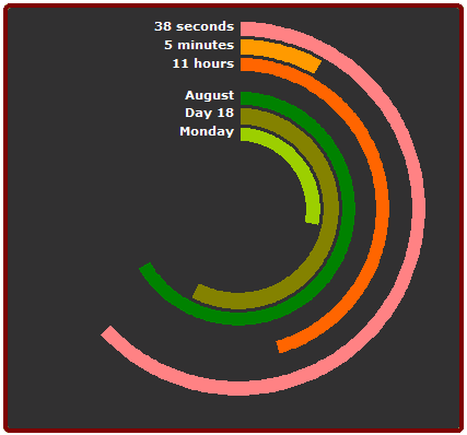
Chandoo saw a post at Smashing Magazine showing Top 10 creative ways to display time, and he took a crack at duplicating a polar clock using an Excel donut chart. Chandoo did a fine job with his copy of Pixel Breaker’s Polar Clock, though the style itself is tricky to interpret.

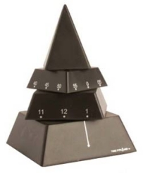
It reminds me somewhat of a pyramid clock, which has three rotating sections that indicate hours, minutes, and seconds. These are not particularly good timepieces, since they’re hard to read. (The same was true about Stacked Pyramid Charts.) But they are conversation pieces.
The donut chart is also a conversation piece, and is also not easy to read. We’re used to a clock scale where there are twelve clicks around the circle, and each click stands for one hour or five minutes (or seconds). If your donut chart had just three rings, 0-60 seconds, 0-60 minutes, and 0-12 hours, its scales would match the customary clockface. I suspect that the combination of arc length and angle in a regular clock is easier to read than arc lengths of the partial rings in the donut clock; at least that’s how it seems to me.
The scales in Chandoo’s detailed donut clock are all different (except minutes and seconds), and in fact, day of the month isn’t even the same from month to month. Putting day of week (7 units) next to day of month (28 to 31 units) probably reduces readability of both. The least significant and fastest changing measure, seconds, should probably be in the center, so its motion causes the least change on the whole chart. I guess that means that Pixelbreaker’s and Chandoo’s clocks are inside out.
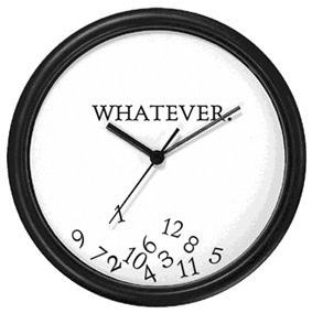
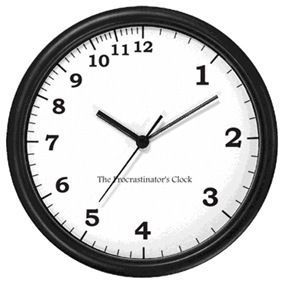
I don’t have an alternative time display that I’ve invented. I am probably too locked into the conventional clock face algorithm. However, I have a couple favorite variations on the standard clock face. The Whatever Clock (below left) is hanging in the hall outside my office. And I sent a Procrastinator’s Clock (below right) to a friend who was struggling to finish a manuscript.
Despite the distortion (or destruction) of the numerical scales, the familiar 3-6-9-12 orientation makes them easy enough to read. My kids who were raised on digital time seem less sure of these clocks.
By the way, if you want to make a standard analog chart in Excel, John Walkenbach shows how in Analog Clock Chart.


derek says
Ah, but as we know, gauge-style displays are to be avoided, because angles are hard to read. So behold… the bullet clock! :-)
Jon Peltier says
Derek –
It follows the rules, yet I think I’d find it hard to get used to. All those centuries of experience with the round clock. Well, I don’t have all those centuries of experience.
Here’s a very compact form which I think people can read:
derek says
It was AM when I wrote that…
Jon Peltier says
I’m a little slow…
Chris says
What’s with all thse 11s and 12s? We should have decimal time.
New York: 0.174
London: 0.382
Paris: 0.424
Jon Peltier says
Chris – That’s how it looked when I copied my original table, then pasted the values transposed. I didn’t know what it meant until I applied the H:MM AM/PM number format.
Chandoo says
@Derek, that is a good idea… bullet chart, you could add an indicator to show if its AM or PM though…
another way is to have the small ticker on top and bigger one bottom, that way when they coincide or close enough it is easy to read :)