Raymond Chen posted recently that The purpose of charts is normally to make information easier, not harder, to understand.
Not always. More often the purpose of a chart seems to be to:
- Make the presenter look smart, or at least cool.
- Make the presenter’s product look better than the competition, despite the facts.
- Accentuate (fabricate) the positive and obfuscate the negative.
- Hide the fact that the presenter doesn’t know what’s going on.
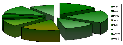
Raymond backs up his assertion with a counter-example which I presume looks like this, with barely distinguishable green gradients and a useless legend.:

You can improve the information transfer by removing the gradients, flattening the awful 3D perspective, and replacing the legend with appropriately located data labels. What do you know, slices one, two, and four are the same size.

A further improvement is made by changing the pie chart to a column chart. And what else do you know, slice two is not the same size as one and four.

So pie charts exemplify chart suck, we knew that. So what are charts really for?
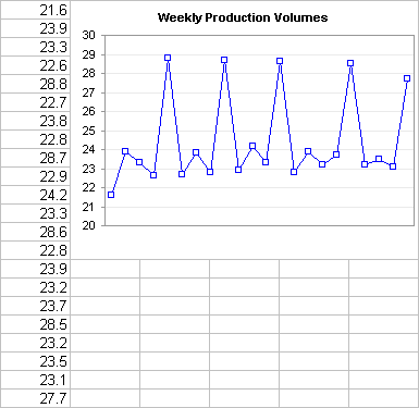
You can Use a Chart to See Patterns in Your Data.

Jorge Camoes suggests Using Charts to Validate Your Tables.

You can use a chart to selectively and interactively display one set of data among many.

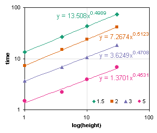
You can use charts in a Graphical Approach to Solve a Simple Physics Problem.


You can use charts for a lot more purposes, and better purposes, than described in the four bullet points at the top of this post. If you’re careful, you may even demonstrate Raymond’s thesis that The purpose of charts is normally to make information easier, not harder, to understand.


Robert Kosara says
While I generally agree with you cynical list of reasons, I wonder about number 4: “Hide the fact that the presenter doesn’t know what’s going on.” I find that a bad or overcomplicated chart makes me ask a lot more questions than if somebody just talks over something s/he doesn’t understand. Looking at the chart, I try to figure out what it’s supposed to tell me, and if I can’t, I keep asking. So this strategy might actually backfire.
Jon Peltier says
Robert –
I agree. By the same token, how often is objective #1 realized?
Jon Peltier says
I think a pie shouldn’t contain more than two segments. Two sections tell as much of a story as a pie can handle, and this is as much pie as I can handle:
(thanks Logic Nest.)
Sandi Mays says
I agree with your comment that Pie Charts generally suck. The qualifier is – they suck when you are trying to compare more than 4 pieces of data.
I like the column chart. I am stuck in a rut, where I always use Pareto bar/line combo charts to visually depict the data.
Tony says
Would the crumbs be the “gray” area that isn’t labeled in the legend? I do love me some lemon pie though. My yellow slice would be much smaller…