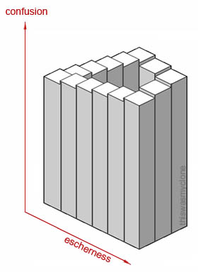
Whenever I am faced with a 3D chart I think of the song lyric I’ve used as the title of this post, taken from Pardon Me by Incubus. I also think of the following chart, which was submitted by thiswasmyclone to the b3ta challenge: graphs. (I didn’t add a hyperlink, because I didn’t want to make it too easy to waste your time, but the link is at http://www.b3ta.com/challenge/graphs/popular/, copy and paste at your own risk.)
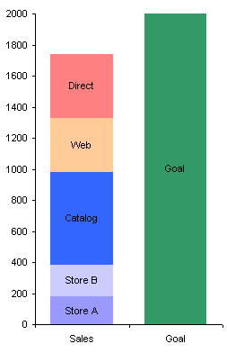
I always tell people to avoid using charts with 3D effects, and they wonder why. I’ll use an example from the Mr Excel forum to illustrate much that is wrong with 3D charts. The Mr Excel thread, Excel Chart – stacked column to chart progress, dealt with ways to show progress towards a goal, where the progress consists of a sum of items. One suggestion was to use a stacked column with 3D effects. Some sample data is shown below, along with my best reconstruction of the 3D chart offered as a solution.
| A | B | C | |
| 1 | Sales | Goal | |
| 2 | Store A | 180 | |
| 3 | Store B | 205 | |
| 4 | Catalog | 595 | |
| 5 | Web | 345 | |
| 6 | Direct | 415 | |
| 7 | Goal | 2000 |
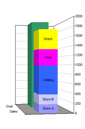
Never mind the aesthetics of the chart, let’s look at how ineffective it is at conveying values. I can’t do better than guess the values of any of the bars, except perhaps the top of the dark blue one, which is just below 1000. I don’t know where to extrapolate the lines otherwise, and without printing it out and marking it up with a pencil and straightedge, I have no chance. Does the yellow bar stop midway between 1800 and 2000? No it’s probably closer to 1800, or maybe lower, but I don’t know where to draw the lines. The pink bar doesn’t stop at 1400, either, probably a bit lower. Impossible to tell because of the difficulties of rendering perspective and parallax onto a 2D surface.
You can improve on this chart simply by removing the gratuitous 3D effects.
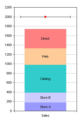
The example below shows how to use a line instead of another column to indicate a goal. The data values are placed in a single column, because only one category is needed. After creating the 2D stacked column chart, the “Goal” series is converted to an XY series (the red square), and X error bars are applied to the XY series, using positive and negative values of 0.4 (left). The marker (red square) is hidden, the error bars are formatted, and the series is given a data label “Goal”. The colors have also been fixed up, though a graphics designer would be able to develop a better color scheme (right).
| A | B | |
| 1 | Sales | |
| 2 | Store A | 180 |
| 3 | Store B | 205 |
| 4 | Catalog | 595 |
| 5 | Web | 345 |
| 6 | Direct | 415 |
| 7 | Goal | 2000 |

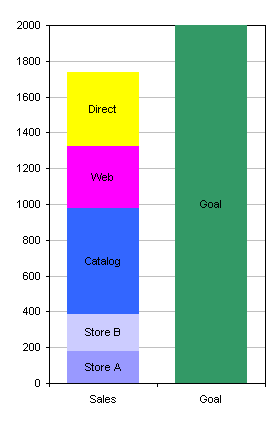
If desired, the Goal series could still be represented as a column, as shown below. In the first chart, the Goal series is on the Primary axis, while the individual sales outlet series are on the secondary axis, so they lie in front of the goal. The gap width for the Goal series is made smaller (50) than for the other series (the default 150), and the secondary Y axis was deleted. This is pretty much what the original 3D behemoth was intended to show.
In the second chart, the sales outlet series remain on the Primary axis, while the Goal series was moved to the Secondary axis, given a border, and made transparent (no fill). The gap width for all series was set to 50, and the secondary Y axis was deleted.
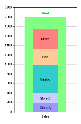
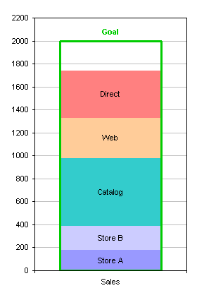
Let’s return to the original data and the original chart, and compare a 2D Excel chart with default formatting with the corresponding 3D chart with default formatting. The 3D chart requires extra shapes to give the false illusion of depth. Also, to make room for the added shapes, the chart does not fill its space as completely.
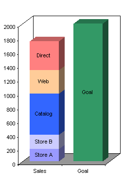
Let’s take this a step further, and deconstruct the 3D chart to see how many elements are critical and how many are pure junk. I copied the chart as a picture (not a bitmap), pasted it into PowerPoint twice, and ungrouped both copies. I kept all 3D junk in one chart and removed the non-junk elements, and I removed all the 3D junk from the other. There was some stretching of the fonts and some darkening of the borders, but you get the idea.
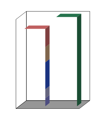
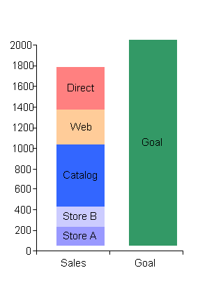
The chart on the left shows all the extra stuff required to give the illusion of a third dimension. The chart on the right shows that even with the junk removed, the display is skewed upwards and to the right to allow room for the added shapes. This deconstruction illustrates the amount of clutter that must be added to a chart to provide the unnecessary illusion of depth, and the skewing of data needed to accommodate the clutter.


Mark Stetz says
Excellent discussion of the problem with 3D charts and how to avoid them Love the ‘Escherness’ graph.
Anonymous says
this is cool…appreciate.
Debbi Barnes-Josiah says
Hi, Jon,
I completely agree with your 3D comments, but… We are doing some Dashboard-type reports, and frankly they look better in 3D; given that we’re ok with the picture being more qualitative than quantitative. The problem, though, is that I want to include a “Goal” line, as you did in the example above. But haven’t been able to figure out a way to trick Excel into putting an automated line into a 3D bar graph. I can manually add a line, but there are multiple graphs, and the data get updated quarterly, etc. Any suggestions?
Thanks!
[ps – In your Goal-line example, why don’t the error bars go vertically instead of horizontally?]
Jon Peltier says
Debbi –
You can’t make a 3D combination chart in Excel. So no 3D bars with a 3D target line (which actually isn’t really a line, but a ribbon).
Oh well, back to best practices.
Debbi Barnes-Josiah says
(wistful tone of voice): Not even a 2D line on a 3D graph?
Jon Peltier says
Not even. But if you could, where along that third dimension would you locate the line? In front of the data? Embedded in the bars? On the back wall, which is impossible to align with the bars to judge where the gridlines may be?