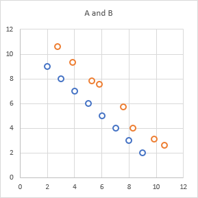
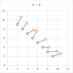
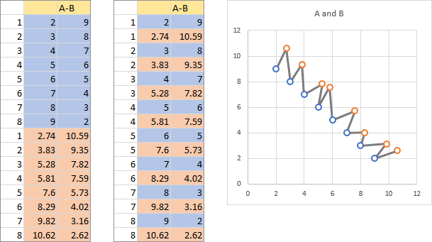
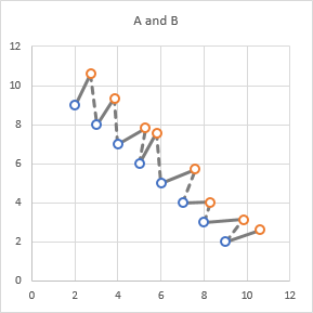
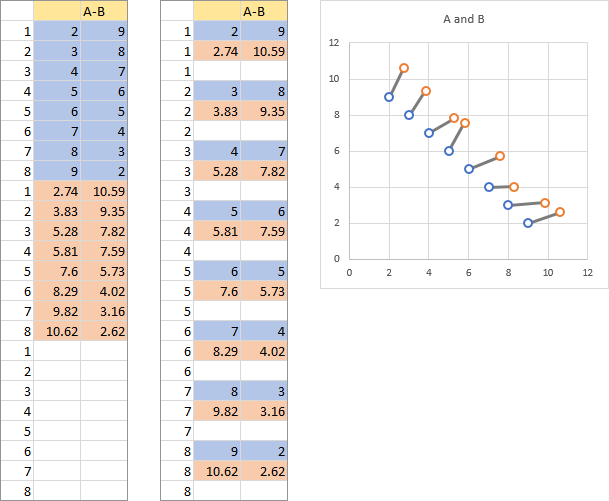
In Connect Two XY Series I showed how to use an extra XY series to connect two existing XY series in a chart. This shows how points in the first series may have changed to produce the data in the second series. A reader asked in a comment how to use arrows to more visually show the direction of change.
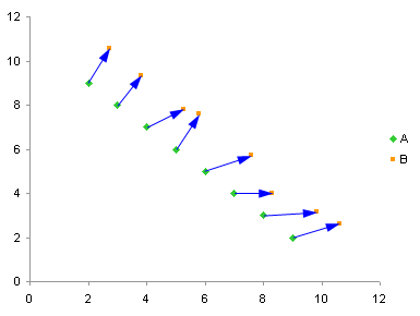
In Excel 2007 drawing these arrows is easy, because one of the formatting changes allows the lines in a chart series to be formatted as arrows. When used judiciously, that is rarely and only for truly informative purposes, the features I and others have derided as “eye candy” can actually be used for good, not just for evil.
In Excel 2003 and earlier, getting these arrows is not as easy, but I have provided a means to do so, and in fact the chart above was produced in Excel 2003. [Read more…] about Connect Two XY Series with Arrows (VBA)


