I like Wired magazine. It has interesting and insightful articles and a certain edgy attitude. I like the magazine enough to have bought a subscription for the dead trees version, even though you can find most of the print content online. There’s something about a real magazine or book that my laptop just can’t match.
But the graphics department has some strange ideas about infographics. Wired generates lots of infographics, some very extensive. Sometimes they are pretty good, and you have to give them credit for trying some extreme things. But in The Dark Lord of Broadband Tries to Fix Comcast’s Image, a biting story about some sneaky packet filtering tricks the cable giant has been pulling, there were some relatively simple charts that raised my hackles. The article was a good read, by the way.
When my family lived in Jersey, our cable was supplied by Comcast, and to be honest, I was satisfied with our service. Here in Massachusetts, our cable is supplied by the town, not by any of the cable companies, and I am even more satisfied. When I call for service, which is rare, the phone rings about three miles away, and the service guy is likely to come by within a couple hours. The town provides cable and electricity to its residents on a not-for-profit basis, too, so the price is also very satisfactory.
The first chart was merely a list of the five worst companies (in a list of 60). To highlight the star of the article, the artist used a thick 3D bar, when a 2D rectangle would have been sufficient. But the 3D bar didn’t really detract from their point, so I can be talked into ignoring this transgression.

The other three charts in the article were less forgivable. First was a line chart showing how the market shares of new cable, DSL, and fiber installations have changed over the past several years. A line chart is definitely the appropriate chart type for this data, but they gave it a 3D aspect. They didn’t give the lines a thickness, fortunately, so we aren’t forced to untangle a set of ribbons. But the inclination skews the perceived slopes of the lines.

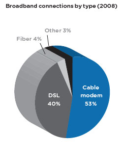
The next chart is a pie chart showing the market shares of the hookup types in the most recent year. This is actually not a bad use for a pie chart: there is one very large segment of around 50% and another nearly as large, plus a couple small ones. I softened my stance against pie charts when I saw similar ones relating to the recent US elections on FiveThirtyEight.com. However, the depth of the Wired pie chart in the third dimension makes it more like a log chart than a pie chart. We see now the reason for the three dimensions of the line chart above: the three charts in the set all have matching 3D orientations. Skew one, screw them all.

The final chart of this triad is a 3D column chart. The 3D effect isn’t too distracting, at first glance. However, after looking more closely, it’s clear that the inclined baseline and the false depth make Cox appear to be at least half as tall as Time Warner, and Time Warner to be two-thirds as much as Comcast. The actual proportions are smaller than they appear.

Usually I construct my own versions of the offending graphics. But this time I’ll leave it as an exercise for my readers.


