Last week we released the PBCharts (Process Behavior Charts) tool for performing SPC control chart analysis. I’ve been working on PBCharts for well over a year, and we had an extended beta testing period, during which we cleaned up numerous issues. I thought I’d walk through an analysis to show how easily PBCharts does its work.
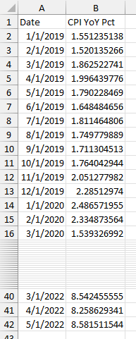
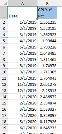
My colleague posted a quick analysis of inflation since the start of 2019, and that looked like a good data set to analyze. The data file CPI YoY Pct.xlsx (click to download) looks like this, showing date and year-over-year percentage increase of the consumer price index:
I’ve described the manual process of generating control charts in Introducing Control Charts (Run Charts), based on Donald Wheeler’s Understanding Variation, an excellent introductory text on this topic. It can be tedious to set up your own control charts, but PBCharts makes it easy to apply the techniques to lots of data.
PBCharts Data
PBCharts uses a specially formatted Excel template for its data, calculations, and charts. A PBCharts workbook has four visible worksheets: Data, Run Chart, MR Chart, and I Chart.
There are a few ways to get the data into the PBCharts file. The PBCharts ribbon presents us with a few options.

Import Data into PBCharts: Click this button, then browse to a data file (CSV, TXT, or Excel) and PBCharts will import data from the selected file into a new PBCharts file.
Analyze Selected Data in PBCharts: Select your data range, or select one cell in the data range, and click this button, and PBCharts will populate a new PBCharts file with the selected data, or if a single cell is selected, with the larger data range that contains the selected cell.
Blank PBCharts File: Click this button to create a new, blank PBCharts file, then paste your data into the Data sheet of the PBCharts file.
The inflation data looks like this in the PBCharts data worksheet:
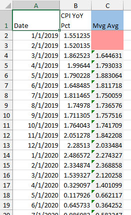
In general, you will have more than one column of data to analyze. For example, the view below shows the inflation data above, with another column showing a three-month moving average. The cell colors tell you about the data: the gray cells indicate that the cell contains a formula, the red cells indicate that they are blank. The blue header cell tells you which column is currently being analyzed (PBCharts analyzes one column at a time). If you click on a different header cell, PBCharts will focus the analysis on the newly selected column.
The PBCharts Ribbon
This isn’t really a manual for PBCharts, just a demonstration, but I’ll show the rest of the ribbon, so my discussion below makes sense. I’ve already shown the section that is used to manage PBCharts files.
The Analysis section of the ribbon includes controls for selecting the column to be analyzed, as well as controls for defining stages, trends, and excluded points, for labeling points, and more.

The Charts section provides a means to override axis scales, to set and show a target value, and to select a run test to apply. You can choose a chart style (bold, medium, or light), you can save charts as text files or export them to PowerPoint or Word, and you can define a dashboard-like layout of multiple charts.

The PBCharts Charts
Run Charts
Click on the Run Chart worksheet, and you see a run chart of the data in the highlighted column of the data sheet. It starts out pretty boring in 2019, then in early 2020 there is a dip, followed by another boring stretch, and starting in early 2021, inflation started ramping upwards.
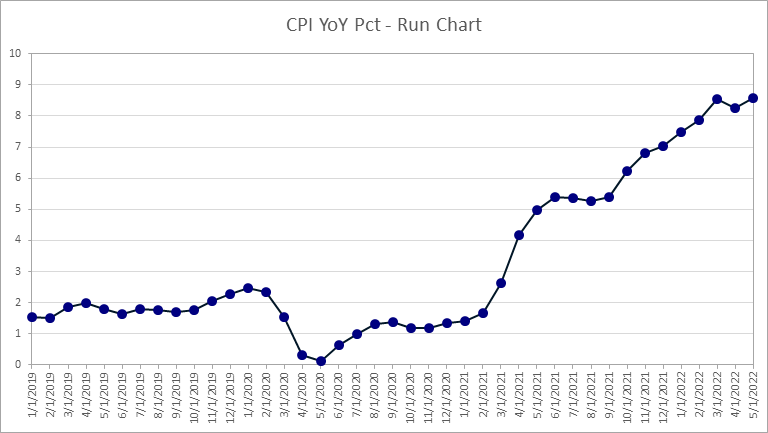
You can select whether to test the run chart for certain conditions using the dropdown in the Charts section of the ribbon. The run chart above has no test.

The chart below has one test, Runs About Median, selected. The median is displayed as a green horizontal line, and every time the data crosses the median, a label is displayed along the top of the chart.

Our data displays 6 runs about the median. For a data set of this size, we would expect 21 runs about median, or between 17 and 26 with a p-value of 0.05. Since our runs are so low, the data is classified as clustering.

The chart below has another test, Runs Up or Down, selected. This counts each time the points reverse direction.
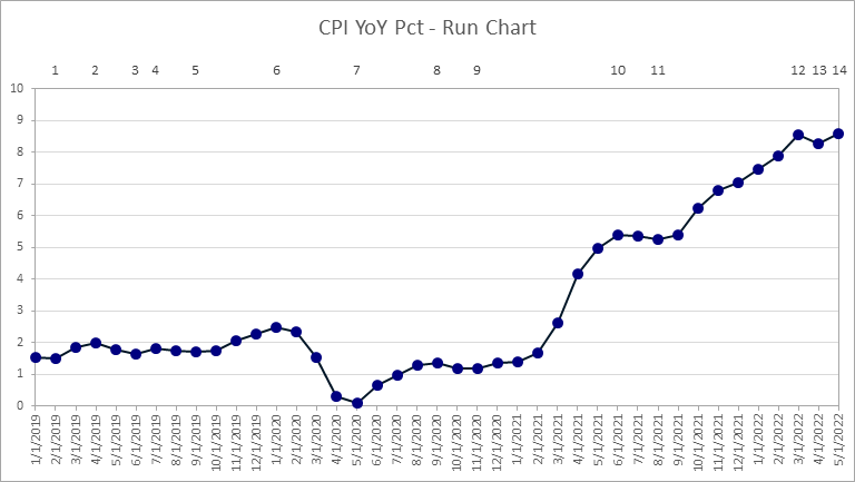
We would expect 27 runs up or down, or 23 to 31 with p=0.05, for a data set of this size. Instead, we see a much lower number, 14, which indicates trending behavior. Not surprising, given the obvious upward trend over the last third of the chart.

The run chart tests tell us that the data is not uniformly distributed, but we can still use control charts to analyze the behavior.
I (Individuals) and MR (Moving Range) Charts
We turn to the MR (Moving Range) Chart. This shows us how much the data changes from one value to the next and is a measure of the variability in the data. We see immediately that there are two peaks in the MR data, indicating large changes in the data, and possibly process changes.
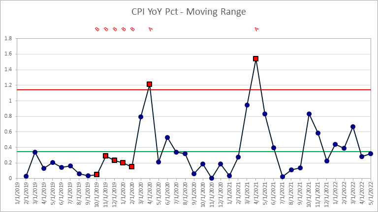
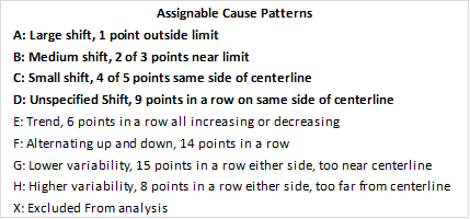
The green horizontal line shows the mean moving range value, and the red horizontal line shows the upper natural process limit (or upper control limit) on the moving range. The red square points indicate points which are out of statistical control, that is, which violate one of the rules, and the red labels at the top of the chart show which rules have been violated. There are four possible rules for MR charts, shown below, and our analysis is checking two of them, in bold. The two obvious peaks exceed the upper control limit.

I’ll show the I (Individuals or individual values) Chart, but it’s not usable yet. The green line shows the mean of the data, and the red lines show the upper and lower natural process limits (control limits). There’s a lot of red, which means that the average and control limits calculated so far do not describe the data well.
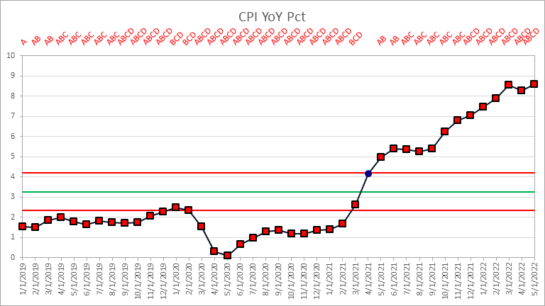
The red square markers indicate points which are out of control, and the text above the chart indicate which rules were violated. There are eight I Chart rules built into PBCharts, and we are checking four of them.
Dividing the Data into Stages
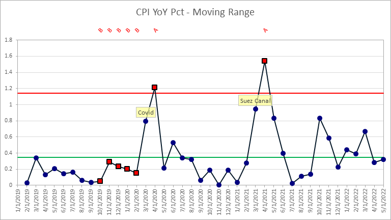
Let’s return to the MR chart and label a couple of points. I’ll label March 2020 “Covid” since it’s when we in the United States started severely limiting our activities due to the Covid pandemic. I’ll label March 2021 “Suez Canal” because that’s the month when the huge cargo ship ran aground in the Suez Canal, blocking all traffic. That event didn’t by itself cause the runaway inflation, but it marked the point when we became aware of how problems with shipping, supply chains, and logistics began to hurt the global economy.
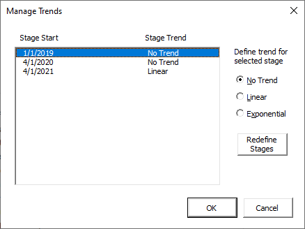
Now back to the I chart. I’ll click the Stages button on the ribbon, and define two new stages starting in April 2020 and April 2021 (the first stage automatically starts at the beginning of the data set).

Next I’ll click the Trends button, and assign a linear trend to the third stage.
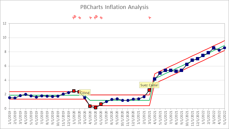
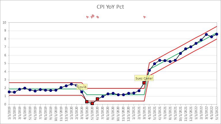
The I chart now looks well behaved. There is an initial horizontal section, then an intermediate horizontal section at a lower inflation value, indicative of reduced economic activity. Finally, there is the final increasing section. We still see a few red out-of-control points, three at the beginning of the middle Covid section, and one at the transition between the Covid static range and the final increasing stage.
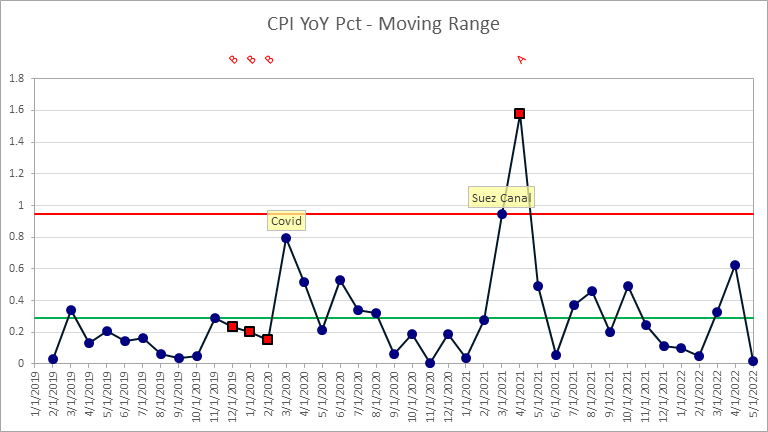
The MR chart shows no point exceeding the control limit where Covid started, though we still have the over-the-limit point where global shipping became an issue. I’m not going to be concerned with these violations.
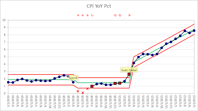
We could modify the I chart further, using the Exclusions dialog to exclude the three out-of-control points at the beginning of the Covid stage. Doing so causes three other points out-of-control, so I would probably just leave those points in the analysis.
The important thing to ask now, is whether the inflation rate will keep increasing. The US Treasury has raised its prime rate in March and again in May to try to slow inflation. There is no sign that this is having any effect, since the latest data points fall within the process limits and no other assignable causes are seen. But we can keep watching, add data every month, and follow the trends.
Locking Limits
PBCharts allows us to select a period of time, and lock in the calculated limits. It is common practice, once a process is deemed stable, to lock the limits before plotting subsequent points. This way adding more data will not affect the displayed limits, and the added data is directly compared to the stable process behavior.
We can use the inflation rate data to illustrate locking of calculated process limits. Since the Fed first increased interest rates in March, let’s back up the data to that point, ignoring the last two points. Here is the I chart.
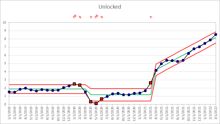
Now I’ll lock the limits in the last stage (April 2021 to March 2022). The dark circles have changed to squares to indicate the points used to calculate the locked limits.
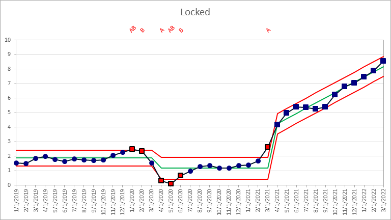
The limits are the same in both charts. Let’s view the final stage side by side.
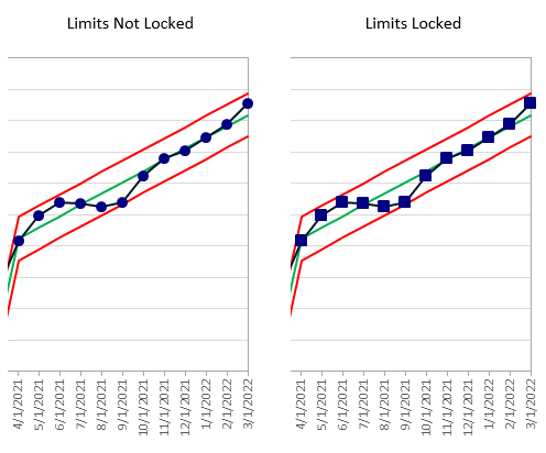
Let’s add back the data for April and May. The difference in the two charts is subtle: notice that the last two circles are closer to the green line without locked limits (left) than to the green line with locked limits (right). This is because the added points have changed the slopes of the green lines and red limits, rotating the right sides of these lines slightly downward.
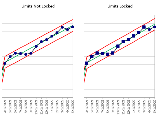
Now let’s suppose that the Fed’s interest rate action has had an effect. To simulate this, and I’ll admit it’s a huge assumption on my part, I’ll repeat the last two actual points for April and May as presumed additional points for June and July. The unlocked green and red lines of the left-hand chart below have rotated further, so that the green line is now below the points for April and May, and the imaginary points for June and July are above the lower red line. The locked limits in the right-hand chart haven’t moved. The points for April and May are still below the green line, and the new points for June and July are below the red line and highlighted as out-of-control points.
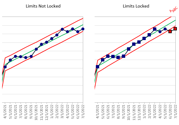
These out-of-control points are a signal that something in the process has changed. We might presume that increasing interest rates has stopped the climb in the inflation rate.
Get PBCharts
PBCharts is a VBA add-in for Excel. It is limited to Windows, but it runs on any supported versions of Excel, from Excel 2013 through Microsoft 365.
To get your copy of PBCharts, visit the PBCharts website. You can download PBCharts on a 14-day free trial basis, or you can purchase a one-year license for $99.00.
Further Reading about Statistical Process Control
- ISO 9001 – Introduction to SPC
- Control Charts on Wikipedia
- Interpreting Control Charts
- Selecting the Right Control Chart


