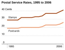
Recently in the Flowing Data blog, Nathan Yau wrote U.S. Census Bureau’s 2008 Statistical Abstract – Looking at America’s Data. Interesting, now I can look up anything and take on Cliff Clavin.
Nathan included a chart showing how the price of first class postage stamps had increased over the years. In a comment I noted that a step chart would have been a better choice to show this data, as the nature of stamp prices is not continuous in nature, but is characterized by constant-price segments with jumps from one price level to the next.

Another commenter disagrees, saying that a step chart makes the trend difficult to see. I thought this was a good excuse to make a comparison between line and step charts for this type of data. [Read more…] about Line Chart vs. Step Chart


