About the Combination Chart
A reader sent me a combination chart showing monthly high and low average temperatures and precipitation in his home state of Bihar, India, and asked how to create this chart in Excel. I believe the source is Wikipedia.
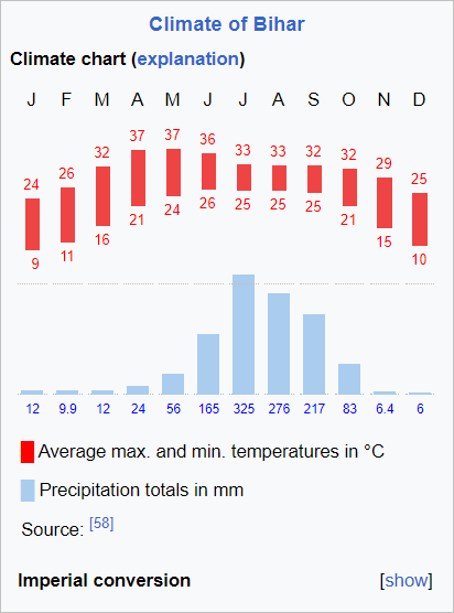
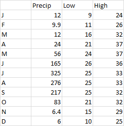
It’s a nice chart, easy to understand, and not too hard to do in Excel. Here is the data I manually extracted from the chart. Precipitation is in millimeters and temperatures in °Celcius.
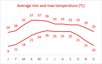
I can use floating bars to plot low and high temperatures by plotting high and low temps in a line chart (see Floating Bars in Excel Charts and Floating Bars).
I first made both lines red, and put data labels above the High series and below the Low series.
I add Up Down Bars to the chart, which connect the first and last data points for each category (month). Since low is first and high is second, the bars go from low to high, so they are Up bars. Sometimes data is mixed, like stock market data which can go up or down, and you will get a mixture of Up and Down bars.
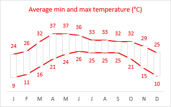
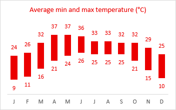
These Up bars need to be formatted. I gave them a red fill color and a border of no color, and I used no line for the high- and low-temperature series.
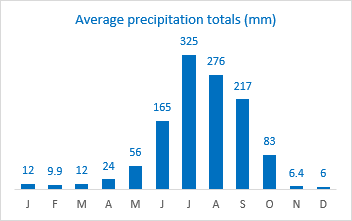
The precipitation data is a simple column chart.
We just need to put these pieces together. I developed the following protocol that will simplify creating the combination chart.
Creating the Combination Chart
Starting with the data shown earlier, insert a line chart.
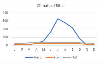
Right click on any series in the chart, and select Change Series Chart Type from the pop-up menu. Change Precip to a Clustered Column type in the dropdown and check the Secondary Axis box.
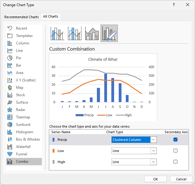
Now it’s a combo chart, but it’s not yet our combo chart. We see low- and high-temperature lines plotted against the primary (left) axis, and precipitation columns on the secondary (right) axis.
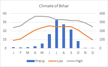
The next step is to stretch the chart to its final (or near final) size.
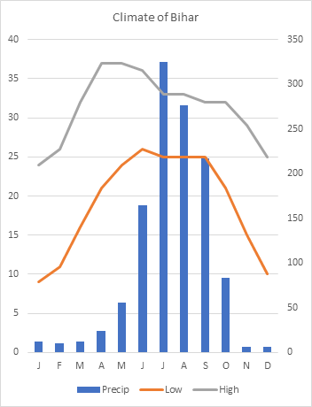
Adjust both Y-axis scales to partition the chart into an upper section for temperature data and a lower section for precipitation data.
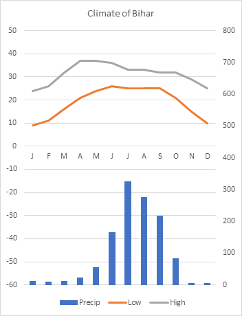
Setting the scales is an iterative (trial-and-error) process, depends on the range and units of your data values, and accommodates space needed for enhancements such as labels. You can readjust the scales at the end to make everything fit nicely. In fact, I built my chart, fine-tuned the axes, and applied those scales to the above chart.
Let’s clean up the chart. Delete the gridlines and legend. For both Y axes, set the label position to None. Set the X-axis label position to Low. Note that the X-axis line remains in the middle of the chart. We could set it to No Line, but I think keeping it helps partition the chart.
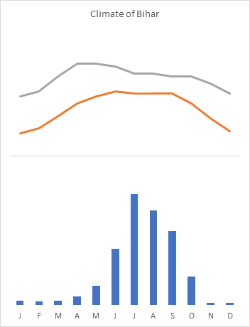
Format the precipitation columns. I’ve set the gap width to 100, added data labels in the Outside End position, and used a shade of blue I prefer for the columns and label text.
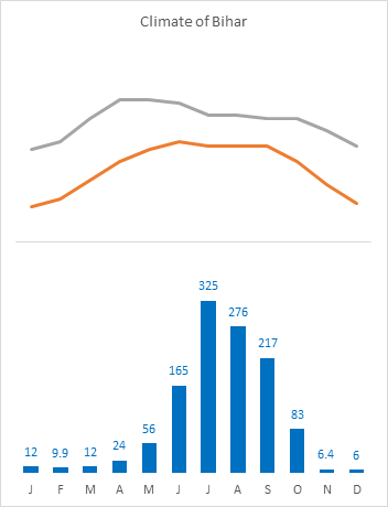
Format the temperatures. Start by adding data labels above the High and below the Low temperatures, and adding Up-Down Bars to the chart.
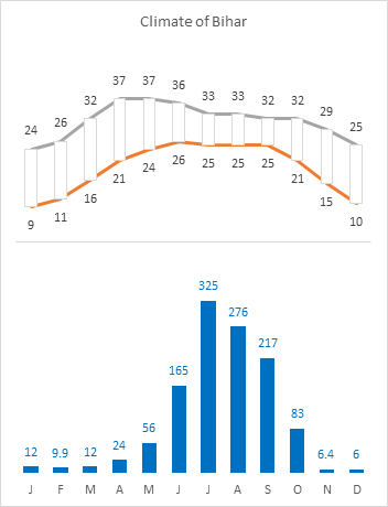
Finish formatting the temperatures. Now that there are Up-Down Bars, you can set the gap width to 100. But you have to select and format one of the lines first, because that’s where you’ll find the gap width setting for the bars. Format the temperatures to use no line. I’ve used a preferred shade of red for the bar fill color and for the labels.
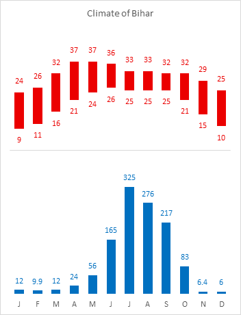
Finish the chart. Format the chart title, then add and format two textboxes to the chart as subtitles. Note: to be sure the textboxes become part of the chart, select the chart before you insert the textbox (Insert > Shapes > Basic Shapes > Textbox).
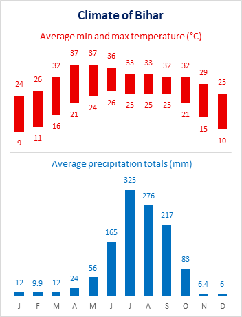
Chart Data From a Different Region
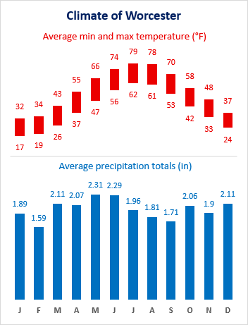
I went online and found similar data for Worcester, MA, a city close to my home. I made a copy of my worksheet, and typed this data in place of the data for Bihar.
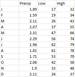
The chart for Worcester was totally messed up. But that’s because Bihar’s data is in °Celcius and millimeters, while the data for Worcester is in °Fahrenheit and inches, and the ranges of values are incompatible.
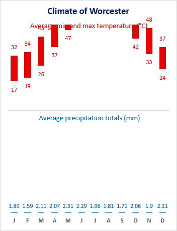
It only took a minute to tweak the axis scales and fix the units in the textboxes. Here is my monthly climate summary for Worcester.
