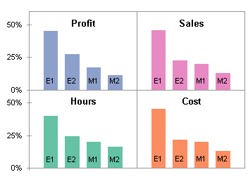
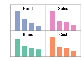
Several months ago, in Column Chart to Replace Multiple Pie Charts I showed how a column or bar chart could display a table of data more effectively than four pie charts could. Another alternative is to build a panel chart, a shown above.
Let’s review the sequence. The data shows how four business measures (Hours, Cost, Profit, and Sales) are apportioned among four categories of employees (Engineer 1 and 2, and Marketing 1 and 2).

Here are the pie charts. Very pretty, colorful and symmetrical and all. But it’s not really easy to compare the actual wedge sizes within and between the pies.

A clustered column chart plots all data on the same baseline, and the value is proportional to the one-dimensional size of the bars, not to a two-dimensional arc length.
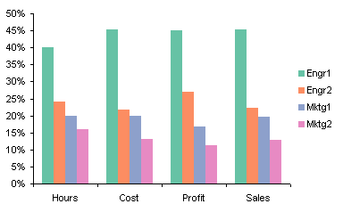
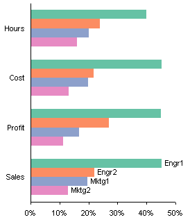
The column chart could be improved by removing the legend and labeling chart series directly. In order to prevent labels from overlapping other labels and other series, it may be necessary to rotate the labels into harder to read orientations. However, we can rotate the whole chart, and retain legible labels in a clustered bar chart.
Finally, for some situations, a panel chart may be an improvement over any of the preceding alternatives. This article shows how to construct a 2-by-2 panel chart. The procedures are easily scalable to any practical R-by-C arrangement.

Panel Chart Data
The original data is shown in the heavy border in B2:F6. This data needs to be rearranged and augmented before we can create the chart.
The data is color coded as follows:
- Green – used for series names in the chart
- Purple – used for series category labels or X data
- Blue – used for series Y data
- Yellow – used for custom data labels on data points
- Orange – user inputs for on-the-fly customizations
Note: I use Rob Bovey’s Chart Labeler to apply custom labels from a worksheet range to a chart series. This is a free Excel add-in which interfaces so well with Excel’s interface that it seems built in. Rob’s utility actually links each data label to a cell, so if the cell’s contents change, the label also changes. The utility also applies the font formatting of the cell to the label, so these ranges in the data below have different formatting from the rest of the worksheet.
The data in B11:M16 will produce the bars that display the actual data, and C8:M9 contains the labels that will show the employee category in the base of each bar. To ensure that Excel correctly parses the data when you create the chart, select cell C11, type a space character, and press Return. This makes Excel think there’s a label in C11, so it starts tie category label range in C11 instead of D11.
The value in cell H3 is the maximum sized bar that will fit vertically in each panel. The largest value in the table is 45.3%, which is bumped up to 50%, then an additional margin is added for the titles in the upper end of each panel, making this height factor 0.6 or 60%.
Range B18:D23 contains the data needed for the XY series that will locate the titles in each panel. The factor of 0.85 in cell D18 means that the titles will be located at 0.85 (85%) of the way from the bottom to top of each panel. The purple values were derived as follows. The column chart has columns in slots 1, 2, 3, 4, etc. Slots 1, 6, and 11 (columns C, H, and M) have zero-height columns, and are located at panel boundaries. We want the titles centered within each panel. An XY point plotted on the category axis is positioned according to the slot numbers. The X positions for the XY points are then (1+6)/2 = 3.5 and (6+11)/2 = 8.5.
Range F18:H24 contains data to define the vertical axis and its labels. The labels in H19:H21 are selected by the user, and axis ticks and labels will be placed at the appropriate positions. The X values of 1 in F19:F24 were derived as follows. The column chart has columns in slots 1, 2, 3, 4, etc. A zero-height bar (column C) is plotted in slot 1, along the left edge of the chart. Therefore we want the axis at X=1.
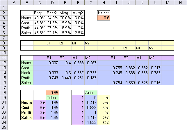
These ranges are not populated by hand, of course. I’m too lazy to keep changing everything when I make a minor adjustment to the chart. The following table shows which formulas to use. Select the indicated range with the first cell of the range as the active cell, type in the corresponding formula, then hold CTRL while pressing Enter.

Building the Panel Chart
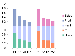
The first step of the process is to select B11:M16 and create a stacked column chart (below left). Notice how the data arrangement in B11:M16 and the formulas for the “blank” series lead to the appearance in the chart.
Make the “blank” series invisible: format it so it has no border and no fill. Now the Sales and Profit bars float above the Cost and Hours bars (below right).

Notice the margins on the left and right of the plot area (left of the first E1 and right of the second M2 categories) are the same width as the gap between the first M2 and second E1 categories. We want the left and right margins to be half as wide as they are. This is easy, simply format the category axis so that the box for “Value (Y) axis crosses between categories” is unchecked (below left).
We’re not going to use the axis labels that Excel wants us to use, so let’s clean up the axes. Format each so that no axis features are visible: no line, no major or minor tick marks, and no tick labels. Delete the legend as well (below right).

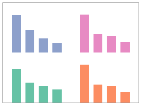
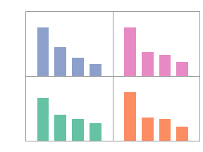
The plot area now expands to fill the chart area. Select the plot area, and drag its left edge to the right to make room for the axis labels we will be adding. Drag the top and bottom edges toward each other slightly. Add panel boundaries. First format the value (Y) axis so it has fixed (not auto) values of 0 and 2 for min and max, and 1 for major unit. Format the category (X) axis so there are 5 categories between tick marks. Then add major horizontal and vertical gridlines, matching the line color to the border color of the plot area.
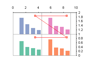
The next few steps will add the panel titles. First copy the range C19:D23, then select the chart, and use Paste Special to add the data as a new series, with series data in columns, categories in the first column (don’t replace existing categories), and series names in the first row. This produces the red-bordered stack of columns that fit poorly into the chart below at right.
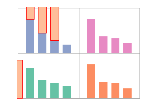
Right click this new series, and choose Chart Type (or Select Chart Type) from the pop-up menu. Select an XY type. The series has converted itself to the backwards “Z” in the left hand chart below.
Excel ever so helpfully placed this XY series onto secondary axes, but we will keep it simple stupid by formatting the series so it plots on the primary axes with the stacked columns.
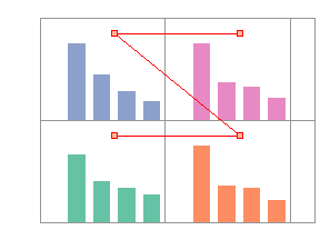
Cycling the chart’s secondary axes on and off have messed up the primary category axis. Select it (click on it carefully, it’s still there), and again uncheck the “Value (Y) axis crosses between categories”box (below left).
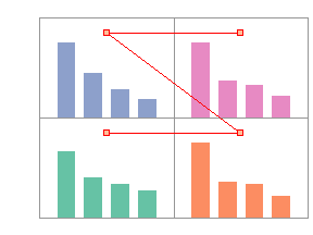
Time to fire up Rob’s chart labeler. Select the chart, then choose “XY Chart Labels” from the Tools menu (or from the Add-Ins tab in Excel 2007), and select the Add Chart Labels command. In the Labeler dialog, select the Titles series, the range B20:B23, and the Center position. The labels now appear centered over the XY markers (below right).
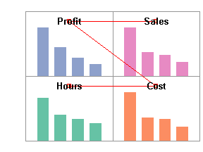
Hide the Titles series by formatting it to show no markers and no lines. You can adjust the vertical position of the titles by changing the value in cell D18.
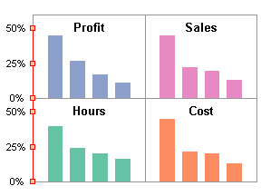
The next several steps add the Y axis labels. Copy F18:G24, select the chart, and add the data as a new series using the same options as before. The new series appears along the Y axis. Since the last chart was converted to an XY series and moved to the primary axes, these are the settings that Excel uses for the new series.

Use the Chart Labeler to add the labels in H19:H24 to the newly added Axis series, in the Left position.
Format the Axis series to hide the line, and to mimic axis ticks with cross markers that match the color of the plot area border.

Finally, add the employee category labels to the bars. Use the chart labeler to apply the labels in C8:M8 to the Hours and Profit series, and the labels in C9:M9 to the Cost and Sales series. I used the Inside Base orientation.

You can download a zip file containing my worksheet with the 2-by-2 panel chart in this tutorial.


