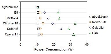
In Bar Chart Value Axis Scale Must Include Zero, I took Microsoft to task (again) for cutting off the bars in their bar charts. This is a reproduction of their plot comparing power consumption of various browsers while only viewing a blank page. Because the bottoms of the bars have been excised, the values they encode are visually distorted. In this chart. Opera appears to have a value twice as large as the preceding ones, when in fact it is only about 7% greater.

For details on the browsers, the load conditions tested, and the results, please visit Browser Power Consumption—Leading the Industry with Internet Explorer 9. This article deals with the manner of data presentation, not the data itself.
Since the topic of my article was bar charts, I only presented bar chart variations. In the comments, Naomi Robbins suggested dot plots, and in a follow up comment I obliged with this plot of the data in the bar chart above.

You can even put multiple series into a dot plot, but in this case it became pretty cluttered. This plot compares browser power consumption for different load conditions.
Panel Charts (Trellis Charts)
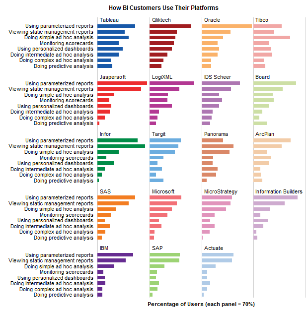
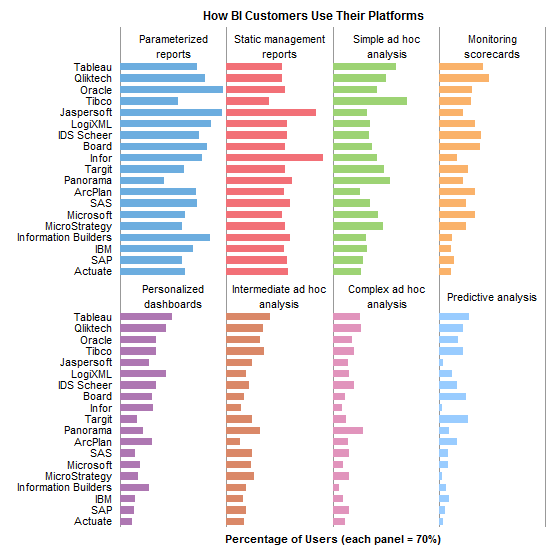
This chart can be uncluttered, while still showing all the data, by converting it to a panel chart, or trellis chart. In a panel chart, the entire chart is divided into panels (like panes of glass within a window), and each data series occupies its own panel. The panels use the same sorted list of categories along one axis and the same numerical scale along the other axis, and the panels are usually sorted.
There are a few different ways to lay out the panel chart. By default the separate panels are usually arranged in a rectangular grid, approximating a square with nearly equal numbers of rows and columns. This panel chart shows the power consumption data from the previous cluttered dot plot in a neat 2 by 2 grid.

Alternatively, the panels can be arranged in a single row.
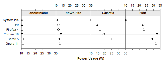
But the most useful arrangement, as long as there are not too many panels, is in a column. In this arrangement, the panels share a single value axis, making it easy to compare values between panels.

We can show the calculated battery life for the various browsers and load conditions in the same way, in a 2 by 2 grid

in a row of panels
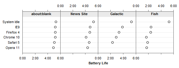
or in a column of panels
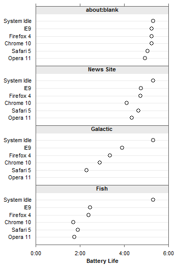
As stated before, the column of panels is most effective, because the panels share the same value axis.


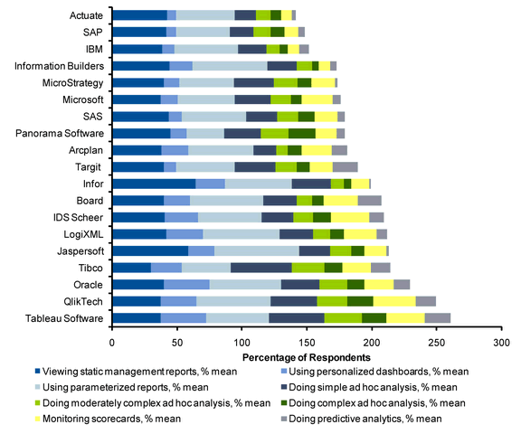
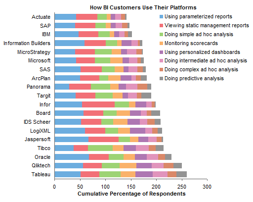
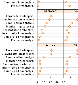 Trellis plots (aka panel charts) split plotted data series up into cells of a grid. The resulting small chart invoke the principle of small multiples by using the same axis scales. Putting series into separate mini-charts eliminates the clutter that occurs when too many points are plotted together in the same chart, while still displaying comparisons and trends. In this post I revisit ineffective stacked bar charts, show better graphical display using bar- and dot-based panel charts, and finally show dot-based panel charts of this data produced with the new