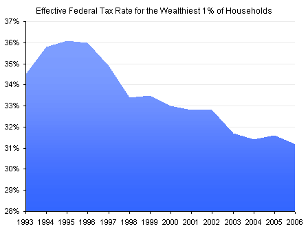
In Daily Chart: Tax the Rich to Pay For Health Care? Conor Clarke responded to a proposal to pay for health care reform by taxing the rich. He plotted the variation in the effective Federal tax rate paid by the top 1% of households to put into perspective the effect of a few additional percent added to the taxes of these high earners. I have downloaded the data from the Congressional Budget Office web site and reproduced Clarke’s chart below.

In Stupid Chart of the Day, James Joyner points out that Clarke’s chart starts from 28%, not from 0%, and thus it is deceiving. (I don’t think it’s really that stupid a chart, but maybe Joyner is going for more pageviews.) In Charts can be Deceiving E.D. Kain followed up on this observation, and produced his own chart of the data; I have reproduced Kain’s chart below.

So which chart is right, and which is deceiving? Well, both plot the data correctly, in terms of not using wrong data. But both have built-in flaws which distort the reader’s interpretations.
Using an axis that starts from zero is important in bar (and column) charts, because the visible length of the bars is what the reader sees and relates to the values. If the bars are truncated, their true length cannot be known, and the user is misled. Since the region under the line of an area chart is shaded, it implies that the area is the important encoding feature in the chart. Thus, starting the axis above zero is misleading for area charts as well as for bar charts.
I don’t think Clarke was attempting to mislead. When you enter his data into Excel and draw an area chart, Excel decides to start the axis at 28% by default, and Clarke simply made no attempt to change the default axis scale. (He did adjust the default fill by introducing a gradient, but the judges are not concerned with artistic impression here.)
And what of Kain’s chart? How is that chart deceptive? Let’s ignore the irrelevant two decimal digits he has added to his Y axis labels. Kain has started his Y axis at 0%, according to best practices for bar (and area) charts. He has made the Y axis maximum 100%, however, which compresses the data into the bottom portion of the chart. The variability in the data is dwarfed by the magnitude of the Y axis.
In any case, a line (or XY/scatter) chart has no implicit requirement to start at zero, since the position of the data points is what encodes their value.The benefit of using a line chart is that you can match the Y axis scale so that it spans from a little bit below the lowest data point to a little bit above the highest.
The 28% default minimum assigned by Excel isn’t even far enough from zero. I’ve used a minimum of 30% and a maximum of 37% on the Y axis of my line chart. This shows the steady decline in tax rate since the mid-1990s, but in no way implies that the tax rate now is 1/6 of it’s peak value.


