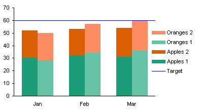
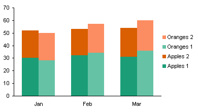
In Clustered-Stacked Column Charts I showed how to create a chart that combined clustered columns with stacked columns. It’s basically just a trick using staggered data to make a stacked column chart so that series display columns for only certain categories, and the gaps give the appearance of clusters of stacked columns. Smoke and mirrors, but it’s an effective use of smoke and mirrors.
That’s been my most popular blog post, and probably the most commented. Many of the comments ask about modifications to the technique to achieve different effects, and mostly these are achieved by carefully adjusting the arrangement of the data. One such request was, How do I add a target line that reaches to the edges of the chart?

The answer isn’t too complicated. Set up the data as shown below.

Using the technique in Clustered-Stacked Column Charts, create a chart using the first five rows of data.

Copy the last row of data (including the label in the first column), select the chart, and use Paste Special to add the data as a new series. A new column series will appear stacked on the rest.

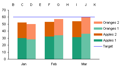
Right click the new series, choose Chart Type, and select the line without markers option. Excel helpfully adjusts the secondary category axis, making the labels visible and making the value axis cross between categories.

No matter, we fixed this once before during the protocol, we can fix it again. Format the secondary category axis so it again shows no category labels, and so the axis crosses at the categories, not between them.


