I’ve been lax about posting lately. The two conferences in September and October have really knocked me off track. It’s not from lack of topics: here’s an article I’ve been sitting on for two months. Back in September, Chandoo presented a difficult problem: Visualization Challenge – How to show market share changes? Specifically, how to show the change in market share among five competitors, for two products.
Chandoo came up with a pair of stacked charts, with the stacked columns staggered laterally.
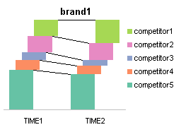

Perhaps the staggering and the connecting lines make it a bit easier to discern the edges of the different colored bars than in an unstaggered stacked column chart. But in general the charts have some deficiencies (these are my versions of Chandoo’s charts, by the way). First, the stacking of bars make it more difficult to judge the magnitude of the segments between top and bottom, and having two charts forces the eye to move too much to see all the data. The legends take up a large amount of space, though of course duplicate legends are overkill.
Here is Chandoo’s sample data, if anyone wants to play along.

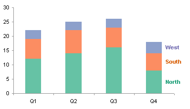
I approached this challenge by first investigating some different chart types. The stacked column chart is less cluttered looking than the staggered charts above, but they don’t really improve on the spatial difference between the two brands, and the large space needed by the legends (we could delete one of the legends, of course).


How about a Clustered-Stacked Column Chart? Below is the data arrangement and resulting chart. I’ve colored the data range using the scheme that Excel uses to highlight data when a chart series is selected: the blue range contains Y values, the purple contains category labels, and green denotes series names. The two columns of category label data produces the two-layer labels (see Chart with a Dual Category Axis). To preserve the lateral spacing, the purple cells with the hatching pattern contain spaces. The rest of the cells in this table are blank.
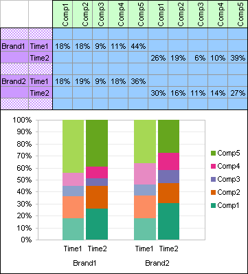
The separation of brands and the excess real estate required for the legend(s) are both improved, and it sure shows off a clever data arrangement. But the values and trends are no easier to compare than in the other chart types above.
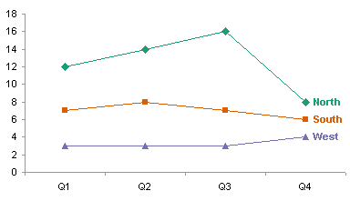
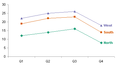
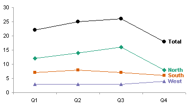
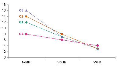
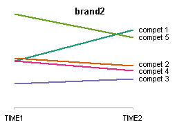
Since we’re interested in trends, a line chart may help with comparisons. Labeling the series directly is less obtrusive than the legends, and more effective at identifying the data. The charts still look somewhat cluttered, and the slopes are all rather too shallow, flattening out the trends.

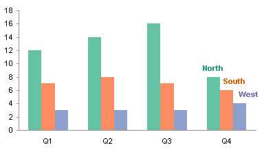
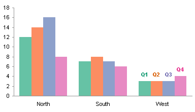
Perhaps clustering the data instead of stacking it can provide a better perspective (see Stacked vs. Clustered). The trends are visible even though the charts have bars instead of lines. The legends are less obtrusive; that’s not an intrinsic property of clustered charts, but rather a consequence of having fewer series. The separation of the two brands still makes comparisons difficult.


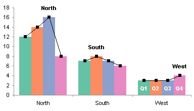
Maybe we can combine the good features of the line and clustered column charts. Enter the panel chart. The two charts below show the values and trends clearly, without a lot of clutter.

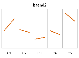
We still have the separation of the brands in the two panel charts above, but the openness of the panel chart allows us to display both brands in the same chart. This is pretty effective, perhaps the best of all the types I’ve reviewed.
Does anyone have any better ideas? Are there better approaches that I’ve neglected?

In the next few days, I plan to write a set of instructions for building this chart. In addition, I thought this data would be a good vehicle to show a little exercise in data exploration, using pivot tables and pivot charts. I’ll comment on this post when I’ve added each of these pages, so if you subscribe below (comments are always welcome, but not needed to subscribe) you’ll receive a notification when I’ve updated.
Update 16 November 2008
I’ve written a couple of follow-up posts. In Explore Your Data With Pivot Tables I used this data to show how pivot tables can be used to investigate the data quickly and easily. Then in a second follow-up I showed How to Build a Simple Panel Chart.


