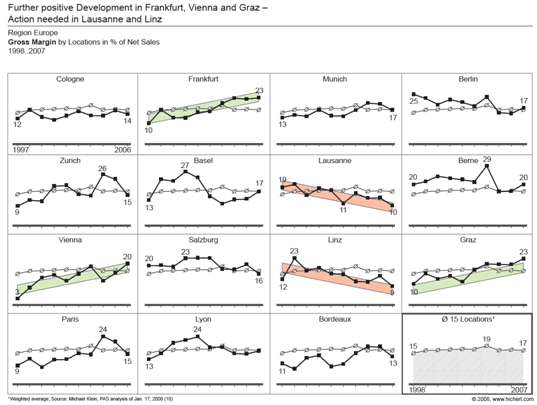
Microsoft introduced Sparklines as a native feature of Excel 2010. In a rare guest post, Sparklines For Excel vs. Excel 2010 Sparklines by Alex Kerin of Data Driven Consulting compared this new feature to existing third-party sparkline add-ins for Excel. In Sparklines and Data Bars in Excel 2010, I gave an introduction into how to use the new sparkline feature, demonstrated some of the options available for Excel 2010’s sparklines, and also showed how Excel 2010’s implementation of Data Bars was far superior to the original Data Bars in Excel 2007. I’ve also shown How to Make Horizontal Bullet Graphs that can be fitted into the cells of a dashboard.
While it’s good to see sparklines as a native Excel feature, the Excel 2010 implementation is rudimentary, and third-party sparkline products have more functionality and more features than the native Excel sparklines. Yet it’s not necessary to deal with add-ins in order to realize expanded sparkline capabilities in Excel. Excel’s regular charts can be used to create decent sparklines, and this article will show you how.
Native Excel 2010 Sparklines
It’s easy enough to insert sparklines into an Excel 2010 worksheet. First, make sure you are not in “Compatibility Mode”. Compatibility Mode means the active workbook is as compatible as possible with Excel 2003; the most obvious feature is that the worksheet grid has the Excel 2003 numbers of rows and columns, not the expanded grid introduced in Excel 2007.
Select the data range or the location for the sparklines, and click one of the Sparklines buttons on the Insert tab. In this example, I selected the range where I wanted the sparklines to appear, then clicked the Column Sparkline button. The dialog shows the selected range in the Location Range edit box.
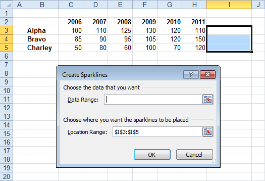
Then I selected the data range, which appears in the Data Range edit box. For some reason, the Location Range edit box is cleared (and each box clears itself when the other box is edited), but Excel remembers the selected range.
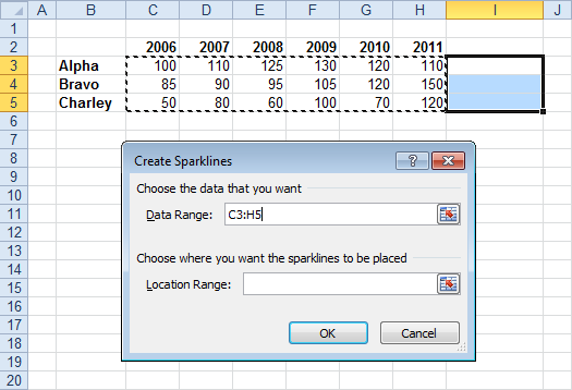
Here are the sparklines with the location range still selected.

Finally, here is the table with sparklines, with the active cell out of the way.

Create Sparklines From Regular Charts
The protocol for generating your own sparklines using regular charts is presented below. This protocol works well in Excel 2010 and 2007. In earlier versions of Excel, charts have a border of several pixels around the plot area, so the chart area must be sized larger than the cell you want the sparkline displayed in. In earlier versions, there is also a limit to how much the chart can be shrunk and still show the entire plot area, so you’ll have to shrink the chart only partway, then shrink the plot area to a smaller fraction of the chart area size.
Keep in mind that while you can use regular charts for sparklines, the small size of a sparkline limits the amount of information you should try to cram into one. Leave out labels and limit yourself to about two series maximum in any given sparkline.
Start creating your sparkline by selecting the data for a single series.

Insert a chart of the desired type. This is a typical Excel 2010 column chart.

Now simplify formatting. Below left shows the chart with the chart area border removed and the chart and plot areas made transparent, so borders and cell fill colors show through. Below right, the legend and any axis and chart titles have been removed.

The bars have been widened in the chart below left (by decreasing the gap width to 50%), and the major unit of the Y axis has been set to a small value, below right.
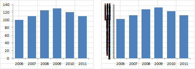
The axes have been hidden by selecting “None” for axis tick marks and axis tick labels and choosing “No line” for the axis line color. Note the size of the plot area within the chart.

For best results, extend the plot area almost to the left and right edges of the chart, and stretch the bottom of the plot area to the bottom of the chart. Leave a large margin between the plot area and the top of the chart. In fact, you may have to increase this top margin in the sparkline, after the chart has been shrunk to fit a cell.
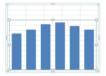
Finally, shrink the chart and position it over the appropriate cell. If you hold down the Alt key while moving or resizing the chart, the chart edges will line up with the cell boundaries. If necessary, shrink the plot area from the top to increase the margin.

When all of the necessary formatting has been applied to the sparkline, and nothing else needs to be done, copy the sparkine and paste it into each of the other cells that need a sparkline. If you hold Ctrl and Alt while dragging the chart, a copy of the chart will be dragged into and aligned with the next cell.

All the charts are formatted identically. They also use the identical data, so let’s fix that.
Select the first sparkline. Notice how the source data is highlighted in the worksheet.

Select the second sparkline. Notice how the highlighted data is from the first row. So is the highlighted data for the third sparkline.

You could change the source data by choosing Select Data from the Chart Tools > Design tab, or from the right-click menu. You could also edit the chart series formula. But the easiest way to adjust the chart data is to drag the range highlight with the mouse. Move the mouse over the highlight until its border thickens, then drag it to the new range. If you’ve selected the plot area or chart area, both the series name and the Y value highlights move together. If you’ve selected the series itself, the series name and Y data must be changed separately.

Correct the third sparkline’s source data in the same way.
Here is the finished table with sparklines. Looks like the built-in sparklines.

You can use any chart type: here’s a line chart with markers.

Why Use Regular Charts?
There are a number of reasons to use regular charts rather than the built-in Excel 2010 sparklines.
Excel Version
One obvious reason is that you might not have upgraded to Excel 2010. If you’re using Excel 2007, the techniques shown here work the same way.
In Excel 2003 and earlier, the chart imposes a thicker border between the plot area and the chart area, so you have to oversize the chart to make the plot area fit as intended. Also, in earlier versions, the plot area only shrinks a certain amount within the chart area, so further shrinking of the chart truncates the plot area. The chart area can only be shrunk so far, but the plot area can be reduced further without shrinking the chart. The result is a chart that’s substantially larger than the cell it covers, but making the plot and chart areas transparent makes this no problem.
Mouseover Information
An important feature of a regular chart that is lacking in a sparkline, is the ability to mouse over a point and read relevant information from a popup. This is very useful in an interactive dashboard.

Combination Charts
What if you want to compare a time series to other data, such as a target value.
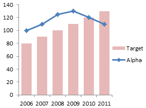
Native sparklines can only plot one timeline, while a regular chart has more flexibility (as do some of the third-party sparkline programs).

Remember the limited resolution of a cell-sized chart: adding the simple target data to these sparklines is almost not worth the effort.
Other Embellishments
You may wish to reverse the vertical axis. For example, your costs are probably reported as positive numbers, but you want to show them as negatives.

Native sparklines do not support reversing the vertical axis, but regular charts do.


