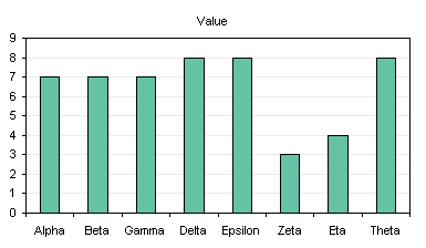
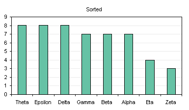
I am often asked how to sort the data in a table without sorting the original data. The answer is twofold: the chart’s source data has to be sorted for the charted data to be sorted, but you don’t have to sort the original data if you can write a few formulas. The trick is to use an intermediate range as the source data, which is linked to the original data, but uses formulas to place the data into the desired order.
Let’s look at a simple example. The table below shows a simple data set with some unsorted values:
| B | C | |
| 1 | Label | Value |
| 2 | Alpha | 7 |
| 3 | Beta | 7 |
| 4 | Gamma | 7 |
| 5 | Delta | 8 |
| 6 | Epsilon | 8 |
| 7 | Zeta | 3 |
| 8 | Eta | 4 |
| 9 | Theta | 8 |

The LARGE(<range>, N) worksheet function is used to return the Nth largest value in a range. Set up columns E and F for the chart source data. In E1 and F1 put headers, in F2 enter this formula:
=LARGE($C$2:$C$9,ROW()-1)
then copy this cell and paste it into F3:F9. To provide the labels in column E, enter this formula in E2:
=INDEX($B$2:$B$9,MATCH(F2,$C$2:$C$9,0))
Copy this cell and paste it into E3:E9. The table looks like this:
| E | F | |
| 1 | Label | Sorted |
| 2 | Delta | 8 |
| 3 | Delta | 8 |
| 4 | Delta | 8 |
| 5 | Alpha | 7 |
| 6 | Alpha | 7 |
| 7 | Alpha | 7 |
| 8 | Eta | 4 |
| 9 | Zeta | 3 |
The numbers are sorted appropriately. If you want them sorted in ascending order, use the SMALL() function instead of LARGE().
The column of labels is not correct, however: Delta appears three times next to the cells containing the value 8, while Epsilon and Theta, which also should be listed besides 8, are missing. Alpha also appears multiple times, and other labels are missing. The reason for this is that the MATCH() function used in column E picks out the first item in the array that matches the entered value. Delta is the first item in the list associated with the value 8, so it is returned every time 8 appears in the sorted list.
The labels are corrected by inserting some adjusted values into the worksheet, as shown below. I’ve used column A for the extra column, but you could locate it next to the second table, so it doesn’t interfere with the layout of the original table, if it is part of a report. Cell A2 contains the following formula, and the cell is copied and pasted into the range A3:A9. The ROW()/1000 term is used to add an insignificant amount to the values, to break ties in the sorting but not to affect the sorted order or to affect the perceived values in the chart.
=C2+ROW()/1000
| A | B | C | |
| 1 | Label | Value | |
| 2 | 7.002 | Alpha | 7 |
| 3 | 7.003 | Beta | 7 |
| 4 | 7.004 | Gamma | 7 |
| 5 | 8.005 | Delta | 8 |
| 6 | 8.006 | Epsilon | 8 |
| 7 | 3.007 | Zeta | 3 |
| 8 | 4.008 | Eta | 4 |
| 9 | 8.009 | Theta | 8 |
The formulas in column F are changed to
=LARGE($A$2:$A$9,ROW()-1)
and the formulas in column E are changed to
=INDEX($B$2:$B$9,MATCH(F2,$A$2:$A$9,0))
The table now is properly sorted, the labels are correctly rendered, and the chart is ready to paste into a report.
| E | F | |
| 1 | Label | Sorted |
| 2 | Theta | 8.009 |
| 3 | Epsilon | 8.006 |
| 4 | Delta | 8.005 |
| 5 | Gamma | 7.004 |
| 6 | Beta | 7.003 |
| 7 | Alpha | 7.002 |
| 8 | Eta | 4.008 |
| 9 | Zeta | 3.007 |


