Microsoft Excel has introduced new features that help you work with geographical data. Excel has new “Rich Data” types, including Geography and Stocks, and a new chart type called Filled Maps. The rich data types were introduced since Excel 2016, and are not included in Excel 2016 or 2019, only in Office 365; the filled maps are not available in Excel 2016 but are included in Excel 2019 and in Office 365. To introduce you to these powerful rich data types and filled maps, I’ll run through a quick example.
States Data
I’ll start with a simple list of the 50 United States.
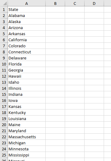
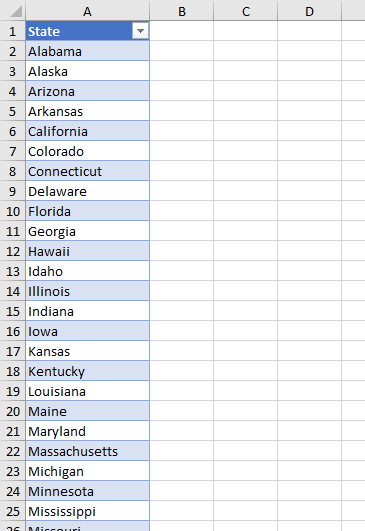
Next I’ll convert this list into a Table. select a cell in the list and click Ctrl+T, and make sure you check My Table Has Headers.
Geography Rich Data Type
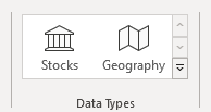
On the Data tab of Excel’s ribbon, you’ll see a group labeled Data Types. It currently includes Stocks and Geography, but there’s room for expansion.
Select the column of state names, and click on Geography in the Data Types group. Excel thinks for a minute, then inserts an icon in front of each state name. The icon looks like a representation of an old-style foldable paper map.
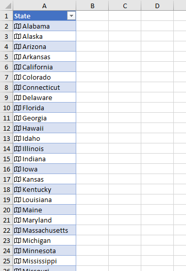
In fact, Excel phones home to get help determining which geographical entities are selected, so you need an internet connection to use this feature.
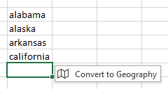
What’s neat is that, if you start typing some recognizable state names in a sheet, after you’ve entered about four names, Excel realizes you’re entering geographical labels, and offers to Convert to Geography, if you click on the little pop-up.
What Makes These Data Types “Rich”?
These Geography data types contain more information than just the name of a region and a cute little folded up map icon.
The first hint of all of this information appears when you select a cell or range containing Geography entities. A small icon pops up next to the selection.
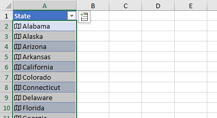
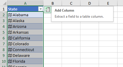
If you mouse over this icon, it identifies itself, and offers to extract a field (of Geography data) to a cell or table column.
Click on the icon to see a list of available fields.
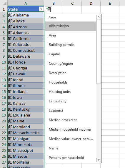
If you ignore the icon and start typing a new column header, Excel will again show you the list of available fields.
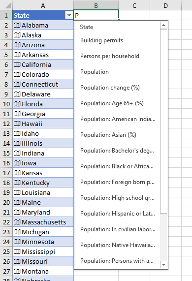
Click on a field name, and the table column populates itself. Pun not included (well, maybe not).
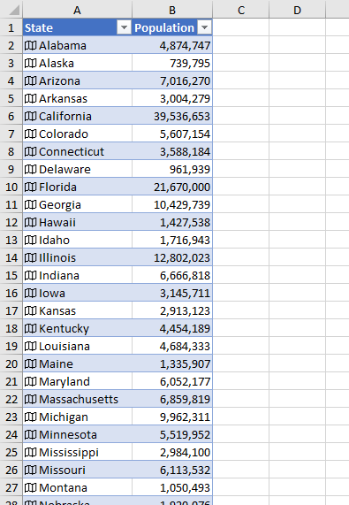
Wasn’t that a lot easier than looking up the data on Wikipedia and doing the ugly copy-and-paste (or the slightly less ugly Power Query operation) to create the table?
The rich data formula syntax is interesting, and maybe not unusual to those who have done a bit of VBA or other programming. You can reference a field by typing the Geography reference (cell address) followed by a dot.
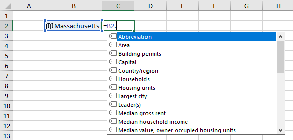
You can see this dot notation in the formula for the population shown in cell C2:
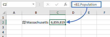
All cells in the population column of the table use this notation in their formulas.
What Was That About Maps?
First we can use the Geography data type to look up information. Next we can visualize the data using a filled map.
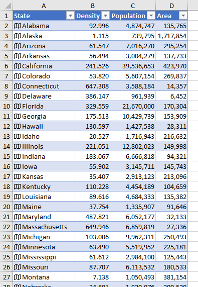
I’ve include more details in my table. In addition to Population, I have added the field Area, which gives me the state’s area in square kilometers. Then I inserted a column for Population Density.
The formula in cell C1 is
=[@State].Population
the formula in cell D1 is
=[@State].Area
and the formula in cell B1 is
=[@Population]/([@Area]/2.58999)
I selected the first two columns of the table, including the header row, and went hunting on the ribbon for something relevant.
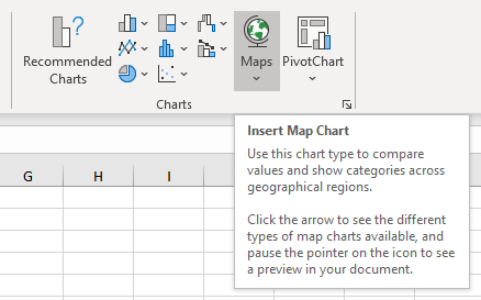
On the Insert tab of Excel’s ribbon, in the group labeled Charts, you can find a control labeled Maps. Mouse over this control, and Excel offers to insert a “Map Chart”, which is a funny name.
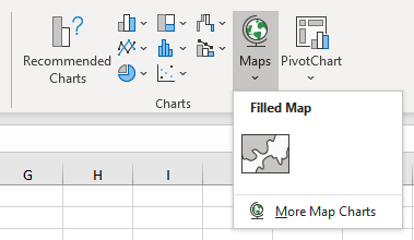
Click on the control’s down arrow, and Excel offers to insert a more aptly named “Filled Map”.
Filled Map sounds interesting, so let’s click it and see what happens.
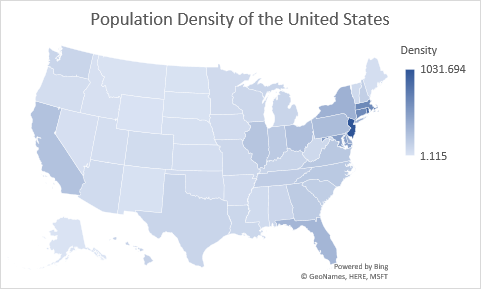
Not bad, and pretty easy. These filled maps are pretty flexible. For example, I’ve filtered out most of the states below to focus on the northeastern quadrant of the country, and I’ve changed from a blue color gradient to purple.
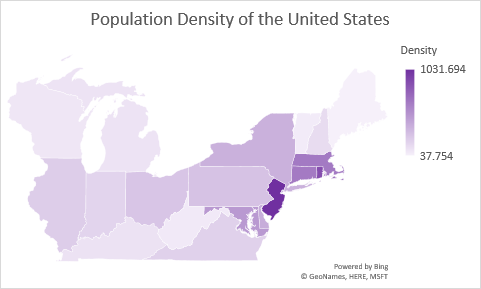
You can map anything that is fillable, countries, states or provinces, counties, even regions covered by zip codes. It’s important to remember that the maps are powered by Bing Maps, so you need an internet connection in order to render them.
Further Steps
Geography and Stocks Rich Data Types are powerful ways to acquire data for analyses and reports. Filled Maps are a great way to enhance a dashboard, with an eye-catching map showing performance across regions.
Excel makes it easy to use these new features, with some amusing caveats. Sometimes, for example, Excel has trouble disambiguating similar abbreviations (e.g., the abbreviations for Washington State and Western Australia are the same, WA). So find a little data, and dig in.


