When you plot some data, it’s common to want to add a line to the chart to provide some context to the data. The line may represent a target value, a budget, a typical level, or some other reference. This tutorial will show how to create a chart with a horizontal line that appears behind the plotted data.
Easy Horizontal Line Across Chart
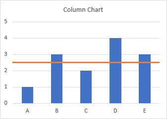
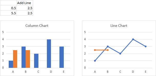
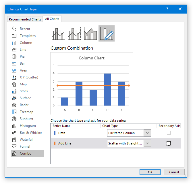
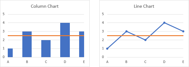
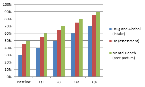
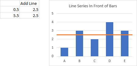
In Add a Horizontal Line to an Excel Chart, I showed how to add a horizontal line to an Excel chart. I started with this data and column chart…
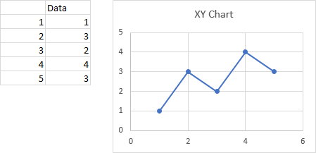
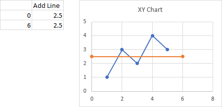
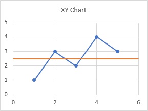
… and I added this data as an XY Scatter series to the chart.
It’s not too complicated, takes only a couple minutes once you know how.
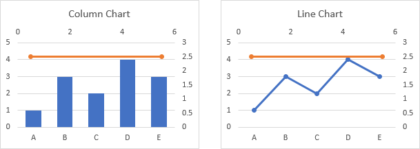
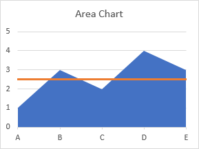
The problem with this easy approach is that the horizontal line cuts in front of the bars, and you may prefer to have the line behind the data.
Let’s Try an Area Chart
I originally had a more convoluted approach to the use of area chart series for this purpose. A long-time reader of my blog, Liu Wanxiang, had a simpler approach. His approach saves numerous steps and is easier to understand and explain, and there is no benefit to my original protocol. With Liu’s permission, I have modified the rest of this post.
We can use an area chart instead of an XY chart to add the line. First I’ll show why it works, and then I’ll show how to do it.
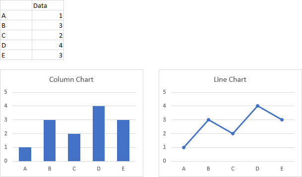
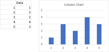
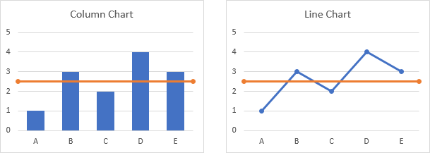
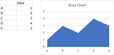
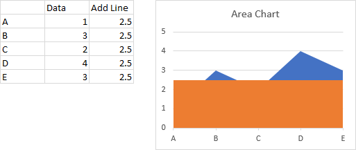
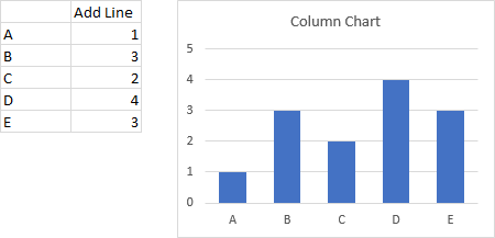
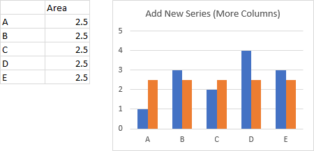
Let’s start with the same simple data and column chart.
Now let’s add this data to the chart. The new series is added as another column chart series.
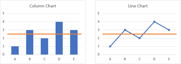
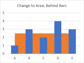
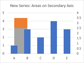
When we change the second set of columns to an area type, the area is drawn behind the original columns.
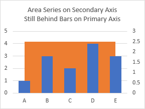
We will need to put the column and area series on different axes in order to make the area stretch to the edges of the chart while leaving the columns where they are. When the area series is plotted on the secondary axis, it still stays behind the bars. This is fortunate, because it keeps the protocol from becoming too complicated.
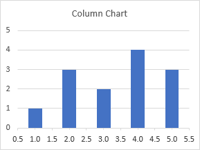
We’ll modify the area chart data and just use endpoints 0 and 1. We’ll use a transparent fill and colored border on the area series. We’ll remove the secondary vertical axis but add a secondary horizontal axis above the chart, and we’ll adjust the tick positions of this secondary horizontal axis. I know it’s a lot of steps, and I’ll do them individually later when I show how to construct the chart. Note that the area’s border lies behind the bars, just as the filled area was behind the bars.
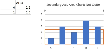
But we see the other borders of this area chart, on the sides and bottom of the chart. How do we get rid of them?
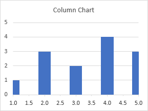
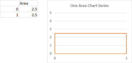
If we strip away the original columns for clarity, we see that a single area chart series gives us the outlines on all four sides of the area.
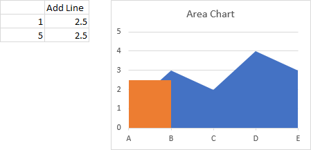
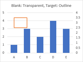
Let’s instead use two area chart series: Blank, which will eventually be blank instead of semitransparent as in the chart below, and Target stacked on Blank.
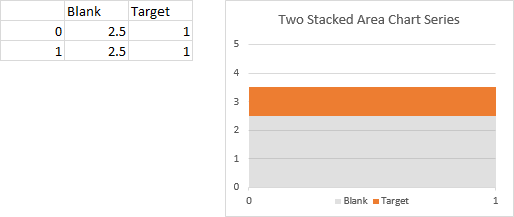
Then we make the Target area transparent and give it the orange border we’ve been using for our target line.
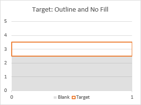
Change the height of the Target area to zero, so the top and bottom edges of the resulting rectangle coincide.
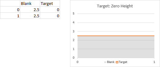
This was the magical step of Liu’s approach: making the Target area series zero units tall. I didn’t even think of it, perhaps because old versions of Excel (2003 and earlier) treated the area chart shape differently. If it was zero height, either the line didn’t show up at all, or it showed up but was double the thickness, I don’t recall exactly which. Probably this was changed in Excel 2007, and I never noticed.
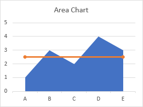
And finally, make the Blank series blank (transparent, i.e., no fill).
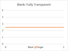
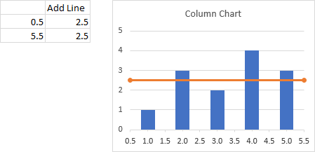
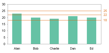
That’s exactly what we need: a single horizontal line at the desired Y position. Now let’s build the chart from scratch, step by step.
Build Chart with Horizontal Line Behind Bars
Once again, we’ll begin with this simple data and column chart.
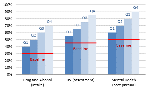
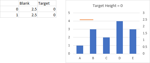
Let’s add two series to the chart, “Blank” which will be a hidden area series and “Target” which will provide the horizontal line with its outline. These will be stacked areas. We want our horizontal line at Y=2.5; we use 2.5 for the Blank values, and 0 for Target. (I’m using a value of 1 for Target for now, just so you can see it as we proceed.)
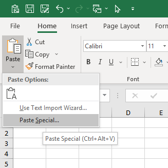
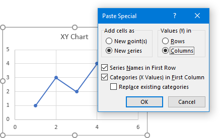
Copy the data range, select the chart, and on the Home tab, click the Paste dropdown and select Paste Special. In the dialog, choose New Series, in Columns, Series Names in First Row and Categories in First Column.
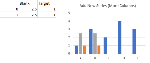
Blank and Target are added as more clustered columns.
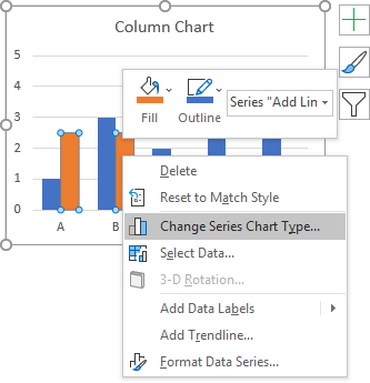
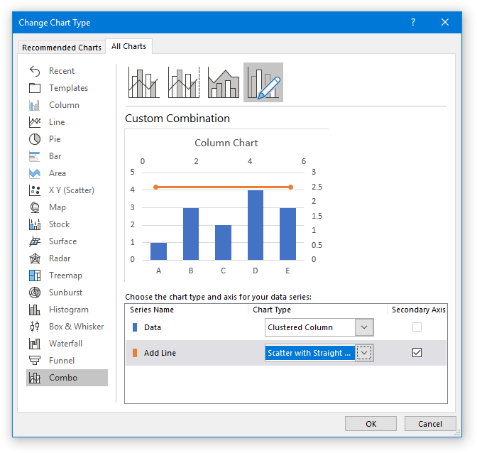
Right click on one of the added series, choose Change Series Chart Type from the pop up menu, change both to stacked areas, and place them on the secondary axis.
Format the Blank series to have no fill so it is transparent. Make Target also transparent, but give it a border.
Now you can change the height of Target to zero. When you get good at this, you can just start out with zero.
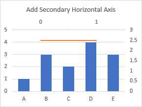
Excel added the secondary vertical axis but not the secondary horizontal axis. Click the floating plus icon next to the chart, click the arrow beside Axes, and check the secondary horizontal axis.
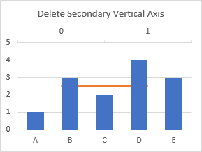
Delete the secondary vertical axis (right edge of chart). The area series are now plotted along the primary vertical axis, so they are in sync with the columns.
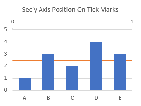
Adjust the secondary horizontal axis, choosing the On Tick Marks option for Axis Position.
Now hide the secondary horizontal axis: format it to use no line and to have no labels.

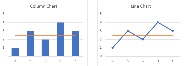
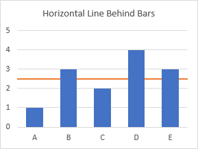
The final result, which is a bit more intricate to create than the chart with a horizontal line in front of the bars, is a chart with a horizontal line that lies behind the plotted data.
Example Workbook
You can download an Excel workbook with a few methods for creating a horizontal line across your chart here: Horizontal-Line-Worksheet-2.xlsx.
More Combination Chart Articles on the Peltier Tech Blog
- Pareto Charts in Excel
- Clustered Column and Line Combination Chart
- Precision Positioning of XY Data Points
- Add a Horizontal Line to an Excel Chart
- Bar-Line (XY) Combination Chart in Excel
- Salary Chart: Plot Markers on Floating Bars
- Fill Under or Between Series in an Excel XY Chart
- Fill Under a Plotted Line: The Standard Normal Curve
- Excel Chart With Colored Quadrant Background