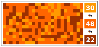
In Partition Charts in Excel – alternative to pie charts [visualization hack], Chandoo offers a “partition chart” as an alternative to a pie chart. We all know pie charts are bad (don’t we???), so it’s good to look for alternatives. Here is part of Chandoo’s partition chart:

This chart uses conditional formatting to achieve the mottled appearance. It’s almost reminiscent of camouflage, partly because of the mottled colors, and partly because the information is well hidden. The colors cover 22%, 30%, and 48% of the area of the chart. Without looking at the legend of the full partition chart below, can you at a glance match up the colors with their associated proportions? I couldn’t, either.
Here is Chandoo’s complete chart, including the legend:

As I told Chandoo in a comment to his post:
While pie charts are somewhat ineffective at showing relative proportions, this partition chart is completely ineffective. If not for the legend, I would have guessed that the darkest color accounted for the largest, not the smallest, proportion. The pie at least puts all of its bits into one wedge per category, while the partition chart keeps all the bits separate, and they are scattered across the chart. It’s as if you spilled a package of M&Ms on the table and tried to determine the portions of each color.
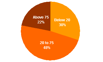
Since there are only three categories, a pie chart isn’t a terrible choice for this data:

As always, the simplest and clearest way to show this data is in a bar or column chart:

Chandoo spoke of the partition chart as a way to look at geographic variations in data. He mentioned that it might be sales of your products in a number of cities. It makes more sense if you were looking at a map of counties, states, regions, or countries, and you were filling each geographical unit’s shape with the fill color. The user would not be expected to integrate the entire map to get an overall percentage. Instead the user could compare the colors of familiar shaped geographical units and make sense of the data. Wikipedia has some examples of this in Red states and blue states:
In this context, regions of different colors can effectively present information about, in this case, election results in different states. In contrast, the partition graph is a map of nothing.


