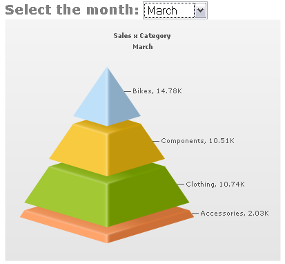
I was directed to the web site for UberBI after reading The Uber Art of Dashboards on the Dashboards by Example blog. I want to say a few words about this chart, a stacked pyramid, which is featured prominently on one of UberBI’s displays.

Stacked Pyramid Chart
I occasionally read the Dashboards by Example blog, although I feel that it lacks any critical assessment of the dashboards it presents. For example, the Dashboard Spy (as the author of Dashboards by Example calls himself) had this to say about UberBI:
“With design deliverables like these examples, they certainly have a grasp of what it takes to design a slick looking dashboard.”
It’s slick looking, all right, if less than efficient and accurate in actually displaying data. One of the commenters added:
“Eye candy is definitely needed on BI dashboard projects whether you like it or not. […] I know you will argue, but believe me that the average user will not care if the blocks are not accurate to their values.”
Wow, it’s hard to argue with such a knowledgeable and outspoken consumer of business graphics. I was going to do a counter-review of UberBI, because I felt it was exclusively an exercise in high fructose eye candy. But I decided a discussion of the above stacked pyramid chart would be a better use of my time.
Let’s take a look at the chart. Looks nice, only four data points, so it’s not too cluttered. The colors are nice too, so I’ll borrow them for my examples. There’s a thin but wide orange (peach?) layer at the bottom, a thick green layer above that, a smaller yellow layer above that, and a relatively small blue cap. It’s nice enough until you study the numbers in the data labels. The small blue cap is the largest value in the pile, and the two mismatched chunks in the middle are nearly equal in value, despite the yellow piece being apparently much smaller.
Although the most obvious dimensional property of each block of the pyramid is its apparent volume, the value conveyed by each block is its thickness, regardless of its area in the other two dimensions. The thickness isn’t even very effective at conveying value: no matter how much I stare at the blue piece on top, it appears as thick as the two middle blocks. If I print out the chart and measure the dimensions of the segments, I can verify that the thickness does scale with the value. But visually it is impossible to see. Even if I flatten the pyramid into a 2D view, the area of each section overwhelms the perception of its thickness.

“Flat” Stacked Pyramid Chart
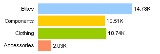
A stacked column chart improves on the pyramid, because the widths of all sections are the same, and the area of each section is directly proportional to its thickness. The blue “Bikes” series is obviously the largest. Stacking the columns this way makes it hard to compare similar values, but clustering them side by side in a column or a bar chart makes all comparisons easy. Use a horizontal orientation to keep labels horizontal (easier to read).


Stacked Column (left) and Clustered Bar (right) Charts
Another problem with many “dashboard” graphics, including the UberBI stacked pyramid and the many dials that grace the UberBI dashboard, is that they only show one point in time. The pyramid allows you to view a selected month, but you cannot see them all at once and cannot assess any trends in the values.
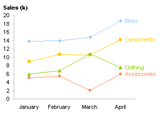
Below is a single chart which requires less space than the stacked pyramid, yet shows data for an arbitrary number of periods. Nothing fancy, no scrumptious eye candy, no sexy 3D effects, just the data. Hey, it’s a line chart! Anyone can make a line chart, even if they don’t have a fancy BI graphics package.

Boring Old Line Chart
The line chart has several advantages over the pyramid chart. First, it shows data magnitudes clearly: values are encoded by a data point’s position along an axis, not by a difficult judgment of the point’s thickness, area, or volume. Second, it shows the trends of the values over time in a single view, without having to switch from one time period to another. Third, it’s clean and fits into a smaller space than the pyramid chart, with no loss of detail.


