You can spend five minutes fixing up your data, or five hours working on a chart with the wrong data.
A user on the Mr Excel forum asked about creating a chart from unsuited data. He asked, “Is there a way to do this without modifying the data table?”
My reply started with “I know you don’t want to hear this, but your data is in the wrong arrangement.” Fortunately, the data was simple and the arrangement was consistent, so it was easy to create a chart staging area to prepare the data for the chart.
Simple Chart Staging Area
I’ve recreated the data below. Obviously someone went to a lot of trouble laying out the data and formatting it just right. This becomes a problem when people become too attached to their fancy display.
The objective is to plot each product by month, for a single year. The chart needs three lines, one for each product. You can tell that it’s not possible using this data directly.
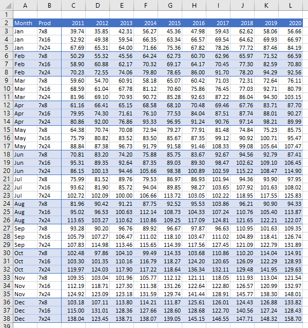
In general, one would have to rearrange the data, feed it into a pivot table, and create a pivot chart from that. But sometimes you’re lucky enough to be able to write a few formulas instead.
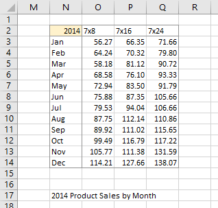
Here is the chart staging area I was able to construct. I listed the months down the side (N3:N14) and the products across the top (O2 to Q2). I put the year in N2, and highlighted it with light gold so a user knew it was important.
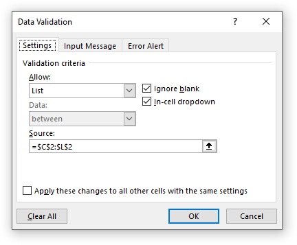
Rather than require the user to type in a new year, and possible type an invalid year, I set up data validation in cell N2. Click Data Validation on the Data tab, select List from the Allow dropdown, then select the years in the first row of the original data range (C2:L2).
The magic formula is in cell O3 of the chart staging area. It’s a relatively simple INDEX formula with a few MATCHes to find the right cell of the original data range.
=INDEX($C$3:$L$38,MATCH($N3,$A$3:$A$38,0)+MATCH(O$2,$B$3:$B$5,0)-1,MATCH($N$2,$C$2:$L$2,0))
I created a dynamic title for the chart with this formula in cell N17:
=N2&" Product Sales by Month"Finally I selected the data range and inserted a line chart.
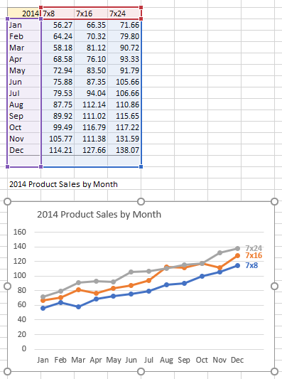
Note that I have included the blank row below the chart staging area. This adds a blank category to the chart with no data points, creating space for the data labels I added to the series. These labels, with font color to match the data points, make it easier to identify the data than the legend, so I deleted the legend.
To get the chart title into the chart, I selected the chart title, typed an equals sign in the formula bar, then clicked on cell N17 and pressed Enter. I also aligned the title with the edge of the plot area.
Create Chart Staging Area with Power Query
Sometimes (most times?) your data will be too complicated or too irregular to use simple INDEX/MATCH formulas to build a staging area. In the old days we would rely on copy and paste and a lot of one-off lookup formulas, but I’ll show how easy it is to stage this data with Power Query.
Rearrange the Data with Power Query
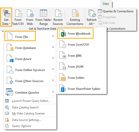
First select your data (or one cell in the data range) and on the Data tab of the ribbon, in the Get & Transform Data group, click From Table/Range. If the data isn’t already in a Table, you will be prompted to create one. Make sure the data is correctly identified, and check the My Data Has Headers box. The Table is created, and the Power Query editor opens up and shows the data.
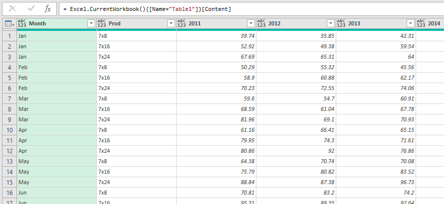
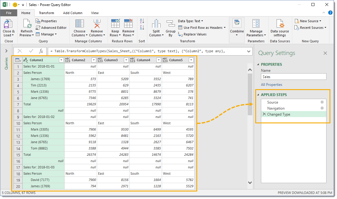
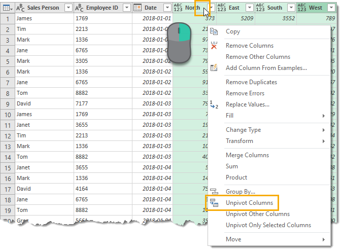
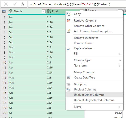
I often remove the step of the query that assigns variable types, because I take care of that later. I selected the first two columns, right clicked in the headers, and selected Unpivot Other Columns.
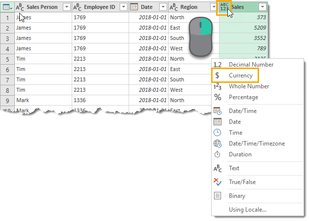
This gives me the four-column data arrangement I will need for a Pivot-Table-based chart staging area. Here is where I changed the data types of the columns: Month and Product to text, Attribute to whole number, and Value to decimal number.
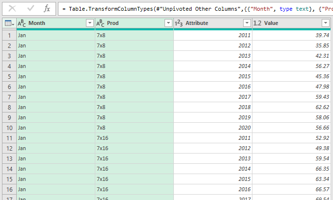
Then I renamed Attribute to Year and Value to Sales.

Finally I dragged the Year column to the first column of the table.
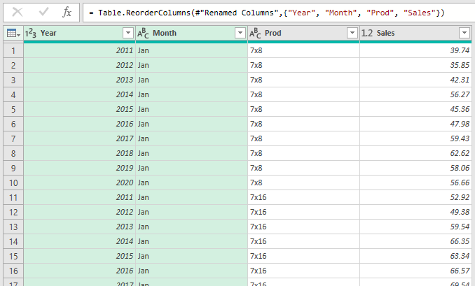
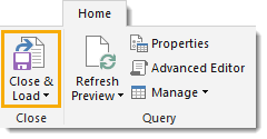
I clicked Close & Load and landed the query into a Table on a new worksheet.
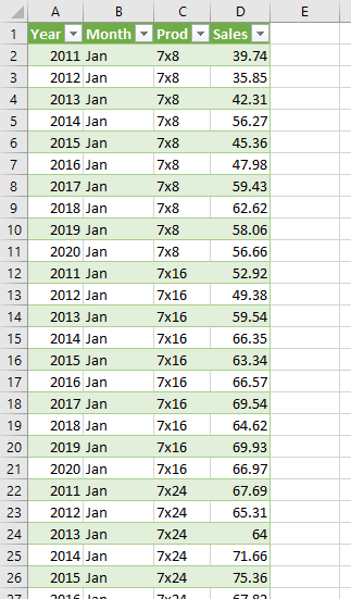
It’s always better to start with an orderly Table as your data, and base your chart data and any tabulated displays on this.
Create a Staging Area with a Pivot Table
From the Table above, I created a Pivot Table on a new worksheet, with Year in the Filters area, Month in the Rows area, Product in the Columns area, and Sales in the Values area.
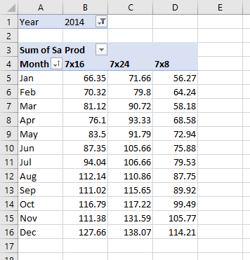
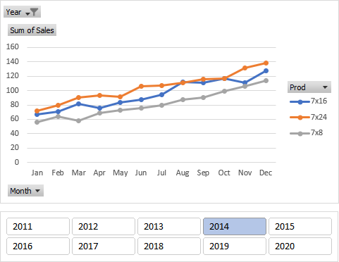
I created a Pivot Chart, then added a Slicer based on the Year field of the Pivot Table. It’s very easy to select a year, even easier than with the data validation cell dropdown I used in the first approach.
Recreate the Original Data Layout with a Pivot Table
With the data in a well-structured Table, we can create another pivot table to mimic the original data layout. I put Year in the Columns area, Month and Product in the Columns area, and Sales in the Values area. I chose the Repeat All Item Labels in the Report Layout dropdown on the Pivot Table Design tab.
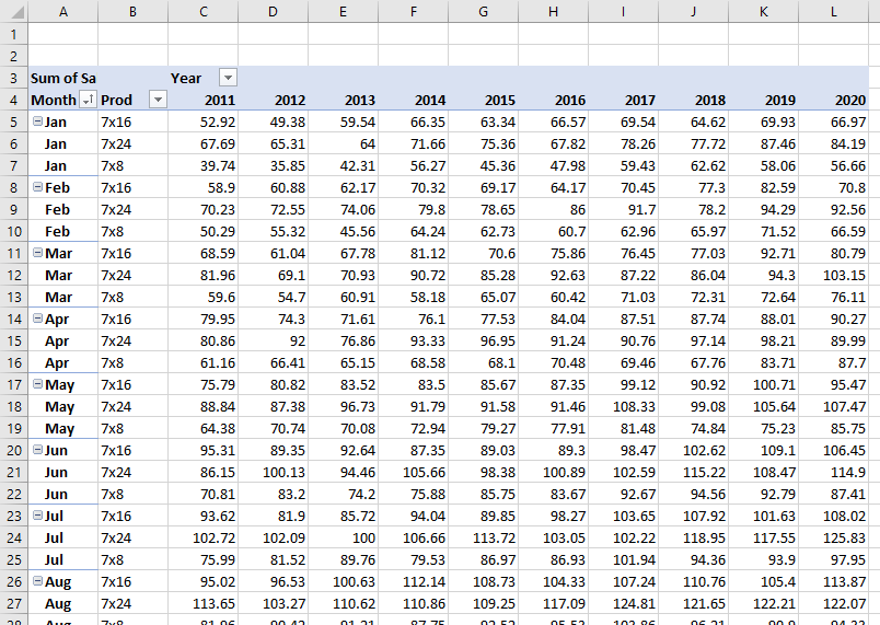
The same effort that went into formatting the original data can be reproduced on this Pivot Table.


