Tornado charts are often used to compare distributions, in the form of back-to-back histograms. Tornado charts are particularly popular for comparing closely related populations, such as male and female age distributions. In this context they are known as “population pyramids”. Tornado charts are attractive, but I don’t think they are as effective as they at first seem to be. To illustrate this point, I went to the US Census Bureau and found the following age data for males and females:
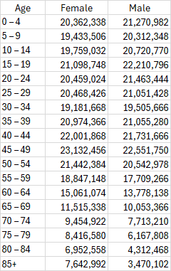
We can make the two histograms from this data, one for the female population and the other for the male population.
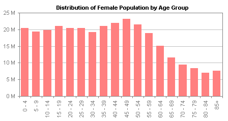
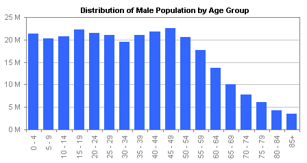
The histograms present the data in separate charts, which makes them tricky to compare, while the vertical age group labels on the horizontal axis are difficult to read. A tornado chart combines the data by rotating these two charts so their categories are arranged vertically, and placing them back to back.
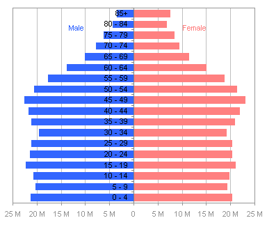
Although the category labels are now horizontally oriented, they are still difficult to read because they are partially obscured by the bars they overlay. This is often fixed by putting the labels on the side of the chart, which unfortunately puts them close to only one of the populations.
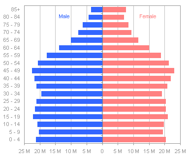
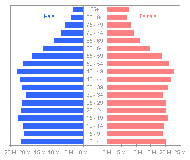
This is also sometimes addressed by splitting the chart halves and inserting the labels between the two populations. This is probably the best of the tornado chart options, because the labels are located at the baselines of each distribution.
While a tornado chart seems like a good approach for comparing similar distributions, I am always somewhat distracted by the optical illusion in which an image seems to switch between a goblet and two profiles in silhouette.

Source: AVIV – optical illusions – brain teasers – riddles
Another problem is that the two populations are more difficult to compare than we think when we view the chart. In the last tornado above, we can clearly see the greater female population in the oldest age groups, and we can see the baby boomer peak in the 45-49 age group. We cannot easily detect the differences between any age groups younger than about 60-64, because the bars move away from each other.
This problem can be solved by putting the bars on the same side of the category axis, in a clustered bar chart. We can easily see the differences between male and female populations in all age groups. In groups up to 30-34, the males have greater numbers; at 35-39 the numbers are very close to the same, and from 40-44 upwards, females have larger numbers, and the differences increase with age. An advantage is that the chart shows the populations with the same resolution as above in less space, because the data only extends in one direction from the category axis.
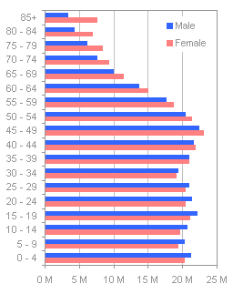
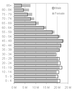
The problem with the clustered bar chart is that the alternating bar colors disrupt the smooth display of the distributions, and in some cases the distributions may be made to appear offset, because of the placement of the bars side-by-side rather than one atop the other. Jorge Camoes has written about population pyramids in How-to screencasts: Population pyramids in Excel and Animation and demographic information visualization. Jorge also thinks these charts are not as effective as they might be, and he suggests the use of overlapping bars, with one displayed as an outline rather than a filled bar. This approach gives a better impression of smooth distributions than the clustered bar chart above, but the different formatting gives different emphasis to the filled bar and outlined bar. The two charts below show the same data, but the initial impressions each gives are different.
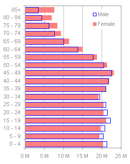

A different choice of colors may improve the uniformity of the two series, but not completely. A black line and a light gray fill give the series more equal weight than the blues and reds above.

I’ve written about Dot Plots in Microsoft Excel on my web site, where I’ve also linked to other sources: Good Graphs for Better Business, by William S. Cleveland and N.I. Fisher, Dot Plots: A Useful Alternative to Bar Charts, by Naomi B. Robbins, Ph.D., and Compare Metrics by Category Using Excel Dot Plot Charts, by Charley Kyd. Jorge Camoes also finds them a suitable replacement for population pyramids in Population pyramids in Excel. This is a good data set to display in a dot plot. The lines clearly show the distributions for both populations, as well as the relative populations in each age range.


