A reader of my post about Trendline Fitting Errors asked how to calculate area under a fitted curve. His stated problem was that when he tried to calculate points based on the fit, it didn’t come close to matching his measured data, even though the fit had a very high R² value. I suspect this problem was due to the tricky nature of the Excel formulas needed to make the various calculations.
Another problem, which is stated in the Trendline Fitting Errors post is that the reader had calculated a 6th order polynomial fit to his data. This is fine, I guess, if you only need the data for interpolation, the fit is close, and due to curvature the fit deviates from a straight line between points.
Despite the problems with using a sixth order fit, I’ve decided to work out the calculations and compute the area under the curve, both under the measured data and unser the calculated data based on the fit.
The Experimental Data
The measured data is shown in the table below. This represents the force needed to move a surface closer to a particular molecule starting at a distance of 1.22 (which is asymptotically close enough to infinity that we assume a force of zero). The units of force and distance are not stated, but it doesn’t matter for this exercise. As the surface approaches the molecule, the force increases, until it is close enough to start to distort the molecule, at which point the force tops out and even decreases at the closest measurement.

Here’s a plot of the data.
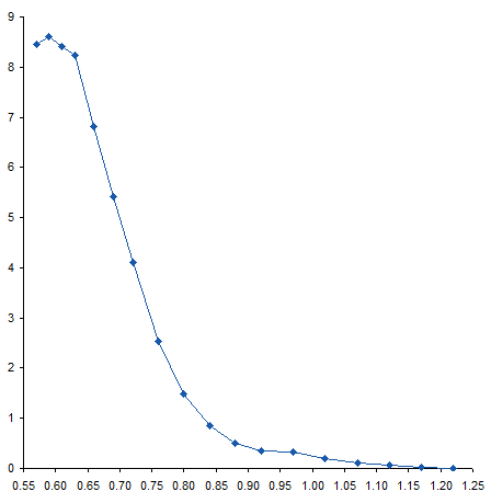
When I first saw the data, I mentioned to the reader that there appeared to be a bump in the curve near the bottom. I’ve zoomed in on this region below. The curve coming from the upper left doesn’t match up with the curve coming from the lower right, resulting in a zig-zag at about X=0.95.
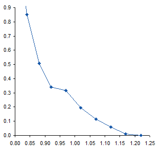
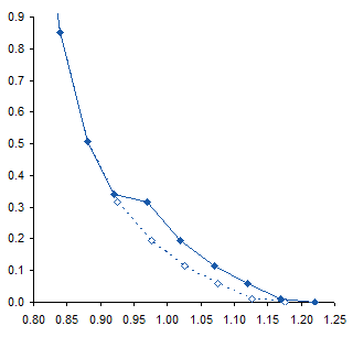
To me this means there may be some slippage in the mechanism that moves the surface, or some other experimental inconsistency. I would think that the actual curve would look like the dotted line below. If it were my experiment I would repeat the measurements, but the exercise below was performed on the unmodified data.
The Trendline
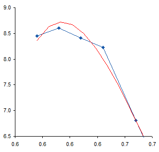
I added a 6th order polynomial trendline to the data. Then, since trendlines are bold black lines that blast your eyes and obscure the data being fitted, I formatted the fitted curve as a thin red line. For most of the range of data the trendline fits pretty closely to the measured data, and the R² value of 0.9996 is very close to a perfect 1.0.

Near the top of the data, the trendline is not very accurate, overshooting the maximum of the measured data, then overcompensating for the decline in the last point.
The fit at the opposite end also isn’t very good. The red line careens back and forth like an out-of-control bobsled trying to hold a line. Note how the trendline is thrown off by the discontinuity I remarked about earlier. The trendline actually reaches a local minimum at about X=1.15, then a local maximum at about X=1.20, before continuing downward, but not quite to zero.
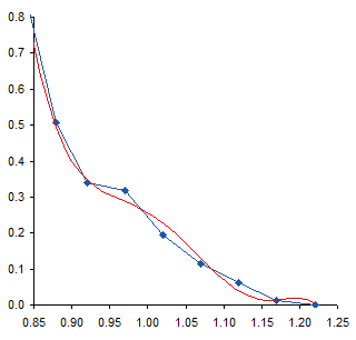
These deviations of the trendline from the measurements, particularly the serpentine behavior at the lower end of the data, illustrates the problem with high order polynomial fits. There’s really not a physical basis for choosing such a fit; it’s simply convenient and gives a high R². Of course, a high R² is not the only reason to select a particular mathematical model, and does not by itself mean the model is a good one. You have to decide whether you think the selected model or the actual measurements know more about your data.
We must take care using the trendline equation in the earlier chart. Its coefficients have only five digits, and with so many coefficients multiplied by so many powers of X, errors can accumulate. Here are the points calculated with these imprecise coefficients. Not very good agreement: the calculated points deviate somewhat more than the trendline at the top, and they go off in another direction entirely at the bottom.
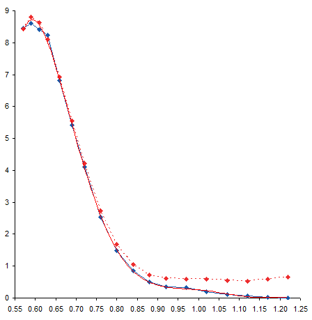
We can improve the precision of the coefficients by formatting the trendline formula in the chart to use scientific notation with 14 digits after the decimal point. It’s ugly, but it’s precise.

Calculating Coefficients
Now, we could then retype all of these coefficients into worksheet cells, but that would take a long time and leave us cross-eyed. The better approach is to let Excel make the calculations using its LINEST worksheet function. You need a range with five rows and one plus the order of the poly fit columns. For a sixth order fit, we need seven columns. Select the range with the active cell in the top left of the range, type in the formula below, then hold down CTRL and SHIFT while pressing ENTER. CTRL+SHIFT+ENTER produces an array formula, which is a topic that could cover dozens of blog posts.
=LINEST(B2:B19,A2:A19^{1,2,3,4,5,6},,TRUE)B2:B19 contains the Y values, A2:A19 contains the X values. We denote a six order poly fit with the ^{1,2,3,4,5,6} notation, which tells Excel to apply each of the exponents in brackets to X in its calculations. The third argument is left blank, because we don’t want to force the fit to go through the origin, and the last is TRUE because we do want to fill the entire selected range with calculations. (The first row of the output contains our coefficients. The second through fifth rows of the output contain information about the coefficients and the model, so we could have simply selected the first row of the range and not bothered with the rest.)

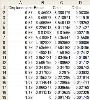
After pressing CTRL+SHIFT+ENTER we get the following table. I’ve inserted headers at the top to remind me which coefficient is which.

Calculating Points
Now we can calculate values at the X values of interest. In this case, I’ve used the same X values for which we have measured data. The formula in cell C2 is shown below, and it is filled down to C19.
=$N$2+$M$2*A2+$L$2*A2^2+$K$2*A2^3+$J$2*A2^4+$I$2*A2^5+$H$2*A2^6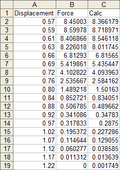
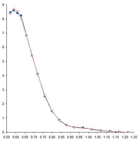
These points exactly fit the trendline, and are pretty close to the measured data.

I’ve removed the curved trendline and connected the calculated points with straight lines. With this formatting it may be easier to see the deviation of the calculated points from the measured data.
Residuals
We can easily calculate the deviation between measured and calculated points. Column D simply shows the difference between columns C and B (calculated minus measured).
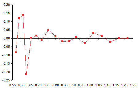
And here is a plot of the residuals, which is the fancy word statisticians use for this deviation. It’s particularly high at the left end of the data (the top, where the trendline overshot the maximum, then overcompensated on the rebound.
Calculating Areas
The original question the reader had was “What’s the area under the curve?” I think the whole polynomial overfit was really a distraction.
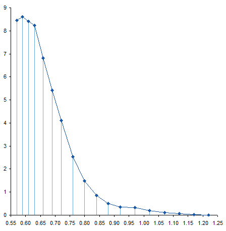
To calculate the area under a curve, we can cut the area into slices, figure out the area of each slice, then add them up to get the total area. We already have data points at certain intervals, so let’s slice the curve at each point. Here is the sliced up area under the measured curve.
Here’s the sliced up area under the calculated curve. Not too different.

The slices are trapezoids, and we know the area of a trapezoid: average height times thickness. In columns E and F I’ve calculated the areas under the measured and calculated curves. The formula in cell E2, filled down to E18, is
=(A3-A2)*(B2+B3)/2where A3-A2 is the thickness and (B2+B3)/2 is the average height. The formula in cell F2, filled down to F18, is
=(A3-A2)*(C2+C3)/2The total areas are summed in row 21.
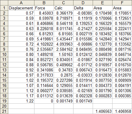
The two computed areas are unusually close, differing by less than 0.03%. In this case, there was no benefit to using a trendline to calculate this area.
You could make the case that trapezoids don’t accurately capture the area under a curve if the data shows lots of curvature. If we had taken measurements more frequently, our points would lie under or over the straight top segments of our trapezoids. If we believe our trendline, we could calculate values at closer intervals, as shown below. We might then say that the computed area was more accurate.
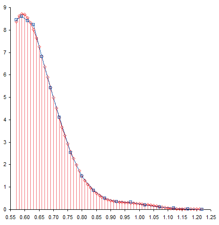
The area calculated for the thinner slices was 1.404070, which is about 0.2% less than the areas computed using thicker trapezoids. This difference is probably from the range between X=0.80 and X=0.97, where curvature in the trendline moved it below the straight line segments of the measured data. Is this a better value? It’s not substantially different from the calculation based on only the unmodified measurements, and I’m sure there are greater sources of error in the experimental setup.


