Polar Plots
Microsoft Excel offers a number of circular charts, but none of them is usually a particularly good choice for displaying data. You can search this blog for “pie chart” and see numerous examples of badly applied pie charts. If you hunt for “radar chart” or “spider chart” you’ll see a class of charts that’s even more deceptive. A major part of the deficiency of radar plots is that they pretend to show a physical, geographical relationship which isn’t present at all.
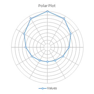
Polar Plots, on the other hand, can be used to map information that has a true geographical component. Ironically, this includes actual radar feedback. The data for a polar plot is given in polar coordinates, which is given as R-theta, where R is the distance from the origin (center of the plot) and theta is the angle from a reference angle, such as north or conversely the positive horizontal axis of overlaid cartesian coordinates.
A Polar Plot is not a native Excel chart type, but it can be built using a relatively simple combination of Donut and XY Scatter chart types. We need to build the grid using a donut chart, then overlay the physical data using applicable XY Scatter chart types.
Preparing the Data
We’ll use a donut chart for the circular grid. The data we need is simple, as shown below. I have 9 columns for the 9 concentric donuts (the smallest donut hole is 10% of the diameter, so this hole plus 9 rings of 10% make 100%). Each ring has 12 segments, so each comprises 30° of the 360° circle of the chart.

Our data is provided in polar coordinates in columns A and B below, where R is the distance from the origin to the data point, and theta is the angle from our reference angle (due north) to the point. These are converted to X and Y in columns C and D. The formula in C2and D2 are:
C2:  =A2*SIN(B2/180*PI())
D2:  =A2*COS(B2/180*PI())
These are filled down to C14 and D14.

Making the Chart
To create the grid, select the blue shaded cells in the top table, and insert a donut chart (below left). The default diameter of the donut hole is 75% of the diameter of the whole chart, so all of the rings are scrunched together. Select any of the donuts and press Ctrl+1 (numeral one) to open the Format Series dialog or task pane, and set Donut Hole Size to 10%, the smallest possible value (below right). While you’re at it, shrink the ridiculously large chart title, if you need it at all.
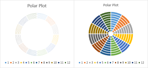
Format each donut series so it has no fill and uses a thin (0.75 point) light gray (25% gray) border (below left). Our grid is ready for real data.
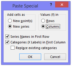
Select the orange shaded range of XY values in the second table above, and copy. Select the chart, and click the Paste Special button on the Paste dropdown on the Home tab of the ribbon to add the data (below right). The data is added as another concentric donut on the outside of the chart.
Use the following settings in the Paste Special dialog: Add cells as New Series, Values in Columns, Series Names in First Row, and Categories in First Column.
Right click on the new series, that is, on the added ring of data, and choose Change Series Chart Type from the pop-up menu. Choose one of the XY types. Here I’ve selected the line and markers option (below left); if you were plotting the advance of alien spacecraft you’d probably want the markers only option.
Excel has plotted the XY data on secondary axes: the axis labels of both are plainly visible in the left chart below. Format each secondary axis scale in turn so the minimum and maximum are equal but with opposite signs; in this case min is -10 and max is +10. Format the axis so there are no tick marks and no tick labels, and use the same line style as the donut grid borders, 0.75 points thick and 25% gray (below right).
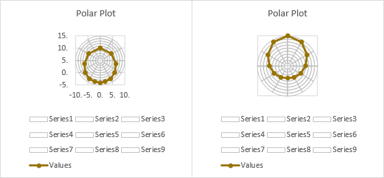
Remove the major vertical and horizontal gridlines (below left). Remove the unwanted legend entries; click once to select the legend, then once more to select the unwanted entry, then click Delete (below right). If there is only one series of XY points, you can probably dispense with the legend.

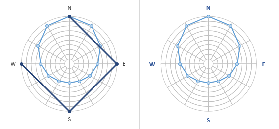
Expand the size of the plot area (below left), and format the series lines and markers if desired (bottom right).
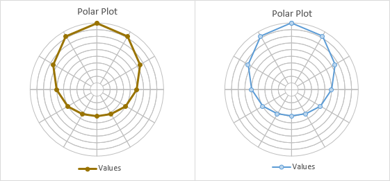
This may be complete enough for you, but as always, there are embellishments available to the clever chartmonger.
Modified Grid
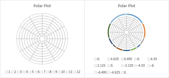
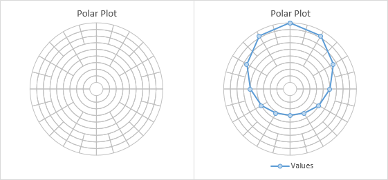
You can change the grid if you like. If I use the following expanded data, the inner few donuts have only 4 arcs, each covering 90° of the ring. The next few have 12 arcs, as above, each covering 30°. The last few have 24 arcs, covering 15° each.

The resulting grid is shown without data below left, and with data below right.

You can show the central circle (donut hole) without the crosshairs if you format the secondary axes to use no line color instead of 25% gray.
Compass Point Labels
Suppose this is an actual geographic representation and you want to label the points of the compass. Set up data as shown below left. Copy the green range, select the chart, and use Paste Special as above. This series is plotted using the same chart type as the previous paste series was converted to, XY scatter with lines and markers.

Add labels to the new series; the default Y values are used in the labels (below left). Remove the title and legend, or shrink the plot area to make room for the labels.
Change the label positions to Above (for the north label), Right (east), Below (south), and Left (west).
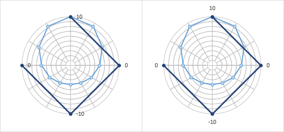
Change the labels as appropriate (below left). You can use one of these approaches:
- Select each label (click to select the series of labels, then click again to select the individual label), double click to edit the label’s text, and type the label you want.
- Select each label (click to select the series of labels, then click again to select the individual label), type an equals sign in the formula bar, and click on the cell containing the label you want. The formula bar will show the link, e.g., =WorksheetName!$F$2.
- Download and install Rob Bovey’s free Chart Labeler from http://appspro.com. This allows you to assign labels from a worksheet range to the points in a chart.
- If you’re using Excel 2013, you can format the labels to use Values from Cells, and select the range of cells containing your labels.
Finally, format the last data series so it uses no lines and no markers (below right).
