Someone asked in the Microsoft Excel Charting newsgroup, “How can I put four pie charts in a printed page, but only have one legend?” Well, the answer to that question has three parts.
- Use a single legend for multiple charts.
- Use data labels.
- Don’t use pie charts.
I’ll address these answers in the order stated above, even though the most important part is the last.
Use a single legend for multiple charts
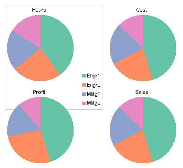
You can simply delete the legend from three of your charts, and arrange the charts so that the remaining chart’s legend is as symmetric as possible. The data shows how four classes of employee (Engineer 1 and 2 and Marketeer 1 and 2) compare in four measured quantities (hours, cost, profit, and sales).
To center the legend among all the charts, keep the legend in the top left chart and delete the legends in the other charts. Make the top left chart taller and wider than the others, and move the legend into the bottom corner. Arrange the other charts in front of the first with a transparent background. This is shown first with a border on the first chart to illustrate its size.
Here are the same charts without the border.
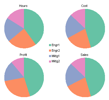
That’s not too terrible, considering it’s a set of pie charts. But it is often better to put the labels on the points themselves instead of sequestering them in a legend.
Use data labels
This option is easier than the first, because all charts can be the same size, and all have the same elements. This is one key to making charts line up nicely. There is no legend, and data labels have been applied using the Categories option.

It’s a little cluttered, but your eye doesn’t have to move from the data points to the legend and back.
Don’t use pie charts
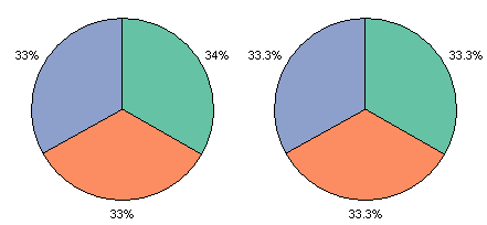
As Professor Tufte writes in The Visual Display of Quantitative Information, 2nd edition (p. 178), “The only worse design than a pie chart is several of them.” Fortunately there are several options at our disposal. To the credit of the person asking about pie charts, he said “No donut charts.” It’s a good thing too.
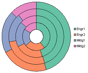
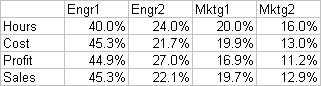
First of all, I don’t know where to put the series labels (Sales, Hours, etc.). Second, if it’s hard to compare the sizes of segments of a pie chart, it’s impossible to judge the sizes of the donut chart’s segments. For example, consider the blue sections. Three of the four have values between 19.7% and 20.0%. Can you tell which is different? Can you tell if the different one is larger or smaller? No way. I’m not telling, either, because first I’d have to look it up in the table*. The blue segment closest to the center looks smallest of all, and in fact it does have the smallest area, but it actually represents the largest value of the blue points. This chart type bears no further discussion.
*A frequently suggested alternative to a pie chart is a table. It contains the same data, arranged neatly in rows and columns, not arbitrarily distributed around a circle, like a pie chart’s data labels.
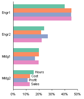
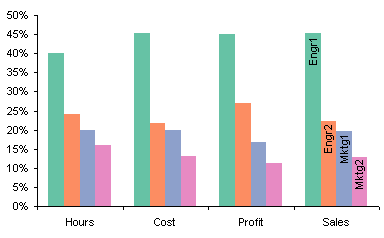
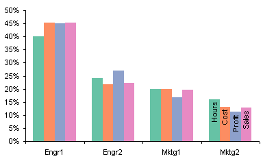
My favorite chart for this type of data is a simple clustered column chart.

You could make a stacked column chart. Each stack shows the sum of the percentages, the way a pie does. And while this is what pies and stacked charts are supposedly good at, they aren’t particularly good at it. At least the column chart has the percentage axis to help judge values, but it’s not easy to compare values of bars that don’t start at the same height. In the clustered chart above, in contrast, all bars start at the same baseline, so any pair of bars can be compared just by comparing the positions of the tops of the bars. Also for charts of the same height, the resolution of the value axis in the clustered chart is finer, so it is easier to see small differences between bars.

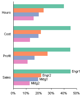
The clustered column chart above is still not ideal. We can replace the legend with data labels to make it easier to decode which bars go with which employees. We can use horizontal labels like this, which are easy to read, but may overlap for certain data configurations.

Or we can use vertical labels, which will not overlap, but are harder to read.
Another advantage of column charts over pie charts is that a single chart shows all the data. If you decide to group your data differently, it’s a simple matter in the chart source data dialog to switch rows and columns.
Edit 21 November 2008
Using bar charts avoids the problems that these column charts have with labels.