The Marketing Charts blog compared Google to the rest of the world in Online Search Share, September 2009 & October 2009. The “guidelines” were followed: for parts of a whole, use a pie chart. And for comparison, why not two pies side by side?

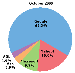
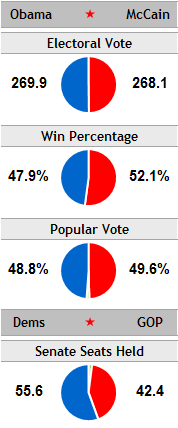
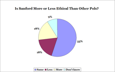
Well, as Edward Tufte once said, “The only thing worse than a pie chart is several of them.” Especially in this case. If not for the different titles and the percentage data labels, I would think someone had goofed and used the same graphic twice.
Having to read the numbers off the chart to make comparisons defeats the purpose of graphing the data, but is not as efficient as a table, because the numbers are strewn about the visual field. I can see that Google takes up most of both pies, but I can only estimate that Google’s take is about 2/3 of either pie.
So what are we trying to show here? If we want to show how each search engine’s share changed, a clustered column chart is good, because the two bars for each company are adjacent, for easy comparison.
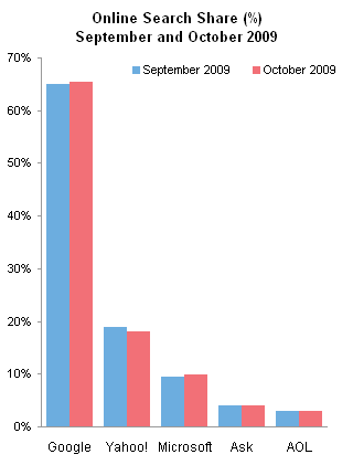
It’s easy to see that Google and Microsoft both went up slightly, and Yahoo went down. And nobody’s really concerned with AOL or Ask, are they?
An alternative to the column chart is a line chart. I shaded the plot area light gray, so it’s obvious that even though Google is way up here and the rest are way down there, all are part of the same chart.
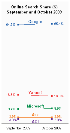
Again, it’s clear that although the changes were rather small, Google and Microsoft both gained at the expense of Yahoo.
What if it’s the change itself that we want to show? Again, a column chart fits the bill.
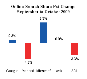
There are a lot of options when you’re selecting the chart type. You need to decide what you want to show in your chart, then select an appropriate graphic that shows it. As usual, it’s not a bad move to select from the array of 2D line and bar charts.
And I had too much pie over the Thanksgiving weekend. They call it a long weekend, when a more accurate phrase would be wide weekend.


