Since before Excel 2007 came out, there have been a number of complaints about how slowly its new graphics engine rendered charts. I decided to run a comparison between Excel 2007 SP1 and Excel 2003 SP3. To level the playing field, I ran each in Virtual PC within its own virtual machine, each allocated 513 MB and running Windows XP SP2.
I populated by blank worksheet with “x” and “y” in cells A1 and B1, and =RAND() in A2 and B2. I extended row 2 down N rows to populate an XY chart with N points. The XY chart had default formatting with markers only, no lines, and the X and Y axis scales were set to automatic.
I automated recalculation in the worksheet using this command from the VB Editor’s Immediate Window:
debug.Print now, timer : for i=1 to 100 : activesheet.calculate : _
    next : debug.Print now, timer
which essentially recalculates the random numbers 100 times, recording the time (now outputs the date and time, timer outputs elapsed time in seconds) before and after the recalculations. Output of a typical run looked like this:
10/10/2008 9:00:55 AM        32455.06
10/10/2008 9:01:05 AM        32465.61
I calculated average chart redraw times by taking the difference between the two timer values, and dividing by 100. The times in Excel 2007 to redraw the chart for 100, 200, 500, and 1000 points is shown in this chart:

I remembered hearing that in the RTM version of Excel 2007, chart performance suffered if the axis scales were fixed, so I ran the same tests on a chart with fixed axes. It turns out that there’s very little difference.

Then I thought about the markers in the XY chart. They are made from the new Office shapes, which means they have built in the ability to contain all kinds of glittery effects, like gradients, shadows, bevels, glows, and the like. Perhaps If I made a line chart instead, with lines only and no markers, I would see a difference. (The line chart used only one column of random numbers.) In fact, there is a difference, and the line charts take substantially longer to plot.

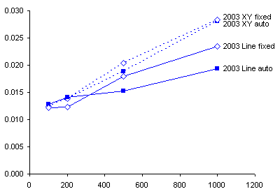
I repeated the tests in my Excel 2003 VM. The line charts in Excel 2003 actually do take a shorter time to redraw than the XY charts. More striking is the different axis scale between the chart above and below this sentence.
The Excel 2007 charts take around an order of magnitude longer to redraw than the Excel 2003 charts.

The data I used in this analysis is available in ChtPerf2003v2007.csv. A pivot table I made from this data is shown below.

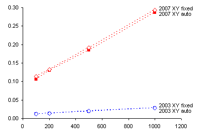
Here is a comparison of 2003 and 2007 XY charts.
The Excel 2007 XY charts take 8.5 to 10.4 times as long to redraw as the Excel 2003 XY charts.

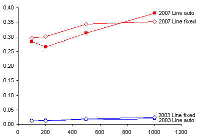
Here is a comparison of 2003 and 2007 Line charts.
The Excel 2007 Line charts take 15 to 24 times as long to redraw as the Excel 2003 Line charts.

Overall, charts in Excel 2007 are redrawn much more slowly than those in Excel 2003.

Update October 10, 2008
In a comment below, Robert Kosara wondered whether using only 513 MB was strangling Excel 2007. I changed the settings on the two VMs so they each used 1023 MB, and I reran the tests. The results can be read in Excel 2007 Chart Performance – Revisited.
Update October 10, 2008
In a comment below, Simon Murphy wondered how much of the chart redrawing discrepancy was due to slower recalculation in Excel 2007. I fired up the two VMs, and I ran tests measuring the time it takes to recalculate various numbers of cells. The results can be read in Excel 2007 Recalculates Slowly.


