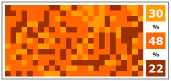
In Ineffective Chart – Partition Chart, I discussed the partition chart that Chandoo spoke of in Partition Charts in Excel – alternative to pie charts [visualization hack]. I felt that the partition chart hid the data it was meant to present. Jorge Camoes remarked that it looked to him like the map of a fragmented hard drive’s file system.
In Partition Charts – Continuation – [More visualization fun] Chandoo has reworked his partition chart, defragging it to bring all same-colored squares together. The original chart
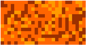
now has just three contiguous colored regions

That looks less cluttered than the original chart with its distracting camouflage effect, but by eye, I still can’t really resolve the difference between 30% light orange and 22% brown, and those numbers aren’t really close enough to be uncertain about them. The pie chart I used in my post showed these values more readily.
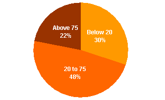
As always, the simplest and clearest way to show this data is in a bar or column chart:

The defragged partition chart reminds me of the “square pie” we first read about in Eager Eyes (Women in IT – Squaring the Pie?), and which was taken up by Juice Analytics (Squaring the Pie), Dashboards by Example (The Square Pie Chart), Anil Dash (Pixels Are The New Pies), Info Clarity (A square pie), Bella Consults (Square pies taste bad), and others. Here are some examples:
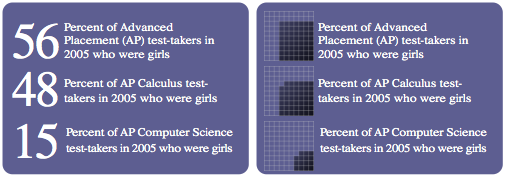
Women in IT

New York Times (left) cited by Anil Dash and Juice Analytics.
Wired Magazine (right) cited by Bella Consults and Dashboards by Example.
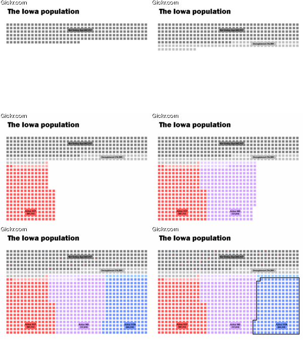
Produced and cited by Info Clarity
The square pie chart was all the rage for a while. Consensus seemed to be split between “they’re wicked cool” and they’re even less effective than round pie charts. My own opinion is that they are ineffective: the awkward shapes imposed by rows and columns of filled squares make comparison of areas even more difficult than comparing areas of rectangles with unequal lengths and widths or comparing areas of rotationally misaligned wedges in a pie chart.
Bottom line: you shouldn’t use square pies or “defragged” partition charts, use a bar chart instead.


