Stephen Few of Perceptual Edge is a reknowned expert on data visualization for analysis and communication of quantitative business information. He is the author of Show me the Numbers and Information Dashboard Design, two books that explain techniques which display information effectively, and why these techniques are an improvement over common practices and over the defaults of common software, such as Excel. The Perceptual Edge web site includes Stephen’s blog, an extensive library of articles by Stephen and other experts in data visualization and data visualization, and much more content.
Stephen recently posted an article which discusses Practical Rules for Using Color in Charts. I certainly can’t improve on Stephen’s article, other than to recommend this article and Stephen’s other resources to those who are really interested in improving their own presentations. I will also point to a couple resources he cites in his article. One is an article by Maureen Stone, an expert in digital color as well as information presentation, entitled Choosing Colors for Data Visualization. The other is Cindy Brewer’s web site which features an elegant Flash application that generates many different color palettes designed to make maps and charts more effective.
I thought a good topic would be a brief discussion of Excel’s color system, followed by a practical Excel-based implementation of the principles laid out in the resources above.
Excel 2003’s Color System
The color system in Excel 97 through 2003 is rather rudimentary. Excel 2007’s color system is very much enhanced, and will not be addressed in this article.
The Excel 2003 color palette consists of 56 colors, accessed through the color palette in dialogs and menus, and through code by a ColorIndex. The user can adjust any of the 56 colors, but these are the only colors available for Excel objects. (Shapes can actually make use of any of the millions of Windows collors, but that’s not germaine to Excel charts.)
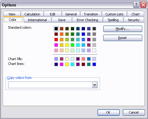
The user modifies the color palette by clicking on the Tools menu, choosing Options, and clicking on the Color tab, which displays the dialog below. The 56 colors are arrayed in all their glory. Note that the top five rows comprise the 40 “Standard” colors, which are always visible on the menu palettes. There are also two rows of special colors, one used for default chart fill colors (for bars, columns, and areas) and the other for default line and marker colors.
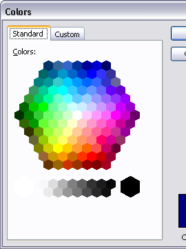
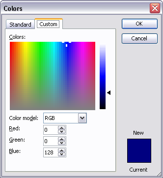
The user modifies a color in the palette by selecting it and clicking Modify. This pops up another dialog with two tabs. From this dialog (see below), the user can either select a color from a wider selection of “standard” colors, or define a color by dragging a cursor or entering precise red, green, and blue values. (The user should look up the definition of colors in terms of red, green, and blue. The only hint I’ll give here is that you can make millions of colors by varying each of these three components from 0 to 255.) Changes made in this dialog are specific to the active workbook only. From the dialog, the user can also reset the palette to Excel’s default palette, or copy a palette from another open workbook.
Standard Chart Colors
When you make an Excel chart, it starts out looking something like one of these:
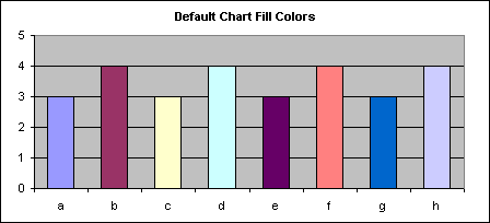
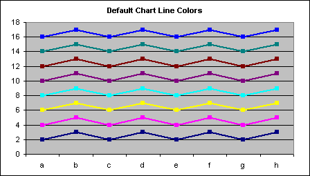
There are a few things we can change right away. First, the ugly gray plot area background should be changed to white. Second, if gridlines are necessary at all, they chould be changed to the lightest gray available. The black border around the entire chart can be removed, while the plot area border, axes, and axis tick labels should be changed to a medium gray, so their appearance does not draw attention from the data. The borders around the columns should be removed as well.
In the charts below, I’ve also made a minor adjustment to the color palette, changing each of the gray shades in the right column to a shade two clicks lighter in the standard color modification dialog. Since the default greens in the palette are either too dark or too bright, I’ve sacrificed the intermediate green and changed it to something that’s a nicer shade, definitely green, but between kelly and forest greens. I have not yet changed the default chart colors in the palette. The charts do look better, but the default series colors leave much to be desired.

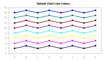
Better Excel Chart Colors
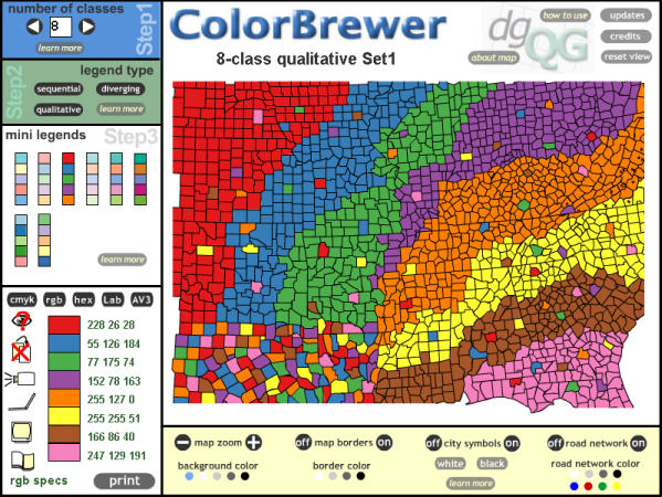
This is what the Color Brewer utility looks like:
You can select a number of classes (i.e., different colors in the palette), and a type of palette. Sequential means graduated shading from dark to light; Diverging means gradually changing from one dark color to white or a light shade in the middle to another dark color; Qualitative means the colors are defined with similar intensity so that no one color appears more important than any other. For typical charts the qualitative style palette is the best choice.
For fills in chart columns, bars, or areas, light to medium colors work best, unless you want to emphasize a small number of points. For lines and markers, medium colors work well.
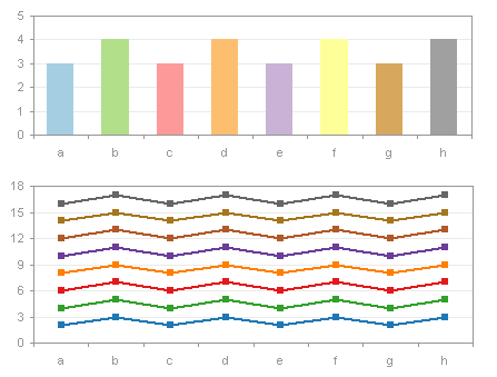
I’ve spent a little time with the ColorBrewer, and used it to define a few sets of custom chart colors. The default palette and two of my custom ones are shown below. The names “Paired” and “Set2 Dark2” derive from names of the color combinations from the ColorBrewer. I’ve slightly modified a couple of the colors, but most are as defined by the ColorBrewer.
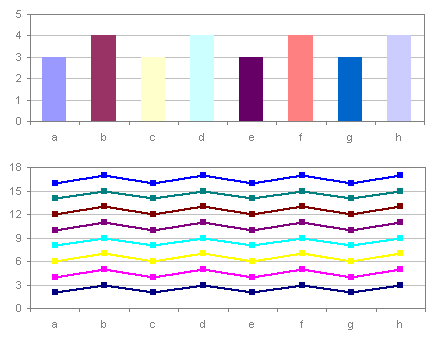
Default Excel Charting Palette
Custom Charting Palette – Paired

Custom Charting Palette – Set2 Dark2 (my favorite)
Update 23 June 2009
An updated version of the Color Brewer has been released: ColorBrewer2.org.
Palette Chooser Utility
To reward persistent readers who have made it this far, I’ve built a small utility to apply a few of these palettes to the active workbook. It is located in the zip file PaletteChooser.zip. Unzip this file, and open the workbook PaletteChooser.xls with macros enabled. The workbook was created in Excel 2003, and should also work in Excel 2002 and 2000. I don’t know whether it will work in Excel 97 or in any flavor of MacExcel, and it is irrelevant to Excel 2007. When the workbook is opened it adds an item called “Custom Palette” to the Format menu; this menu item is removed when the file is closed. Colors are stored in the Colors worksheet of PaletteChooser.xls and displayed in the Prelim worksheet; for each palette, most of the changes are based on ColorBrewer colors, but I’ve also included my adjusted grays and greens. To modify another workbook, activate it first before selecting the Custom Palette menu item. Invoking this menu command will pop up the following dialog:
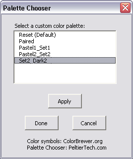
The custom palettes stored in the Palette Chooser workbook are listed in the dialog. Clicking Apply or double-clicking on a palette entry in the list box will apply it to the active workbook. When you find one you like, click Done. If you want to cancel the changes, click Cancel. If I get ambitious I will post instructions here for anyone who wants to define their own palettes; clever Excel users may figure it out on their own.


