The Paired Waterfall Chart
I came across a new (for me) style or waterfall chart last month, which I call the paired waterfall chart. It is designed to show how an investment fund’s total holdings, comprised of stocks or other vehicles and cash, changes during a time period, based on changes in value of its stocks and on proceeds from the sale of some stocks.
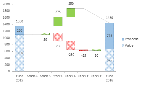
Here is an example of such a chart. The holdings of the fund totaled 1350 in 2015: 1100 in stock plus 250 in cash. The holdings of the same fund in 2016 totaled 1450: 675 in stock and 775 in cash. Stock A didn’t change in value. Stock B appreciated by 50 in value. Proceeds from the sale of some Stock C were 275, while the fund’s total value of Stock C declined by 250; the difference of 25 must have been additional appreciation of Stock C. Sales of some Stock D resulted in proceeds of 250 and corresponding loss in value of 250. Stock E went down 25 in value, while Stock F went up 50.

There is no provision for taking cash and buying more of a stock already in the portfolio or a new stock, so the upper set of floating bars are green only, that is, you can only gain cash. The lower bars can be red or green, but the value of your stock holdings can never drop below zero, because at worst the stock is worth nothing. These constraints make the chart slightly easier to build than a standard waterfall, though the horizontal and slanted lines are trickier than in the standard one.
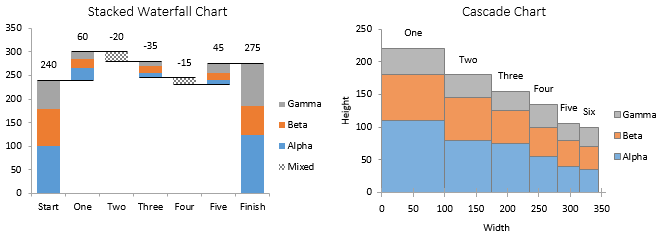
For want of a better name, I call this the “Paired Waterfall Chart”. In hundreds of images of waterfall charts that Google found for me, none had this same structure. I tried to crowd source the chart’s name on Twitter, but the only suggestions that weren’t lame attempts at humor were “stacked waterfall” and “cascade”, and these refer to other chart types. If you know what this chart is really called, or if you have some examples you can share, please let me know in the comments below this article.

How To…?
Since I’ve never seen this kind of waterfall, and since nobody asked me how to make one, I have not prepared a tutorial. But someone did ask whether my charting software, Peltier Tech Charts for Excel, could make these charts. The answer was, not yet, but with the thought of perhaps selling a few licenses, I took on the task. So…
Paired Waterfall Charts in Peltier Tech Charts for Excel
The Advanced Edition of Peltier Tech Charts for Excel now includes a Paired Waterfall Chart feature, and that’s what I used to make the chart at the top of this article. The data consists of three columns of data, with labels for the horizontal axis, entries for value of the holdings, and entries for proceeds due to any sales. The top row consists of labels, and the totals in the bottom row are omitted, because the program can add better than you can.
If you are a licensee of an older Peltier Tech utility, let me know and I’ll send a discount coupon code so you can upgrade at a discount. And you should upgrade, because Peltier Tech Charts for Excel works in Microsoft 365, and the same add-in file works on both Windows and Mac.
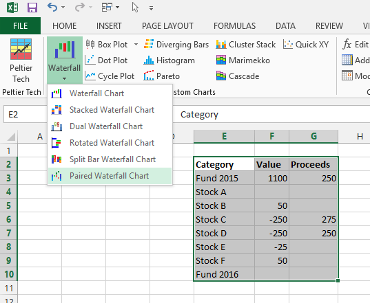
Like all of my utility’s charts, it is easy to make the Paired Waterfall Chart. With the data selected, click the Waterfall dropdown, then click the Paired Waterfall Chart button.

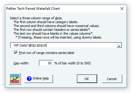
This very simple dialog comes up.

Click OK, and the program generates a new worksheet with a bunch of formulas in a nice Excel Table, and the Paired Waterfall Chart (click on the image to see it full-sized).
I’m gradually transitioning as many of my program’s chart output sheets to use Excel Tables, because they make it easier for users to adjust the chart’s data after they’ve already built the chart. Tables will also make it easier when I finally come out with Peltier Tech Charts for PowerPoint and Word. The structured referencing in the tables can be a challenge, but Zack and Kevin’s book about Excel Tables helped a lot.


