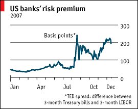
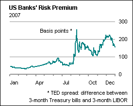
A visitor to my web site emailed me, asking how to make a nice chart like the one in Postcards from the ledge on The Economist‘s web site. There is no default Excel chart type that comes anywhere close, and the person asking the question didn’t yet understand the breadth of Excel’s flexibility. I reproduce the Economist chart below, along with the Excel counterpart I cobbled together in about ten minutes (it took longer to find the data than to knock off the chart). It’s not a perfect match, but it shows what is possible.

Nice chart from The Economist

Nice chart done in Excel


