 My colleague and fellow Excel MVP Mike Alexander of DataPig Technologies has sent me another article, so instead of the blog being silent while I take today off, it will be graced with more of Mike’s wisdom. Last November, Mike shared with us his Ten Chart Design Principles.
 Mike and I have taught advanced Excel classes together, and next month we will host the Second Annual Excel Dashboard Boot Camp. This will be a three-day extravaganza that will take you through the mechanisms of Excel data analysis and charting for purposes of creating effective dashboard-style visualizations.
Mike has written , which is among the most comprehensive Dummies books I’ve come across. The book is geared towards Excel 2007, but its principles and techniques are valid for any version of Excel. Mike takes his readers through dashboard principles, data preparation and chart creation, advanced data techniques including pivot tables and dynamic ranges, automation of dashboards using VBA, and designing interactive dashboards.
Without further ado, Here’s Mike:
A Few of My Favorite Chart Labeling Tricks by Mike Alexander
Often times, a few basic labeling tricks can enhance your chart labels and help bring out an extra layer of analysis. Here are a few of my favorite ways to enhance my chart labels.
Conditionally Color the Y axis
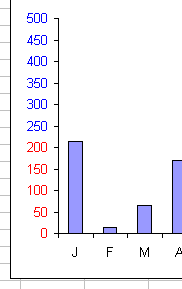
Did you know you can apply a conditional format to your chart labels based on their values? Using custom number-formatting, you can repurpose the Excel’s number formatting to apply your own conditions. For example, if you highlight a range of cells and go to the number format dialog box, you can click on Custom in the ‘Category’ list Then you can enter in something like [Red][<=200]#,##0;[Blue][>200]#,##0.
This will color any number <= 200 Red, and any number >200 Blue.

Charting this range will give you colored chart labels! You can’t do this with conditional formatting.
This will color any number <= 200 Red, and any number >200 Blue.

Jon explains these number format techniques in detail in Number Formats in Microsoft Excel.
Add layers to your X-Axis Chart labels
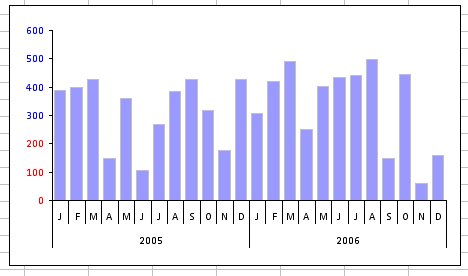
Have you ever created a pivot chart and got results like this?

You’ll notice that the X-axis has layered/nested labels. That is, month labels and associated years Well, you can achieve this result without a pivot chart by simply including another column of labels in your source data as shown here:

Embed Data Values into your X-Axis Labels
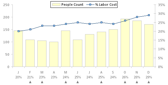
We all know that you can use Data Tables to show the actual data values for your charts. But there are situations where you may want to show the values for only one series in your chart. For example, take a look at this chart:

How did I get the Data Table to show only the values for % Labor cost and not People Count? The answer: I didn’t use the Data Table option. I used Excel’s Alt+Enter trick.
If you’re in a cell and you hold down Alt while you hit enter, Excel will place a carriage return character into the cell, forcing your values to show on two lines.
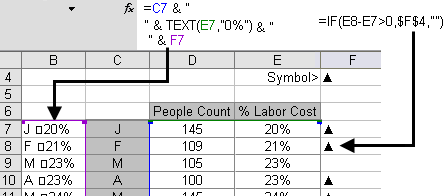
You can take advantage of this behavior in your data labels. As you can see, the source for the Primary X-Axis label is a combination of the Month name and % Labor Cost (separated by a carriage return).

Here is a sample of the formula used to get this setup. After you enter this formula, click in the space between the quotes and hit Alt+Enter. This will trigger the carriage return.
Note the use of the TEXT function. This is necessary so that the number formatting (in this case, percentages) is retained after you apply the carriage return. See this link for more info on that: http://www.techonthenet.com/excel/formulas/text.php.

Again, this is just a formula trick that concatenates all the values I want to see in my X-Axis label.


