XL Cubed (parent company of BonaVista Systems, maker of the MicroCharts add-in for Excel) has shown some very effective dashboard report examples in a couple of recent posts.
In 2008 Excel Dashboard Competition Winners the winners of the 2008 Excel Dashboard Competition are announced:
1. Wade Stokes – International Bank Dashboard
Displaying many disparate Banking Key Performance Indicators, and designed as the basis for the Management review of business performance, it truly achieves More Information per Pixel.
2. Jim Uden – Outpatient Surgery Center Dashboard
Developed for Meridian Surgical Partners, as a one page snapshot for the review and presentation of partnership level business operations and trends. Jim also includes probably the best associated description of dashboard content and the thought processes involved which we’ve seen.
3. Hitesh Patel – Pharmaceutical Sales Dashboard
Developed by Hitesh Patel and Mike Askew of Data Intelligence, for Bristol Myers Squibb. A key report for the Regional Sales Managers, containing the information required to run the business in terms of cash, growth, share, and competitive performance.
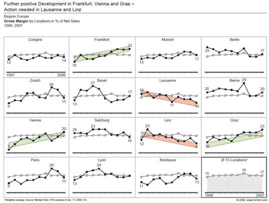
In More Information per Pixel!, they display a very nice report by Professor Rolf Hichert:

Rolf very effectively uses the technique of small multiples with sparing colors to highlight high and low performers among a portfolio of organizations.
These MicroCharts guys are really onto something.


