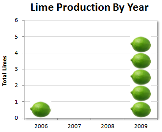
Excel author extroardinaire and amateur banjoist John Walkenbach describes this year’s Lime Crop this weekend in The J-Walk Blog. I’ve reproduced John’s chart below.
In a completely unwarranted statement, John snidely wondered how long until I criticized his chart.
Man. How did I deserve that… Oh, yeah.
Well, he asked for it.
Here’s what I did like about John’s chart:
- He used PNG format for the image file.
- The chart clearly shows most of the data.
- The use of lime graphics was not overboard, in fact, one lime per lime is an appropriate scaling factor.
Here’s where John’s chart needs improvement:
- His ink to data ratio is way too high: look at that distracting shadow.
- His vertical axis title is tilted 90°, making it hard to read.
- The zero limes harvested in 2007 and 2008 are not clearly shown.
- Time series data is usually more effective on a line chart.
I’ve made the appropriate changes in the following chart.
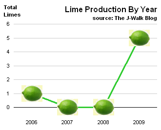
I guess we should call this a Lime Chart.


