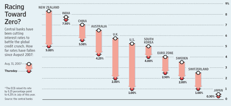
David Boyle of InfoClarity shows us a chart of declining interest rates in Interest rates racing down. He got the chart from Paul Kedrosky‘s The Interest Rate Race, and Paul apparently got the chart from the Wall Street Journal‘s Fed Weighs Its Options as Europe Cuts Rates (don’t bother following this link unless you have a subscription).

Click on the chart to see it at full size
Of this chart, Paul said, “Good graphic in the WSJ today showing the race to zero by central banks in major countries worldwide.” David added, “There was a nice little chart in the Wall Street Journal yesterday showing clearly how central banks are racing interest rates towards zero.”
My first impression upon seeing tha chart was, “Wow, the rates sure are declining fast!” But I was misled by the effective advance PR and the poor chart design.
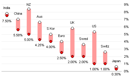
Let me explain this deception by first recreating this chart.

The titles of the two posts (“The Interest Rate Race” and “Interest rates racing down”) combined with the decreasing top series of points instantly caused me to mentally connect these points, like this:

Wow, look at that decline. It was pretty steady for a while, but lately it has accelerated. See it? Here, let me help.

What could be more clear? I’m sure many people stopped here, thinking that the chart had made its point clearly.
But that’s a false conclusion to draw from this data. When you step back and let (un)common sense guide your reasoning, you will realize that the chart above does not plot a decline in interest rates over time as it may seem. It plots a decline from one country to another at one point in time in October 2007.
The data could just as easily be sorted by interest rate not at the beginning of the period, but at the end, that is, last Thursday. This is arguably more relevant, since it’s more recent. You still see a steady decline in rates, but not as steep just because of the scaling of the chart.

It’s still going down, but not as sharply.

One could plot in order of increasing change in interest rate, which implies no false trend. It does not really make a point or show anything particularly clearly.

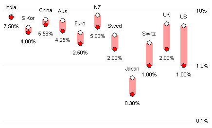
Or in order of increasing proportional change in rate, on a logarithmic Y axis to scale the proportional change more clearly. Again, no implied pseudo-trend, but also no clear point.

If we want to observe the decline in rates more clearly, we should use a “Bumps Chart”. You can read about bumps charts at Process Trends, at Junk Charts, or at XL Cubed. Essentially bumps charts show changes in a number of related values from one time point to another (or sometimes over a series of time periods). The chart below shows the changes in interest rates from a year ago October to last week. This bumps charts shows the decline in rates clearly, for each country, without resorting to displays of exaggerated pseudo-slopes to magnify the effect.


